HOW DO THE ELEMENTS OF YOUR PRODUCTION WORK TOGETHER TO CREATE A SENSE OF BRANDING?
Branding refers to the promotion of a particular product or company by means of advertising and design.
A brand is a name, term, design, symbol or any other feature that identifies one seller's good or service as distinct from those of other sellers. The key components that form a brand's toolbox include a brand's identity, personality, product design and brand communication.
The branding of our product included a postcard advertisement, poster and a website part of the ancillary tasks of our short film. The genre of our film was psychological thriller so the use of colours like red, mustard yellow and black was the main concept of our postcard, poster and website. The dark concept of the film was highlighted with the poster using references from posters of other famous Hollywood psychological thrillers.
The postcard we created was meant to be for the purpose of creating an attraction for the target audience of our film.
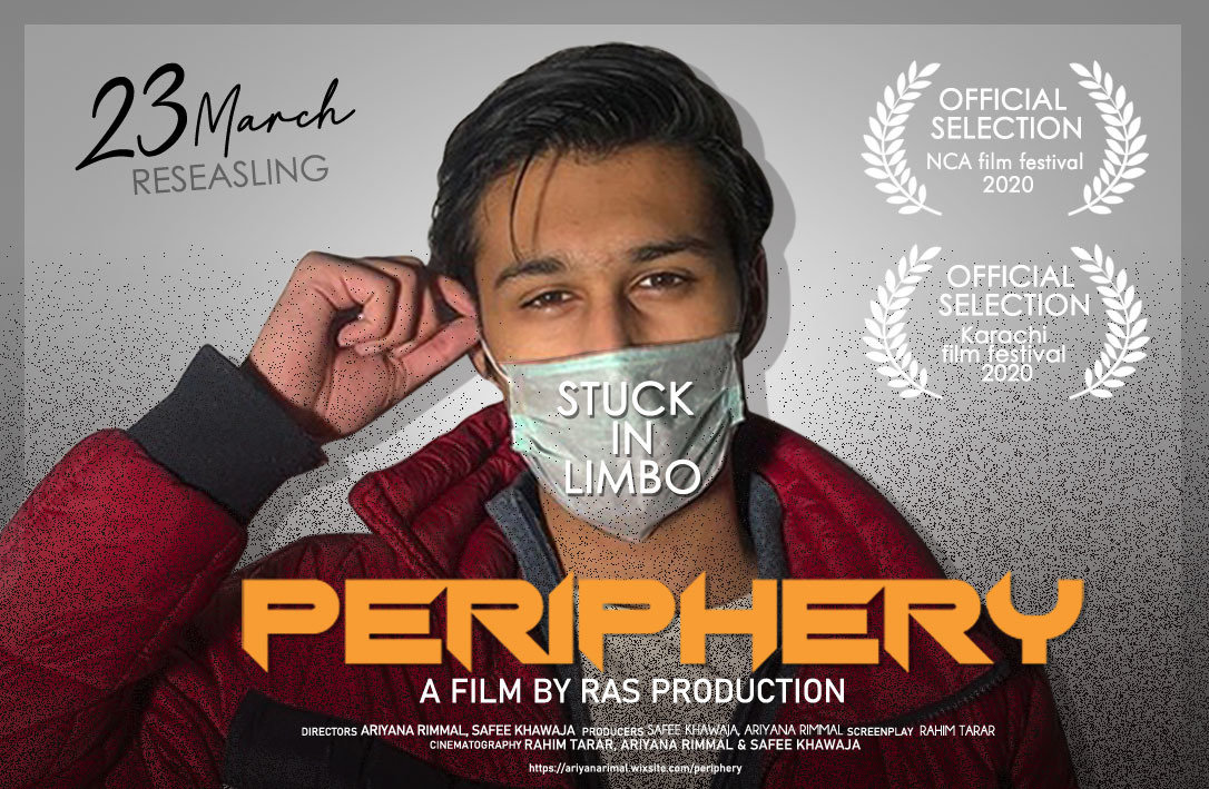
We made the postcard advertisement for the purpose of representing at film festivals across Pakistan. This advertisement made it very easy for us to create a sense of branding for our project because not only did this poster help us distribute the film but also create a hype for our short film.
The postcard along with our poster was printed into hard copies and distributed amongst our peers.
The main font used in the postcard advertisement, poster website and the film thumbnail are all the same for the purpose of creating a signature font to represent our brand.
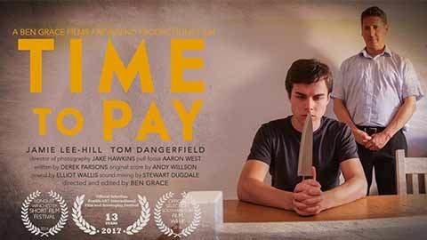
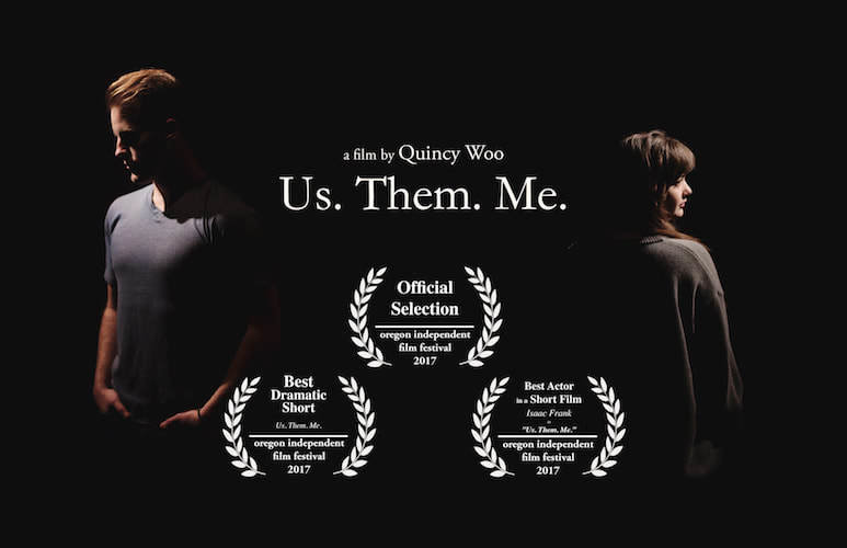
The postcards we used for inspiration.
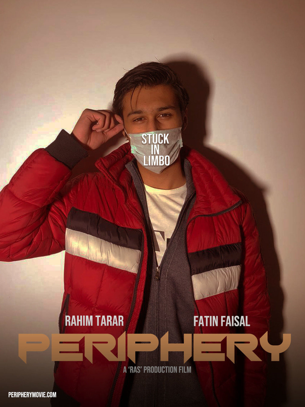
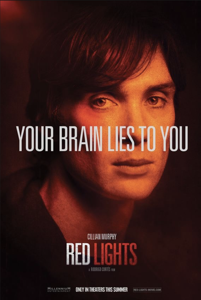
The use of the red filter, decreased highlights and decreased
brightness makes our film poster as close to real media text as
possible. The striking theme of the poster and minimalistic
look draws the audiences attention towards our short film.
The text fonts on the film poster are also
similar to the poster we took inspiration from.
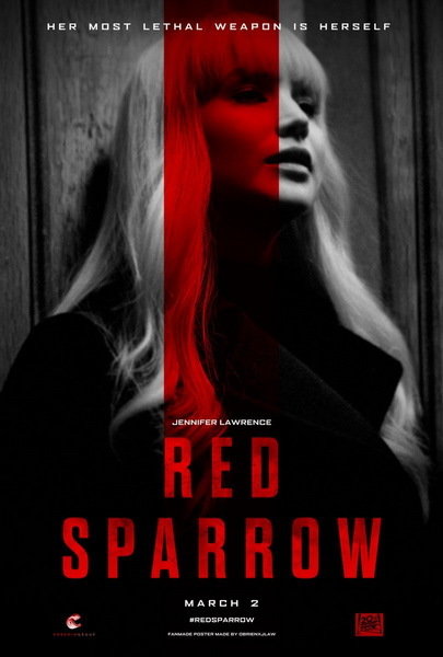

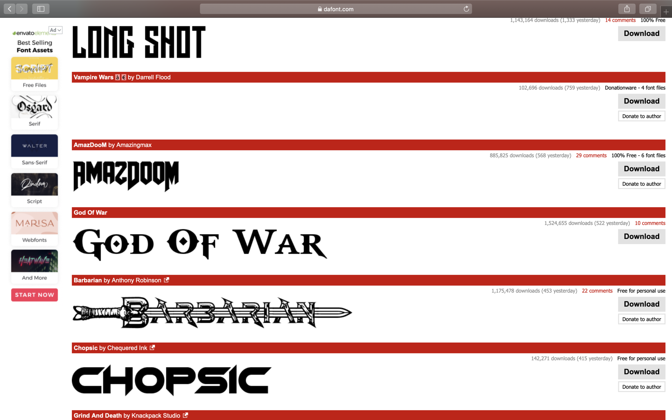
The search for the perfect font to draw attention towards the poster and to create a sense of individual branding associated with a bold font to show the name of the film was very vigorous. The font of the title was very different and I was personally drawn towards the font when I found it on dafont.com and thought the audience would also be very intrigued by it!
The font is very eye catching and would draw attention towards it but only remotely as to not to draw the attention away from the main characters expression and the text on his surgical mask. Fonts create a brand name, like famous film franchises that have specific fonts and styles that are only associated with that specific product. these fonts go on to become Logos.
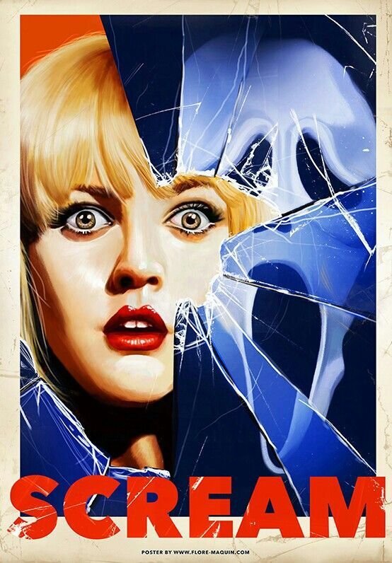
similar fonts


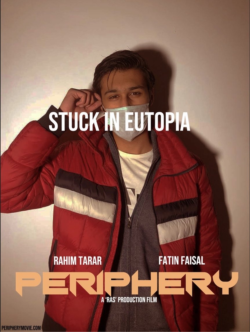
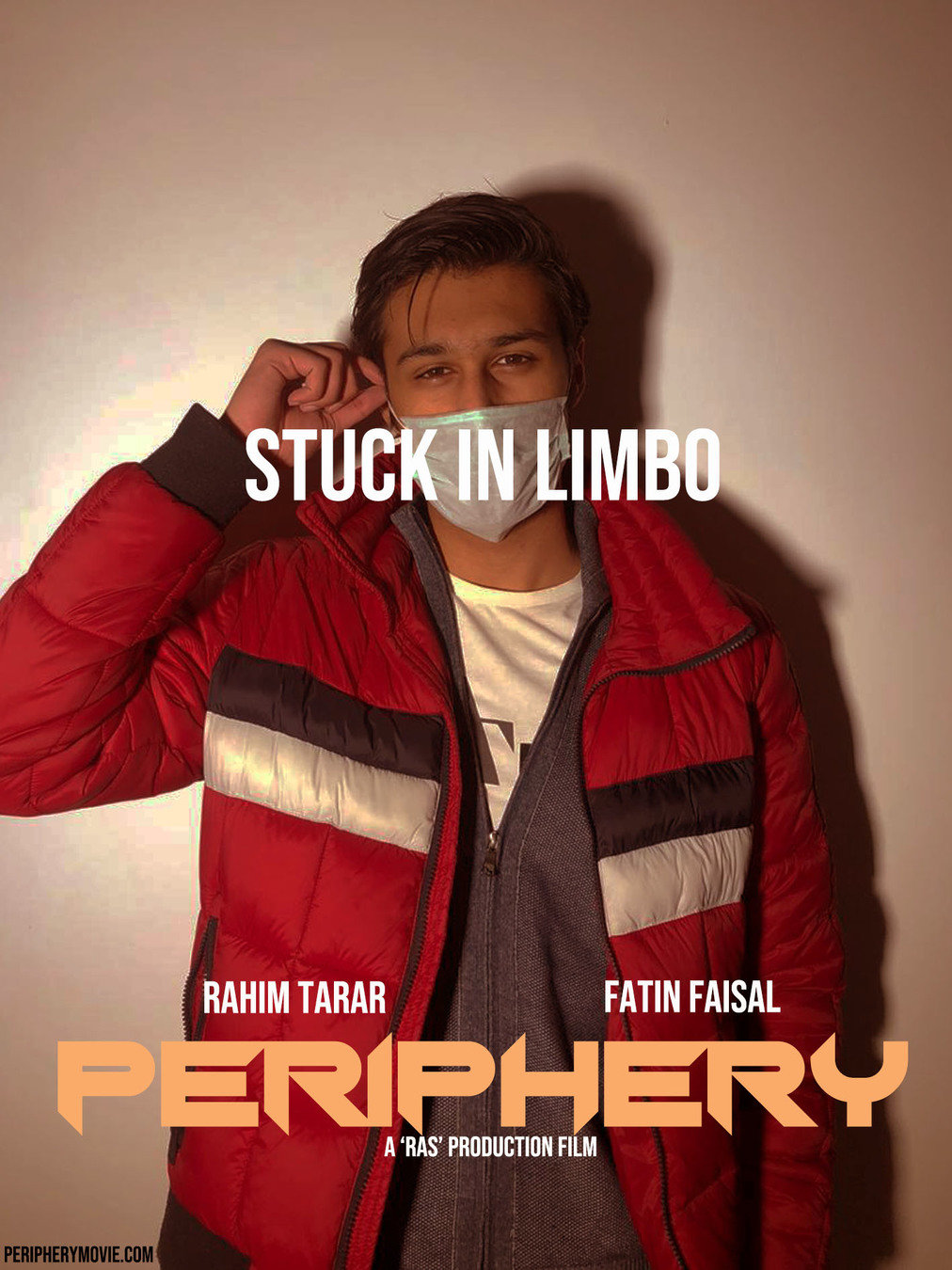
The tagline was very primal in the production process of our poster for the reason that it was supposed to disclose the story to the audience but only slightly so the whole story doesn't get compromised.
The placement of the tagline was what was confusing for us. The placement of the tagline across the main characters face was drawing too much attention away from the characters expressions and the main title of the film. it was too much to look at all at once hence we decided to make the placement horizontally across the surgical mask. This gave the element we were looking fir without looking out of place.
When it came to choosing the right words for the tagline, the word utopia was chosen first, but since the word symbolises being in a state where one thinks everything is ideal, the word limbo was more feasible to use. The characters state of mind and being stuck in a time loop was better portrayed by the word limbo. Taglines are also very important in creating a sense of branding for certain products since it symbolises and is usually associated with the particular product is it marketing. Many films, products and music videos are portrayed through taglines or punchlines that are also important with film sequels and for audience to recognise the film with.
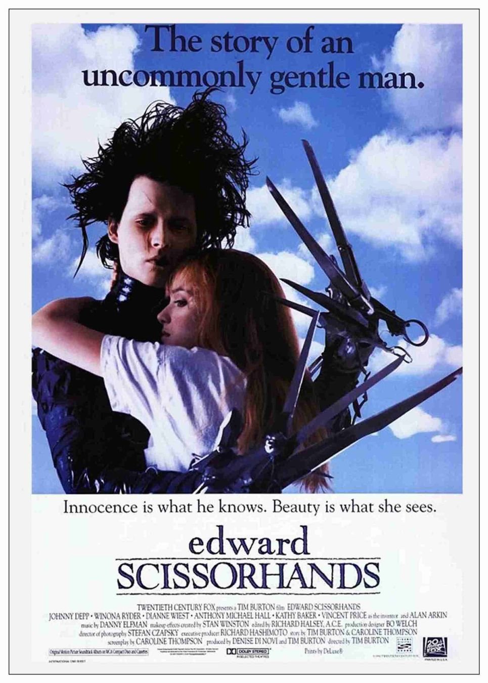
a very essential part of any movie poster is the famous tagline, like the one seen in the poster of 'Edward Scissorhands'.

The film title was supposed to be as relevant with the situation being portrayed in the film as possible. The film was based on a post apocalyptic situation based on the life of a survivor. The name 'PERIPHERY' best represented the film.

The word periphery means the end and also means secondary. Since the human population has almost seized to exist, the word periphery pretty much sums up what is happening in the film after the world has ended. The word periphery also represents the narrative of how the protagonist is actually the one that is sick and has been in a coma for the past 3 years so he is secondary to his own story.
The film title is primary towards creating the sense of branding of a product since the name of the product is its primal identity. This is the reason why the name was very carefully selected!
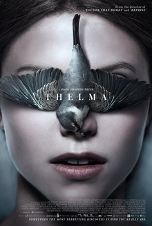
The unorthodox film title 'Thelma' gives off a vibe that draws the audience towards the film.
The production logo of our film was 'RAS PRODUCTIONS' which is an abbreviation for the first three letters of the names of my group partners and I, Rahim, Ariyana and Safee. The use of a production logo was basically for the reason of creating a brand for our product and for creating an importance for our production house. Many films usually do well due to the brand name that their respective production houses have. For this reason, creating a brand name for our production house was imperative. we also added an intriguing suspenseful music to create an opening theme for RAS.
Famous production houses with blockbuster films.
the intro themes of monopoly production houses 'Warner Brothers' and '20th Century Fox'
we also made a website as part of our ancillary tasks to create a sense of branding for our project.
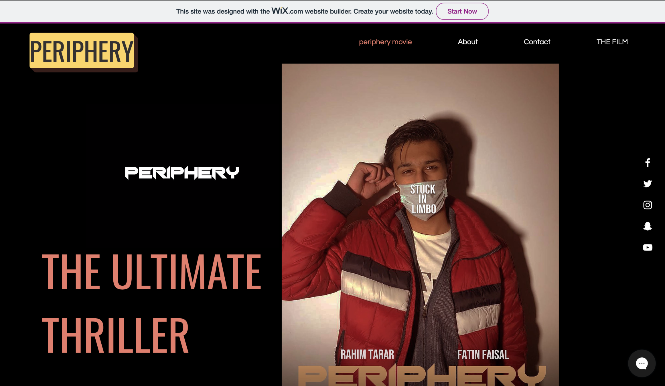
the website was made on wix.com. It contains sections like about the film, contact the film management and the film was also uploaded on the website for the audience to access.

https://ariyanarimal.wixsite.com/periphery/about
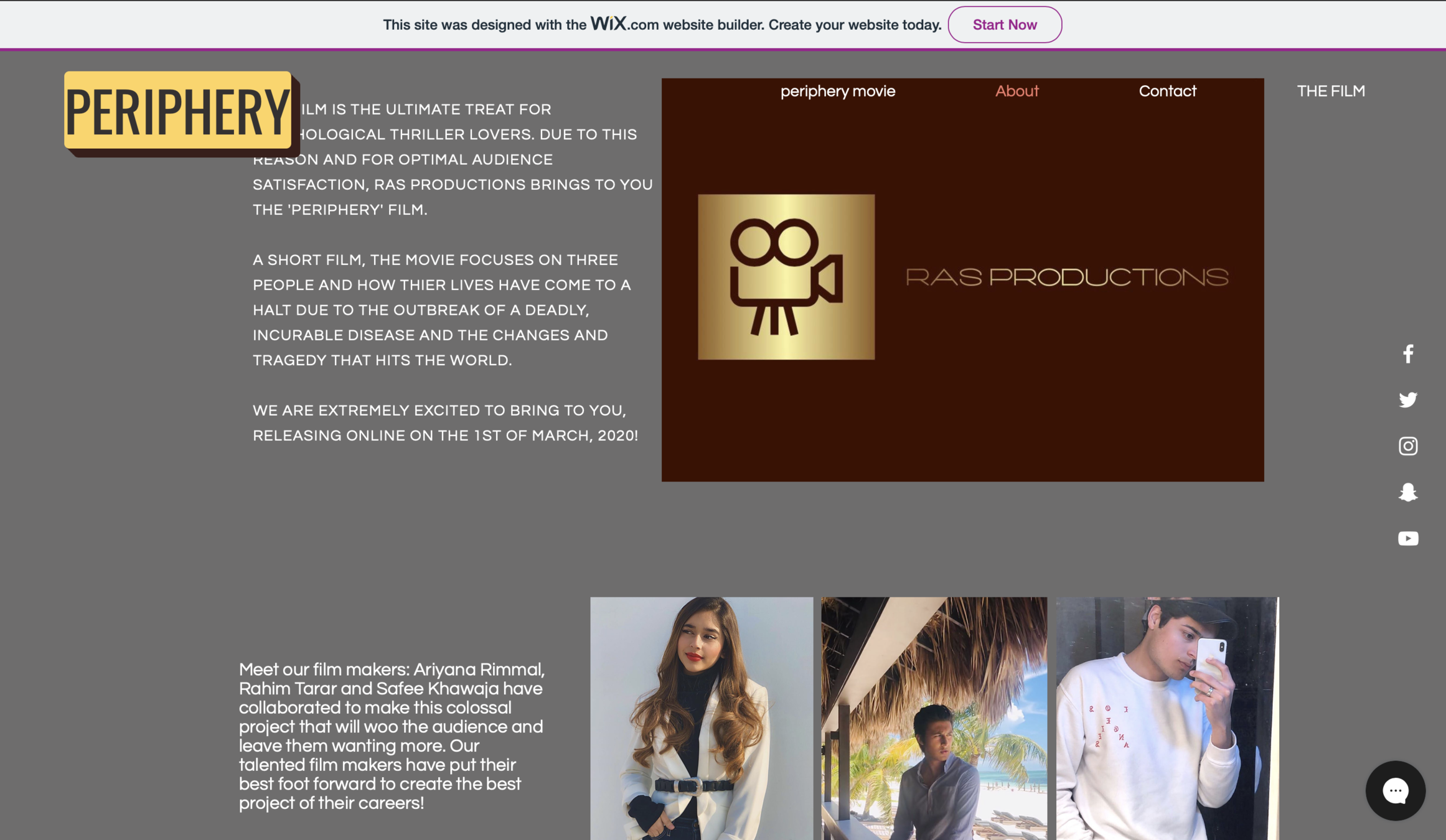
we thoroughly explained the genre, essence of the film and the information of the creators of the film to create a brand image based on the story and the film makers.
On the website, we also made a series of merchandise for the website to show how the our film is aiming to create a sense of branding for our product.
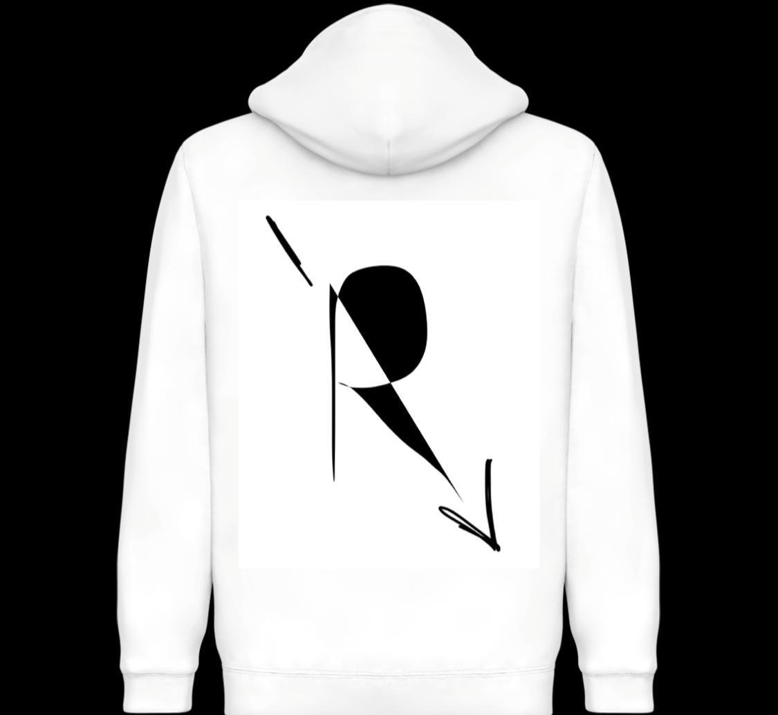
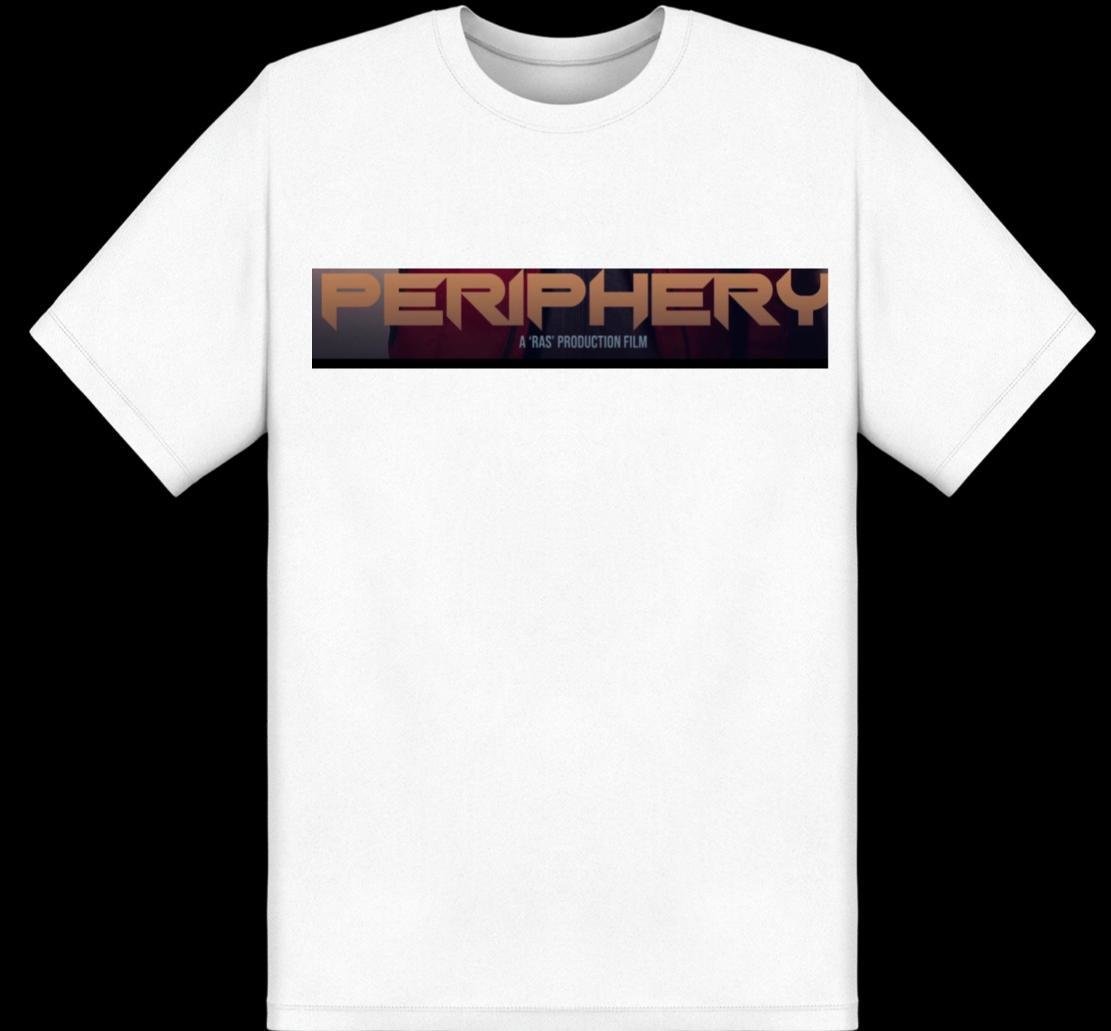
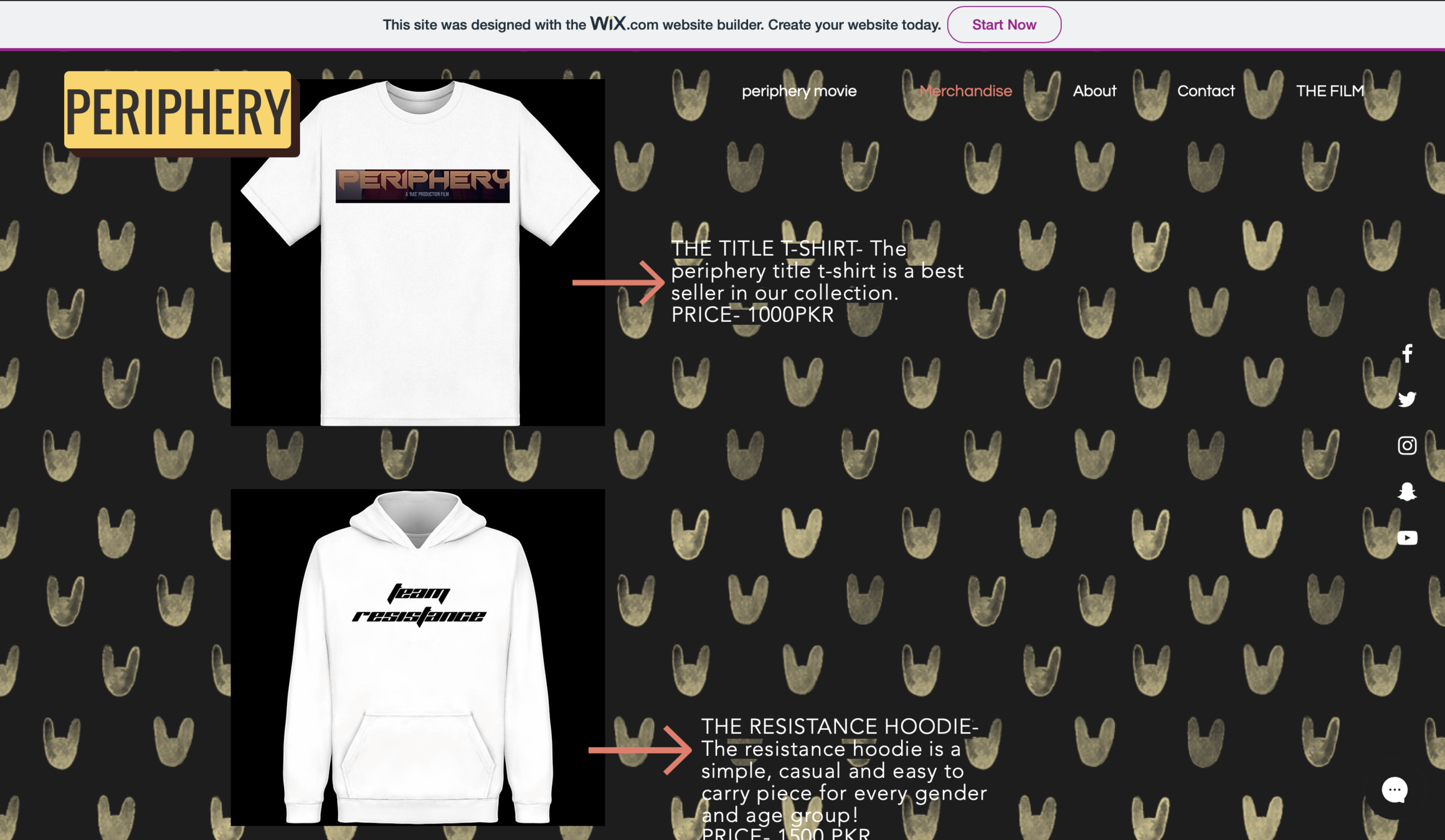
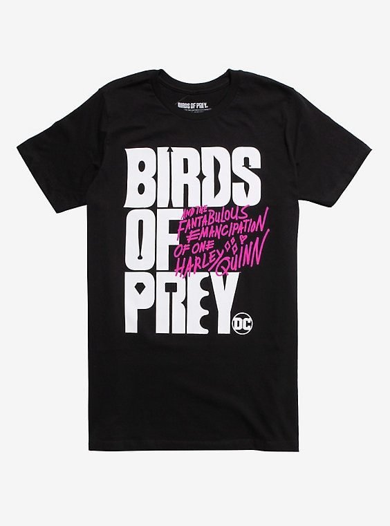
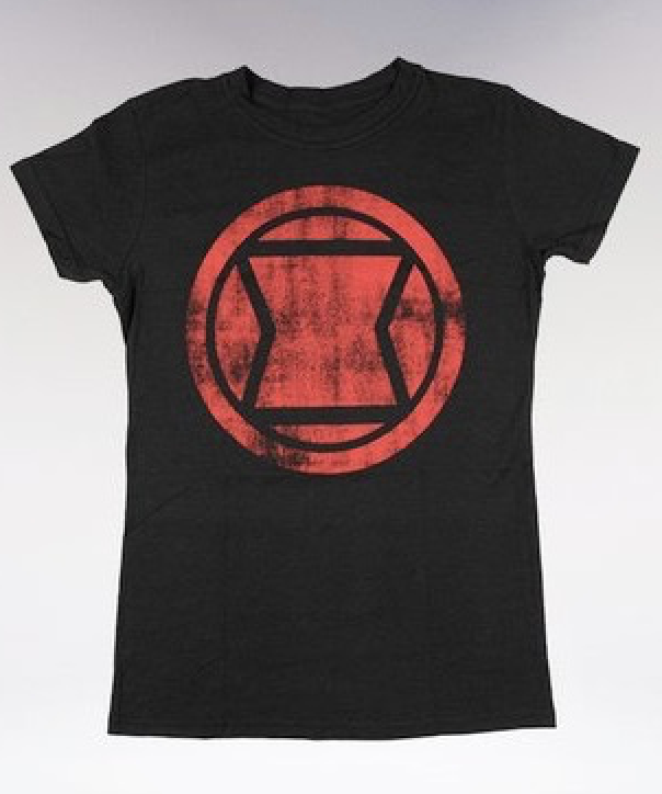
Some examples of merchandise clothing for new and upcoming films like DC's Birds of prey and MARVEL's Black widow.
The inspiration of our film website was taken from websites of different films and how they are titled and made for the purpose of creating a brand name for our film.
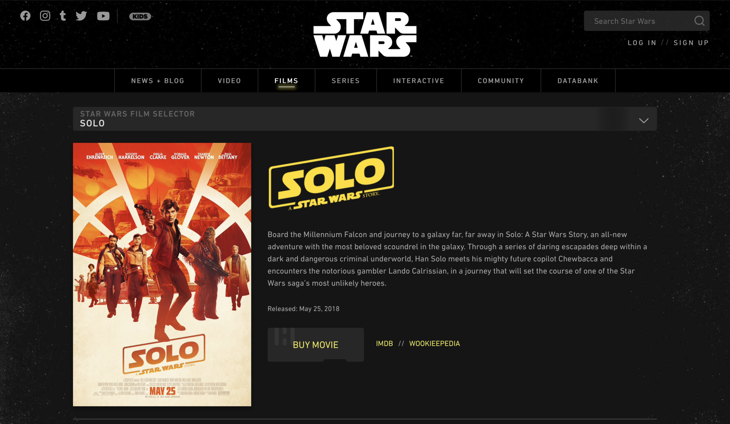
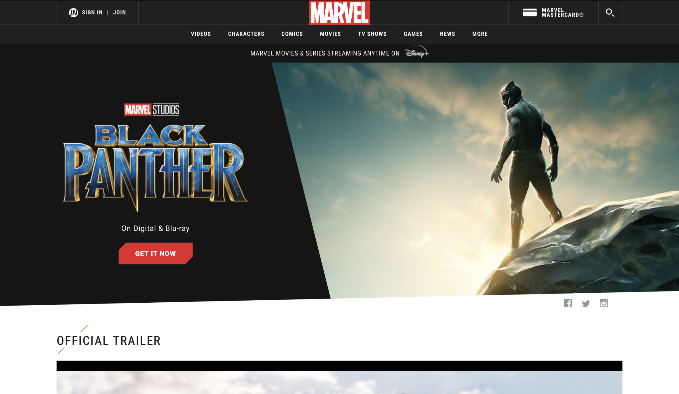
these websites are for blockbuster films that are world famous and have their own brand names. I added the poster on the principal page and the rest of the information in different menus, as seen in these websites.

we also made an instagram account for the film where we uploaded the film poster, youtube link to watch the film and to create a brand name and a hype for the film before releasing so that it becomes a hit. We also took inspiration from instagram accounts of movie accounts.

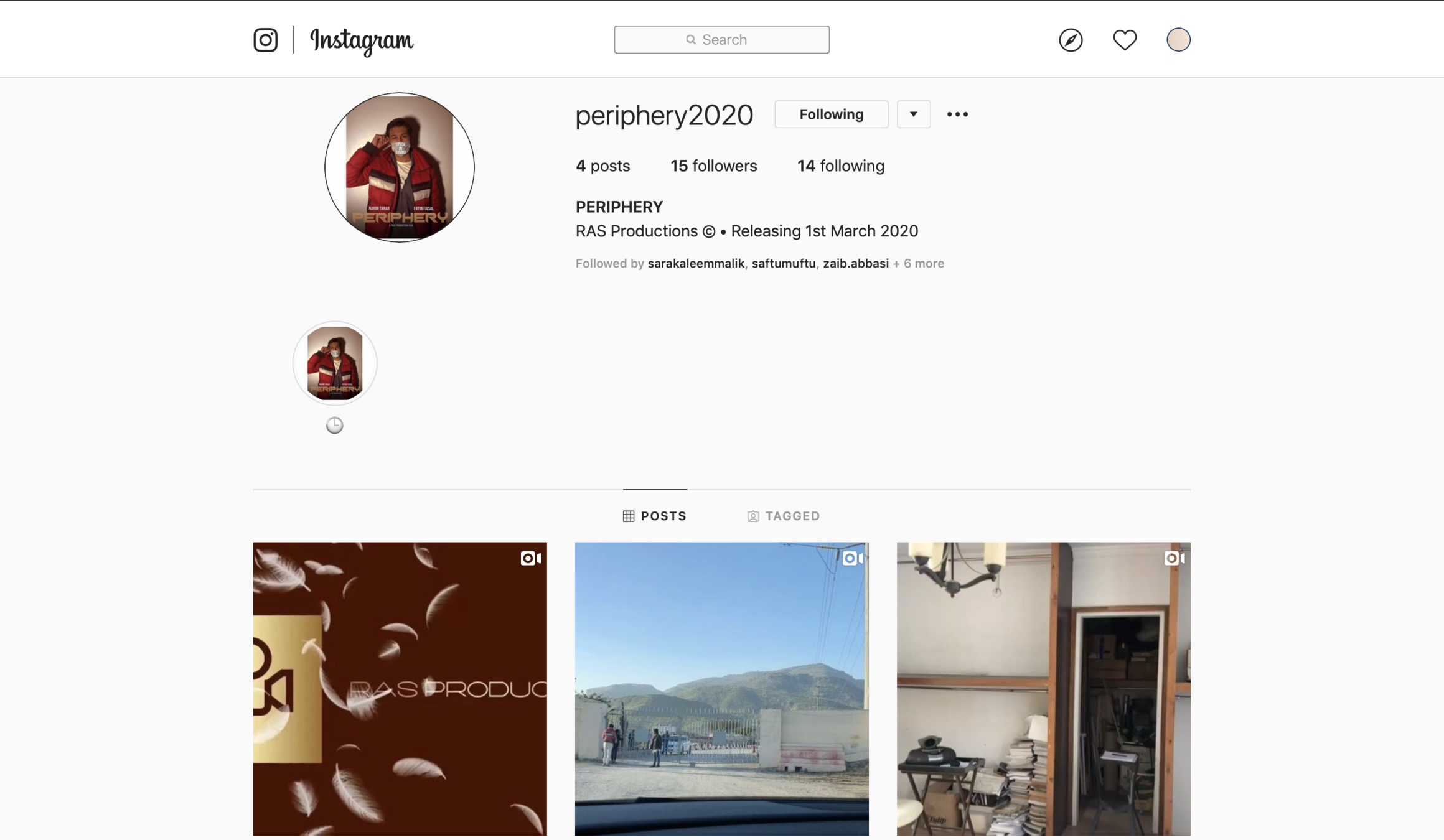
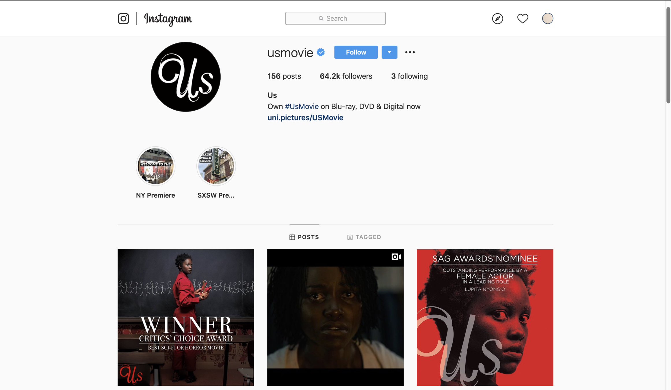
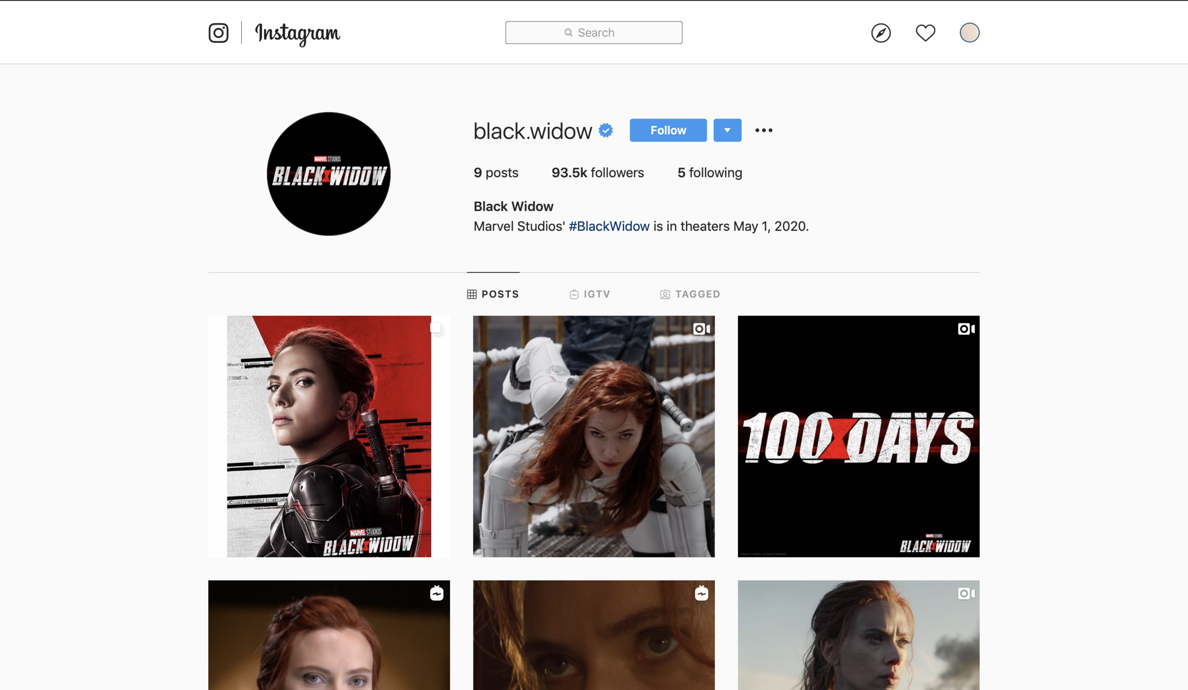
The Instagram accounts of real movies
Finally for the post production of our film, we posted the film on youtube and digitally printed the posters and spread them around our school and amongst our peers to make the film a success and to be viewed by people. The branding and marketing process made it possible for our film to be a commercial success!