
Alexandre Sobolevski
Armin Taheri
| Today we will ... |
|---|
| + Introduce plotly |
| + Setup Ipython notebook |
| + Example: Remake LIGO's static plots |
| + Example: Scatter plot on a globe |
| + Talk about our collaboration platform |
| + Example: Heat Maps |
| + Example: 3D Surfaces |
| + Example: Quiver Plots |
| + Example: Streaming API |
| + Example: Mandelbrot in 3D! |

why and how
we use it
is the collaboration platform for modern data science

APIs


For This Tutorial, Let's Use

Get Started!
$ pip --version

pip 8.1.2 from /.../... (python 3.5)
Check if pip is installed
If not then install it
$ curl -O https://bootstrap.pypa.io/get-pip.py | python

$ pip --version
Some of you might need to use "sudo"
$ curl -O https://bootstrap.pypa.io/get-pip.py | sudo python

$ pip --version
Get Started!
Install Numpy, Pandas, Plotly, and Jupyter Notebook
$ pip install plotly pandas numpy jupyterExtract and enter the tutorial notebook directory
$ tar -xvzf /path/to/plotly_tutorial.tar.gz

$ cd plotly_tutorial

$ jupyter notebook .
And you should see the notebook open in your browser!
First, We Need Some Data
Recent LIGO Paper
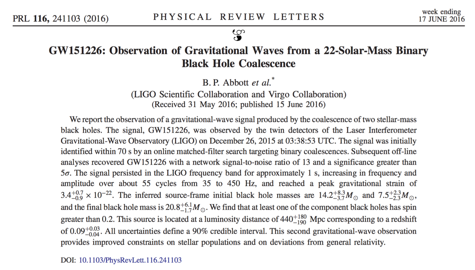
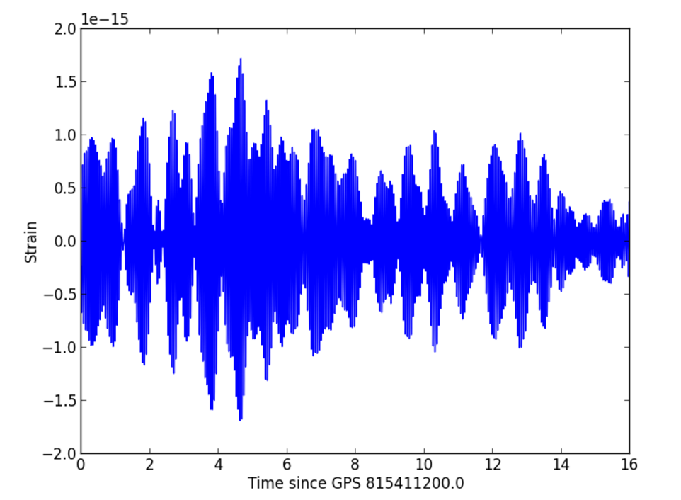
source https://losc.ligo.org
The First Reason Why We Use Plotly
Sign Up to Plotly
Go to https://plot.ly/settings/api
and sign up if you don't have an account already.
Now you can create and save plots to the cloud inside your notebook using your API key!
import plotly

plotly.tools.set_credentials_file(
    username='tutorial.account',
    api_key='gxa2ckhtj2' #keep this a secret
)
import readligo as rl
# First from H1
strain_H1, time_H1, chan_dict_H1 = rl.loaddata(fn_H1, 'H1')
# and then from L1
strain_L1, time_L1, chan_dict_L1 = rl.loaddata(fn_L1, 'L1')
# both H1 and L1 will have the same time vector, so:
time = time_H1
delta_t = 10
indxt = np.where((time >= tevent - delta_t) & (time < tevent + delta_t))
time_seg = time[indxt] - teventSTEP 1: DATA
STEP 2: TRACE
trace_time_series_H1 = {
    'type': 'scatter',
    'name': 'H1',
    'x': time_seg,
    'y': strain_H1
}
trace_time_series_L1 = {
    'type': 'scatter',
    'name': 'L1',
    'x': time_seg,
    'y': strain_L1
}
checkout the documentation for more options!
https://plot.ly/python/reference
layout_time_series = {
    'showlegend': True,
    'title': "LIGO strain data " + str(delta_t) + ' around of the event',
    'xaxis': {
        'title': 'time [s] since ' + str(tevent) + ' sec',
        'titlefont': {
            'family': 'Arial, monospace',
            'size': 18,
            'color': '#ff6600'
        }
    },
    'yaxis': {
        'title': '',
        'titlefont': {
            'family': 'Arial, monospace',
            'size': 18,
            'color': '#ff6600'
        }
    }
}
STEP 3: LAYOUT
STEP 4: PLOT!
import plotly.plotly as plotly
import plotly.graph_objs as go

data_time_series = go.Data([trace_time_series_H1, trace_time_series_L1])
fig_time_series = go.Figure(data = data_time_series, layout = layout_time_series)
plotly.iplot(fig_time_series, filename = 'LIGO-time-series')
The First Reason Why We Use Plotly
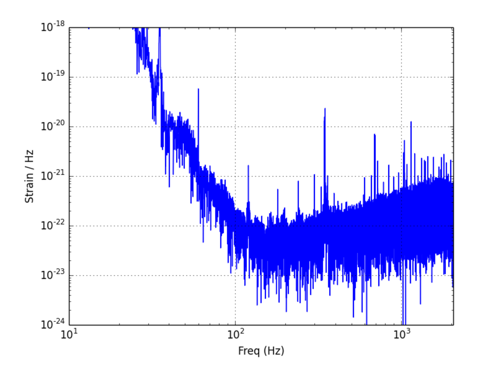
The First Reason Why We Use Plotly
t_tot = time[-1] - time[0]
dt = time[1] - time[0]
fs = int(1.0 / dt)
freq = np.arange(0, fs, 1.0/t_tot)


window = np.blackman(strain_H1.size)
windowed_strain_H1 = strain_H1*window
windowed_strain_L1 = strain_L1*window
freq_magnitude_H1 = abs(np.fft.fft(windowed_strain_H1))/t_tot
freq_magnitude_L1 = abs(np.fft.fft(windowed_strain_L1))/t_tot
STEP 1: DATA
STEP 2: TRACE
trace_fft_H1 = go.Scatter(
    name = 'H1 magnitude',
    x = freq,
    y = freq_magnitude_H1
)
trace_fft_L1 = go.Scatter(
    name = 'L1 magnitude',
    x = freq,
    y = freq_magnitude_L1
)
layout_fft = go.Layout(
    showlegend = True,
    title = 'Strain in Frequency Domain',
    xaxis = {
        'title': 'frequency [Hz]',
        'type': 'log',
        'titlefont': {
            'family': 'Arial, monospace',
            'size': 18,
            'color': '#ff6600'
        }
    },
    yaxis = {
        'title': '$ Hz^{1/2} $',
        'type': 'log',
        'titlefont': {
            'family': 'Arial, monospace',
            'size': 18,
            'color': '#ff6600'
        }
    }
)
STEP 3: LAYOUT
STEP 4: PLOT!
import plotly.plotly as plotly
import plotly.graph_objs as go

data_fft = go.Data([trace_fft_H1, trace_fft_L1])
fig_fft = go.Figure(data = data_fft, layout = layout_fft)
plotly.iplot(fig_fft, filename = 'LIGO-frequency-distribution')
The First Reason Why We Use Plotly
Let's try something different...
latitude = [30, 46]
longitude = [-91, -119]
names = ['Livingston', 'Hanford']
STEP 1: DATA
STEP 2: TRACES
trace_location = {
    'type': 'scattergeo',
    'lat': latitude,
    'lon': longitude,
    'text': names,
    'marker': {
        'size': 10,
        'color': ['rgb(255, 0, 0)','rgb(0,0,0)']
    }
}
layout_location = {
'title': 'Hanford and Livingston LIGO locations?',
'geo': {
'projection': {
'type': 'orthographic'
}
}
}STEP 3: LAYOUT
data_location = go.Data([trace_location])
figure_location = go.Figure(data = data_location, layout = layout_location)
plotly.iplot(figure_location, filename = 'LIGO-locations')
STEP 4: PLOT!
The Second Reason Why We Use Plotly
find these at https://plot.ly/
COLLABORATION
The Second Reason Why We Use Plotly
find these at https://plot.ly/
COLLABORATION
The Second Reason Why We Use Plotly
find these at https://plot.ly/
COLLABORATION
Fork and see the code! https://plot.ly/114/~alexandres/
The Second Reason Why We Use Plotly
find these at https://plot.ly/
COLLABORATION
The Second Reason Why We Use Plotly
find these at https://plot.ly/
COLLABORATION
The Second Reason Why We Use Plotly
find these at https://plot.ly/
COLLABORATION
Let's make a Heatmap
We will plot a heatmap for the function
from numpy import linspace, meshgrid
from plotly.graph_objs import Heatmap

grid_points = linspace(-10,10,200)

# X and Y are each 100 by 100 matrices
x, y = meshgrid(grid_points, grid_points)

zdata = x*x + y*y
Configure the Figure
# Can use constructors in plotly.graph_objs
# to generate plot traces
trace = {
    'type': 'heatmap'
    'z': zdata
}

figure = {
    'data': [trace],
    'layout': {
        # You can even use mathjax syntax
        #for latex mode in strings
        'title': '$$z = x*x + y*y$$'
    }
}
We define a new trace for the heatmap, and a layout for the figure's title. We can use mathjax notation in the title for writing equations.
Heatmaps!
from plotly.plotly import iplot

iplot(figure, filename="heatmap-blob")
3D Surfaces!
Many plots like heatmap can take an N by M matrix. Surface plots are one of such plots; it takes such a matrix as data for its "z" attribute
# keeping everything
# from the heatmap example
# but changing the trace's
# type to surface

from plotly.graph_objs import Surface

trace = Surface(z=zdata)

iplot(figure, filename="surface-bowl")
Convenient Graph Objects
The Plotly python api offers graph objects that will specify our traces for us
from numpy import linspace, meshgrid
from plotly.graph_objs import Heatmap

grid_points = linspace(-10,10,200)

# X and Y are each 100 by 100 matrices
X, Y = meshgrid(grid_points, grid_points)

zdata = x*x + y*y

# Can use constructors in plotly.graph_objs
# to generate plot traces
trace = Heatmap(z=zdata)
figure = {
'data': [trace],
'layout': {
# You can even use mathjax syntax
# for latex mode in strings
'title': '$$z = x*x + y*y$$'
}
}
from plotly.plotly import iplot
iplot(figure, filename="heatmap-blob")The Plotly Pattern
So the pattern is starting to unfold.
- Get data
- Look at the api reference at plot.ly/python
- Supply a graph object (Scatter, Heatmap, Surface) with a configuration and some data
- Run the code!
- Find and share the plot at plot.ly/organize
Figure Factory
The python API comes with some experimental chart types and helper methods to create entire figures without specifying the configuration for every trace and the layout.
We'll then add more traces to show a heatmap of the function and points where the sink and source of the scalar field are.
We will use the "create_quiver" figure factory to construct a figures traces and layout to plot the gradient of the function:
Step 1: Compute the function and gradient
from numpy import linspace, meshgrid, gradient, exp

x_range = linspace(-2,2,20)
y_range = linspace(-2,2,16)

x,y = meshgrid(x_range, y_range)

z = x*exp(-x**2 - y**2)
v, u = gradient(z)
This is where we define our plot's source of data. Our function will be visualized by the heatmap, and its gradient by the quiver plot.
Step 2: Create the Quiver Figure
# Create quiver figure
figure = FigureFactory.create_quiver(
    x=x,
    y=y,
    u=u,
    v=v,
    scale=0.35,
    arrow_scale=0.4,
    name='quiver',
    line=dict(width=1, color='black')
)
FigureFactory's create_quiver function returns an entire figure equiped with data traces and a layout. We can then work off of this figure to extend it further.
The Base Quiver Plot
from plotly.plotly import iplot

iplot(figure, filename='function-gradient-quiver')
Step 3: Extend the Figure
from plotly.graph_objs import Scatter, Heatmap

# Create points
points = Scatter(
    x=[-.7, .75], y=[0,0],
    mode='markers',
    marker=dict(size=12),
    name='points'
)

heatmap = Heatmap(
    x=x_range,
    y=y_range,
    z=z,
    name="heatmap"
)

# Add points to figure
figure['data'].append(points)

# Adds heatmap underlay
figure['data'] = [heatmap] + figure['data']

# Set figure title and hide legend
figure['layout']['title'] = "$$xe^{-x^2 - y^2}$$"
figure['layout']['showlegend'] = False- We can now create a scatter trace with two points where the source and sink of the scalar field are.
- We can also create a heatmap of the actual scalar field.
- We place the scatter points on top of the quiver trace.
- We then put the heatmap below the quiver trace.
- Note that the layers of the plot are determined by the order of the list assigned to "figure['data']".
Step 4: Plot it!
from plotly.plotly import iplot

iplot(figure, filename='function-gradient')
Streaming Sub-Plots!
Some data is only available as a stream. It would be quite nice if we could share a plot that is constantly visualizing a real-time stream of data.
This is exactly what the streaming API is used for! For each data trace you want to stream to in a plot, you need to generate an streaming API token at plot.ly/settings/api
Only one data trace could be bound to a streaming API token so make sure it keep them secret!
The Plan
First We will download some GDP data around the world with Pandas.
from pandas import read_csv

data_frame = read_csv(
    'https://raw.githubusercontent.com/plotly/datasets/master/2014_world_gdp_with_codes.csv'
)
Then we will select five countries and compute a fake model of their GDPs over time starting at their 2011 GDP
Finally we will represent this fake stream of data in a sub-plot using line charts, a Choropleth map, and a bar chart.
countries = ['BRA', 'CAN', 'CHE', 'RUS']

subset = data_frame[data_frame['CODE'].isin(countries)]
Computing the Time Series
# Create a dictionary which maps country code to GDP
gdp = {}

for index, row in subset.iterrows():
    gdp[row['CODE']] = row['GDP (BILLIONS)']

from random import random
from copy import deepcopy

def update_gdp(current_gdp):
    copy_gdp = deepcopy(current_gdp)
    for key in copy_gdp:
        # Random gaussian growth rate between -0.20 and 0.20
        value = copy_gdp[key]
        growth_rate = (random()*2 - 1) * 0.2
        copy_gdp[key] = value + value * growth_rate

    return copy_gdp
We compute the trajectories of the gdp artificially by taking some random percentage of the current gdp and either incrementing or decrementing the gdp by that amount.
We will plot the trajectory as a line for each country.
Computing the Time Series
# Container for sequences of GDP updates
gdp_sequences = {}

# Append a gdp update to the sequences
def append_gdp(gdp):
    for key in countries:
        gdp_sequences[key] = gdp_sequences.get(key, []) + [gdp[key]]

# Initialize the sequence with some GDPs for each country
append_gdp(gdp)

# Generate a sequence of GDPs for each country
for i in range(20):
    append_gdp(update_gdp(gdp))
We can now generate a new dictionary that maps country codes to a sequence of GDP values. We define a function which takes a GDP update and appends each GDP to the corresponding country in the sequence.
Defining the Lines
from plotly.graph_objs import Scatter

def make_line(country_code):
    return Scatter(
        y=gdp_sequences[country_code],
        name=country_code,
        mode="line"
    )

# Generate Line traces to plot in the figure
line_traces = [make_line(country_code) for country_code in gdp_sequences]
We can then define a "Scatter" trace for each sequence set the trace's draw mode to "line". We can also name the line so that we can read it off the plot when we mouse hover and also off the legend.
Defining the Plot Titles
layout = {
    'title': 'GDP Snapshot',
    'xaxis': {'title': 'Time (years)'},
    'yaxis': {'title': 'GDP (BILLIONS)'}
}

figure_lines = {
    'data': line_traces,
    'layout': layout
}
As with every other plot, we want titles to show up for our plot and our axes. We then want to put everything together into a figure we can plot.
Plotting time!
from plotly.plotly import iplot

iplot(figure_lines, filename="gdp-snapshot")
Bar Charts!
Using the same data we can plot a snapshot of GDP for a single GDP update in a Bar chart.
from plotly.graph_objs import Bar

gdp_update = update_gdp(gdp)


bar_trace = Bar(
    x=countries,
    y=[gdp_update[key] for key in countries],
    name="GDP bars"
)

layout = {
    'title': 'GDP Snapshot',
    'xaxis': {'title': 'Country Code'},
    'yaxis': {'title': 'GDP (BILLIONS)'}
}


figure_bar = {
    # Plot a single bar chart
    'data': [bar_trace],
    'layout': layout
}
Plot the Bar Charts!
from plotly.plotly import iplot

iplot(figure_bar, filename="gdp-bars")
Choropleth Charts!
layout = {
    'title': 'Map for GDP for One Year'
}

figure_choro = {
    # Plot a single bar chart
    'data': [choro_trace],
    'layout': layout
}
from plotly.graph_objs import Choropleth
# Generate Line traces to plot in the figure
gdp_update = update_gdp(gdp)
choro_trace = Choropleth(
locations=countries,
z=[gdp_update[key] for key in countries],
name="GDP choropleth",
# Configure the legend's color bar
colorbar = {
'tickprefix': '$',
'ticksuffix': 'B',
'title': 'GDP<br>Billions US$'
}
)We can show a geographic heat map of the GDP for each country!
Plot the Choropleth Chart!
from plotly.plotly import iplot

iplot(figure_choro, filename="gdp-choropleth")
Put It Together!
from plotly.tools import make_subplots

full_figure = make_subplots(
    rows = 2,
    cols = 2,
    subplot_titles = (
        'GDP Time Series',
        'GDP for One Year',
    )
)

# Hide choropleth color bar
choro_trace['showscale'] = False
We can create a special figure using the "make_subplots" method from the "plotly.tools" module.
In this case the choropleth map's color bar will be obtrusive so we'll hide it
Put It Together!
# Set traces into their subplots
bar_trace['xaxis'] = 'x2'
bar_trace['yaxis'] = 'y2'

choro_trace['geo'] = 'geo3'
We have to set different axis targets to seperate the plots into their own sub-plots. We'll keep the line chart bound to its initial set of axes.
Geographic traces must set their 'geo' property to 'geoX' where X is the sub-plot to bind to.
Put It Together!
# Accumulate traces into one array
full_traces = [choro_trace, bar_trace] + line_traces

# Set the traces of the sub plot figure
full_figure['data'] = full_traces
full_figure['layout']['title'] = 'GDP Sub Plot'

full_figure['layout']['geo3'] = {
    # set the position and size using relative viewspace positions
    'domain': {'x': [0.0, 1.0], 'y': [0.0, 0.35]}
}
We then accumulate all the traces into the 'data' property of the full sub-plot figure and set the title of the entire sub plot.
Note that for Geographic plots, we need to set the 'geoX' property in the layout of all geographic sub-plots to have a domain property. We use this property to set the relative size of the map to the view-space
Plot it!
from plotly.plotly import iplot

iplot(full_figure, filename="gdp-sub-plot")
Make it Stream!
streaming_keys = [
    'kqrbk2g9jo', 'brb0um2l0c', 'osv8zy33nh',
    'q4wdes5yy0', 'z008j82eji', '51kncwir1s',
    'c3ymqy6g1j'
]


MAX_POINTS = 60
In order to stream data into a plot, we need a streaming token for each trace in the plot. We can get these from plot.ly/settings/api.
Make it Stream!
from plotly.graph_objs import Stream as StreamID
from plotly.plotly import Stream as StreamLink

stream_writers = {}
Streaming data requires two python objects. First we need a Stream Id Object, which can be found as 'Stream' in the 'plotly.graph_objs' module.
Second we need a Stream Link Object. this can be found also as 'Stream' but this time in the 'plotly.plotly' module.
Stream Id objects are bound to traces, and Stream Link objects do the actual data streaming to our plot. We will keep track of these Stream Link objects inside 'stream_writers'.
First bind the Line Traces
i = 0
stream_writers['lines'] = {}
for line in line_traces:
    stream = StreamID(token=streaming_keys[i], maxpoints=MAX_POINTS)
    stream_writers['lines'][line['name']] = StreamLink(streaming_keys[i])
    line['stream'] = stream
    i += 1
We go through each line trace and bind a streaming token to the trace using a Stream ID object. We then create a Stream Link object which does the actual data writing and pass the Stream Link object to the same stream token.
Then we bind Bars and Choropleth
stream = StreamID(token=streaming_keys[i], maxpoints=len(countries))
stream_writers['bar'] = StreamLink(streaming_keys[i])
bar_trace['stream'] = stream

i += 1

stream = StreamID(token=streaming_keys[i], maxpoints=len(countries))
stream_writers['choro'] = StreamLink(streaming_keys[i])
choro_trace['stream'] = stream
We follow the same pattern for the Bar trace and Choropleth trace.
So stream_writers now references all the Stream Link objects, each Stream Link object writes data using its assigned streaming token, and each trace receives data from a Stream Link object that shares it's bound streaming token.
Stream the Data!
def init_streams():
    for line in line_traces:
        stream_writers['lines'][line['name']].open()
    stream_writers['bar'].open()
    stream_writers['choro'].open()

def close_streams():
    for line in line_traces:
        stream_writers['lines'][line['name']].close()
    stream_writers['bar'].close()
    stream_writers['choro'].close()
We need two methods for opening and closing all the streams.
Stream the Data!
from time import sleep

def update_streams(streamed_gdp):
    for line in line_traces:
        stream_writers['lines'][line['name']].write({
            'type': 'scatter',
            'mode': 'line',
            'y': streamed_gdp[line['name']]
        })

        # The server won't recieve data
        # faster than 50 miliseconds at a time.
        sleep(0.06)

    for country in countries:
        stream_writers['bar'].write({
            'type': 'bar',
            'x': country,
            'y': streamed_gdp[country]
        })
        sleep(0.06)

        stream_writers['choro'].write({
            'type': 'choropleth',
            'locations': country,
            'z': streamed_gdp[country]
        })
        sleep(0.06)

    # Use our fake data generator
    # from before to update GDPs
    return update_gdp(streamed_gdp)
Next we need a method to actually write data to the streams
Reconstruct the Figure
We put together the figure with the new streaming traces and a new title.
Notice the Plotly pattern never changes!
# Accumulate traces into one array
full_traces = [choro_trace, bar_trace] + line_traces

# Set the traces of the sub plot figure
full_figure['data'] = full_traces
full_figure['layout']['title'] = 'GDP Streaming Sub Plot'

full_figure['layout']['geo3'] = {
    # set the position and size using relative viewspace positions
    'domain': {'x': [0.0, 1.0], 'y': [0.0, 0.35]}
}
Plot the Streaming Plot
We can now plot the plot, and run a loop that streams the fake data to the plot. Anyone with a link to the plot can see the data stream in real time!
init_streams()

streamed_gdp = gdp
for i in range(15):
    streamed_gdp = update_streams(streamed_gdp)
    sleep(0.5)

close_streams()
from plotly.plotly import plot
iplot(full_figure, filename="gdp-sub-plot-streaming")Plot the Streaming Plot
Fractals and Projections
Let's draw a 3D Mandelbrot Set!
The Mandelbrot Set is the set of numbers, c, in the complex plain that do not cause the sequence:
to diverge
Let us draw a 3D surface, for the function:
where k is the maximum number of iterations we run on the sequence.
Compute the Points
from numpy import linspace, meshgrid, zeros

x_range = linspace(-2,2,200)
y_range = linspace(-2,2,200)

x, y = meshgrid(x_range, y_range)

c = x + y*1j

def f(z,c):
    return z**2 + c

NUM_ITERATIONS = 40
def mandelbrot(c):
    z = zeros(c.shape)
    iter_matrix = zeros(c.shape)
    for i in range(NUM_ITERATIONS):
        iter_matrix[z<2.0] = i
        z = f(z,c)
    iter_matrix = iter_matrix / float(NUM_ITERATIONS)
    return iter_matrix

mandelbrot_set = mandelbrot(c)
Using python's complex numbers we can easily write a function to compute the mandelbrot series and iterate it over the meshgrid representing the complex plain.
We will plot the number of iterations before divergence for rectangular region of points in the complex plane.
Custom colours!
We can map colours to each level of intensity and plotly will interpolate between them.
colorscale=[
    [0.0, 'rgb(20,29,67)'],
    [0.1, 'rgb(28,76,96)'],
    [0.2, 'rgb(16,125,121)'],
    [0.3, 'rgb(92,166,133)'],
    [0.4, 'rgb(182,202,175)'],
    [0.5, 'rgb(253,245,243)'],
    [0.6, 'rgb(230,183,162)'],
    [0.7, 'rgb(211,118,105)'],
    [0.8, 'rgb(174,63,95)'],
    [0.9, 'rgb(116,25,93)'],
    [1.0, 'rgb(51,13,53)']
]
Configure the 3D Surface
from plotly.graph_objs import Surface

# 3D surface of mandelbrot
# set offset 1.0 units upward
popout_layer = Surface(
    x=x,
    y=y,
    z=mandelbrot_set + 1.0,
    colorscale=colorscale
)
We create a surface configured with the custom colours which plots the normalized number of iterations before diversion.
Configure the 2D Projection
#Flat projection of mandelbrot set under 3d surface
flat_layer = Surface(
    x=x,
    y=y,
    z=zeros(mandelbrot_set.shape), # Make the projection flat
    surfacecolor=mandelbrot_set,
    colorscale=colorscale
)
We create a flat surface which is only coloured by intensity. This is done by using the "surfacecolor" attribute instead of the "z" attribute of surface plots.
Put Together the Figure and Plot!
data = [popout_layer, flat_layer]

layout = {
    'title': 'Mandelbrot Surface'
}

figure = {
    'data': data,
    'layout': layout
}


from plotly.plotly import iplot

iplot(
    figure,
    filename="fractal-surface"
)
Community Feed:
Examples and Docs
Your Graphs!
Ask us for more info on slack!