Synergy
Synergy is common within real media texts. This allows a brand to be formed with artists. These branding decisions are made before the music videos are produced. Aspects of costume, props, location, appearance and use of colour styles and graphics are used to highlight key features of the artist or theme for the album to create synergy across all the products that promote the artists album.
Rita Ora
RED
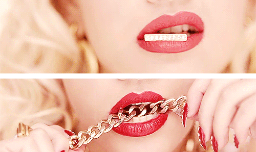
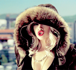
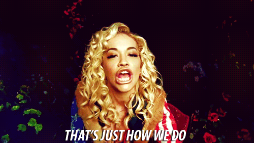
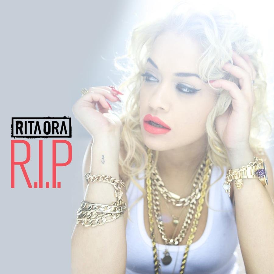
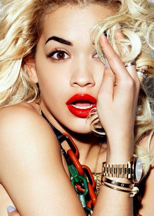
Since Rita exploded onto the scene with her First Solo Single R.I.P Immediately a brand was starting to form. The colour red for Rita was significant. People could recognize her because of her classic red lipstick and occasionally red nails either way red was her signature colour. This is shown throughout all her videos and even when she goes to social events. This allowed her to create an identity.
Blond Hair/Classic Curls
Other than the colour red Rita is also known for her blonde hair and classic curls. These establish her appearance and makes her noticeable anywhere she is. Both the blonde hair and curls come from one of her inspirations Gwen Stefani, with this comes comparisons and expectations on music.
Font
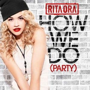
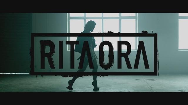
synergy is decided before launching the artists new album so the audience can see what direction and have some sort of idea of where the artist is going. As Rita launched her singles before her album, one after the next her name fonts are all the same. This shows the relativity between all of them leading to her album.
Font (Continued)
The font was used on her first solo single video 'R.I.P' featuring Tini Tempah. Using her font (which will be used throughout her first album) was important to establish herself as a solo artist as originally she featured on a DJ Fresh track called 'Hot Right Now' which didn't give her as much recognition as an artist and more of a featured artist. Having it at the Beginning of her video shows the audience who she is as a solo artist.
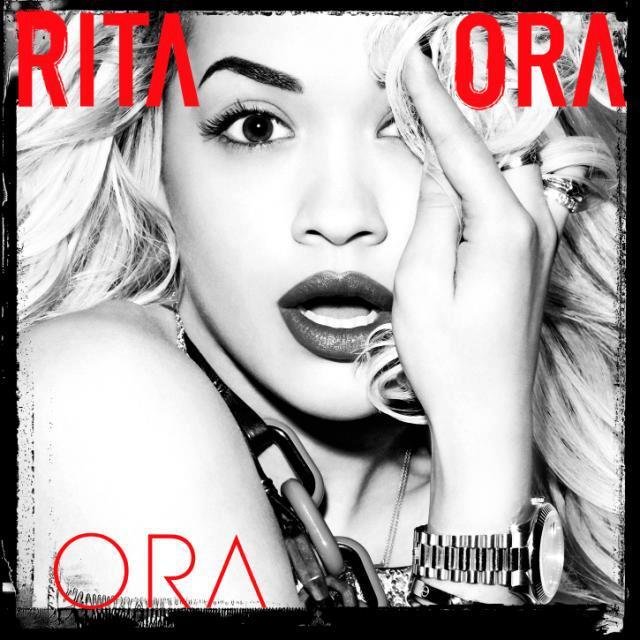
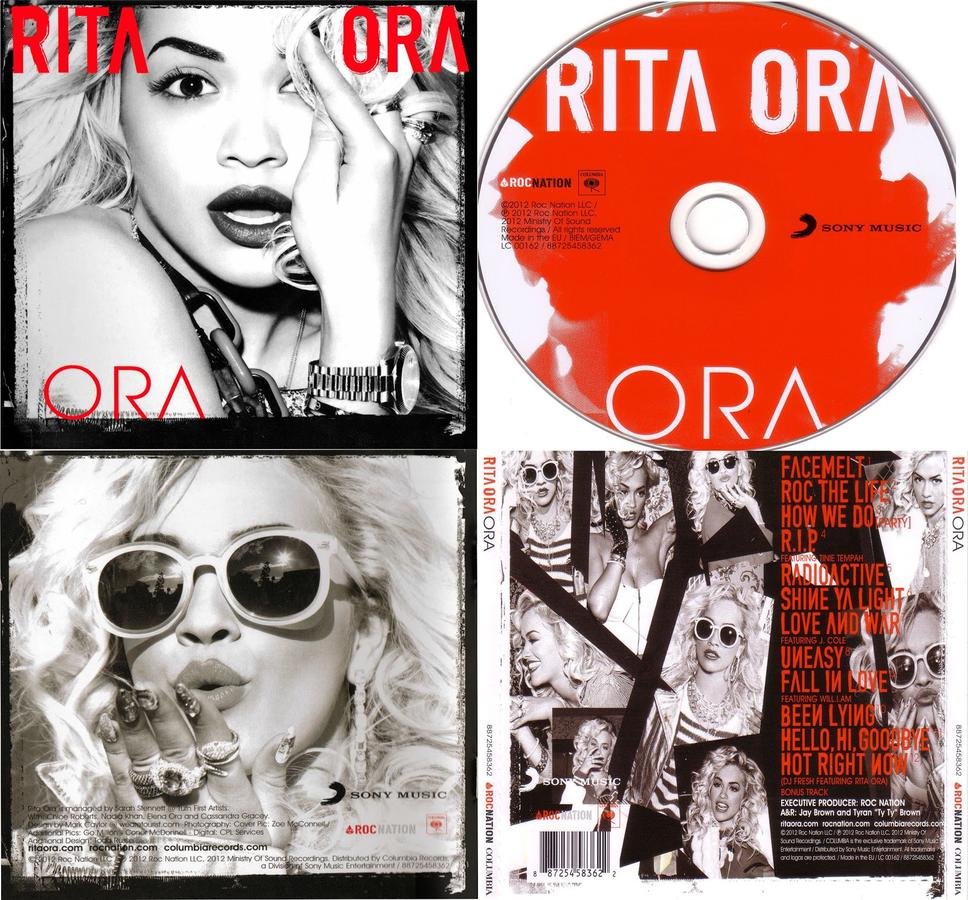
ORA
Finally The Album Got Launched And Automatically we see references to synergy with the classic blond hair red lips, curls and the font used for the title and the track listing. Her fans are able to see the significant colour red and the image she has presented with her hair and makeup. Then you have the obvious font which has been shown through her singles . The digi pack of the album has a theme running through it with the typical colours red and white but also black and white shown through the images displayed within and out of the case.
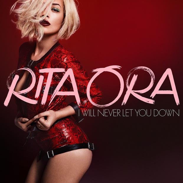
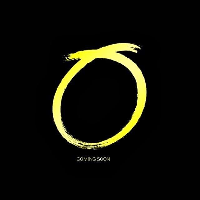
Even Now...
As she gets ready to launch her second album she has given her fans a symbol which will be associated with her second album which is not yet released. This symbol has been used for a number of things such as her first single 'I Will Never Let You Down' . This then went on to hastags such as '#O' and fans questioning what it could mean.
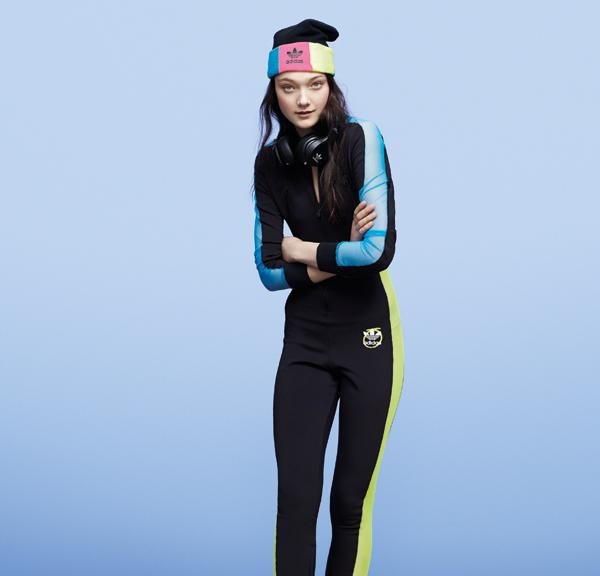
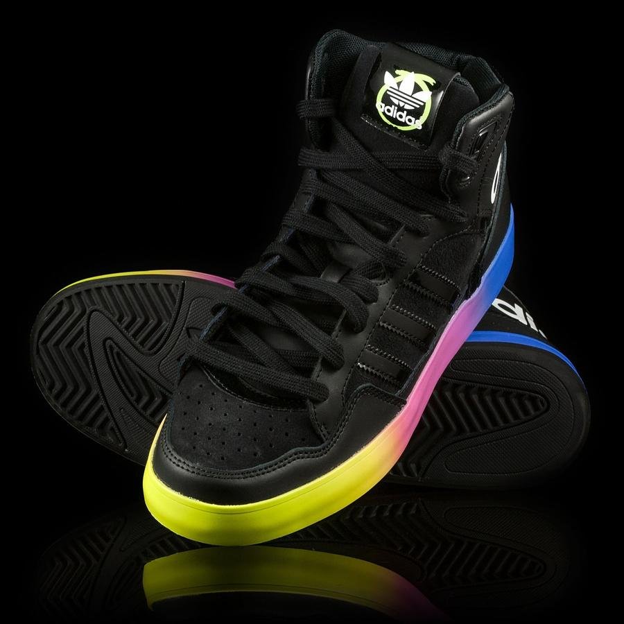
Adidas Range
Rita Ora has recently signed a 2 year deal worth £2.5M to design her own range with Adidas Originals. As this is leading up to her second album she has used the symbol on her clothing and shoes wear. This again lets her be recognisable so when fans go to purchase they'll see the symbol and know its her range. This starts to create a brand for Rita.