Style Guides

5 different kinds of style guides
- Content and editorial style guides
- Branding and identity style guides
- Development style guides and coding standards
- Human interface guidelines
-
Front-end style guides
Content & Editorial
An editorial style guide ensures a consistent tone of voice is used throughout a publication or website.
MailChimp’s Voice & Tone is one such resource, and it’s fantastic. It includes examples of how MailChimp gives feedback to users and is also educational, providing explanations of why something should be written in this way.
Branding & Identity
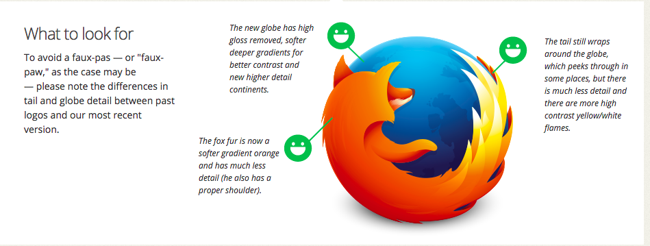
Brand guidelines vary in depth and complexity. Some are quite lightweight, such as Firefox’s, which sets out the corporate colors and how to use the logo.
Other brands are much stricter and provide a lot of detail, like the British Airways guidelines (PDF), which cover every conceivable aspect of the brand.
Development style guides & coding standards
These are useful when several people are working on the same codebase. They will mention things like whether to use spaces or tabs, underscores or camelCase. They keep code maintainable, and make it easier for people, often working separately, to collaborate. Github has guidelines on its own CSS and JavaScript styles. There will be dozens of people writing code at the company at any time, so consistency is important.
Human interface guidelines
While not strictly about matters of style, as input methods such as speech and gesture become more popular, interaction guidelines have become important. Apple first published its influential Human Interface Guidelines in 1987 and continues to develop them for Mac OS X and iOS today. Microsoft has written its guidelines for designing interfaces that can be interacted with using Kinect for Xbox (PDF).
Front-end style guides
Front-end style guides are built specifically for the web. The main difference between a regular style guide (like one produced for print) and a front-end style guide is that a front-end style guide uses real code and works in the browser. It’s a page of HTML that demonstrates a site’s main styles, how and when they can be used, and where the markup for a module matches the markup used on the actual site.
A front-end style guide is living documentation and grows organically with a site throughout its lifetime. As new features are added or designs tweaked, site owners should update the style guide. When new people start work on a project, it acts as a reference and helps prevent duplication of code and design patterns.
What are the benefits?
-
ACCURATE OVERVIEW OF THE UI
- checklist for all of the things that may have been forgotten or overlooked in the design and implementation
-
KICKSTART FOR NEW PAGES
- promotes code reuse
-
SIMPLIFIED TESTING
-
easy to pinpoint the exact spot of breakage
-
-
COMPONENT CULTURE
- breaks an interface down into smaller, easy to digest components
-
BETTER COMMUNICATION
- common vocabulary begins to emerge for use across teams
Who uses front-end style guides?
A live style guide example
Here's a quick/easy example of a style guide.
Type in any URL like "portlandcodeschool.com" and the website will autogenerate a limited style guide.
Our version: Poor man's
Here's how we can make a quick/easy static guide:
http://www.poormansstyleguide.com/
Create a new file called styleguide.html in the root of your yeoman app. Paste the HTML from this site and bam! You've got your own style guide!
Adding Color
How can we add color specs to this guide?
Styleguide with generators
Here are just a few of the style guide generators I attempted to get working: