CD COVER CONVENTIONS
FRONT COVER
· A simplistic colour scheme and design
· Few or no characters
·A title that explains to the audience what the album will be about
· Bold, simple fonts for the band name
·Similar or entirely opposite font for the album title
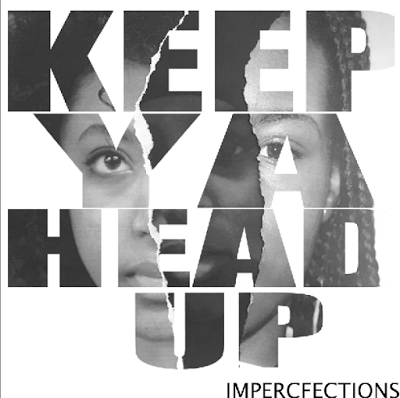
I decided to combined three images, ripping them and sticking them together to add
texture to the image. I feel it has a hidden meaning the struggle black females face in
society.
I decided to have the name of the song in simple bold writing, however to make it unique i merger the layers and used the magic wand tool to reveal the image behind.
I also did the bands name in bold and simple text.
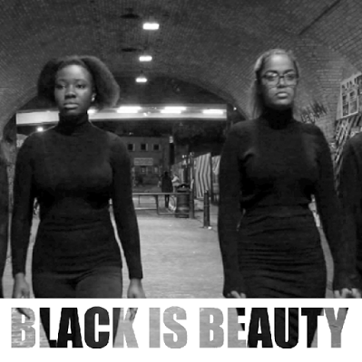
I tried to diversify my models using a darker model and lighter one and a black Muslim model.
I also went with black and white to remove the colour from my models, telling my audience that shades of black doesn't matter we are all one.
Back Cover
·List of song titles, usually centred
·Bar-code in bottom right hand corner
·Name of record company
·Copyright and year
·Who owns the copyrighted material
·Who the album has been distributed
·Band name at very top
·Name of album beneath this
I decided not to have the band name nor the name of the album on the back cover, I decided to put it on the spine. I used sketch effect on Photoshop, I used it because it looks like the TV effect that #i used in my music video. I used the Atlantic Records and Def Jam logo and producer and disturber information , and the bar-code and the parental advisory symbol, to give the CD cover a professional feel.

INSIDE
- Colour scheme that is the same as the rest of album
- Blank, plain background
- No characters
- Few or no text
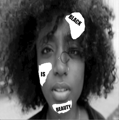
I followed the conventions, I used images that I took while filming scenes, I feel they are empowering and really reflect my music video

SPINE
- Name of the record company in its recognised font, or logo
- Name of band
- Name of album
- Both in the same simplistic fonts
- Code linking to the record company
I wrote the band name and the code linking to the record company in simple font
