How effective is the combination of your main product and ancillary texts?
Evaluation Question 3
Overall, I believe the combination of my main product and my ancillary texts is quite effective. I have used synergy to create connections that link my media products together.
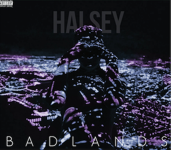
From the beginning, I knew that I wanted a running theme throughout my products. After deciding on my chosen song, I sought inspiration from the album name - Badlands. I decided to use cityscapes throughout my work as a central theme in my products. Synergy is a tool utilised heavily in the indie-pop genre as it is not often featured in the mainstream media. Artists must then create an instantly recognisable brand for themselves in order to then gain attention for their music. I wanted to reflect this indie-pop convention and so I ensured my chosen theme was prominent in my media products.
Synergy
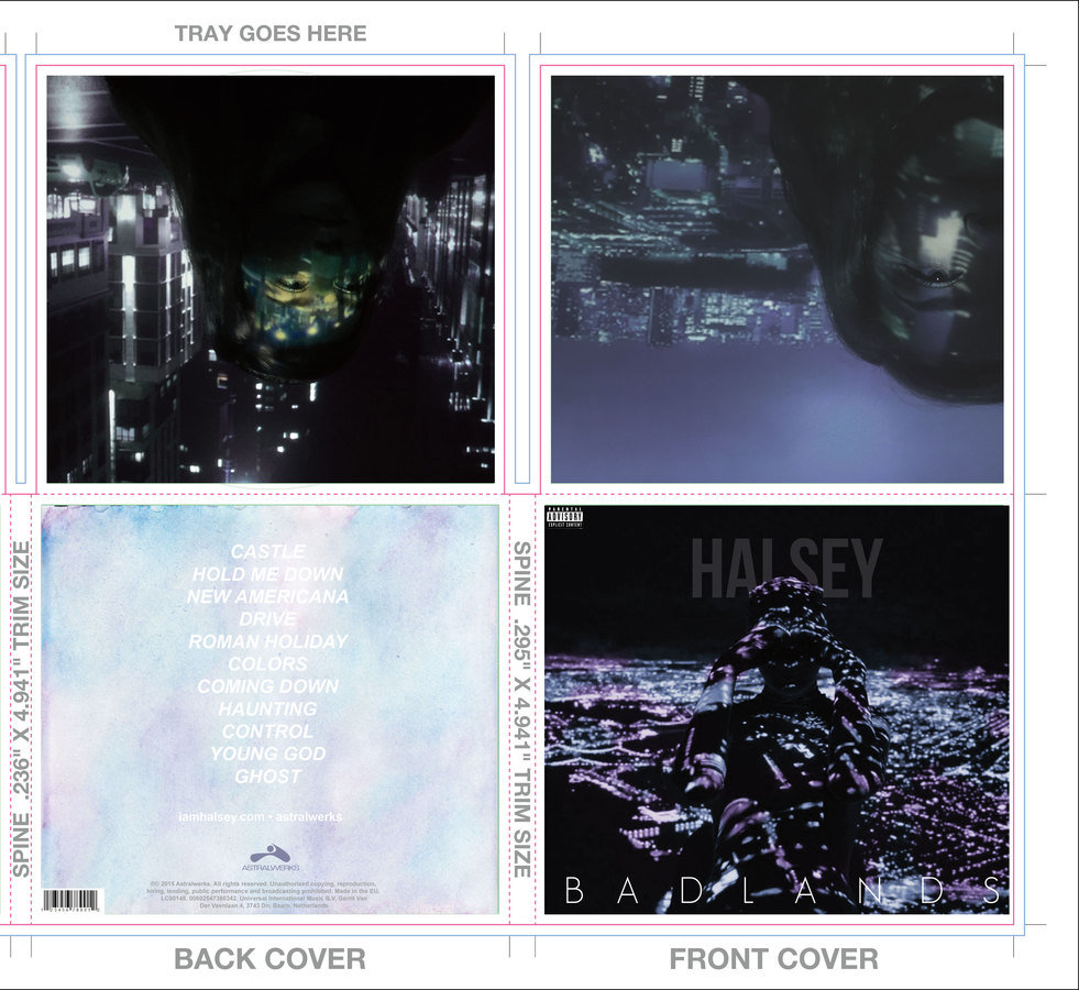
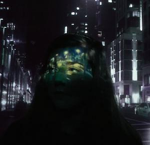
Cities are a central theme of my work, demonstrated on my digipak and poster, as well as in my music video.
Synergy In My Work

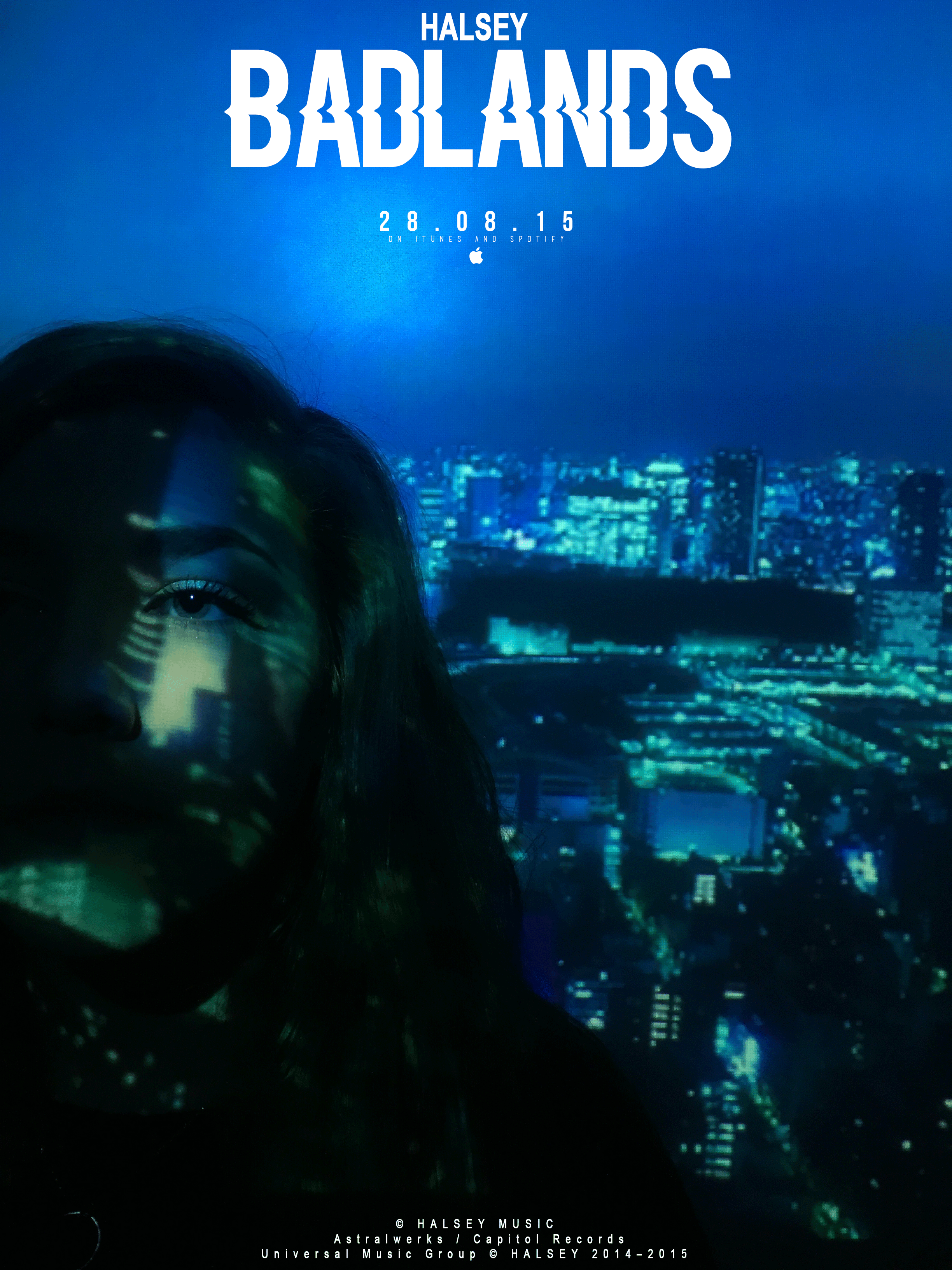
To make the link more prominent, I could have inserted a thumbnail of my album cover on to the poster I created. However, I wanted the main feature of my poster to be the interesting image, as opposed to the advertising side of it. This is common of the indie-pop genre as artists tend to be more focused on the creative process of producing and distributing an album.
Synergy In My Work
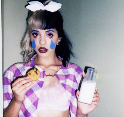
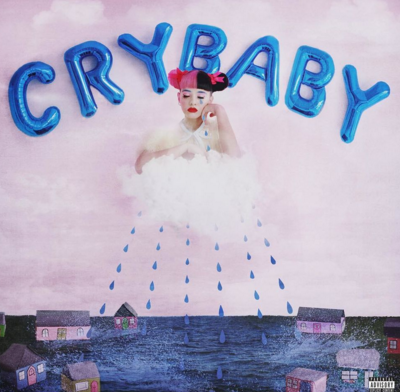
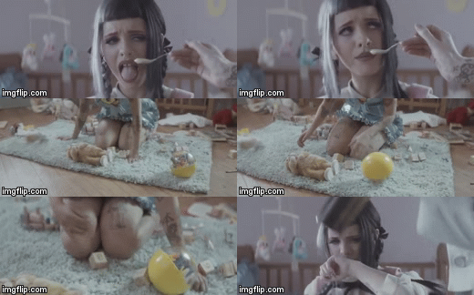
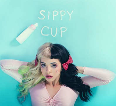
Melanie Martinez is a new indie-pop artist who has created a very unique and recognisable style for herself. She uses props, make-up and bold colours to present herself in a very child-like, dollish way. This is then strengthened by her song and album titles, such as 'Sippy Cup' and 'Cry Baby'
Synergy In Indie Pop

Synergy
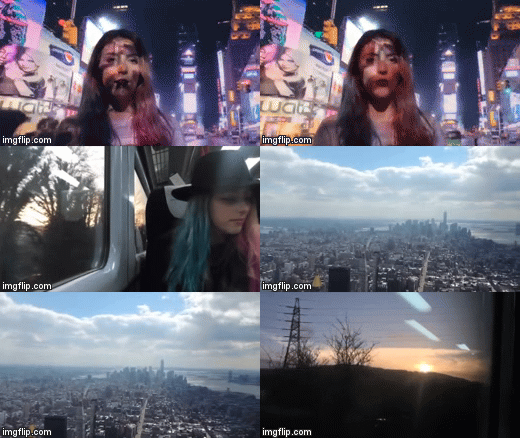
To further the effectiveness of the combination of my products, I could have used stills from my music video in my ancillary texts. While this is an easy way to create brand recognition, I found in my research that this is most common when advertising a single, as opposed to an album like I was.
Synergy: Colour Scheme
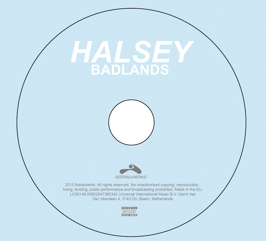
A simple yet effective way of creating synergy through my media products was through the use of colour. The combination of my media products is effective as the same colour scheme is carried throughout. The colour of the disc ties in with colours used on my digipak, which also ties in with the colours I had chosen for my poster. I also used a similar colour scheme in my music video which tied my media products together in a very effective way.

Shot Style
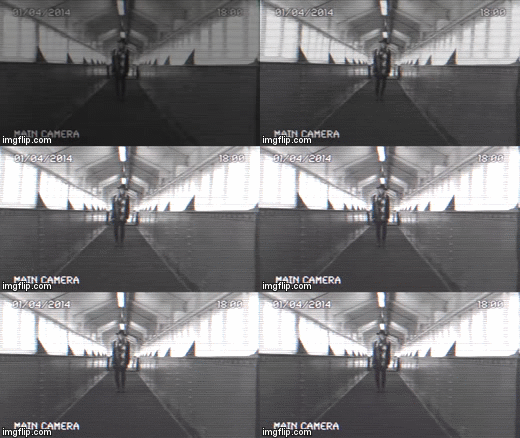
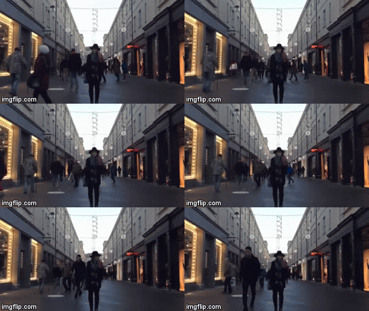
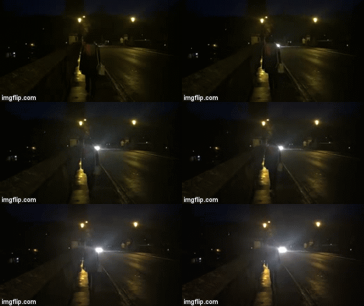
Throughout my music video, I used lots of shots where the artist is centred. This is similar to the images I have chosen to use on my digipak and it establishes to the audience that she is the focal point.
Editing Style
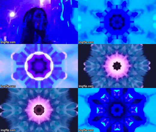
I liked the idea of distortion and the unique twist it gave otherwise fairly normal images. Unique and creative methods are praised in the indie-pop sphere and so I thought it was apt to incorporate such ideas. On my poster, I chose a font that appeared to be distorted. Similarly, when editing my music video I picked filters that gave the clips different effects (including 3D, kaleidoscope and security camera). I think these choices helped create a unique feel to my products by giving them an unusual twist.

Representation
The Male Gaze
Laura Mulvey's 'Male Gaze' is a theory that states audiences must view the film from the perspective of a heterosexual male. She notes that the camera often focuses on the curves of a woman's body and that what happens after is a representation of the male's response to this. Mulvey also discusses the objectification of women and goes on to say that female viewers experience the narrative through identification with the male.
This theory is not applicable to the combination of my products as, instead, I set out to portray the female lead as independent and carefree. The Male Gaze is set on sexist ideals that are now widely being thrown out. As the indie-pop genre is a new and innovative genre, these beliefs do not tend to be demonstrated as it instead displays the views of a younger generation.
Representation
In My Media Products
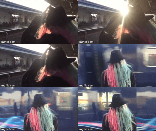
In my media products, I have portrayed the female as very independent. She is alone in my main product as well as my two ancillary texts. On the poster, the artist appears to be quite confident as she is looking upwards slightly. This depiction is also true for the images I chose to use on my album cover. In my music video, the artist is seen travelling around a city alone. This strengthens this portrayal of her being a strong and independent female lead, rejecting gender stereotypes in the process. I decided on presenting the protagonist in this way as it is very similar to how the artist presents herself in real life. The continuity of this depiction throughout the combination of my media products helps maintain the link, whilst also creating a positive representation of the artist with the audience.