ARTIST POSTER RESEARCH
ARCTIC MONKEYS
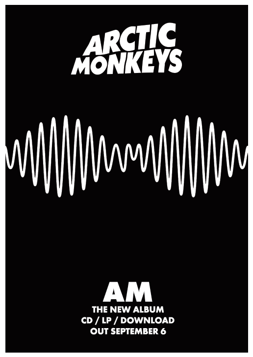
The most important information, the artist and album's names, are written in a bigger font. This draws attention and generates excitement surround the album. The image on the poster is also the image on the album cover. This maintains brand awareness and generates an image for the artist.
The release date is also of prominence, as well as the formats the album will be available on. This is an important feature as fans then know when to expect the new music and how they can obtain it.
ALBUM ADVERTISEMENT POSTER
ARCTIC MONKEYS
This poster represents the indie-rock genre well due to the monochromatic colour palette. It is also very simplistic, meaning it does not take away from the poster's purpose.
ALBUM ADVERTISEMENT POSTER
RIHANNA
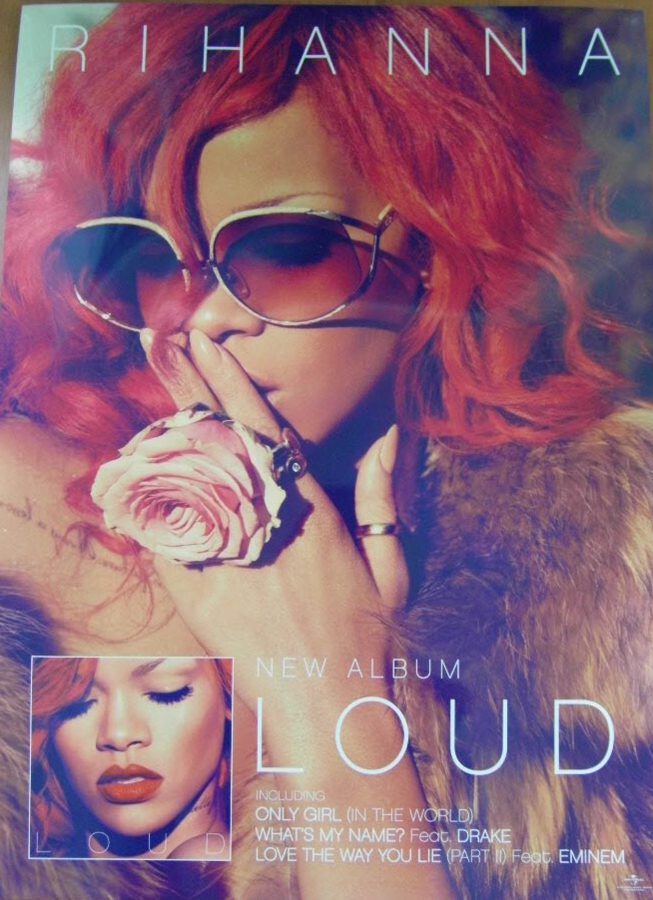
The album name also dominates this poster, with the artist's name being the second most noticeable element. At the time of this release, Rihanna had created her signature style - vibrant red hair with matching rouged lips. The images on the poster follow this style, making the album instantly recognisable to be that of the artist. This would also catch the attention of fans. The bright colour palette has two purposes: attracting attention, as well as portraying the fun atmosphere this genre of music emits.
ALBUM ADVERTISEMENT POSTER
RIHANNA
Towards the bottom of the poster, it lists a few of the songs featured on the album. These are likely to be singles that would have already generated a lot of success. The song "Only Girl In The World", for example, was one single that was incredibly successful. The other songs listed are collaborations with other well known artists (Drake and Eminem) and so will interest a wider audience.
ALBUM ADVERTISEMENT POSTER
MARINA AND THE DIAMONDS
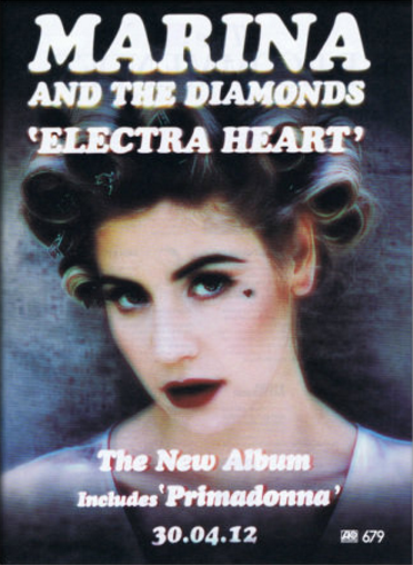
This digipak embodies many conventions of the indie-pop genre. Muted colours are used throughout the poster, something typical of this music style. The unique and innovative editing style is also representative of the genre, as it appears to have a 3D effect on top of the image. The poster also has a slightly static quality to it which is reminiscent of old televisions. This suggests the artist has drawn inspiration from past decades - something typical of the indie-pop genre. The editing style makes it immediately recognisable to belong to this genre.
ALBUM ADVERTISEMENT POSTER
MARINA AND THE DIAMONDS
While it portrays the genre accurately, it also advertises the album very well. The artist's name is emphasised at the top, along with the new album name. The release date is also very visible on the poster, allowing fans to generate excitement. The hit single 'Primadonna' is also emboldened in hopes of building upon the success of the song. This encourages those who have heard the song to buy the full album.
ALBUM ADVERTISEMENT POSTER
ARIANA GRANDE
This poster follows a monochromatic palette, excluding the album title which is a pale pink colour. Pink is a stereotypically feminine colour and ties in with Ariana Grande's celebrity persona.
Similar to Rihanna's album, it also lists popular songs that are on the album. All of which are also collaborations with global celebrities and would thus also engage the fan bases of those artists.
Another important convention of this promotional poster is the release date. The font is emboldened, catching people's attention and creating excitement for the release.