Styled Components
BEM
&

BEM
på ~5 min
BEM
Et sett med regler for å unngå problemene med CSS og lage komponent-baserte systemer
Block
Element
Modifier
.card
.card--dark
.card__image
.card__contents
.card__actions
.card--opaque
.card__title
.card
.card--dark
.card--opaque
Lorem ipsum
Lorem ipsum dolor sit amet, consectetur adipiscing.
Lorem ipsum dolor sit amet, consectetur adipiscing.
.card__image
.card__contents
.card__actions
.card__title

.card
.card__contents
.card__actions
.card__title
.card
.card .card--simple
.card__meta
.card__title
.card__title
.card__tags

Aldri .card__actions__button
.card {
display: flex;
flex-direction: column;
align-content: flex-end;
min-height: 300px;
padding: 20px;
background-image: url('...') contain center;
/*
Elements
*/
&__title {
color: white;
}
&__contents {
margin-top: 10px;
}
&__actions {
display: flex;
width: 100%;
align-content: flex-end;
margin-top: 5px;
}
&__tags {
display: flex;
width: 100%;
align-content: flex-end;
}
/*
Modifiers
*/
&--simple {
align-content: space-between;
}
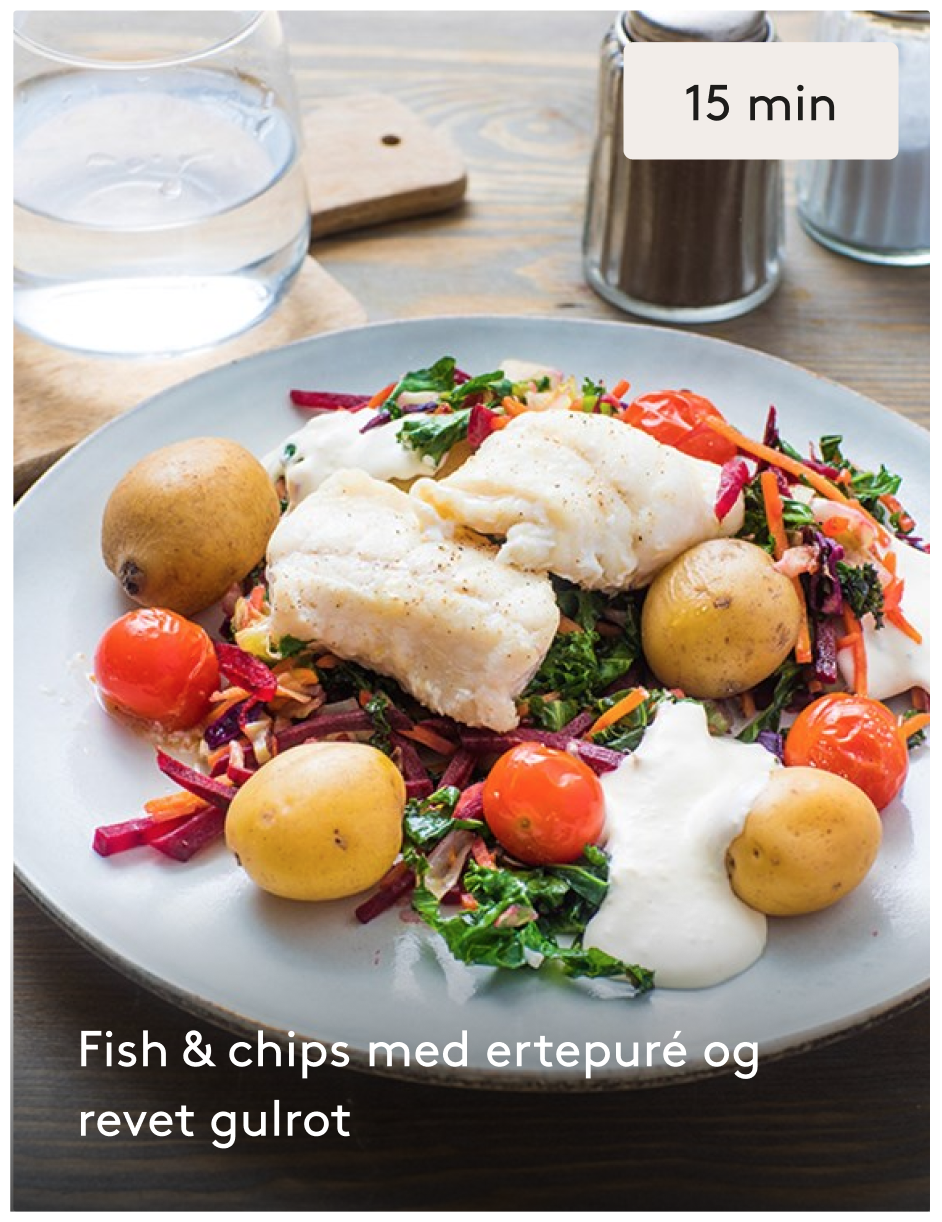
}<article class="card card--simple">
<ul class="card__tags">
<div class="tag">15 min</div>
</ul>
<div class="card__title">
<h3>Fish & chips med ertepure</h3>
</div>
</article>
Hvorfor BEM?
- Selvdokumenterende
- Struktur i teams
- Komponenter (modulært)
- CSS minus "C" (men ikke 100%)
- Ingen nestede selektorer
- Ingen prioritetskonflikter
- Veldig kjent
- ...
Ferdig!
Styled Components
på ~5 min

Okay..
men, hvordan funker det egentlig?
1
Finn styled-component X
const Button = styled.button`
font-size: 25px;
color: red;
&:hover {
color: blue;
}
`;2
Generer klassenavn
const className = 'sc-' + hash('sc' + x);
// -> sc-bdVaJastart loop, x = 0
x++
3
Generer CSS
const selector = '.' + className;
const css = stylis(selector, styleString);
/*
.sc-bdVaJa {
font-size: 25px;
color: red;
}
.sc-bdVaJa:hover{
background-color: blue;
}
/*4
Legg til CSS i <style />
<style data-styled-components>
/* sc-component-id: sc-bdVaJa */
.sc-bdVaJa { ... }
</style><!html>
<head>
...
<style data-styled-components>
/* sc-component-id: sc-bdVaJa */
.sc-bdVaJa { color: red; }
</style>
...
</head>
<body>
<h1 class="sc-bdVaJa">Pop pop!</h1>
</body>
</html>Kildekode
Output i browseren
import React from 'react';
import ReactDOM from 'react-dom';
import styled from 'styled-components';
const RedBox = styled.div`
color: red;
`;
class App extends Component {
render() {
return (
<RedBox>Pop pop!</RedBox>
);
}
}
ReactDOM.render(
<App />,
document.getElementById('root')
);
Ferdig!
BEM i Styled Components
på ~5 min
<article class="card card--simple">
    <ul class="card__tags">
        <div class="tag">15 min</div>
    </ul>
    <div class="card__title">
        <h3>Fish & chips med ertepure</h3>
    </div>
</article>SASS
CSS-i-JS
<Card simple>
  <Card.Tags>
    <Tag>15 min</Tag>
  </Card.Tags>
  <Card.Title>
    <H3>Fish & chips med ertepure</H3>
  </Card.Title>
</Card>
primitives og blocks
Primitives
- <h1/>, <h2/>, <h3/>
- <ul />, <li />
- <button />
Blocks
- <Card />
- <Avatar />
- <MainNav />
Hvorfor ikke bare bruke SASS da?
på ~5 min
Det kan du godt..
Kjør på!
SASS
CSS-i-JS

Kompileres på forhånd
👎
👎
Funker, alle kan det
👍
Mixins, Extend, Include
👍
👎
Kompileres i browseren
👎
👍
Themes!
// constants/config.js
const config = {
  theme: {
    colors: {
      text: "#3C3C3B",
      primary: "#DB3E77",
      secondary: "#1446A0"
    },
    typography: {
      font: "'Sedgwick Ave', cursive"
    },
    gutter: 10
  },
  otherStuff: {}
};

// index.js
<ThemeProvider theme={config.theme}>
  <App />
</ThemeProvider>

// Button.js
const Button = styled.button`
  background: ${props => props.theme.primary};
`
"as"
// Ser ut som knapp, men er link
<Button as="a" href="mailto:test@test.com">Send oss en epost</Button>

// Ser ut som h1, men er h2
<H1 as="h2">Velkommen til Jungelen</H1>
SASS
Kompileres på forhånd
👎
👎
Funker, alle kan det
👍
CSS-i-JS
Mixins, Extend, Include
👍
👎
Kompileres i browseren
👎
Ingen globals
👍
👎
Isolerte komponenter
👍
👍
<article class="article">
  <h2 class="article__title">15 min</h2>
  <div class="article__contents">
    <p>
      Lorem, ipsum dolor sit amet consectetur adipisicing elit.
    </p>
  </div>
</article>
Markup
.article {
    display: block;

    /*
    * Elements
    */

    &__title {
        font-size: 40px;
    }

    &__contents {
        margin-top: 10px;
        color: gray;
        font-weight: 100;
    }
}
Styling
SASS
Kompileres på forhånd
👎
👎
Funker, alle kan det
👍
CSS-i-JS
Mixins, Extend, Include
👍
👎
Kompileres i browseren
👎
Ingen globals
👍
👎
Isolerte komponenter
👍
SASS
👎
Ikke like utbredt
👎
javaScript
👍
👍
Ferdig!
TO DO: Konklujon
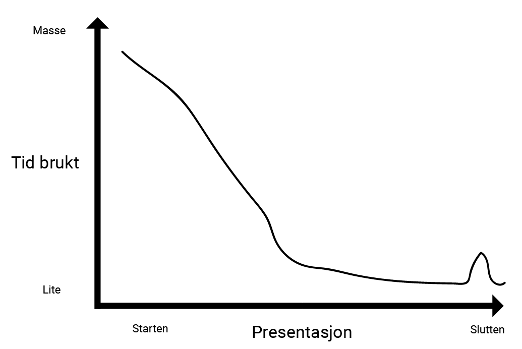
Forhåndsgjort vurdering av egen presentasjon