Data Visualization
Using visual communication to better explain complex information so you write less
Considerations
Tell one story.
Think less, understand more.
Respect the chart.
Tell one story
What is the most important information you're trying to convey?
What's the story?

Source: 538
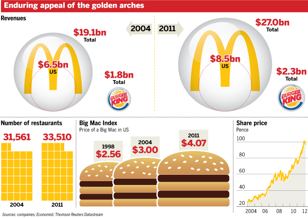
What's the story?

Source: New York Times
What's the sTory?
Source: Globe and Mail

Think less, understand more
Consider data literacy.
Accuracy.
Avoid gimmick.
WTF?
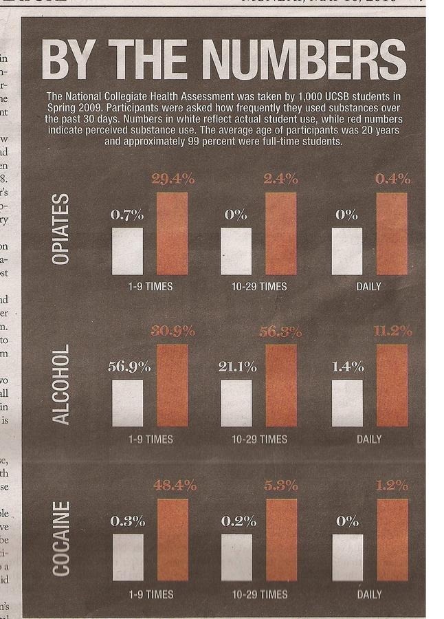
consider data literacy

Source: UK Guardian
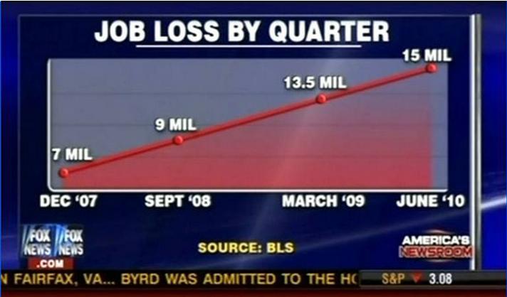
Accuracy
Source: FOX News

Avoid gimmick
Source: Financial Times
WTF?
Source: Canadian Broadcast Corporation
Respect the Chart
Line Chart
Bar Chart
Pie Chart
Stacked Bar Chart
Scatter Plot Chart
Line Chart
Great for showing trends over time.
Works well with one or many variables.
Make sure chart is "zeroed."
Line Chart

Do: Clean and clear
Source: Mother Jones
LINE CHART
Don't: Not zeroed, confusing labeling
Source: Fox News
Bar Chart
Great for ranking data.
Great for comparison.
BAr cHart
Do: Clean, simple and ranked
Source: 538

BAR CHART
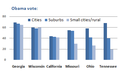
Don't: Confusing, better ways to approach
Source: New York Times
Pie Chart
Showing parts of a whole in isolation.
Working with few variables.
Pie Chart
Do:
simple and clear

Source: Joystick Tales
Pie Chart
Don't for the love of the Great Pumpkin:
Source: THINK Magazine

Stacked Bar Chart
Compare parts of whole without distortion.
Makes comparing multiple bars easier.
Can be ranked as well.
STACKED BAR CHART

Do: Ranked, Equals 100%
Source: EdSource
Stacked Bar Chart
Don't: This doesn't add up to 100%!
Source: Flowing Data

Scatterplot Charts
Great for comparing two variables.
Shows distribution.
Scatter plot Charts
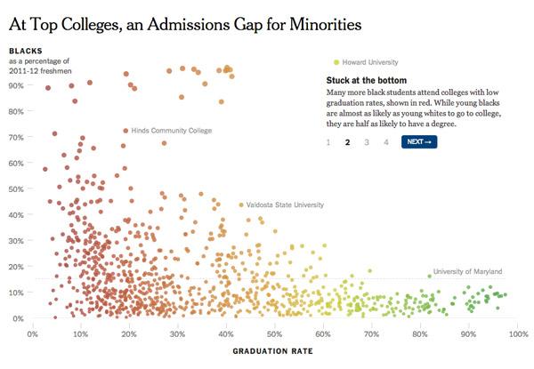
Source: New York Times
What to take home
Simplify.
Let the data tell the story.
Tell one story in a chart, even if there are many.
Get inspiration.