Question 2
How effective is the combination of your main product and your ancillary texts?


Analysing and adapting to existing products
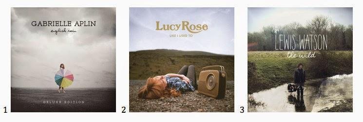
Before we could make our digi pack and poster, we had to look at existing products of the indie acoustic genre. At the very beginning of the project I analysed a digi pack a poster of some different indie acoustic artists. Some of these I have included on this slide. This will demonstrate the kinds of things we wanted to include in order to conform to the conventions of the genre correctly.

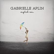
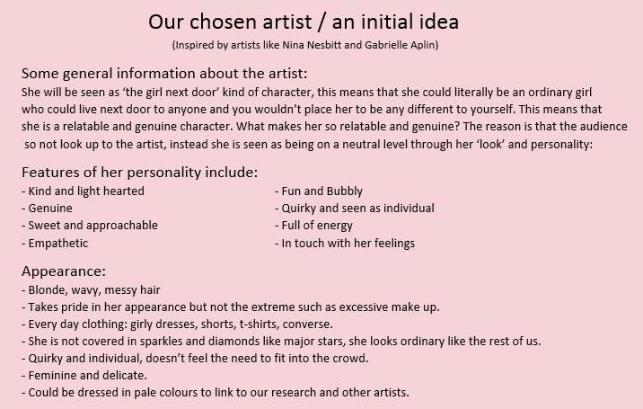
GABRIELLE APLIN - ENGLISH RAIN
- Artist's name is in a consistent font throughout, making it memorable with a different font for the album name which matches the track list.
- The same image is used for the alum and the poster, with the poster just being an elongated version of the album cover.
- Font from the artist name used for the tour dates
- colours are consistent throughout - using black and white with a simple splash of colour for the umbrella
- The outfit is simple and can be seen as every day wear which makes it relatable for the target audience which is the same as our audience.
- Bar code and copyright is included on the back cover.

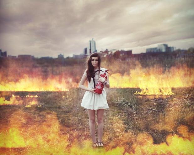
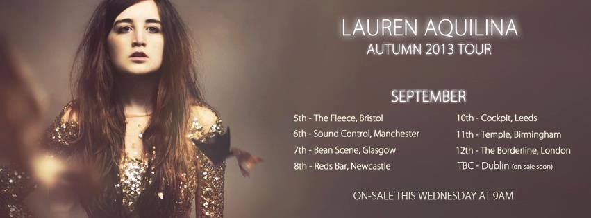
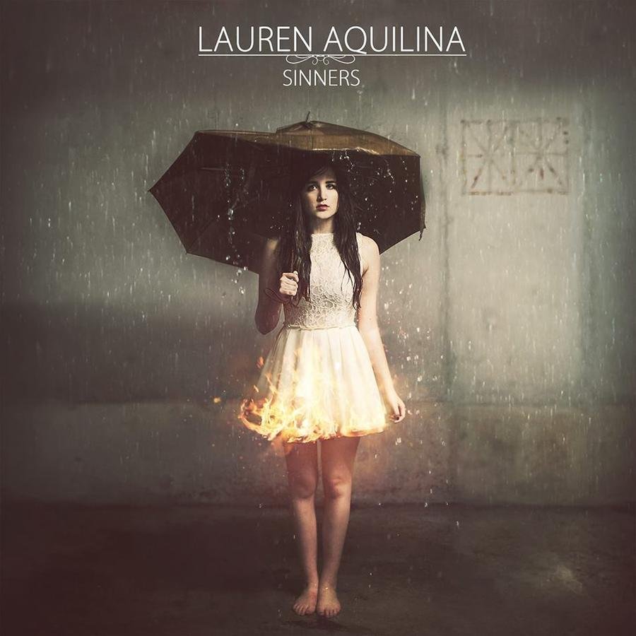
LAURENA AQUILINA - SINNERS
- All the colours remained the same throughout all of her products.
-Her name has a signature font which differs fron the album name font
--No track lists are shown
- There is a link between the front and the back cover, being the fire on her dress and then the fire in the field with her holding an extinguisher
- The poster has the same text however is edited to glow to give a show feel.
- The lighting very much focuses on her with he positioned in the centre.
- The costume is quite simple, a plain dress (apart form the tour poster)
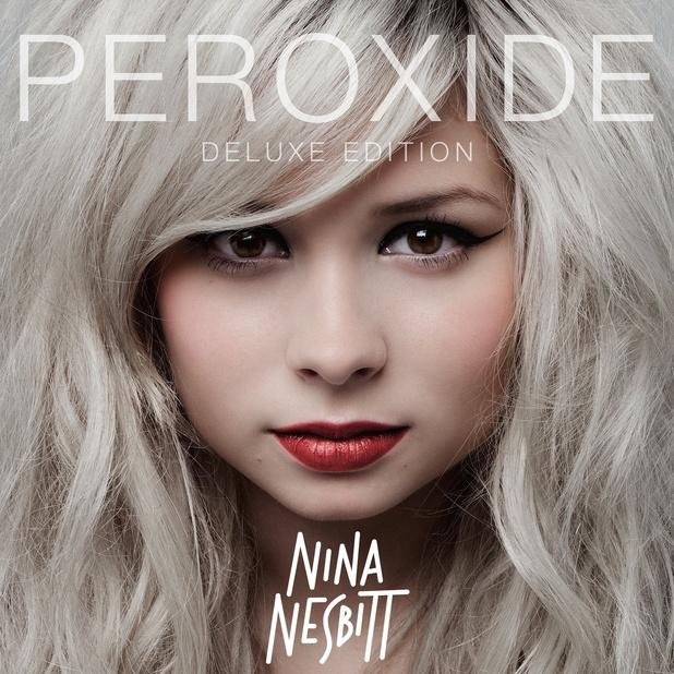
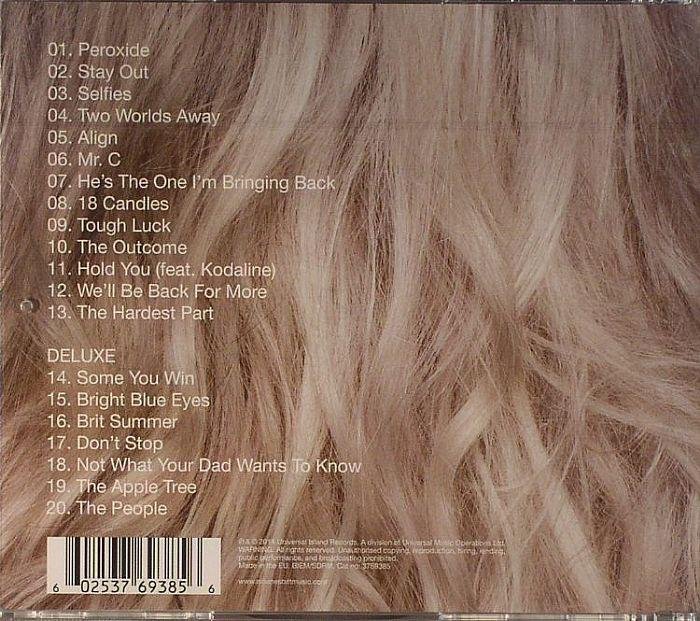
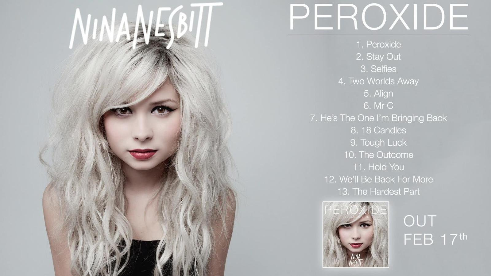
NINA NESBITT - PEROXIDE
- The front and back image match, with the front being a close up of her face and when turning to the back cover it is the back of her hair.
- Artist name has a signature font which is consistent in both CD and poster.
- White text is used to match colours
- Bar code is included on the back with copyright information in small text
- Plain every day outfit which is relatable to her and our target audience
- The track list is repeated on the poster as well as a replica of the image as a mid shot instead of a close up.
- release date is included.
- A small image of the album cover is on the poster to make it clear to the audience what it is they are looking for to buy.
Audience Research Influences
Our audience research also played a huge part in our decision making along side the analysis of existing products. This part of the research was done through 2 different questionnaires: one for the digi pack and one for the poster.
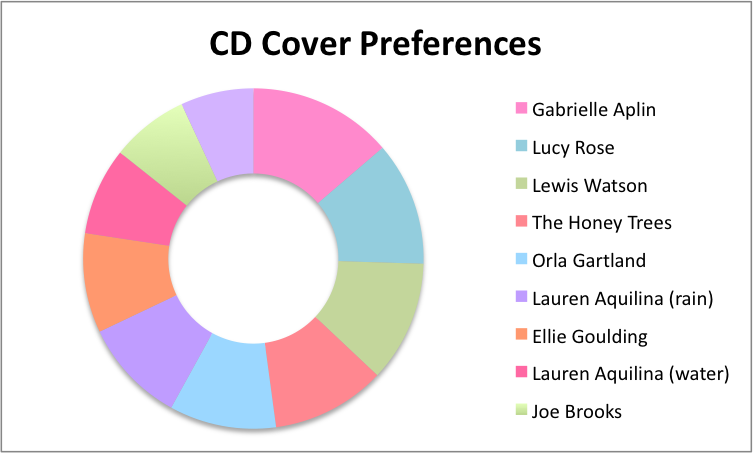
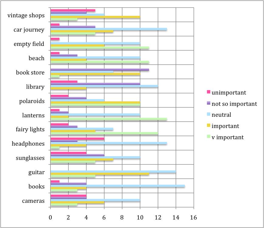
This chart shows the results from our audience research as to which album covers were favoured from the ones we showed. The reasons behind this was theat they included the actual artist, they were simple, the composition, consitency of colour, font is nice, that they differ from mainstream covers.
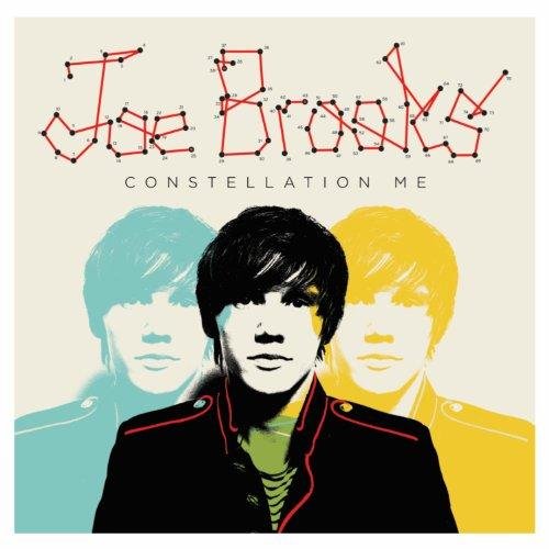
The Joe Brooks album cover was the least popular. This is because it is a cartoon image, but also because it is a male character and our target audience are female and wanted it to be relatable to them. This was another way of reinforcing our protagonist as a female.


Advertisement posters
After collecting our research results, it was clear that our audience favoured Nina Nesbitt's Advertisement poster. This clearly sign posted to us what our audience want to see as well as what is conventional to the genre (things listed in the previous slide)
- Consistency within both the CD and the poster.
- Having consistent fonts, colours, mise en scene gives the audience something to remember (makes the artist memorable) - representation of the artist.
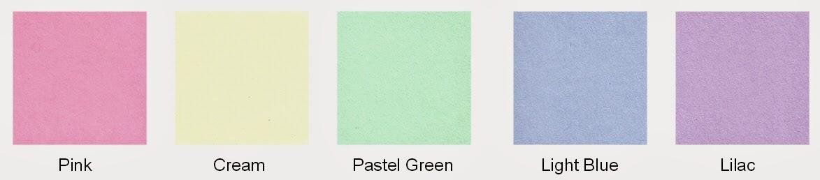
- The audience feel strongly about colours - they like the use of pastel colours and which match the genre well.
Linking our digi pack and poster link to our analysis and research

Our main inspiration being Nina Nesbitt and Gabrielle Aplin - favoured by our audience and best representation of the genre.
Links


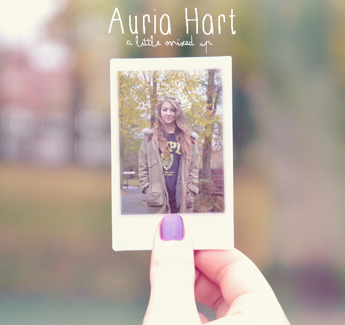
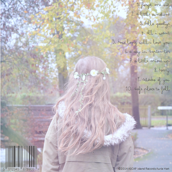
- We ensured that the font used for her name 'Auria Hart' was all in the same font - Thinnyness. This way the audience get a memorable feel about the artist as well as the consistency that they wanted.
- We also made sure that we used a separate font for the album title. this font was then also used for the track list and the release date for the album.
- We kept the colour scheme consistent. This included the colour of the font in wither black or white so that it stands out and is easily readable over the background image.
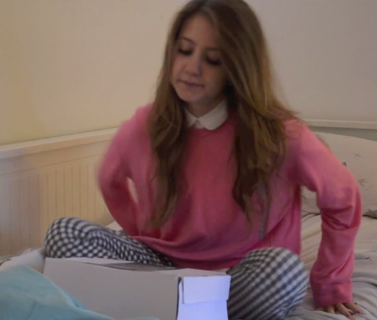
- Mise en scene - her outfit is simple and every day wear, this makes our artist relatable to our target audience. She is also placed in the centre of the picture in all the images.
- Similar to Nina nesbitt we used a clever technique to have the front cover with her facing the camera, to the back of the cover being the back of the artist showing her hair - the same as Nina.
- We included a bar code at the bottom of the album cover as well as a copyright notice to our record label which is island records.
- The lighting within all the products are high key to convey a happy atmosphere which links to what the genre is all about.
NEXT SLIDE:
I am going to explain how our digi pack and poster links with our music video and the ways in which they all represent the artist. This will also show how we have successfully produced forms which look like they belong to the indie acoustic genre with picture evidence.

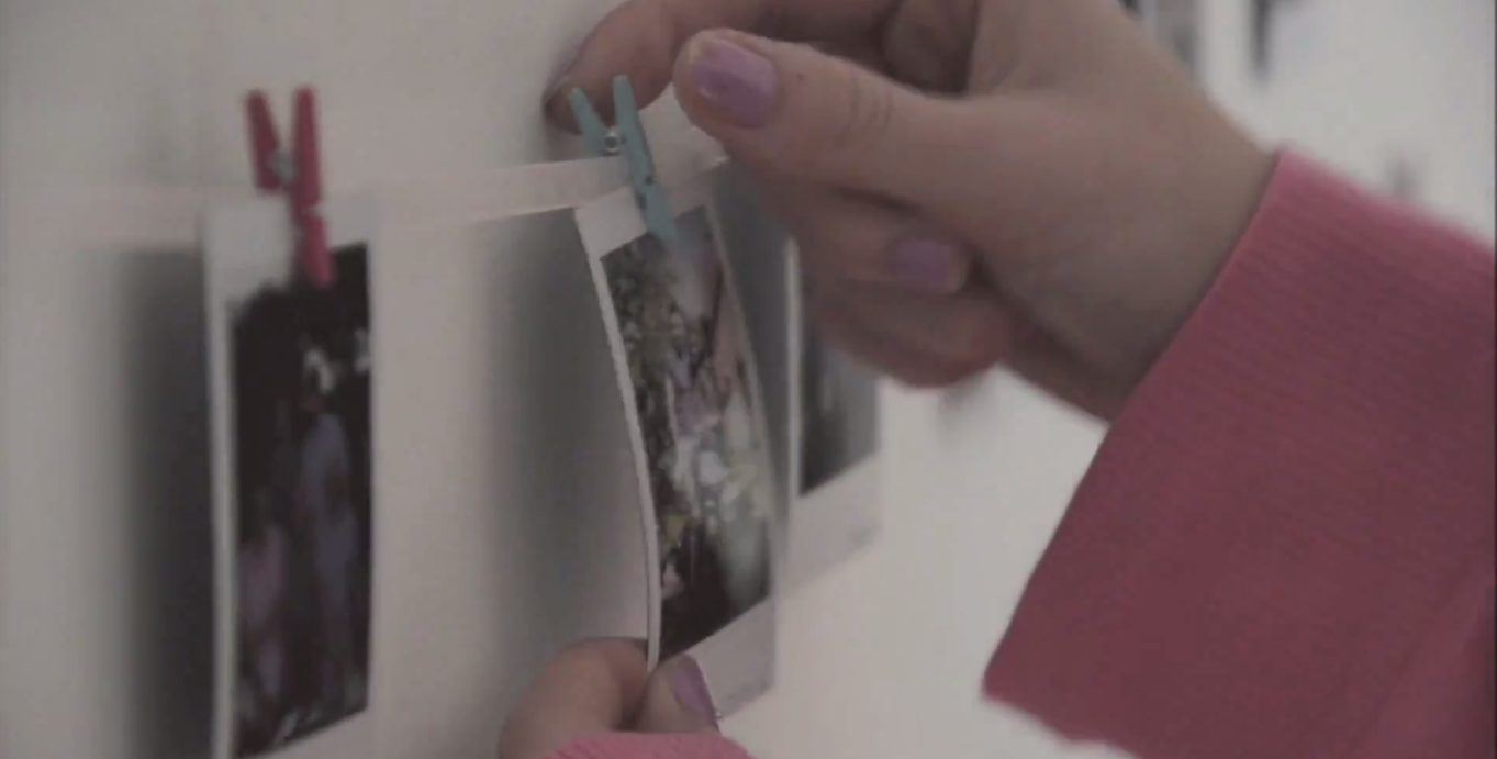
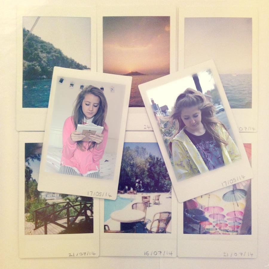
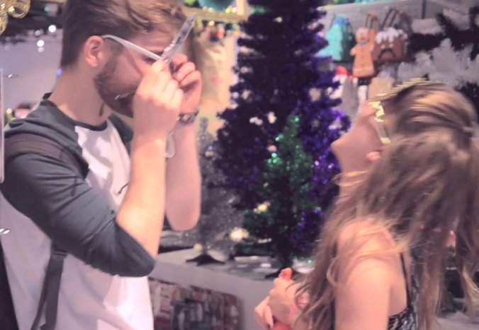
Props - Polaroids
Throughout the video there is a link back to polaroids. These were a key element in the video which we wanted to bring forward in our digi pack and poster.

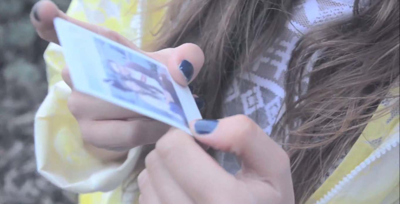

This is a chart showing the results from out audience research questionnaire. Here we found out which elements we should try and use due to them being preferred by our audience. As you can see, polaroids had a high importance. We then knew we should include this in our video. After this, when coming up with ideas for the digi pack based on key props and settings, we thought that the polaroids would be best affective as each song on the album is supposed to represent a memory. Similarly in the video, it is made up of a montage of memories and what they resulted to. As our artist is so quirky and individual to herself, we wanted her to stand out and by putting he on a polaroid really represents how she is as a woman.
How our idea of including polaroids to link all our products together reinforces or challenges theories to support the genre:
LAURA MULVEY
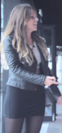
When working on the representation of our artist in our planning stages, we had a clear idea of how we wanted to show our artist. We wanted to challenge Mulvey's idea of the 'male gaze' which can be that women are seen as objects but also weak and incapable of dealing with situations. Auria is a strong character. She boxed away everything so that she could move on from the past relationship she had which was clearly the correct thing to do after Aaron met up with his ex again. The album cover reinforces this too as she is not in revealing clothing, she is not trying to sell herself as an object but she is showing who she truly is and is happy about it.
We were also aware that polaroids were very much a current affair of 2014. This is when Auria will have made her break into the music idustry and created her video to promote herself. This means that a lot of her target audience which would be of a similar age will be able to relate to the props in the video and album cover and will entice them into looking further. Even walking past the album and seeing the polaroid can appeak to them and the fact that they may have the same camera or might even want a polaroid: they will find it appealing and inspiring to look at.

Inside cover:
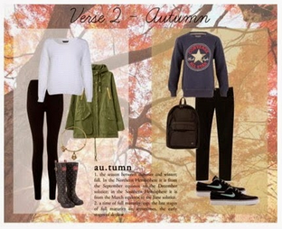
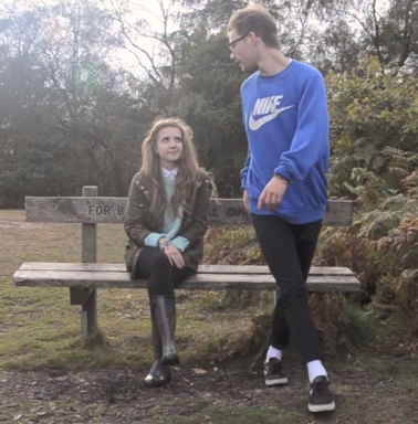
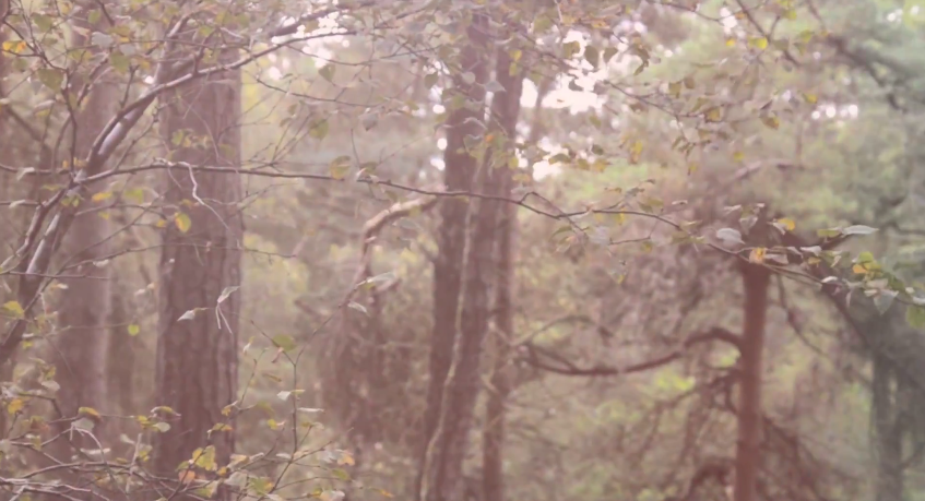
Setting - woodland surrounding
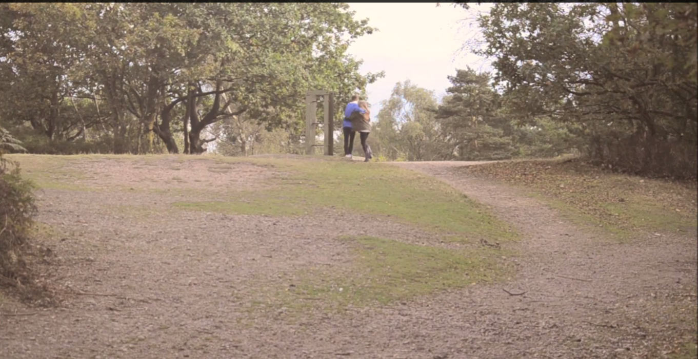
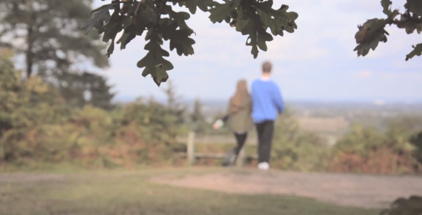
All of our products include a woodland surrounding - park or open space. This was a common element of the indie acoustic stock settings, it was found in other videos a lot and we therefore wanted to make sure that our digi pack and poster had this included in it. The colours were also effective and linked to the pastel type colours our audience were looking for.

Again, we saw high importance in insuring that all our products conformed to the needs of our target audience. Baring in mind that all these options of what we cold include came from the ananlysis of existing indie abousitc products. Therefore which ever element we were to include i would conform to the common stereotypes in a indie acoustic product. In the chart it shows that empty fields were important to the audience and by including this we knew we would have the pastel colours they want to see too.
Establishing shots:

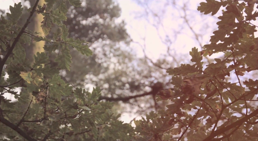
There is a clear link between the trees in all the shots on both the digi pack and the video. Establishing shots are conventional to the indie acoustic genre so that the audience can familiarise themselves with the setting. the fact that we have kept it consistent throughout having Beth in the centre of the frame shows that she is representing the genre. They both compliment each other in order to promote the artist well too, as well as it generally appealing to the target audience as this is what they asked to see in the questionnaire.
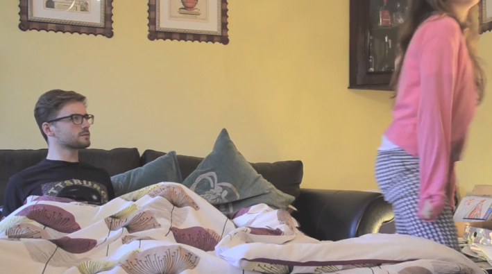
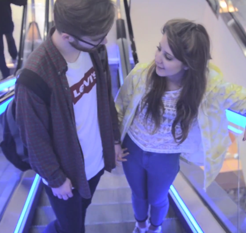
Costume in our products
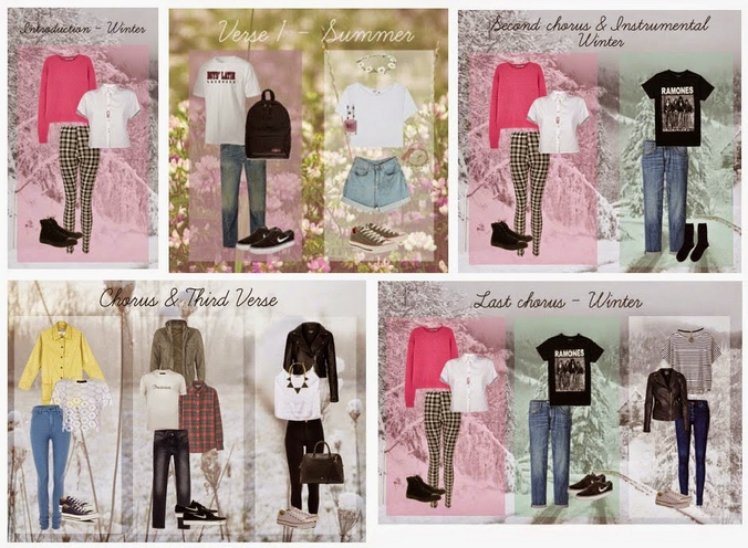


When we replaced the bournville park scene with a verso of happy memories being played as a montage. We wanted to introduce another scene in selfridges in town. This was the outfit we used instead.

Costume link with the video and the digi pack and poster:
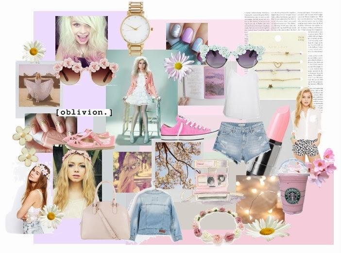
We decided to ask Beth to wear a nice large green coat that covers her up well. This is similar to the coat she wore in the autumn scene which is an immediate link to the video and how she has a certain dress sense, which other teenagers can aspire to as they are every day topsop, new look, H&M styled clothes. We also made a link to iconography in our digi pack. Beth is wearing a floral headband which links in with the scenery but the idea of daisies in the summer being an indie aspect. Which also links to the original mood board we put together to represent Beth. This gives her a happy persona about her making her seem summery, smiley and generally getting on with life happily - like others should.
We made a plan of all the kinds of costumes we wanted out characters to wear in the video. Ones we though would match the genre but the convention of that outfits being casual and every day to be relatable. We stuck to these very well with all looking almost identical. This was then a case of picking which outfi we though would be most effective to link for the album and poster.
Concluding all the links between my digi pack, poster and music video


Front cover:
Back cover
Inside cover
Advertisement

Music video
Now that I have made detailed links between all my products, I am going to make all the general links making it clear that they successfully achieve their purpose of both representing the artist and entertaining the target audience by using the codes and conventions of existing media texts.
- Stock settings
Throughout all of my products, there is a huge link in terms of settings as a visual. We have made a strong use of the stock setting woodland and empty spaces as we believe they have a significance to the character, the fact that she enjoys travelling and even that the empty spaces can isolate her as a character showing how we have presented her as a strong individual female. - Iconography
The main element of iconography used in every part of my promotional packet is a polaroid. In the video, we actually see the polaroid being taken as well as polaroids shown at the beginning of the video. For the digi pack and poster we though this would be most effective to use as a link from the video as it shows Beth's quirky character and the idea that her album is a montage of memories, similar to the montage of shots at the beginning of the music video. - Colour
The colours we have used have remained bright throughout. This has given every aspect of our products the consistent feel our target audience wanted as they favoured the Nina Nesbitt album cover and poster sue to them being the same image with consistent colours and brightness. We have tried to edit both the video and the promotional package so that the colours are almost pastel, which is a convention of our genre. - Costume
Costume for every scene was planned after doing all our research. This concluded to the fact that we would keep all the costumes simple, like every day wear so that it could be relatable to the target audience, making Beth an easily achievable figure to look up to and inspire to be. We made sure that the costume in all of our products were quite bright and colourful. We also included a floral headband on the digi pack and poster as part of the costume to again relate to the woodlands/outdoor theme and also link in one of our previous ideas. - Graphology
For the music video we chose not to add any text. Only some of our genre used text at the beginning of their music video and we felt as though this didn't fit in as much with ours. However we did use two consistent fonts for the digi pack and poster. These are handwriting style fonts, which make it seem like a signature and personal from the artist to the audience. - Representing the artist
All the elements talked about above show how we have represented the artist. Especially through the use of costume, the laid back image and the thought of her being a relatable and inspiring figure to look up to. But also in terms of the typography and how the album is like a signature personalised for each viewer. - Shots
Within all the products, we have used a lot of the same shots. Within the digi pack and the poster, all the images of Beth are a medium shot. This is enough to show both costume, facial expression, body language and environment. Also, the majority of the shots used in the video are mid shots, for example during conversation,

Reflecting on the digi pack and poster
Does it fulfil its purpose?
I think it is important that i reflect on our products to ensure that i have made all the links i can between all the media we have produced.
One of the most important things about the digi pack is that it actually looked like it could be an existing product in the market ready to be sold. First of all, we ensures that we used a camera which was of high quality. One of the functions of this was that we can easily focus on wither the foreground or background. This was particularly important with our digi pack as we needed this function so that we could blur the background where all the trees are and focus predominantly on the polaroid where the artist is positioned. This then links to artists such as Lauren Aquilina who seemed to have some sort of lighting positioned over her in the digi pack to give it a focus on the artist. Ours was so that it focused on the polaroid and that the image was easy to see. This function also allowed us to fulfil the purpose as we were able to place the text over the darker blurred background, also giving the white text a focused feel linking to the white border on the polaroid picture. The main things really, overall, was that we had Beth in the centre of the shot, we had the album name and title which was easy to view, read and clear that it was there. But also that on the back cover there was a clear copyright notice and a bar code making it look as though it is an item on sale at the moment. The track list also links with the same fort that is on the front which is easily readable and also advertises the songs well which is what every album should do. Therefore i think that our album looks like an indie acoustic album, and definitely fulfils it's purpose of being that product.
Would it be appropriate for your target audience?
We did focus a lot on what our target audience told us in the questionnaires. The main factor which comes up a lot when talking to our audience is that they want it all to be relatable. They want to be able to look at the digi pack and find a link between that and their life. I think that even the album name ' a little mixed up' represents the age of the teenage population as they are going through a lot of changes within their life. Also things as simple as the mise on scene. The outfit being plain and every day means that the audience can go out and buy similar clothes and almost feel as though they can have a similar attitude to situations just because they can be like Auria.
Another thing we did which our target audience responded positively to was the editing of the image. In the music videos we showed them in a focus group they made a comment about the film flares looking cute and making the video more enjoyable. So me and Katie used an app called pixlrexpress on the imac which allowed us to ass a film flare over the top of an image. This made a nice link between the digi pack and the video as well as conforming to what is in actual indie acoustic videos and what our audience want to see.
An interesting factor about the digi pack we noticed we could do was making the font look as though it was handwritten. This was not only common within the genre but really shows the education side of a teens life and that the album can be an escapism.
(the previous slides explain in a lot more detail how all of my products link together to represent the artist well).
Through the use of costume, shots, props, stock settings, lightings and all of the factors we considered at the beginning, we were able to correctly present our artist how we wanted to when we created the mood board. We represented her with a consistency throughout the video, digi pack and advertisement. I feel as though we have created an artist which is so inspirational to teenagers, someone who is strong, happy and is able to enjoy things even when times are hard. She is not a problematic representation of youth which other genres can portray, but instead how we would like the older generations to see youth; something which shouldn't be feared.
How does it combine with you advertisement and music video?

