My Pitch
Content
The content of my magazine will include a news section, which will talk about what's hot in the rock music industry, about albums & new releases, also including gig pictures of latest bands, which will have comments from the individual artists about how they felt about it. This would be convention & would appeal to my target audience, as people like to hear from their favourite bands. Live reviews from fans would be another one of my sections, including photos from meets & greets, which would appeal to the target audience as it would make them want to go see these bands live, as it'd be exciting to hear about other people's experiences. There will also be a gig guide, showing what the upcoming events are, including dates & venues & advice on where to buy tickets from etc, also showing which places are sold out. This would appeal to my target audience as they may want to go to these tours so it would be helpful to find out what's going on.

House Style
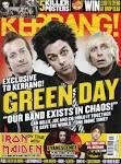
My house style is going to include the font 'Midnight', it's an edgy, rough looking font which is conventional for a rock music magazine, such as Kerrang!. I want my colour schemes to stick to blood red, electric blue, light grey & black, as these colours would appeal to my target audience according to my focus group & questionnaire.


Mode of Address
For the font styles, i want them to look quite aggressive & loud, with the colours being dark & gothic. The font styles are going to be sans serif, which makes things seem more informal as it's less fancy & more masculine. This magazine will be very informal as it's going to be appealing to a young adult target audience, ranging from 15-25 yr olds. The aggressive font for Kerrang! connotes the informality as it shows that it isn't a girly pop magazine, it connotes the rock genre really well.

Genre
The genre of my magazine is rock/metal/alternative. I will show this through use of fonts, content, images & mode of address.