Question 7
Progress from Preliminary Task
The skills that i have acquired throughout the making of the music magazine are visible, i think. As the first magazine is very bland, the image quality is poor, in comparison to the 2nd magazine, which means my photography skills have improved greatly, the images used for the 2nd magazine are also a lot more appropriate, & are my own images, whereas the images on the school magazine were not my own.
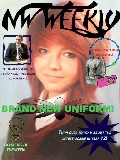
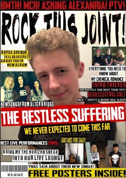
The font choices i have chosen are much improved for the music magazine, as i have been able to choose fonts that are appropriate for the genre. I have been able to recognise attractive fonts for a specific type of magazine, where as for my preliminary task my ability to do so was poor. I have been able to use fonts to appeal to my target audience by applying my knowledge of stereotypes & conventions to what i feel would be the most appropriate - to appeal to my demographic. The font choices are bold & they stand out against the different colours within the music magazine - where as the school magazine lacks the eye catching, bold fonts for the coverlines etc.
My skills for the layout of my magazine have improved vastly, this is due to my ability to include necessary content. The content i have provided within the school magazine is very limited - it is quite boring with not a lot to look at - which is very unconventional for a magazine & may not appeal to the demographic of the younger generation as they may lose concentration quite quickly. My music magazine cover page has improved as it includes many different subheadings, images, coverlines & other features you would expect to see on a music magazine. The layout for my music magazine also follows the route of the eye which appeals to the target audience a lot more as they would see the content a lot easier - keeping them interested & engaged in my product. The layout of my music magazine is conventional for a rock music magazine, as it has the correct content where it would usually be in popular magazines - having a lot of audience research has allowed me to make these decisions to make an accurate, popular magazine cover.
The colours i have used on my music magazine have improved from when i made my school magazine - the choices i have made are a lot bolder - using appropriate colours to suit the genre of the magazine, i have stuck to a colour scheme of a darker colour board to appeal to my target audience. These choices i have made have improved my production skills as i have been able to create a much more accurate magazine cover. in comparison to the school magazine, where the colours seem faded & very dull. I have captured the correct colours in my imagery for my music magazine by using appropriate lighting - it has also helped to go by what my target audience would have been more interesting in, as it has made my music magazine a conventional, stereotypical magazine. I have been sure to use the correct types of backgrounds for my photography to make it contrast with the colours of my fonts etc, to make everything stand out & be eye catching.

The images i have used throughout the music magazine have improved greatly from the preliminary task. The shot types, angles, & image quality are all a lot better. The shot types i have used have improved as they are now some what professional & are conventional for a music magazine, where as for my school magazine, the images are of a low quality & there are not enough of them. For the images on the music magazine, they are very clear & bold. I have been able to take photographs that look like real life band photos to appeal to my target audience, using the research from my audience/demographic appeal. The research definitely made me a lot more successful in creating specific images that look realistic & are appropriate for the specific genre.