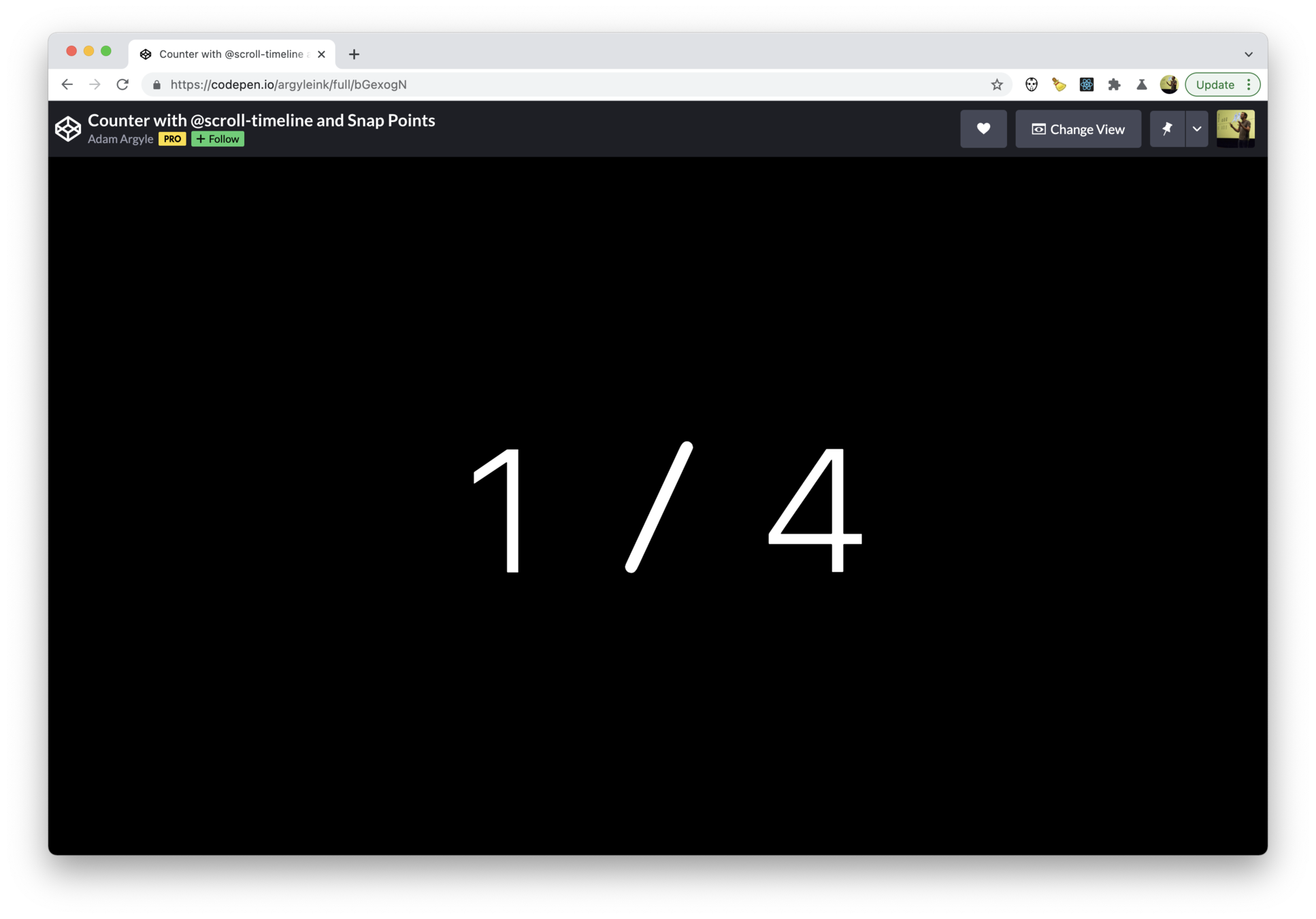
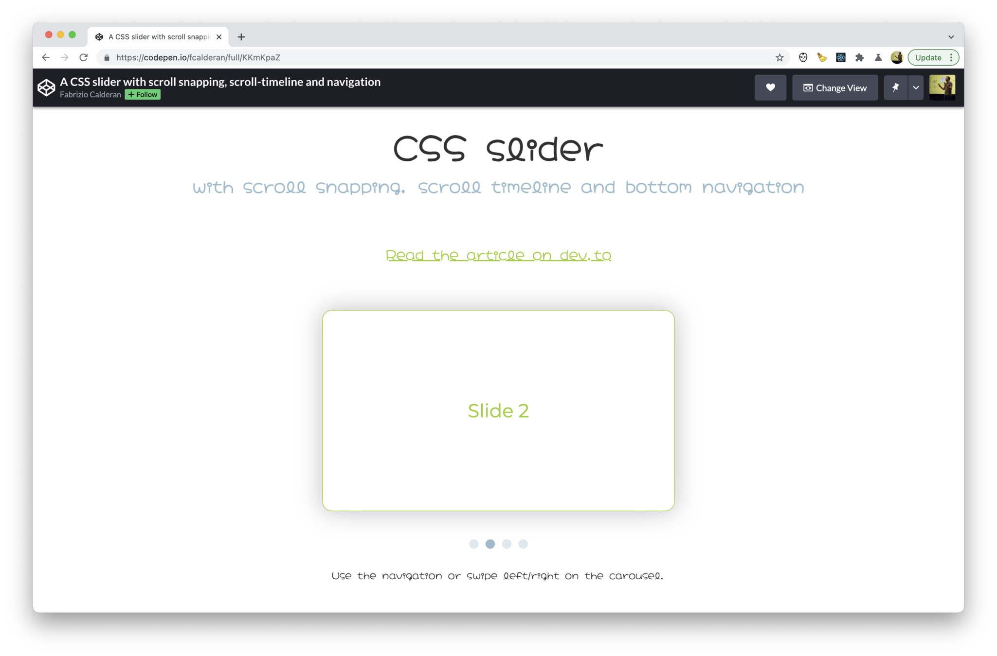
Scroll-Linked Animations with CSS @scroll-timeline
CSSCamp 2021

Bramus Van Damme


🚨
Experimental CSS Features Ahead!
Chromium 89+ with the #experimental-web-platform-features flag enabled required
🤩
Exciting
Features Ahead!
Hardware accelerated Scroll-Linked Animations, running off main thread without any need for any JavaScript!
Scroll-Linked Animations with CSS @scroll-timeline

Scroll-Linked Animations
Scroll-Triggered Animations
Scroll-Linked Animations
Animations based on the scroll-progress of a scroll-container

@keyframes adjust-progressbar {
    from {
        transform: scaleX(0);
    }
    to {
        transform: scaleX(1);
    }
}

@scroll-timeline progressbar-timeline {
    source: auto;
    direction: vertical;
    scroll-offsets: 0, 100%;
}

#progressbar {
    animation: 1s linear forwards adjust-progressbar;
    animation-timeline: progressbar-timeline;
}- A CSS Animation
- A Scroll-Timeline
- A link between both
Scroll-Linked Animation Key Components
💁♂️ A Scroll-Timeline is a type of timeline whose actual time value is determined not by a ticking clock but by the progress of scrolling in a scroll container.
time-range- scroll-offsets
- orientation
- source

Scroll-Timeline Descriptors
time-range- scroll-offsets
- orientation
- source
Scroll-Timeline Descriptors
🔥 TIP: Always set time-range to the exact same time as the animation-duration, unless you have a (very good) reason not to.
time-range- scroll-offsets
- orientation
- source
Scroll-Timeline Descriptors
☝️ In an older version of the spec the scroll-offsets had to be defined as start and end.
time-range- scroll-offsets
- orientation
- source
Scroll-Timeline Descriptors
☝️ As the selector() function requires an explicit #id, you can't reuse your timelines. Instead you'll have to duplicate your code.
- Cover to Header
- Parallax Header
- Full-Screen Panels with Navigation
- Full-Screen Panels with Navigation (alt)

More Demos

Other Tips / Findings
🔥 TIP: Always set animation-timing-function to linear
unless you have a reason not to.
☝️ It's not possible to use CSS Custom Properties as values for descriptors
Fin?
Scroll-Linked Animation with Element-Based Offsets
Animations based on the location of an element within the scroll-container

Element-Based Offsets in Pseudo-Code
@scroll-timeline box-enters-and-leaves-scrollport {
  scroll-offsets:
    “the box is at the bottom edge of the scrollport”,
    “the box is above the top edge of the scrollport”
  ;
}
Element-Based Offsets in CSS:
<element-offset>
- target:
selector(#id) - edge:
end|start - threshold:
[0..1]
@scroll-timeline box-enters-and-leaves-scrollport {
  scroll-offsets:
    selector(#target) end 0,
    selector(#target) start 0
  ;
}
Typical
<element-offset>
Combinations
-
end 0→start 0
= touching scrollport the edges -
end 1→start 1
= in between scrollport edges -
end 0→end 1
= enter from bottom into scrollport -
start 1→start 0
= exit at top from scrollport
Revealing Image
@keyframes reveal {
  from {
    opacity: 0;
    clip-path: inset(45% 20% 45% 20%);
  }
  to {
    opacity: 1;
    clip-path: inset(0% 0% 0% 0%);
  }
}
@scroll-timeline revealing-image-timeline-1 {
scroll-offsets:
selector(#revealing-image-1) end 0.5,
selector(#revealing-image-1) end 1
;
}Slide-In Contact List
@keyframes slide-in {
  to {
    opacity: 1;
    transform: translateX(0);
  }
}

li {
  animation: 1s slide-in ease-in forwards;
}

@scroll-timeline list-item-15 {
  source: selector(#list-view);
  scroll-offsets:
    selector(#list-item-15) end 0,
    selector(#list-item-15) end 1
  ;
}

#list-item-15 {
  animation-timeline: list-item-15;
}
Slide-In-Out Contact List
@scroll-timeline tl-list-item-12-appear {
  source: selector(#list-view);
  scroll-offsets:
    selector(#list-item-12) end 0,
    selector(#list-item-12) end 1
  ;
}
@scroll-timeline tl-list-item-12-disappear {
  source: selector(#list-view);
  scroll-offsets:
    selector(#list-item-12) start 1,
    selector(#list-item-12) start 0
  ;
}

#list-item-12 > * {
  animation:
    1s li-appear linear tl-list-item-12-appear,
    1s li-disappear linear tl-list-item-12-disappear
  ;
}
Horizontal Scroll Section
@scroll-timeline horizontal-section {
  source: selector(body);
  scroll-offsets:
    selector(#sectionPin) start 1,
    selector(#sectionPin) end 1
  ;
}

@keyframes move-horizontal-section {
  to {
    transform: translateX(calc(-100% + 100vw));
  }
}

#sectionPin {
  height: 500vh;
}
.pin-wrap {
  position: sticky;
  top: 0;
  animation: 1s linear move-horizontal-section forwards;
  animation-timeline: horizontal-section;
}
🐛 You'll see the animation glitch upon reversal (when scrolling back up), due to Chromium Bug 1175289
Cover Flow
🐛 The items at the start and stop of the list are rendering wrongly due to Chromium Bug 1174838
- The
<ul>element is the scroll container, and the<li>elements inside scroll. - The
<li>elements themselves switch z-index, and their contained<img />elements are transformed.
Stacking Cards
- Keep items in view with
position: stickyand vary thepadding-topto achieve the offset. - Lay out all cards in their wrapper using CSS Grid with fixated rows. Before they stick their padding doesn't appply.
☝️ Thanks to playing with animation-delay I’m able to use one shared @scroll-timeline for each card
Fin?

Browser Bugs
- Chromium: Bug 1023424
- Firefox: Bug 1676780
- Safari: Bug 222295

Build demos!


Fin.
Bramus Van Damme