Data Viz
Considerations and Practical Tips
Dr. Kostelac and Branden DuPont
Medical College of Wisconsin
What is data visualization and how is it used?
- "...anything that converts data sources into visual representation" (Duke University Libraries)
- “Data visualization is a way to represent information graphically, highlighting patterns and trends in data and helping the reader to achieve quick insights.” Gartner Glossary
-
How is it used?
- Understand data quickly
- Identify relationships and patterns
- Pinpoint (emerging) trends
- Communicate the story to others
- https://www.geeksforgeeks.org/why-data-visualization-matters-in-data-analytics/
What do we mean by data visualization?
- It is both the "what" and the "how"
-
What: Think charts, graphs, maps, tables
- but there are lots of permutations of each of these
- often have a spatial and/or temporal component
- sometimes they work best in combination
- How: Dashboards, infographics, reports, static web pages, presentations, etc.
- Depends on the data, purpose, audience, questions you are trying to answer and other factors
Examples
What are some of the challenges and considerations?
-
You need to get to know the data
- Cleaning, preparing, and understanding are the hardest parts
-
Documentation often is lacking or limited depending on the data source
-
Documentation and notes are important!
-
Considerations for the sensitivity of data
-
Lots of decisions to make along the way
- Sometimes simple is better…
Tool options discussion and considerations
- Cost
- Frequency and process to update
- Security
- Sustainability
- Ability to hire people with the skillset
- Ease of use
- Functionality and flexibility
- Others
What Type of Data Viz Project Do I Have?
Which Type of Data Visualization Project Do I Have?
-
Exploratory
- provide multiple analyses
- filters for various perspectives
- question is open ended
- more interactivity
-
Explanatory
- explore and understand an analysis
- similar to a policy brief
- question is discrete
- less interactivity
- annotation!
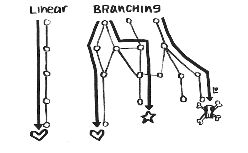
Susie Lu:
Explanatory vs Exploratory
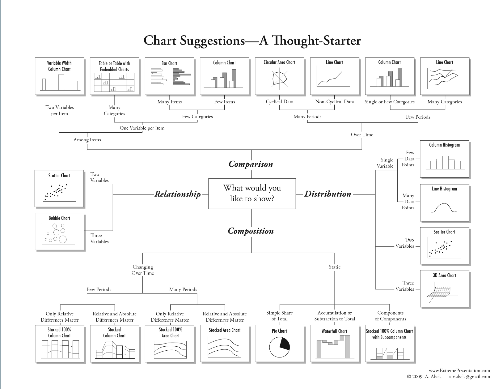
How Do I Choose the Right Data Viz?
- Good visualization is difficult, complex, and takes practice
- Good place to start: FT Visual Vocabulary
- Most of these can be made in standard viz tools
- Collect examples you like (Washington Post, ProPublica, Urban Institute, Flowing Data)
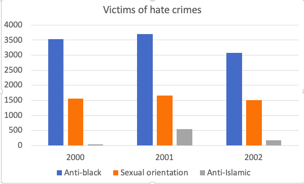
Example: Line Chart
- great for telling a story
- making comparisons between groups over time
How to Improve Chart Design?
Elijah Meeks
- Don't use the chart defaults, be intentional about design
- Use annotations whenever possible -- even more than interactivity
- Chart's meaning should be clear at a glance. Highlight or add narrative to key insights.
- When appropriate add elements like
- data source
- contextual notes about the data
- last chart update
- who made the chart
Paul Krugman is Bad at Viz
https://twitter.com/paulkrugman/status/1305237645459628044?lang=en

How to Use Color Effectively?
Lisa Charlotte Ross
- Color in data visualization is difficult
- Best advice is to read several blog posts by Lisa Charlotte Ross
- Explain what your colors encode
- Grey/Black is the most important color
- Use the same color for the same variables when appropriate
- No more than 7 colors: 2 to 3 is ideal
Practical Examples?
- Think tank/government agency with embedded visualization: