Website Inspirations
+ Deconstructions
Regional Website
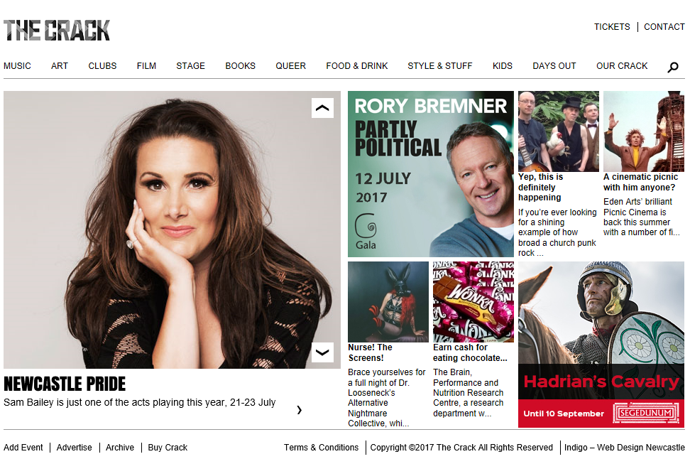
One of my regional websites I am looking at is The Crack magazine. At first glance the site simple to navigate and clean. but it its very boring to look at. The Masthead stands out from majority of the website making sure that it is important. The site is easy to navigate and user friendly with links for every sub-genre of culture which allows the audience to instantly find what they are looking for without seeing other genres.
The small amount of text emphasizes the professional and directly addresses the regional target audience. For example it shows the name of the feature with a brief one line summary or the date of the event. This is much more precise and straight to the point therefore keeping the audience focused. This is a layout I will definitely take inspiration from as it will engage my modern yet intelligent audience, who will enjoy the image like pin-board and ability to navigate independently to their chosen feature or sub-genre.
Prioritized features have larger images within the hyperlinked pin-board like layout. This scattered image layout is similar to social media platform ssuch as Tumblr or Pinterest which will be very appealing to my younger audience. I also feel it is very modern and visually engaging and is a much better alternative to lengthy text descriptions. The main features are part of a sliding gallery which switches every 5 seconds adding interest .
National Website
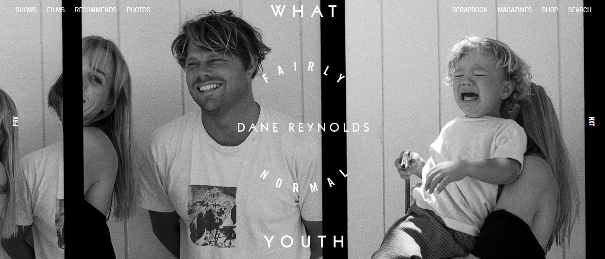
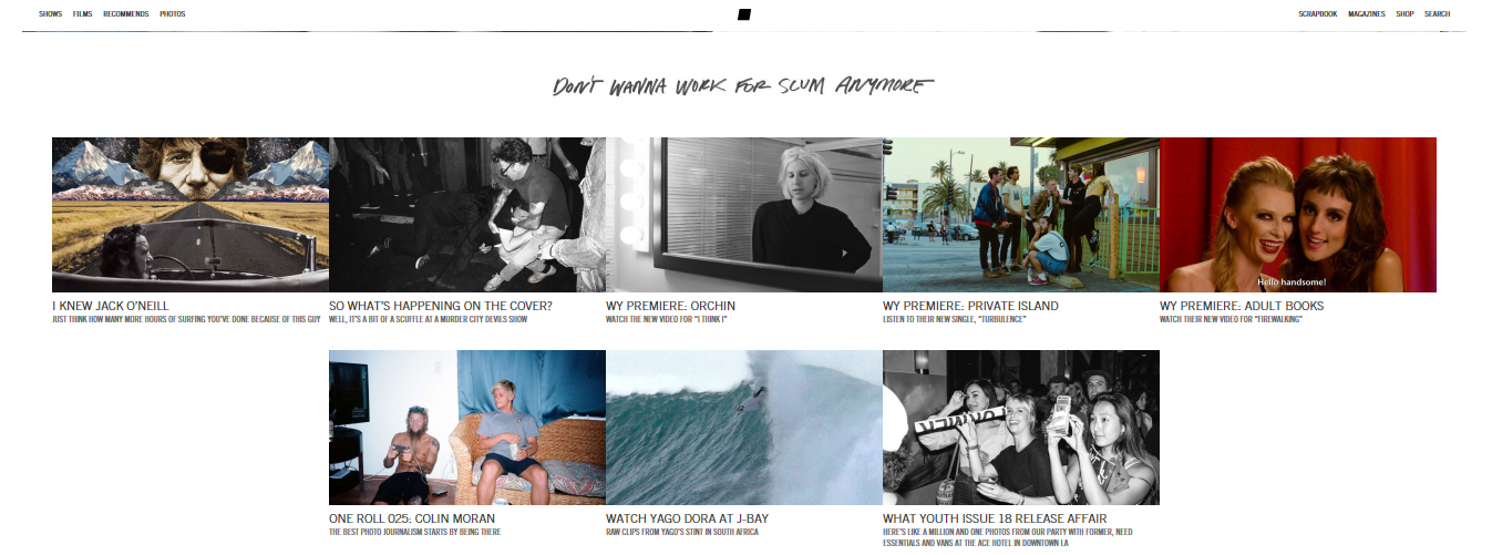
For my National Website I am going to be looking at the WHAT YOUTH website, UNlike the regional website it is a very aesthetically pleasing website to take inspiration from and isn't boring, the website is easy to navigate and clean. The main stories are placed on a moving gallery at the top of the website and changes every 6 seconds to show a different story to keep viewers interested. The drop down navigation bar features pictures of things linked into what the drop down section is about for example the magazine dropdown box shows pictures of their magazines.
The rest of the website on the front page is a series of other stories that viewers may be interested in, this helps keep people on the website as they are different stories that will grab various peoples attentions. The use of the white background behind the images helps them stand out to the viewers and the use of different filters on the images, make the images look important and also shows that creative side of the website . I also like the slogan underneath the moving pin board feature.
National Website
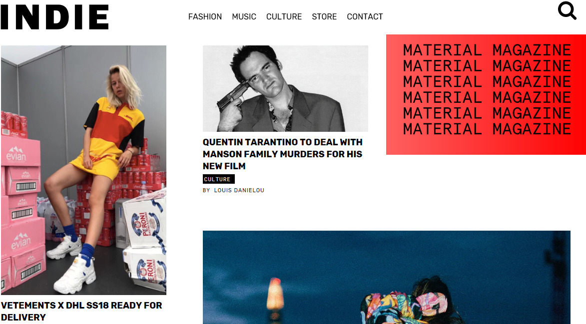
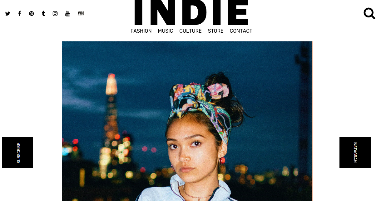
For my second National Website I am going to be looking at the INDIE website. Like my first national website, it is a very aesthetically pleasing website to take inspiration from , the website is easy to navigate and clean. The main stories are placed on a moving gallery at the top of the website and changes every 5 seconds to show a different story to keep viewers interested. The navigation bar is simple yet effective and takes you straight to articles on the website about what you are specifically looking for, for example if you click on the fashion option it will show you all the articles about fashion.
The rest of the website on the home page is a series of other stories that viewers may be interested in, this helps keep people on the website as they are different stories that will grab various peoples attentions. The use of the white background behind the images helps them stand out to the viewers and the use of different filters on the images, make the images look important and also shows that creative side of the website . The only downfall to this website is that the images are too large and appear unorganised which takes away the professional look about it.
Main Inspirations
WHAT YOUTH - Pros and Cons + Drop down navigation tools and pictures linking to what the drop down is about + Moving picture gallery for main stories + Layout of sub stories and the colour scheme of the pictures - No use of logo INDIE - Pros and Cons + How when you scroll down the page the logo stays with you +Social media links on the top of the website +Colour scheme -Images are way to large and look unorganised and unprofessional
I am going to list the pros and cons of the websites I have analysed. For my website I am going to be taking inspiration from:
The Crack - Pros and Cons + Social Media list on the side of the website featuring links to Facebook, YouTube, Pinterest ect. + Moving picture gallery for main stories - Boring to use and look at
Although my main inspirations are The Crack, INDIE and WHAT YOUTH website, I have taken ideas from all my research to inspire my website production.
I will make sure my website is:
- Direct and straight to the point (most people rarely read the content before properly engaging with a site therefore if key information is buried in paragraphs it will most likely be missed)
- Easy to Navigate (avoiding visual clutter by having navigation links to certain sub-genres not only makes the site user-friendly but also makes the homepage less cluttered and more aesthetically pleasing)
-Well Designed (First impressions are extremely important in terms of websites therefore it is important the design, images and color scheme are on point to appeal to my specific audience)
To ensure I am successful in this I will include the following features:
-Masthead (stays on screen throughout all navigation in same position)
-Navigation Links (Headlines the page making it easy for the audience to find their specific sub-genre)
-Pin-board hyperlinked Images ( similar style to Pinterest to create a contemporary feel)
-Interactive gallery of featured stories (user-friendly)
-Quirky and Unique Images (adds a unique and appealing touch to the website)
-Social Media and Contact Links (Instagram, Tumblr, Snapchat and Facebook)
What will make my website sucessfull