Advanced CSS
What we'll cover
- Transforms
- Animations
- Transitions
- Media Queries
- Screen/Print styles
Graphics Processing Unit (GPU)
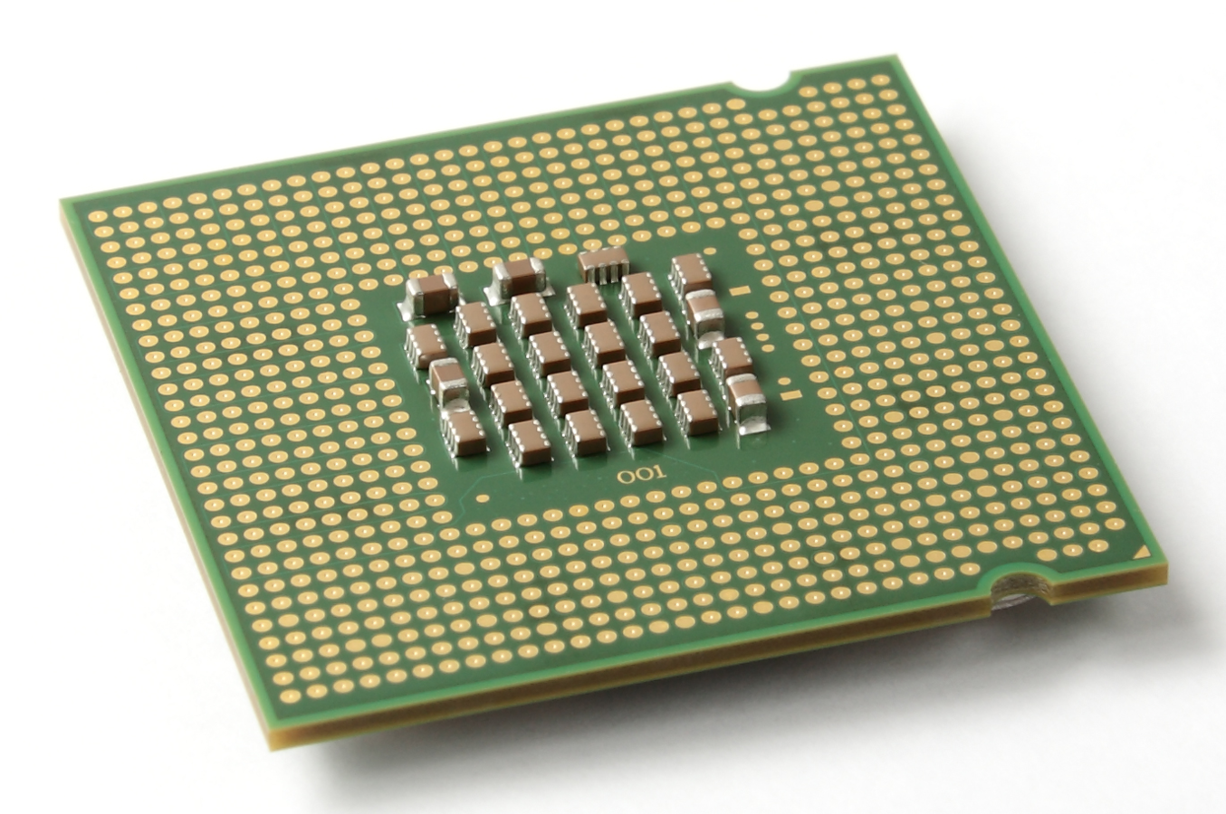
The CPU is located on the computer’s motherboard; it processes almost everything and is known as the brain of the computer.
Central Processing Unit (CPU)
The GPU is located on the graphics card of the computer, and is responsible for processing and rendering graphics.
Graphics Processing Unit (GPU)
CPU draws the layers
Central Processing Unit (CPU)
- GPU composites the layers
- GPU is efficient at basic drawing operations
- Changes on GPU-composited layers are the least expensive
- GPU is designed specifically for performing the complex mathematical and geometric calculations that are necessary for graphics rendering.
- Offloading operations onto the GPU can yield massive performance gains and can also reduce CPU contention on mobile devices.
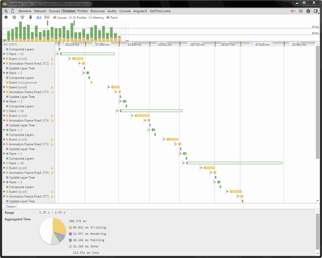
The best-performing version of the pixel pipeline avoids both layout and paint, and only requires compositing changes.
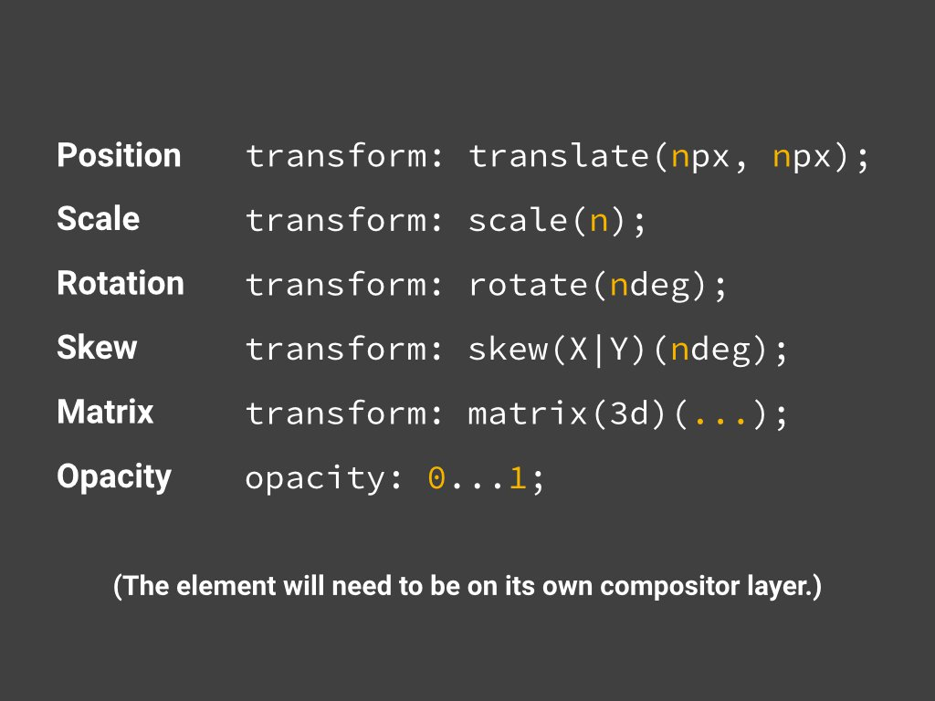
In order to achieve this you will need to stick to changing properties that can be handled by the compositor alone. Today there are only two properties for which that is true:
transforms and opacity

Seriously, that's it.
https://developers.google.com/web/fundamentals/performance/rendering/stick-to-compositor-only-properties-and-manage-layer-count

Transforms
CSS transforms are implemented using a set of CSS properties that let you apply affine linear transformations to HTML elements. These transformations include rotation, skewing, scaling, and translation both in the plane and in the 3D space.
Transform
Transform
Tilt Demo
https://codepen.io/brigittewarner/pen/vGLRRj
Animations
CSS animations make it possible to animate transitions from one CSS style configuration to another. Animations consist of two components:
- a style describing the CSS animation and a set of keyframes that indicate the start and end states of the animation's style
- Possible intermediate waypoints.
Initial Values of
Animation Properties:
- animation-name: none
- animation-duration: 0s
- animation-timing-function: ease
- animation-delay: 0s
- animation-iteration-count: 1
- animation-direction: normal
- animation-fill-mode: none
- animation-play-state: running
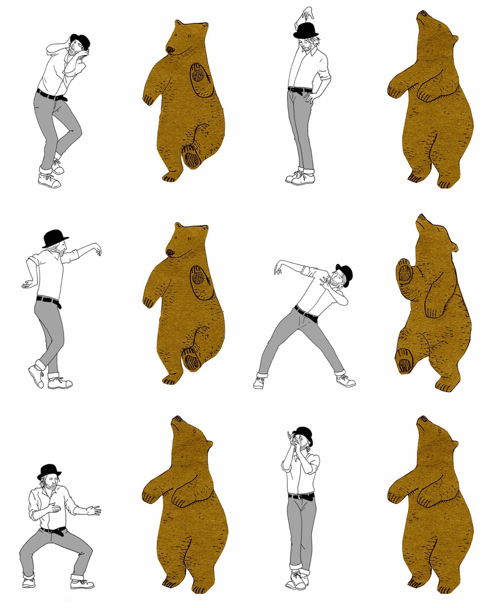
Animation
Horizontal Scrolling Demo
http://codepen.io/brigittewarner/pen/yOepQP
Activity
- Read Beginner's Guide to CSS Animations
- Create a Codepen account
- Either fork and edit or create an animation from scratch
Transition
The transition CSS property is a shorthand property for transition-property, transition-duration, transition-timing-function, and transition-delay. It enables you to define the transition between two states of an element.
Transition
Hover Demo
http://codepen.io/brigittewarner/pen/yOeoqz
Media Queries
@media screen and (min-width: 700px) and (orientation: landscape) { ... }
Logical Operators
and, not, or
Media Features

Media Query
Demo
http://www.webdesignerwall.com/demo/media-queries/
Responsive Screen
.square {
  background: red;
}

@media screen and (max-height: 720px) {
  .square {
    height: 100px;
    width: 100px;
  }
}

@media screen and (min-height: 720px) and (max-height: 760px) {
  .square {
    height: 200px;
    width: 200px;
  }
}
<div class="square"></div>print.scss
@media print {

  // Set default to black and white
  body {
    color: black;
    background: $white;
  }

  .home-button {
    i {
      background: url("images/logo/allovue_logo_bw.svg");
    }
    h1, h2 {
      color: black;
    }
  }

   // Don't display these when printing
  .not-for-print {
    visibility: hidden;
  }

  .only-for-screen {
    display: none;
  }
}
Homework:
(due Thursday, Nov 17)
- Completed HTML/CSS
- Refer to the rubric!
$300 million button
https://articles.uie.com/three_hund_million_button/
