UX and Accessibility
What we'll cover
- User Flows
- User Testing Best Practices
- Section 508 Compliance
- Colorblindness
- Screenreaders
- Closed-captioning Tools
- i18n & l10n
Login Success/Error Flows
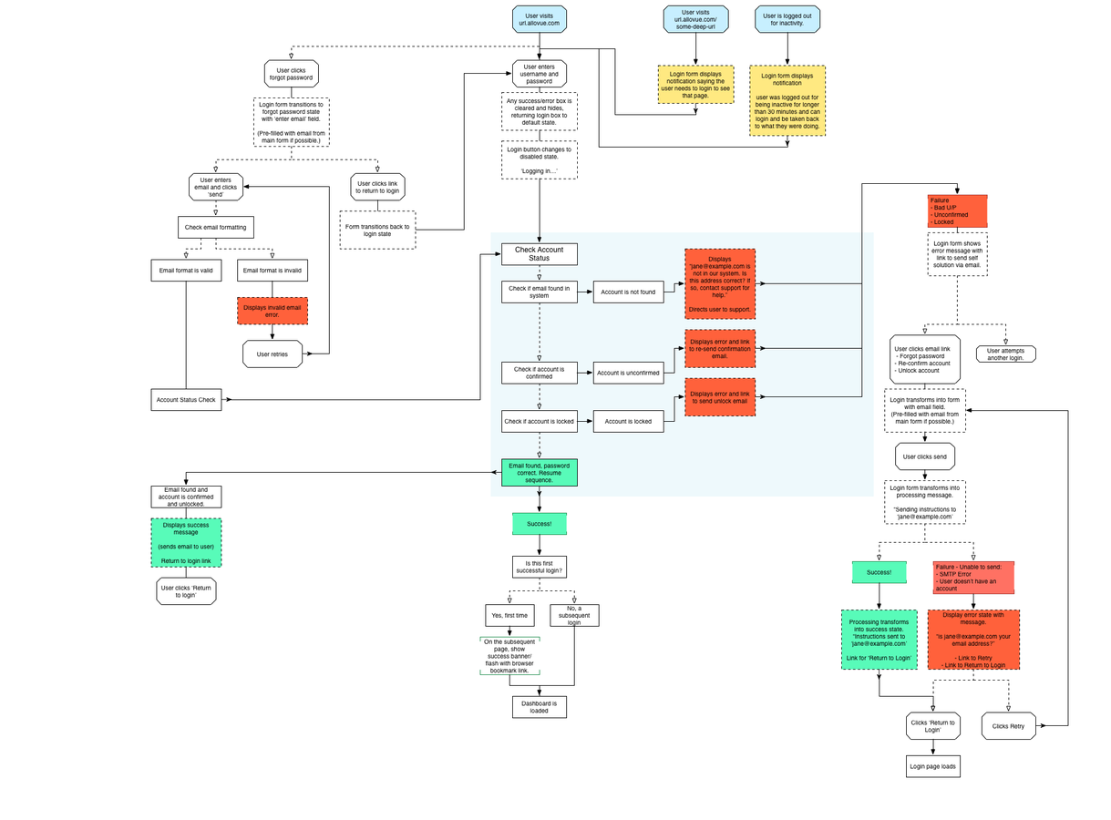
Why User Flows?
Site flows only capture an overview of the site's general architecture.
User flows allow us to think through how to get users from A to B. We can better keep track of the pages and messages we need to design in order for a task to be completed.
eg: making a purchase (conversion)
User Flow Tools
https://www.gliffy.com/ (free!)
https://www.omnigroup.com/omnigraffle
https://www.sketchapp.com/
Video
Use a simple script that asks users to attempt 3-4 integral tasks and have them talk out loud as they complete them.
Analytics
Javascript libraries such as Analytics.js can be used to track user actions.
Google Analytics can be utilized to track user traffic over time.
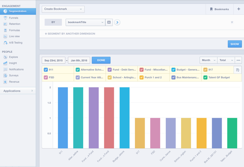
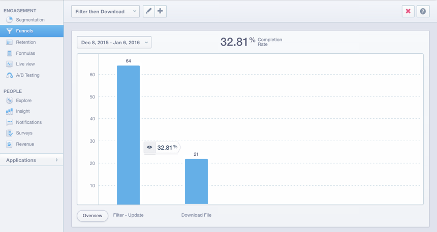
Mixpanel excels at analyzing user interaction through actions, properties, and funnels.
User surveys and chat
SurveyMonkey, Wufoo, Scorecards, Intercom.io
Mixpanel Segmentation
Mixpanel Funnels
User Testing Activity
1. Find a partner
2. Choose a website you use frequently (or used once and hated being it was hard to use)
3. Ask your partner to complete a simple task such as creating an account, finding a piece of information, or downloading design collateral.
4. Have them talk out loud and take notes on things that do and don't work well.
5. Share your findings with the class.

Section 508 Compliance
-
http://www.section508.gov
- All federally-purchased technologies must meet these guidelines.
- Your site should too. It's the right thing to do.

Bookmark Me!
https://www.access-board.gov/guidelines-and-standards/communications-and-it/about-the-section-508-standards/section-508-standards#subpart_b
Semantic HTML
All images should contain an alt attribute
<img src="https://....jpg" alt="New York City Skyline">

All links should contain a title attribute
<a href="#" title="Home Page">

<form>
<label for="identification">
<input type="email" name="email">
</label>
<label for="identification">
<input type="password" name="password">
</label>
</form>
All form inputs should contain a type attribute.
Some people can't read this text.
Colorblindness
http://www.color-blindness.com/

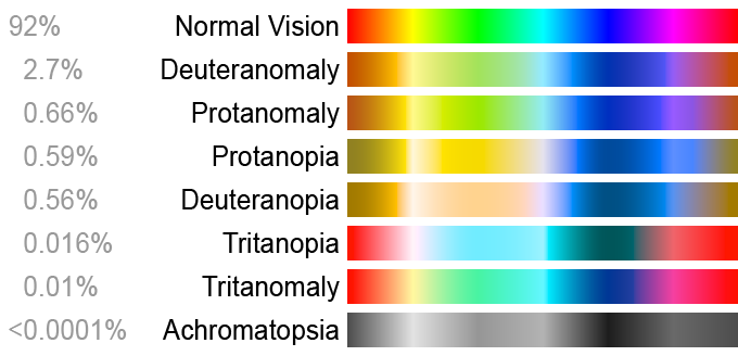
8 main types of color vision deficiencies
Acquired or Inherited
Red-Green Confusion
Deuteranopia
Deuteranomaly
Protanopia
Protanomaly
Yellow-Blue Confusion
Tritanopia
Tritanomaly
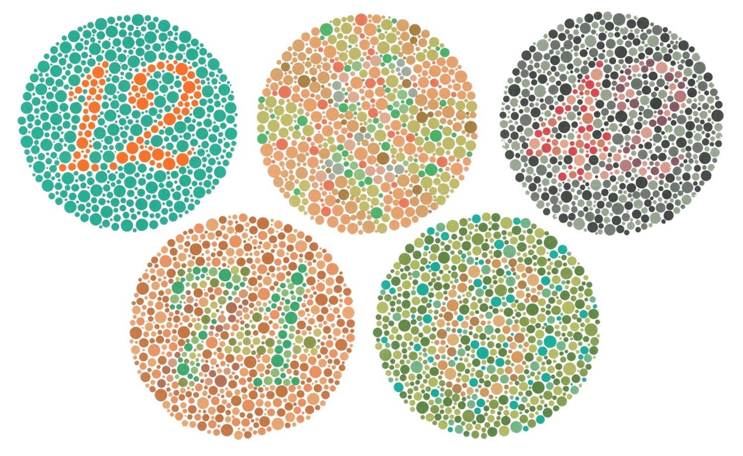
Monochromacy
Partial Monochromacy
General Guidelines
1. Don't only rely on colors to distinguish information
2. High contrast
3. Make the color areas of keys and legends large
4. Utilize user testing and available tools

Activity!
Use the Sim Daltonism app to visualize colors as they are perceived with various types of color blindness.

Screenreaders
Your Mac has one built-in!
VoiceOver Activity
http://www.apple.com/accessibility/osx/voiceover/
1. Navigate to a site with a lot of content
2. Put on headphones
3. Command + F5 to toggle off and on
4. Close your eyes and navigate the site
Closed-captioning
- White Coat Captioning
- Rev
- YouTube
- closed-captioning
- subtitles

https://support.google.com/youtube/answer/2734796?hl=en
Internationalization &
Localization
The process of adapting computer software to different languages and regional differences.

Internationalization
Creating a site that can be used by people from countries around the world.
Localization
Enhancing the site with regional specific languages
Generational qualifier
- Dutch, French, and German surnames, among others, may have prefixes such as "von," "de," and "van"
- not just suffixes like in English (i.e. Sr. and Jr.)

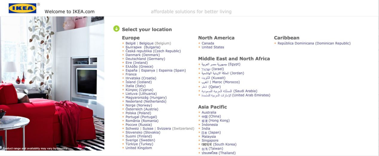
Quick Activity
Visit ikea.com and explore 2-3 different country sites.
What do you notice?
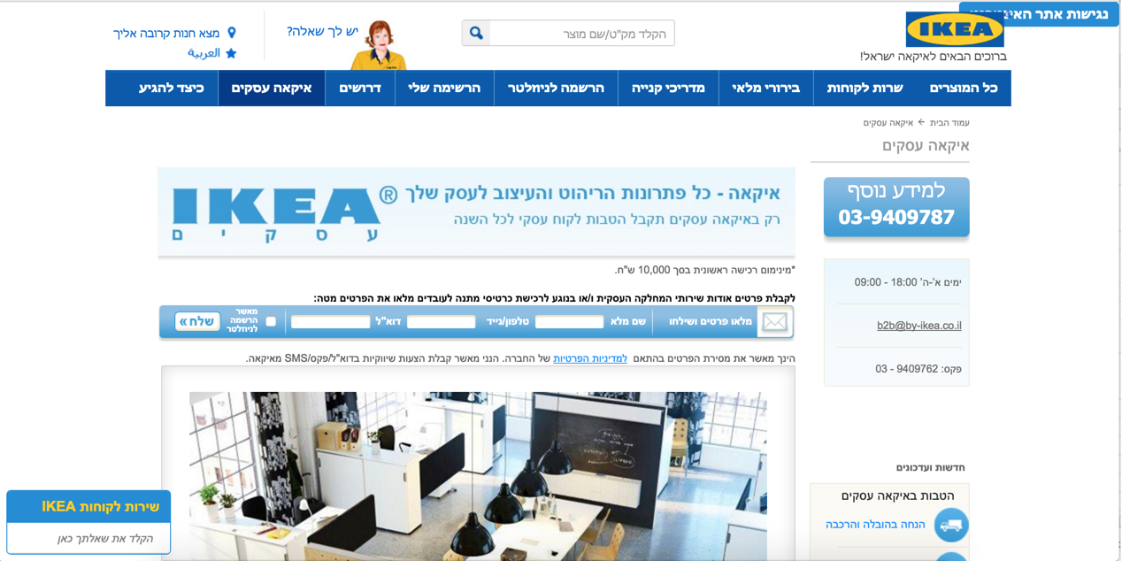
Ikea's Israel site is designed to be read from right to left.
Questions?
User Flow
Create user flow for a common web process (login/payment processing/etc) with 10-15 steps including:
- Success
- Failure
Site Evaluation
- Evaluate it for its accessibility/compliance
- Create and deliver 5-minute presentation (lightning talk). No more than 20 slides total.