2. How effective is the combination of your main product and ancillary texts?
Why having an effective combination of main products and ancillary texts is important.
Having an effective important combination of the main products and ancillary texts is a key way to gain a star identity or a brand image. If a music video has a certain star identity about it, if you were to see an album cover involving similar themes to the music video, people should recognise who it is and will be known with your star identity. This helps with the professionalism of your band as a whole. With a certain style of creativity, you can gain a niche audience who enjoy it and your popularity overall should increase as a larger amount of people will be able to make simple links between your main product and ancillary texts.
OUR THEME
Our theme for our music video is that the main teenage character asks a girl out on a date and at the end of the song they eventually leave for the date. Throughout the song it shows the guy getting ready for the date and we see what he gets up to throughout the day. We also see him at his band practice throughout the song also. Our theme for the digipak and advert is to keep it simple so we went with the basic style. This included a black background with the band members leaning over the music decks. The simplicity really matches the indie genre as well as the dark background.
THE MAIN PRODUCT
ANCILLARY TEXTS
ADVERT
DIGIPAK
MAIN PRODUCT (Music Video)
Give Me A Try - The Wombats
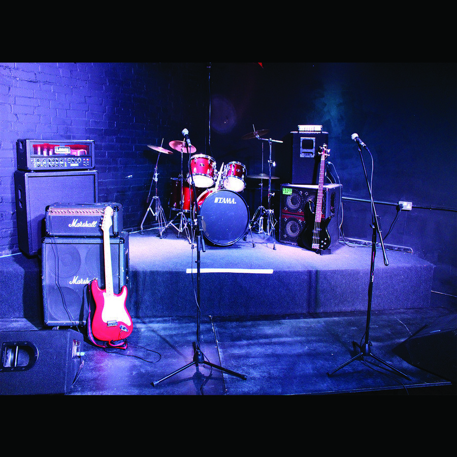
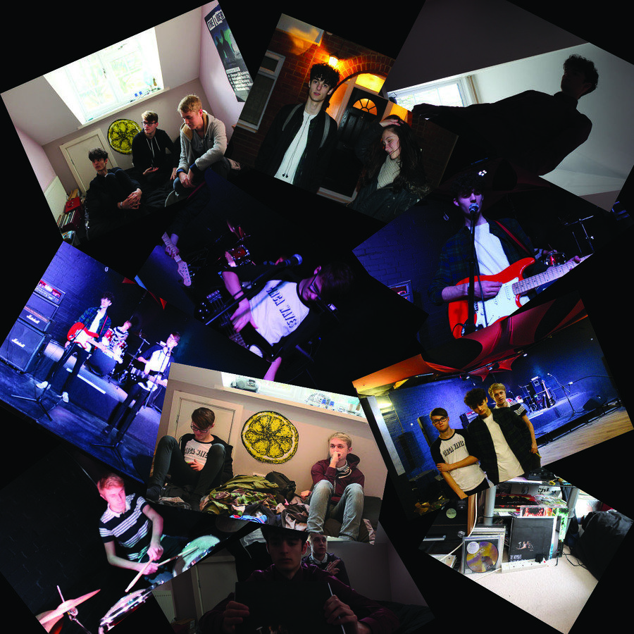
In our music video of the Wombats song 'Give Me A Try' we decided to go with a fast music video with a clear storyline and upbeat ideas. Our genre song is a Rock - Indie hybrid so we decided to use a band with guitars and drums to match the rock part of the genre, while they wear indie clothing as well as playing in a darkened studio. Also we matched the indie genre with a comedy video of sorts, because it does include some comedic tones in. However we have two parallel stories going on within our video. One story is with the lead actor, asking a girl to go on a date to Nando's and his two friends helping him get ready for the date. The other story is the same friends together in a band playing in a darkened studio, as they work on a new song. The story involving the band together is what we focus on in our digipak and advert, as in the digipak we have them leaning over the music deck as they check out their new song. With our studio story, it shows our band as friends which is relatable for our target audience as our age range is around 14-25 years old. This is an age where people tend to do stuff together and have fun together like starting bands or creating videos. With the inside cover we have lots of pictures of sets and instruments which is included in our music video and this involves a lot of our overall theme because we are a band who enjoys playing music and also friends outside of that who hang out together, so it shows the empty locations and rooms of our actors and includes that they have a lot of places to be and have a very relatable lifestyle to everyone watching our music video. A sense of brand identity is shown within our music video with this as it shows a type of togetherness within friends and band mates.
ANCILLARY TEXTS (DIGIPAK)
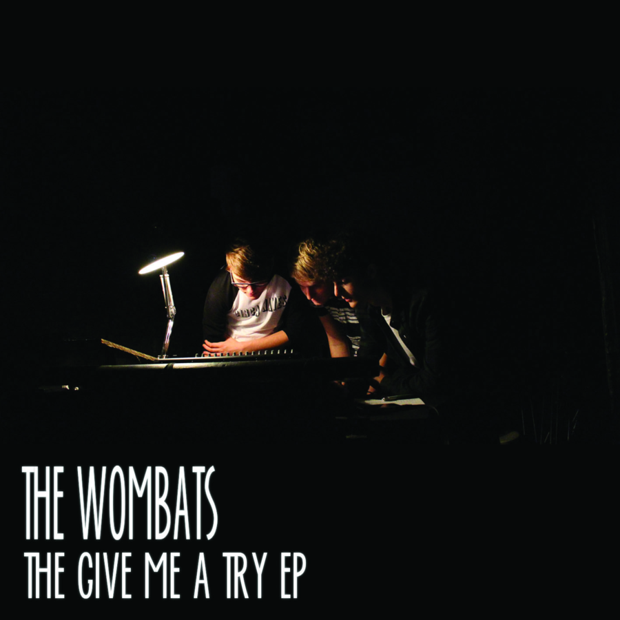
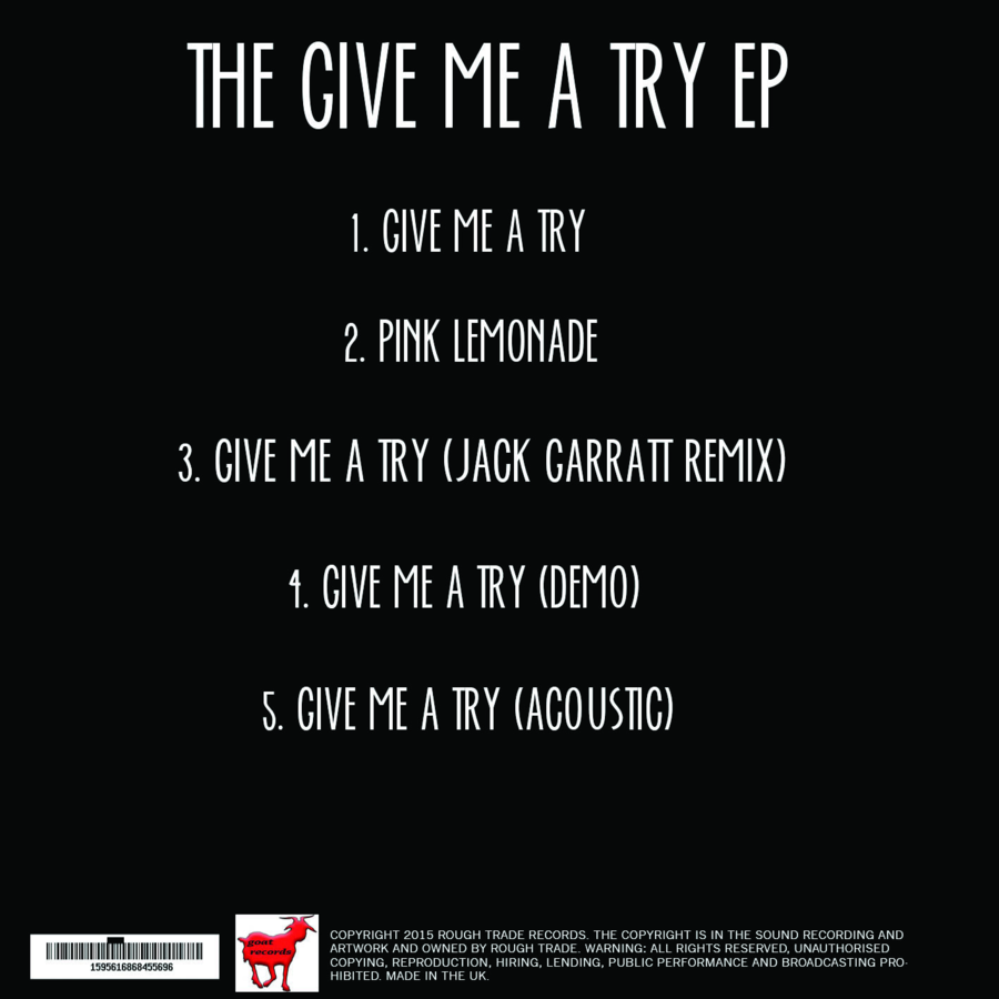
Our digipak includes a picture of three bandmates leaning over a music deck as they check out the song they have just produced, on the front cover and on the back cover they have used an indie font, which is simple but effective, which has a list of songs which is featured on the album. The font is white on top of a black background so it stands out very clearly, as they are opposite colours. This will get a sense of brand identity as it is a very simple design but because of the use of font and simplicity, it should stand out over many other harder to look at designs. This is a theme throughout our ancillary texts. The actors who are in the digipak are the same people in the music video so this is a clear link that they also star in the digipak. A long with them being the same actors, they are wearing the same clothing, so a consistent link between our main product and ancillary texts are clear to see. The colours used our the same colours in the studio shoot as we still remain in the studio, so this is a link to the music video and our theme of simplicity and also matching our own brand identity, which has been created.
ANCILLARY TEXTS (ADVERT)
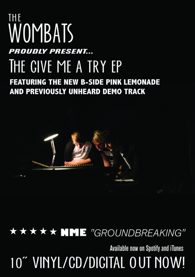
Our advert follows our theme of being simple yet effective, as we use the band shot over the music decks with a small light on showing us together listening to our song. This links to the togetherness of the band from our music video, shown again in the advert. We also used a black background to match our studio scenes as the dark lighting shows a key link to our rock - indie hybrid genre. We also have included the same house style with our fonts on our advert, so the brand identity can still be fulfilled and shown clearly for everyone to notice and see. This is a clear link between our ancillary texts and music video as every actor from the band is featured in the advert and the majority of the music video. This shows a clear brand identity between the advert and music video.
HOW TO MAKE BRAND IDENTITY CLEARER
We could of possibly used a better image in our digipak or advert where it is easier to see all of us together as a band and possibly made it clearer what we are looking at. If we did this then we could of looked more like a professional band with the lighting and framework and if we were to do so our brand identity would of been clearer and of a higher calibre. Another way we could of improved our brand identity would be to use patterns or possibly make either our digipak inside cover, or advert brighter, with a pattern or separate image. For example we could have given our band a logo of sorts because this would be a good way of gaining a brand identity, so if they were to see a logo from our band, they will know exactly who it is. We could of also used a logo or stated who our band was in our music video at the start, instead of making no sign of who we are whatsoever.