Q5. How did you attract/address your audience?

My intended target audience for my music magazine would be preferably a
male audience however this magazine will certainly appeal to a lot of females,
aged around 16-21 years old who would generally be students, and are into new
wave, Hip Hop. However the way I have produced my magazine would ensure that
people outside my target audience would be interested in the magazine. As
people 21+ would also be interested in some of the features consisting within
the magazine such as fashions, trends, music reviews , also as I noted before
there will be a lot of people of a female gender who would be interested in my
music magazine.
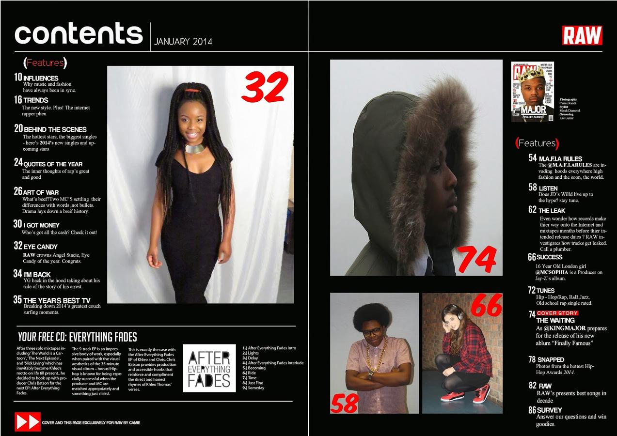
One way in which I've tried to attract and address my audience is through the consistent colours I
used throughout the three pages. Colours of black, red and white are used to
reach out to both male and females of my target audience.


Also the colours are
a good combination that is striking physically and therefore it will attract my
audience, drawing in their attention. Throughout the three pages I’ve created
of my magazine I’ve used bold and sans serif fonts, which will also draw in the
audience’s attention, attracting them.
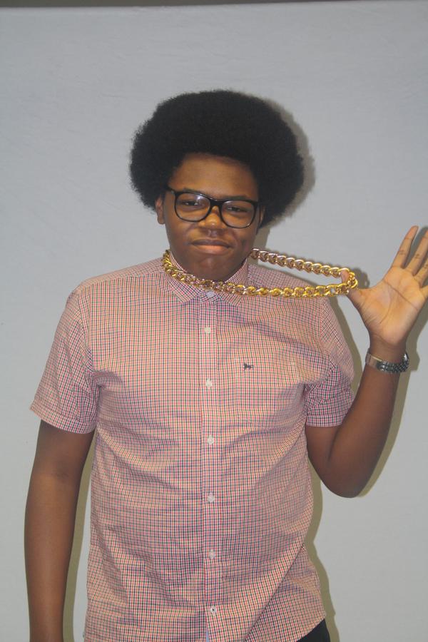
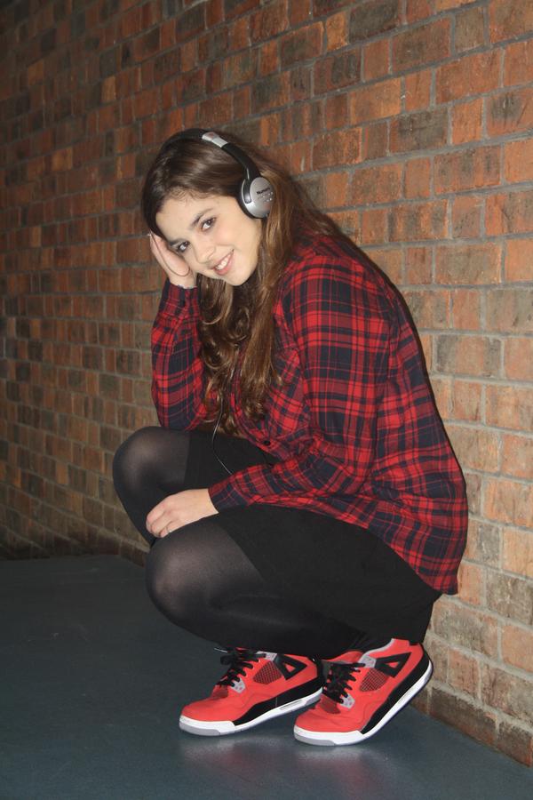
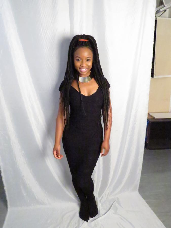
The images used all use direct address, making that image something personal to each one of the audience, it also creates a thinking point where they are interpret their own meaning of what that image might represent.

I’ve used mainly formal language but there are some quirky sentences that create an informal atmosphere, making the article and contents page more interactive and talkative.
for example
