Tailwind
Workshop
Making things move

LottieFiles
Es necesario conocer la tecnología para saber sus pros y contras
Introducción
¿Qué es TailwindCSS?
Tailwind CSS es un framework de CSS basado en utility-first
Un framework CSS contiene estilos y funcionalidades predefinidas para "hacerte la vida más fácil".
¿Entonces no es lo mismo que Bootstrap?
¿Clases de utilidad?
Necesitas saber CSS
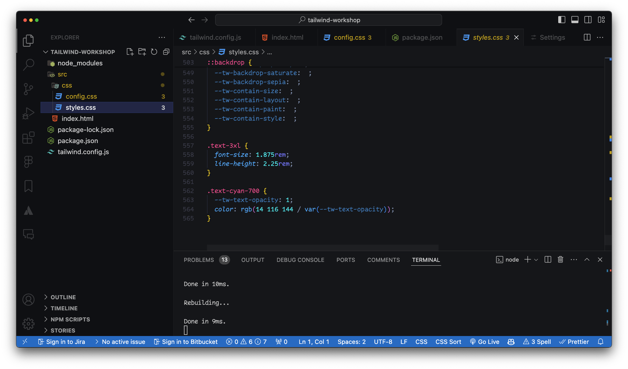
.title {
  color: indigo;
  font-size: 4rem;
  text-align: center;
}
.indigo {
color: indigo;
}
.font-xlarge {
font-size: 4rem;
}
.text-center {
text-align: center;
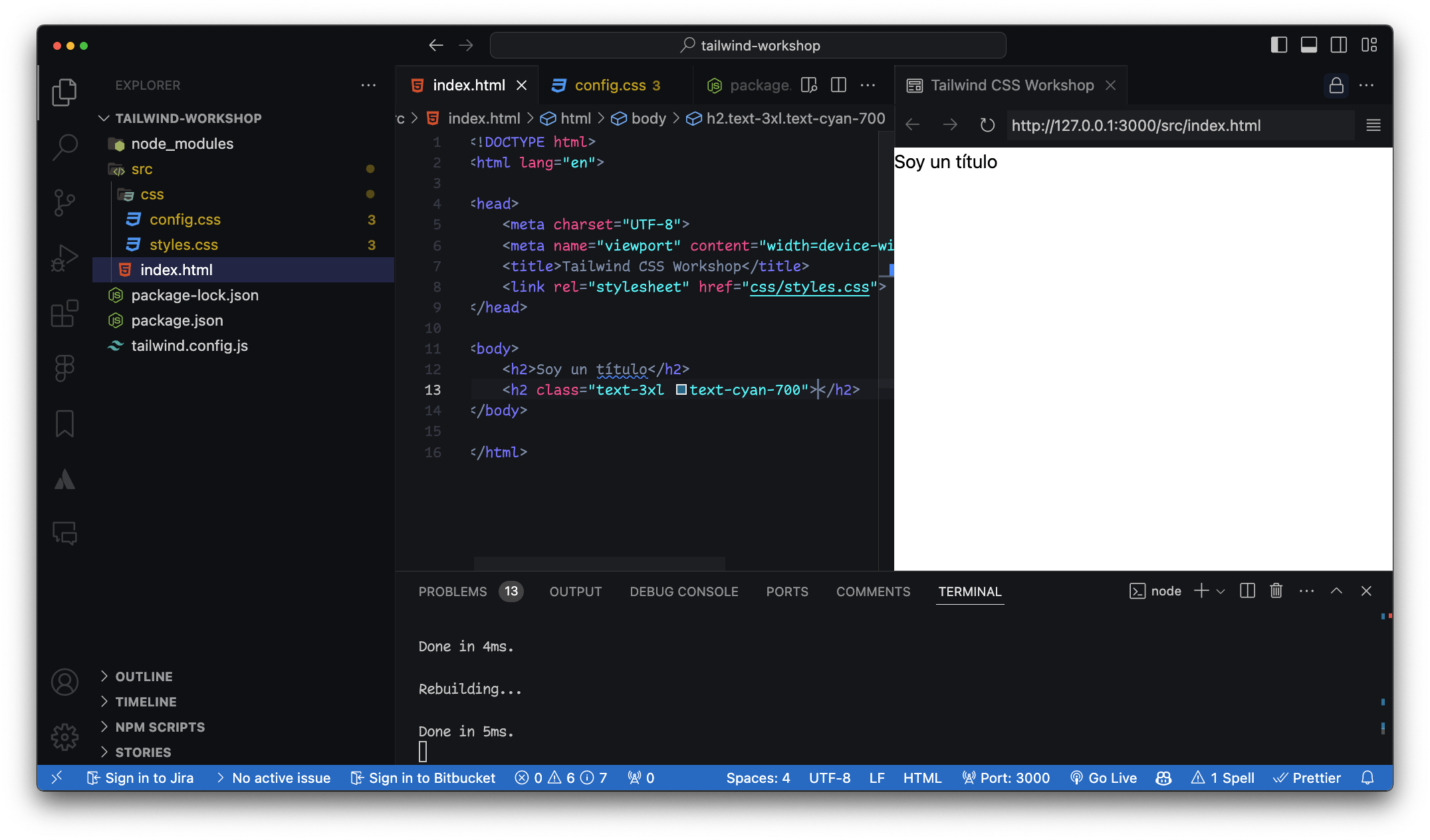
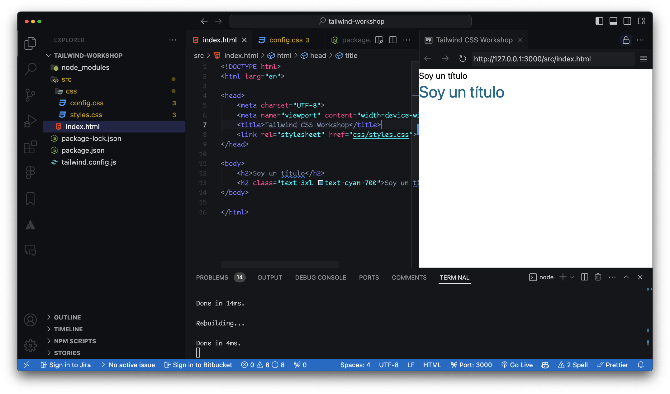
}<h2 class="title">Soy un título</h2>
<h2 class="indigo font-xlarge text-center">Soy un título</h2>/* style.css */
.btn {
background-color: blue;
color: white;
padding: 10px 20px;
border-radius: 5px;
}<!-- index.html -->
<button class="bg-blue-500 text-white py-2 px-4 rounded">
Button
</button>h2 con clases CSS y de utilidad
Botones animados
¿Ventajas?
Tienes establecidas clases de utilidad
¿Ventajas?
-
No necesitas pensar en nombres de clases.
-
Simplifica la arquitectura de CSS.
-
Facilita la creación y reutilización de estilos.
RWD
Mobile first
Documentación
Oficial de Tailwind
Extensiones para VSCode
Tailwind CSS IntelliSense
Opciones de instalación
Tailwind CLI - Play CDN
Gestor de paquetes
npm

Gestor de paquetes
npm install -D tailwindcss
npx tailwindcss init
/** @type {import('tailwindcss').Config} */
module.exports = {
  content: [],
  theme: {
    extend: {},
  },
  plugins: [],
}
/** @type {import('tailwindcss').Config} */
module.exports = {
  content: ["./src/**/*.{html,js}"],
  theme: {
    extend: {},
  },
  plugins: [],
}
Crear la carpeta src
HTML y JavaScript
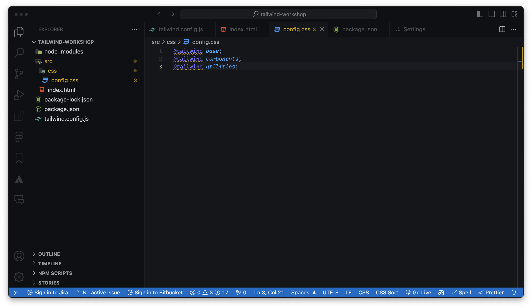
Crear carpeta CSS con las 3 directivas
@tailwind base;
@tailwind components;
@tailwind utilities;
npx tailwindcss -i ./src/input.css -o ./src/output.css --watchNuevo script en el package.json
Las rutas las carga el diablo
--watch 👀content: ["./src/**/*.{html,js}"]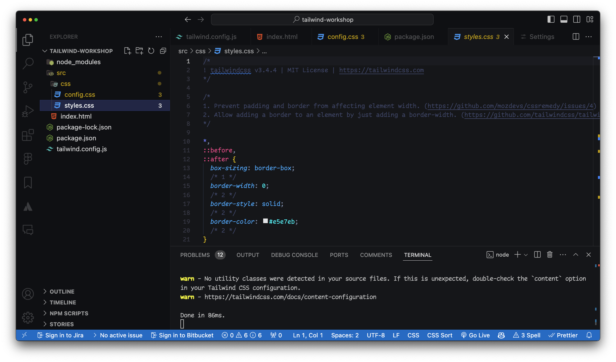
Estilos de la directiva @base
<link rel="stylesheet" href="styles.css">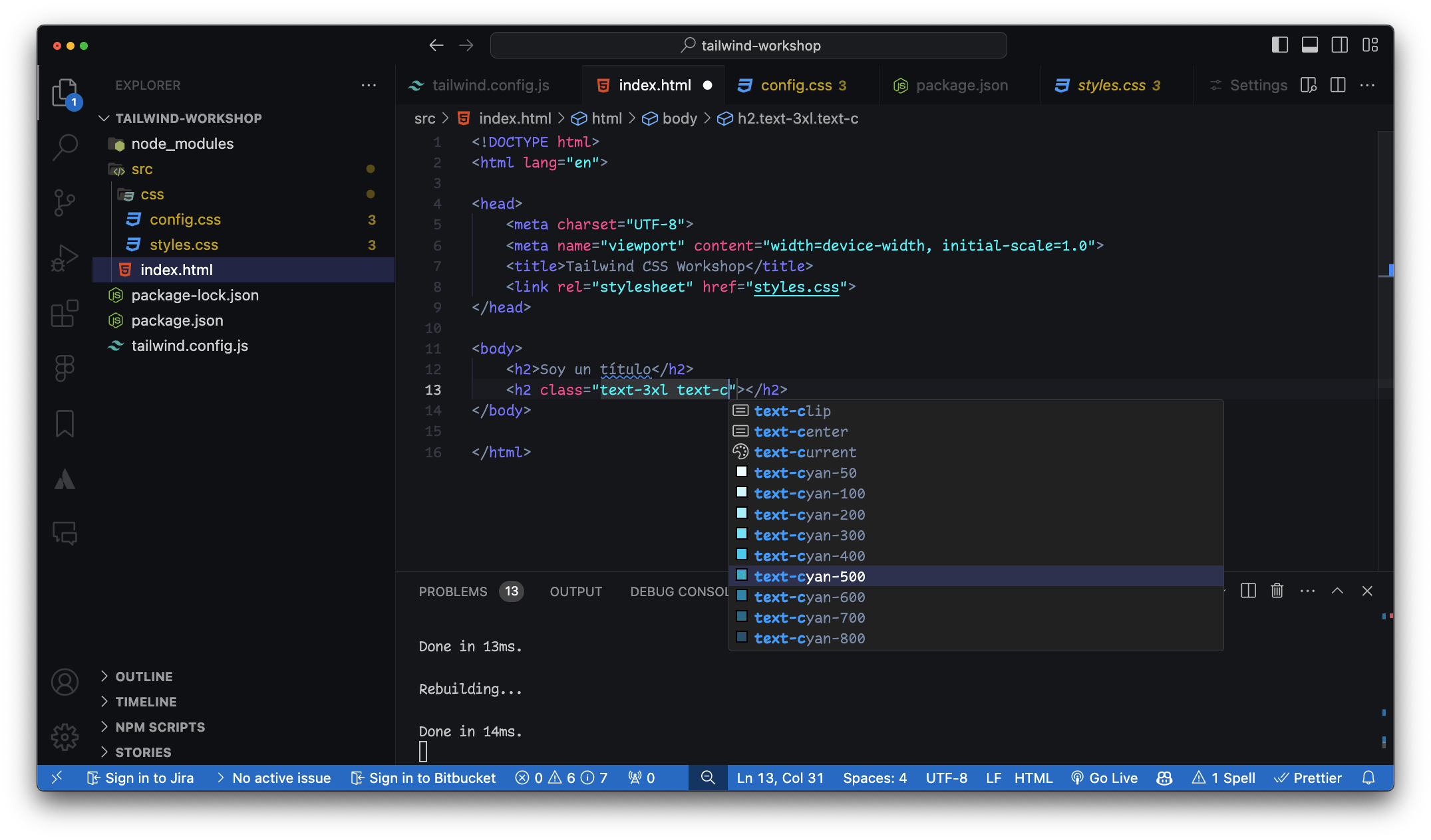
Módulos en Tailwind
Clases de Colores
Definir un valor personalizado
¿Cómo se personalizan los colores en Tailwind CSS?
class="text-[#DC2024]"class="text-[200px]"Definir un valor personalizado
Como background-color
class="bg-teal-700"class="bg-teal-700/60"class="bg-[patatablue]/80"Módulos en Tailwind
Clases de posición
class="static fixed absolute relative sticky"class="inset-0 inset-x-0 inset-y-0"Módulos en Tailwind
Sistema de espaciado
Sufijo 1 == 4px0 al 96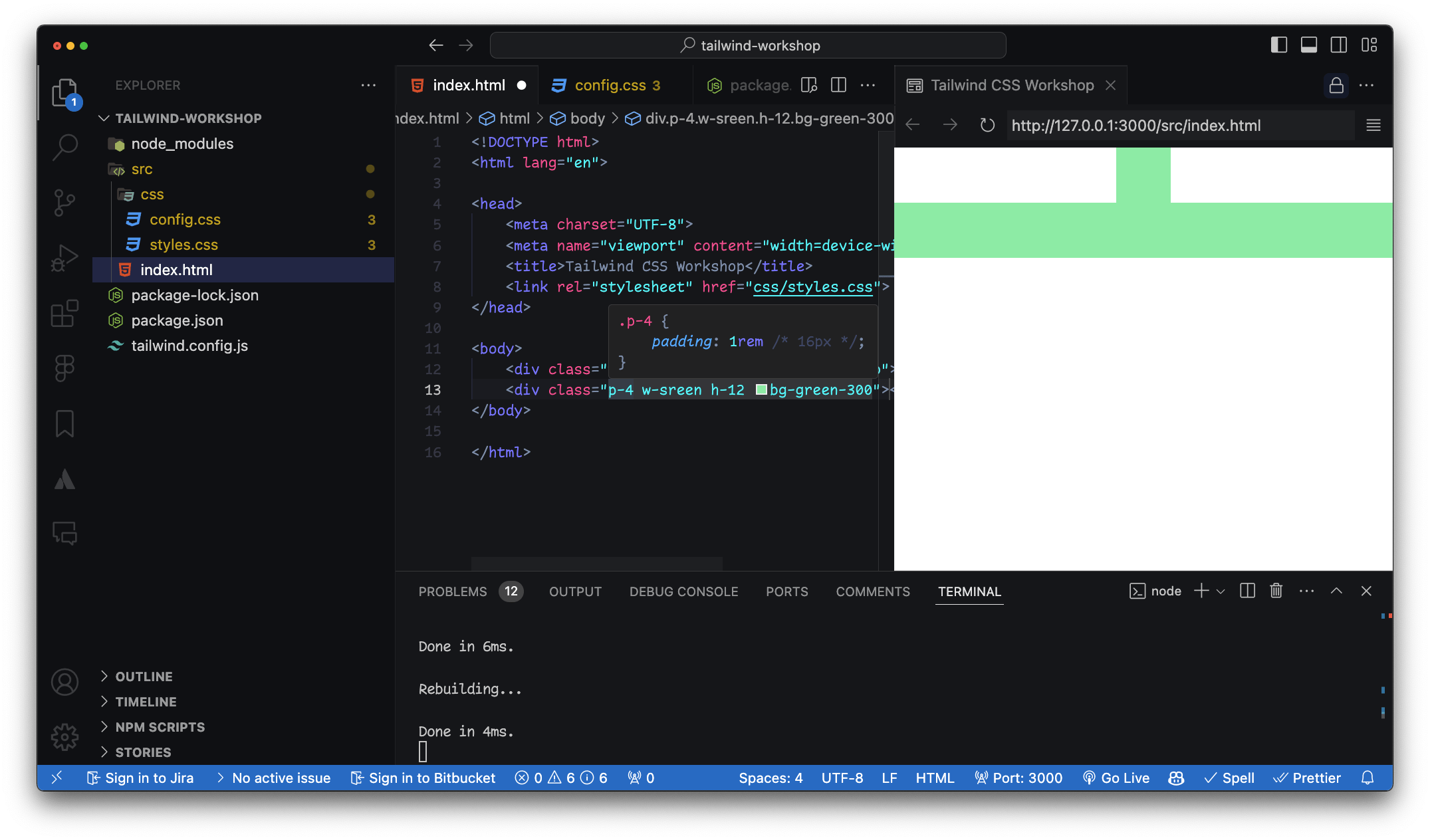
w-[202px].w-screen {
width: 100vw;
}
.h-screen {
height: 100vh;
}
.w-1/2 {
width: 50%;
}Sufijos extra
auto - auto
min - min-content
max - max-content
fit - fit-content
screen - 100vw / 100vh
full - 100%Demo
Interactividad avanzada
<section class="p-8 bg-green-400 group/section">
    <figure class="w-72 h-80 relative top-24 left-16 overflow-hidden group/figure">
        <p class="absolute inset-0 text-black bg-green-600/60 flex items-center justify-center font-semibold text-2xl z-20
        group-hover/figure:translate-y-0
        group-hover/section:bg-yellow-600/50
        transition">Este es un texto</p>
        <img src="<https://via.placeholder.com/150>" class="w-full h-full object-cover relative" id="img">
    </figure>
</section>
<section class="p-8 bg-green-400 group/section"><figure class="w-72 h-80 relative top-24 left-16 overflow-hidden group/figure"><p class="absolute inset-0 text-black bg-green-600/60 flex items-center justify-center font-semibold text-2xl z-20
group-hover/figure:translate-y-0
group-hover/section:bg-yellow-600/50
transition">Este es un texto</p><img src="<https://via.placeholder.com/150>" class="w-full h-full object-cover relative" id="img">Group modifiers
Desglose
<figure class="w-72 h-80 relative top-24 left-16 overflow-hidden group/figure"><p class="absolute inset-0 text-black bg-green-600/60 flex items-center justify-center font-semibold text-2xl z-20
group-hover/figure:translate-y-0
group-hover/section:bg-yellow-600/50
transition">Este es un texto</p>
Cómo funciona
Definición del Grupo Modificadores de Grupo
<section class="group bg-green-400 p-8">
    <div class="relative overflow-hidden group-hover:bg-blue-600">
        <p class="text-white absolute inset-0 flex items-center justify-center
           transition transform translate-y-full group-hover:translate-y-0">
            Este es un texto
        </p>
        <img src="<https://via.placeholder.com/150>" class="w-full h-full object-cover">
    </div>
</section>
Ejemplo simplificado
Dudas
Prácticas
Pregunta 1:
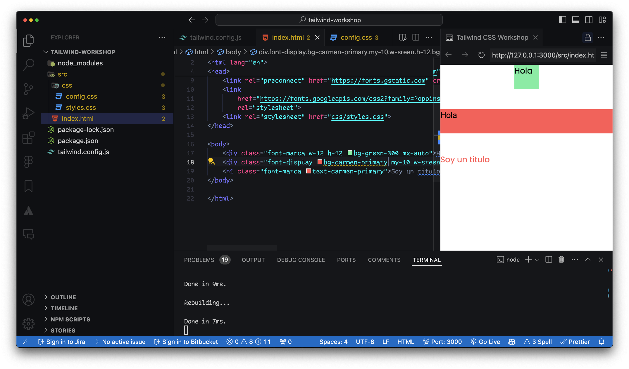
¿Cómo se personalizan los colores en Tailwind CSS?
/** @type {import('tailwindcss').Config} */
theme: {
    extend: {
      fontFamily: {
        "display": ['"Arial", "sans-serif"'],
        "marca": ['"Poppins", "sans-serif"'],
      },
      colors: {
        "carmen-primary": "#FF6363",
        "carmen-secondary": {
          100: "#E2E2D5",
          200: "#888883",
        },
      },
    },
  }
<!-- index.html -->
<div class="bg-primary text-secondary p-4">
Custom Colors
</div>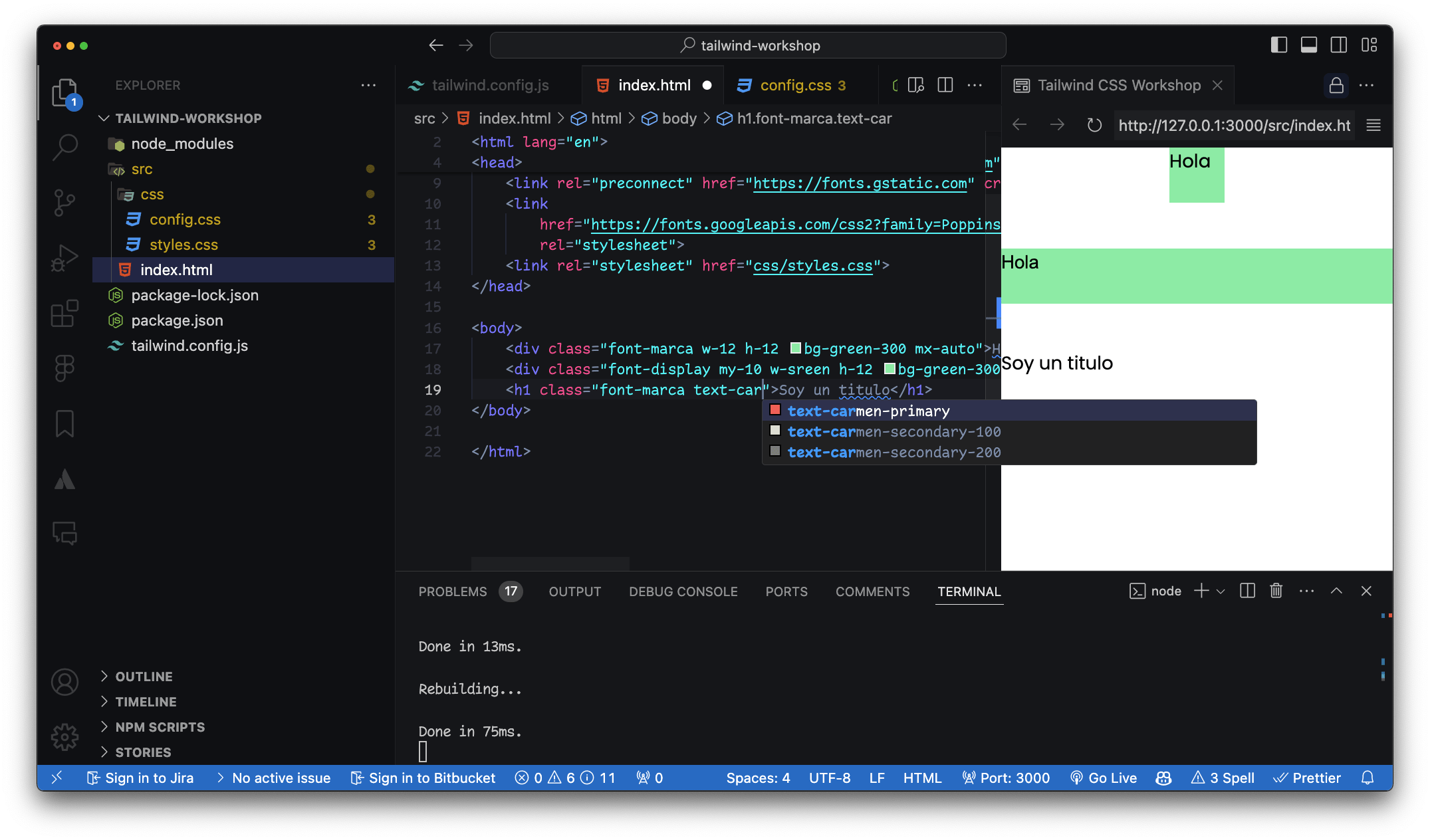
¿Y si quiero agregar un nuevo valor?
Puedes agregar nuevos valores a las propiedades / clases de utilidad
Pregunta 2:
¿Cómo se crean clases personalizadas en Tailwind CSS?
La directiva @apply
En nuestro archivo CSS
/* input.css */
.btn-custom {
  @apply bg-primary text-white py-2 px-4 rounded-lg shadow-lg;
}
<!-- index.html -->
<button class="btn-custom">
  Custom Button
</button>
Pregunta 3:
¿Cómo se maneja el diseño responsive en Tailwind CSS?
Layout
CSS Grid y Flexbox
<!-- index.html -->
<div class="bg-blue-500 p-4 sm:bg-green-500 md:bg-red-500 lg:bg-yellow-500 xl:bg-purple-500">
  Responsive Box
</div>class="w-[90%]"Pregunta 4:
¿Cómo se añaden transiciones y animaciones en Tailwind CSS?
<!-- index.html -->
<button class="bg-blue-500 text-white py-2 px-4 rounded transition duration-500 ease-in-out transform hover:bg-red-500 hover:scale-105">
  Hover me
</button>
Pregunta 5:
¿Cómo se instalan y utilizan plugins en Tailwind CSS?
// tailwind.config.js
module.exports = {
  plugins: [
    require('@tailwindcss/forms'),
    require('@tailwindcss/typography'),
  ],
}
Pregunta 6:
¿Cómo puedo utilizar valores personalizados para tamaños en Tailwind CSS?
// tailwind.config.js
module.exports = {
  theme: {
    extend: {
      spacing: {
        '72': '18rem',
        '84': '21rem',
        '96': '24rem',
      },
    },
  },
}
<!-- index.html -->
<div class="w-72 h-84 bg-gray-200">
Custom Spacing
</div>Pregunta 7:
¿Cómo puedo aplicar estilos condicionales para diferentes estados de un elemento (hover, focus, etc.)?
<!-- index.html -->
<input class="border-2 border-gray-300 focus:border-blue-500 focus:outline-none" type="text" placeholder="Focus me">
Pregunta 8:
¿Cómo puedo gestionar el responsive design con Tailwind CSS utilizando breakpoints específicos?
<!-- index.html -->
<div class="text-sm sm:text-base md:text-lg lg:text-xl xl:text-2xl">
  Responsive Text
</div>
Pregunta 9:
¿Cómo se manejan las clases de utilidad para el grid en Tailwind CSS?
<!-- index.html -->
<div class="grid grid-cols-3 gap-4">
  <div class="bg-blue-500 p-4">1</div>
  <div class="bg-green-500 p-4">2</div>
  <div class="bg-red-500 p-4">3</div>
</div>
media queries
Repaso en la documentación
@layer components {
    .btn {
        @apply bg-blue-500 text-white font-bold py-2 px-4 rounded;
    }

    .my-area {
          grid-template-areas:
          "header"
          "navigation"
          "social-media"
          "logo"
          "footer";
      }

      .my-area-md {
          grid-template-areas:
          "logo           header      navigation"
          "social-media   navigation  footer"
          ;
      }
}
Pregunta 10:
¿Cómo se incluyo una fuente custom en Tailwind CSS?
¿Y los estilos de fuente?
Tailwind sólo tiene 3 clases para font-family
<link rel="preconnect" href="https://fonts.googleapis.com">
<link rel="preconnect" href="https://fonts.gstatic.com" crossorigin>
<link href="https://fonts.googleapis.com/css2?family=Poppins:ital,wght@0,100;0,200;0,300;0,400;0,500;0,600;0,700;0,800;0,900;1,100;1,200;1,300;1,400;1,500;1,600;1,700;1,800;1,900&display=swap" rel="stylesheet">
/** @type {import('tailwindcss').Config} */
module.exports = {
content: ["./src/**/*.{html,js}"],
theme: {
extend: {
fontFamily: {
"display": ['"Arial", "sans-serif"'],
"marca": ['"Poppins", "sans-serif"'],
}
},
},
plugins: [],
}Material UI
Como dependencia en el proyecto
Ejemplo práctico
Creación de un footer
Repositorio
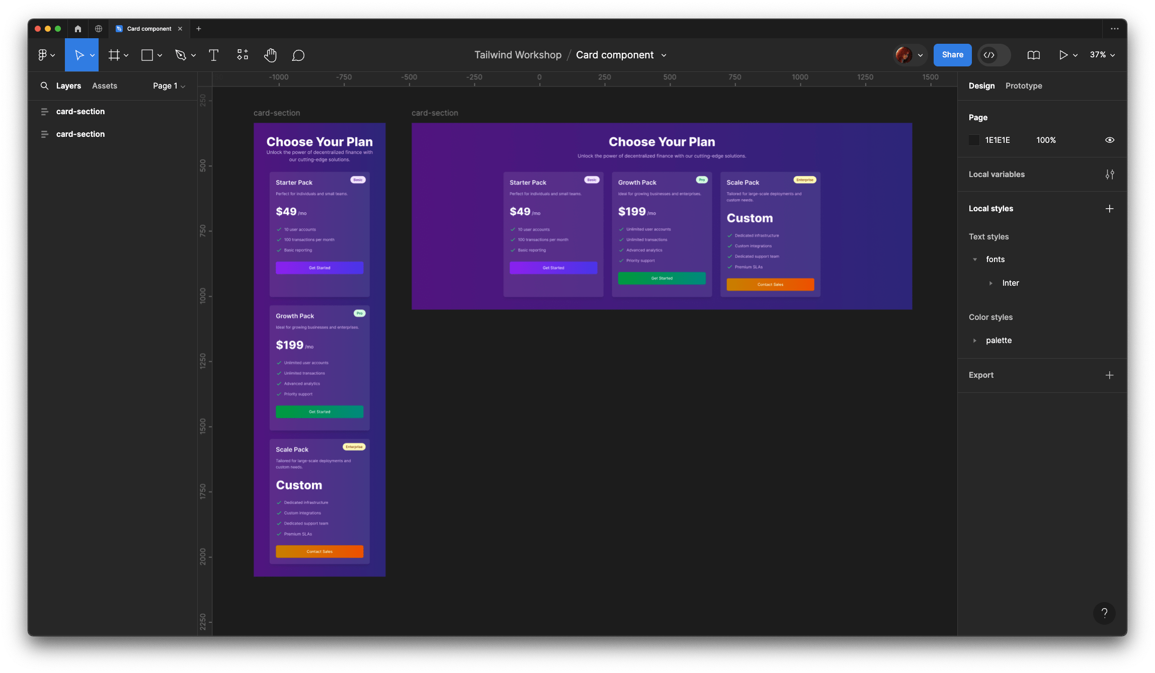
Creando una card
Con layout responsive