styled-components
8/30/17
The evolution of styling at Weedmaps


Charlie King - @thebringking
Who am I?
What's your relationship with CSS?
CSS
JS
Me
What's the right way to style a React application?
Whatever works for you and/or your team!
Your mileage may vary*
Basic Form
#usetheplatform

app/
├── scss/
│   ├── main.scss
│   ├── variables.scss
│   ├── mixins.scss
│   ├── my-component.scss
├── js/
│   ├── my-component.js
└── templates/
├── my-component.html- SCSS / LESS
- Seperation of Concerns
- Many tools available
- Simple
The Good
The Build
- Concatenation
- Autoprefixer
- Hashing?
app/
├── scss/
│   ├── main.scss
│   ├── variables.scss
│   ├── mixins.scss
│   ├── my-component.scss
├── js/
│   ├── my-component.js
└── templates/
    ├── my-component.html
Cognitive distance
...cognitive distances are mental representations of large-scale environmental distances that cannot be perceived from a single vantage point but require movement through the environment for their apprehension
The Ugly
Regressions, Regressions, Regressions
Globals
Unused CSS
Intermediate Form
CSS Module-ish

app/
├── components/
│   ├── my-component/
│   ├──  ├── index.js
│   ├──  ├── styles.scss
│   ├──  ├── my-component.test.js
import Styles from './styles.scss' // this is very much like CSS Modules
import withStyles from '@ghostgroup/universal-sass-loader/runtime' // but without modules and generated names
export default withStyles(Styles)(() => (
<div className="deal-claim">
<div className="deal-claim__content">
</div>
</div>
))@import '../../../styles/settings';
@import '~foundation-sites/scss/foundation';
.deal-claim {
&__content {
padding: rem-calc(18);
}
&__unclaimed-content,
&__claimed-content-upper {
align-items: center;
display: flex;
justify-content: space-between;
}
&__action-button {
background: none;
border-color: $iron;
color: $charcoal;
&:last-of-type {
margin-bottom: 0;
}
&:only-of-type {
margin-bottom: 1rem;
}
}
&__email-form {
align-items: center;
display: flex;
justify-content: space-between;
}
&__email-input {
@include input-base;
flex: 2.5;
margin-right: rem-calc(12);
width: 100%;
}
&__send-button {
flex: 1;
justify-content: center;
}
&__emailed-message {
color: $teal;
font-size: rem-calc(14);
font-weight: 600;
line-height: rem-calc(17);
}
}The Good
Cognitive distance is much lower, in the same folder
Uses SASS and all the great mixins and support libraries
Globals and class mis-use made harder, using BEM and encouraging (not enforcing) module scoped CSS
The Build
Webpack loader eliminates FOUC, inlines styles into the <head>
No unused CSS. Only modules rendered inject styles
The Ugly
You need a custom loader
Custom loaders, sometimes have issues with other tools (storybook, etc.)
BEM
Doesn't follow the spec (importing non-js files) #usetheplatform
Final form
styled-components

app/
├── components/
│   ├── my-component/
│   ├──  ├── index.js
│   ├──  ├── styled-components/
│   ├──  ├── ├── index.js
│   ├──  ├── ├── header.js
|   ├──  ├── ├── content.js
import { Flex, Box } from 'grid-styled'
import { Header, Content } from './styled-components'
export default () => (
<Flex column>
<Box width={1/2} px={2}>
<Header>
Some Header
</Header>
</Box>
<Box width={1/2} px={2}>
<Content>
Some Content
</Content>
</Box>
</Flex>
)// Header
import styled from 'styled-components'
import { rem } from 'polished'
export styled.h1`
font-size: ${rem(32)};
`;// Content
import styled from 'styled-components'
import { rem } from 'polished'
export styled.p`
font-size: ${rem(14)};
`;The Good
Cognitive distance is much lower, in the same folder of the same type! ++
Syntax and process the same (import, exports, etc)
import { Flex, Box } from 'grid-styled'
import { Header, Content } from './styled-components'

export default () => (
  <Flex column>
    <Box width={1/2} px={2}>
      <Header>
        Some Header
      </Header>
    </Box>
    <Box width={1/2} px={2}>
      <Content>
        Some Content
      </Content>
    </Box>
  </Flex>
)The Good
Class mis-use harder, module scoped CSS
The Good
Globals
import { injectGlobal } from 'styled-components';
import { normalize } from 'polished'

injectGlobal`
    html {
      box-sizing: border-box;
      > body {
        background-color: ${theme.colors.border};
      }
    }

    *, *:before, *:after {
      box-sizing: inherit;
    }

    body {
      margin: 0;
      font-family: ${theme.text.fontFamily};
      background: #F4F4F4;
    }

    ${normalize()}
  `;
The Good
Themes
import AppTheme from 'lib/styles/theme'
import media from 'lib/styles/media'

const Header = styled.div`
  background-color: ${({ theme }) => theme.colors.primary};
  color: ${({ theme }) => theme.colors.white};
  height: 56px;
  width: 100%;
  align-items: center;
  text-align: center;
  display: flex;
  overflow: hidden;
  ${media.large`height: 75px;`}
`;

Header.defaultProps = {
  theme: AppTheme
};

Header.propTypes = {
  theme: PropTypes.shape({
    colors: PropTypes.shape({
      white: PropTypes.string,
      primary: PropTypes.string
    })
  })
};
import { ThemeProvider } from 'styled-components'
import Header from 'components/header'
import AppTheme from 'lib/styles/theme'
export default () => (
<ThemeProvider theme={ AppTheme }>
<Header>
</Header>
</ThemeProvider>
)Look familiar?
  <GridView
    AllowsColumnReorder="true"
    ColumnHeaderToolTip="Employee Information">
    <GridViewColumn
        DisplayMemberBinding="{Binding Path=FirstName}"
        Header="First Name"
        Width="100"/>
      <GridViewColumn
         DisplayMemberBinding="{Binding Path=LastName}"
         Width="100">
        <GridViewColumnHeader>Last Name
           <GridViewColumnHeader.ContextMenu>
             <ContextMenu
                MenuItem.Click="LastNameCM_Click"
                Name="LastNameCM">
                <MenuItem Header="Ascending" />
                <MenuItem Header="Descending" />
             </ContextMenu>
           </GridViewColumnHeader.ContextMenu>
        </GridViewColumnHeader>
    </GridViewColumn>
  </GridView>
XAML (WPF, Silverlight)
<LinearLayout xmlns:android="http://schemas.android.com/apk/res/android"
   android:layout_width="match_parent"
   android:layout_height="match_parent"
   android:paddingLeft="16dp"
   android:paddingRight="16dp"
   android:orientation="horizontal"
   android:gravity="center">
    <TextView
        android:id="@+id/text_view_id"
        android:layout_height="wrap_content"
        android:layout_width="wrap_content"
        android:text="@string/hello" />
 </LinearLayout>
Android UI
+ the cascade!
import { Flex, Box } from 'grid-styled'
import { Header, Content } from './styled-components'
import { BlueSection } from '../components/blue-section'

export default () => (
  <BlueSection>
    <Flex column>
      <Box width={1/2} px={2}>
        <Header>
          Some Header
        </Header>
      </Box>
      <Box width={1/2} px={2}>
        <Content>
          Some Content
        </Content>
      </Box>
    </Flex>
  </BlueSection>
)
// BlueSection
import styled from 'styled-components'
export default styled.section`
color: blue;
`;
The Build
Webpack loader eliminates FOUC, inlines styles into the <head>
No unused CSS. Only modules rendered inject styles
No custom loaders! Can optimize with Babel only
Can use tree-shaking, closure compiler to reduce bundle size. Just JS
The Build
Single JS bundle(s)
Definitely doesn't #usetheplatform
The Ugly
Double parse
Hot-reloading in Chrome 😭
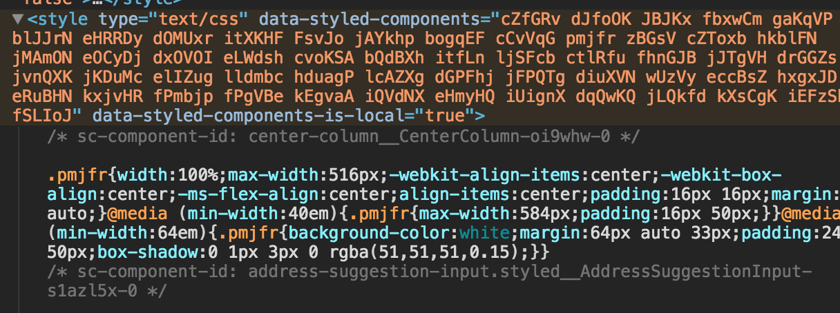
Obfuscated Source, non-semantic output
Editor support, nesting string literals, ugh
Questions / Comments?
Play with it here ^