A2 Media Studies Evaluation: Question 2
Charlotte Upham
How effective is the combination of your main products and ancillary texts?
Synergy
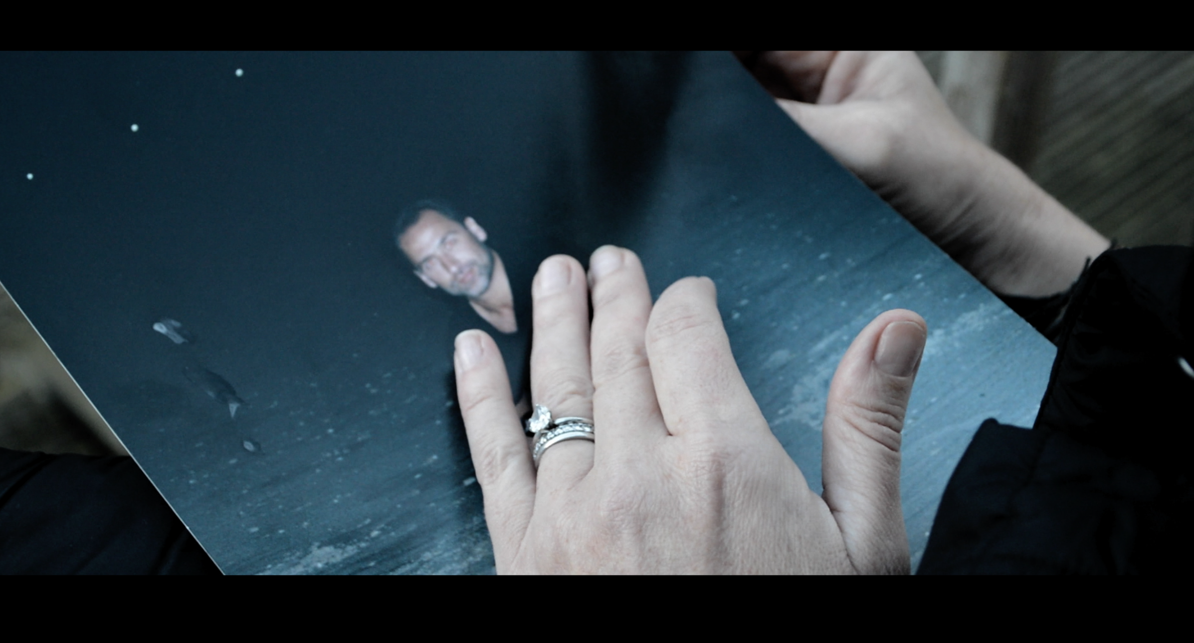
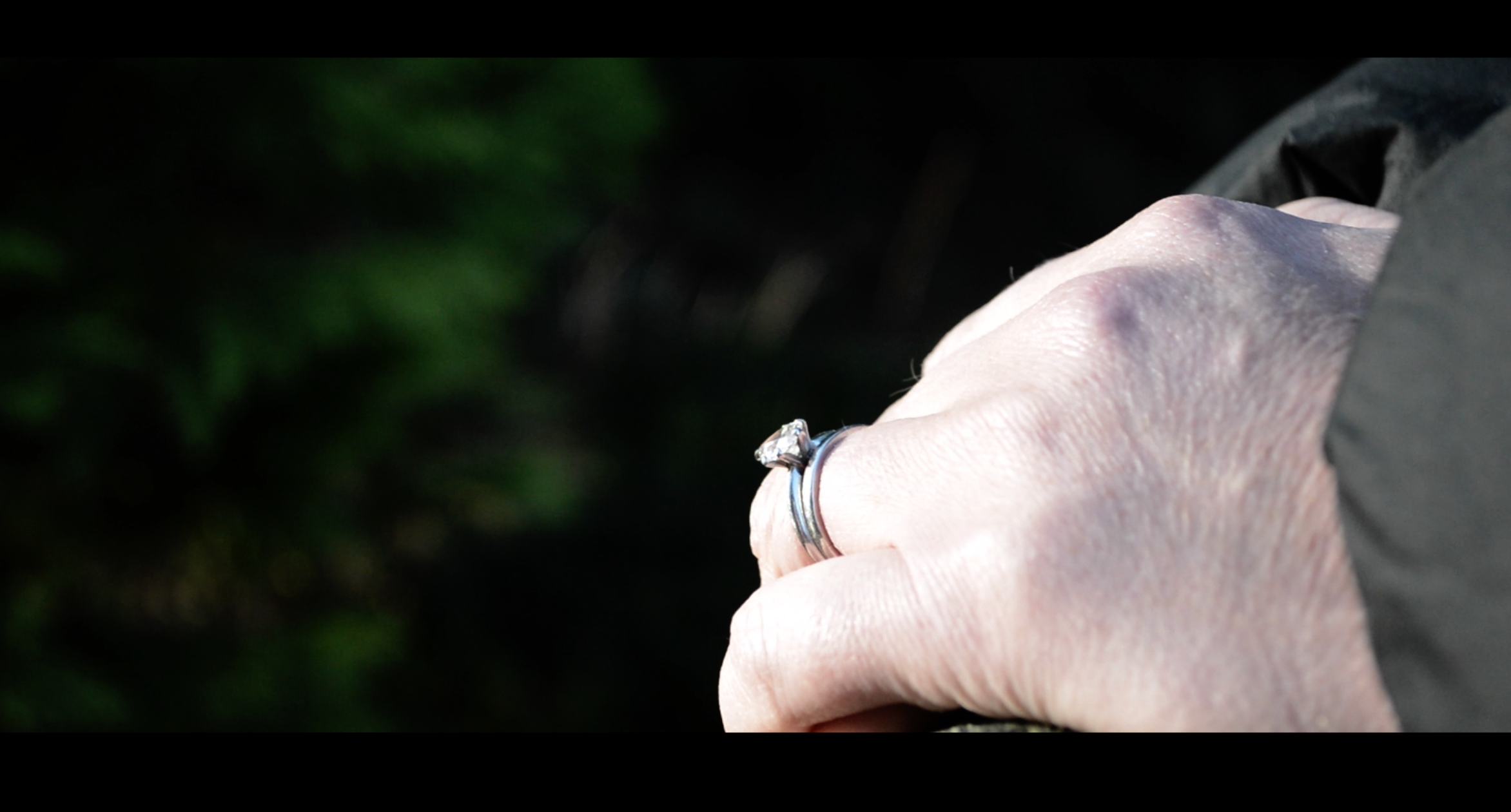
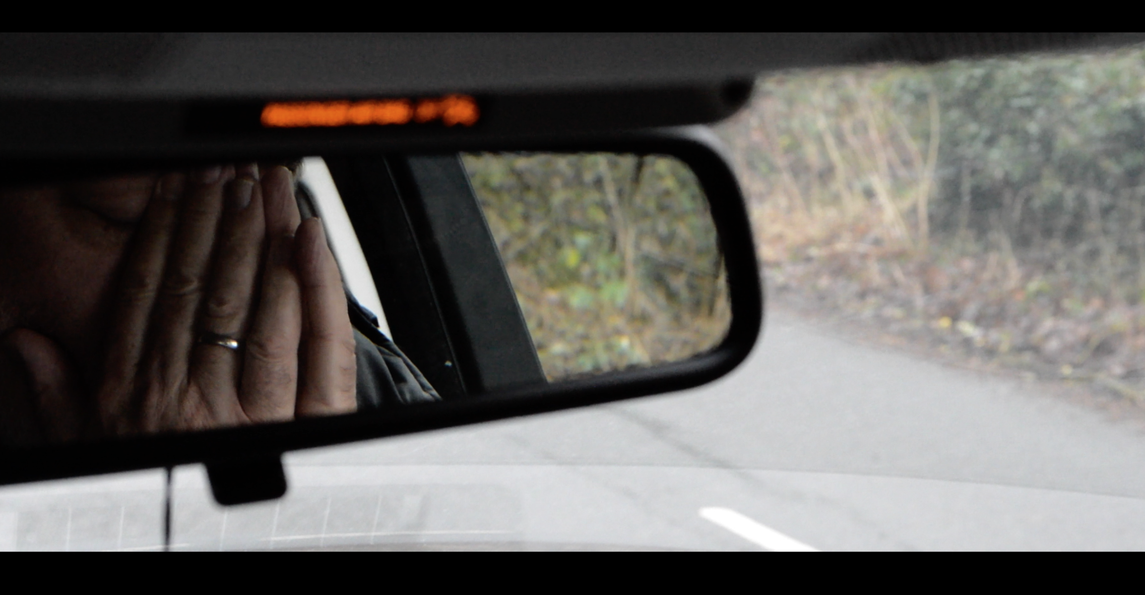
I have created synergy between all of my products by including repeated motifs, contrasting frames and still images that exhibit low-key and high-key lighting to evoke different emotional responses (also noted on my DigiPak and Magazine Advert designs) and editing that demonstrated a consistent “mood” evident in all three of my products. My music video is not sparse when it comes to being full of repeated signs. This is specifically demonstrated through the use of the repeated motif of hands; an element that I intended to use to establish clear symbolism throughout the film, with audiences being able to decipher both the obvious denotations as well as the connotations.
audience reception
In line with Reception Theory, the repeated motif is symbolic of the bond that the two actors share and the unwavering desire that they feel and as a producer, thus making it the dominant message that is woven through the text and that I want audiences to accept. However, it is entirely up to the audience whether or not they choose to accept the dominant message, to make a negotiated interpretation or a completely oppositional one.

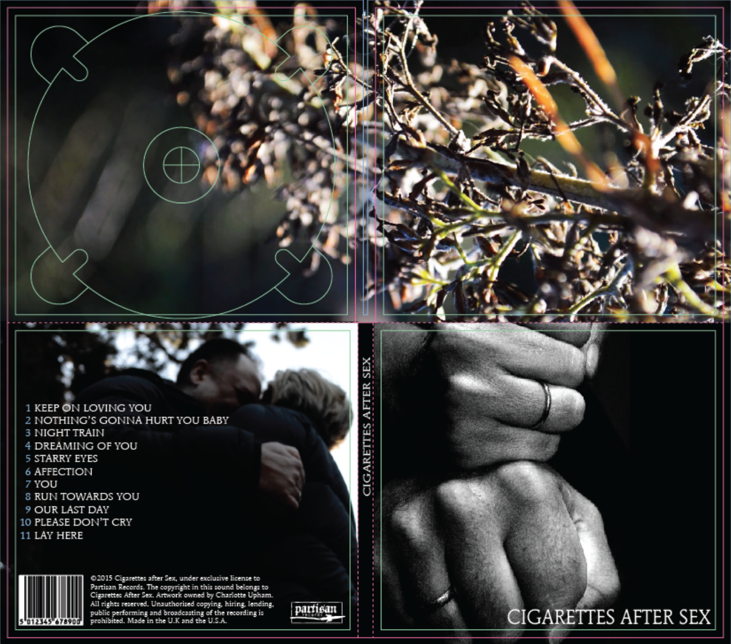
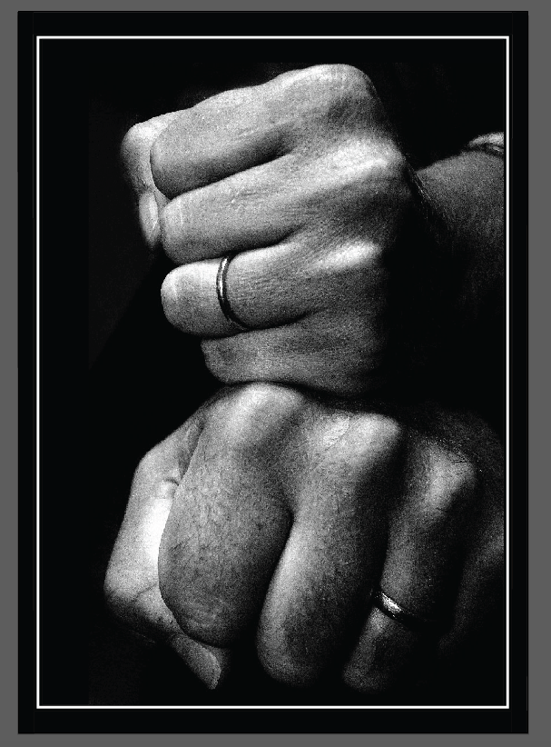
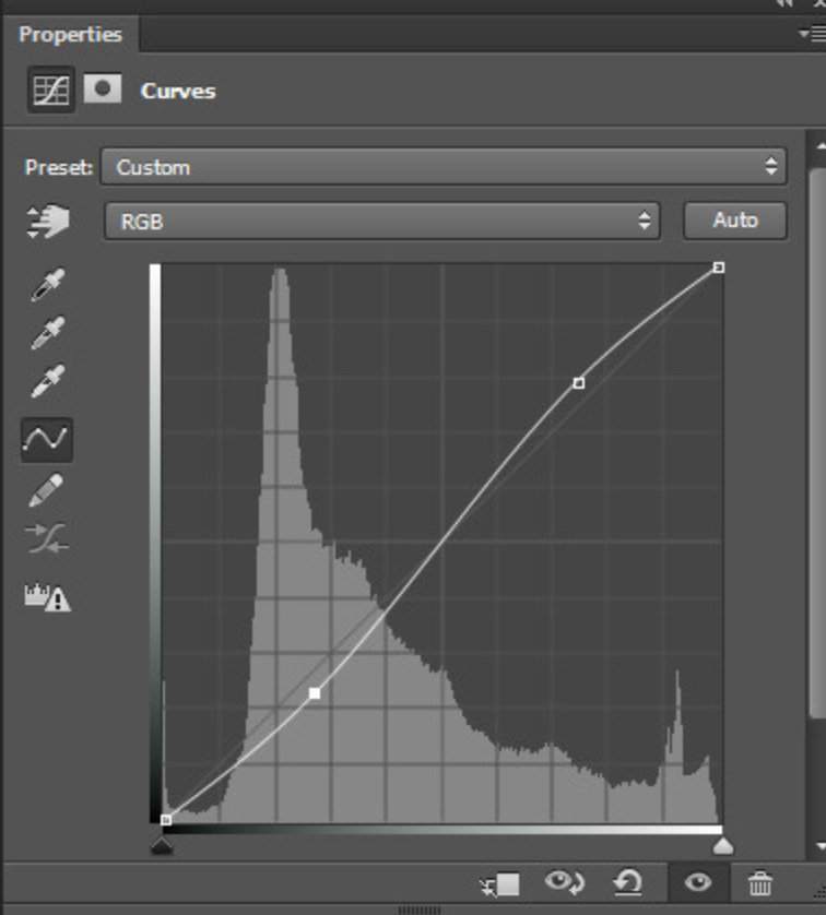
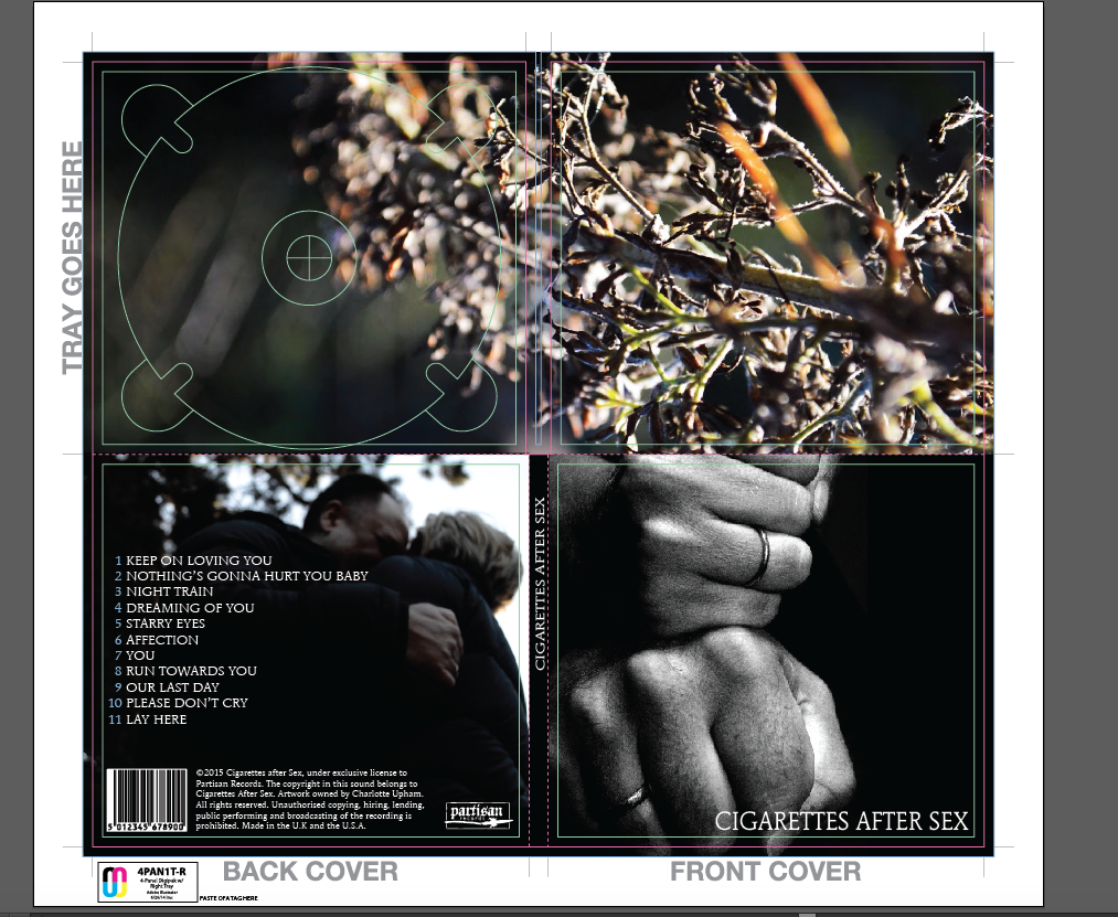
On my DigiPak design, I included a horizontal image of the hands and previously edited the image using Photoshop and a function called ‘Curves’ to maintain the monochromatic design as seen throughout all of my products. In terms of my magazine advert, another image of the actors’ hands is included in the final design, albeit a different image – this time with a portrait orientation. Again, to further reinforce the synergy between my products, I edited the image using the same process as I did with the first – Photoshop and the ‘Curves’ function.
ANCILLARY PRODUCT: DIGIPAK

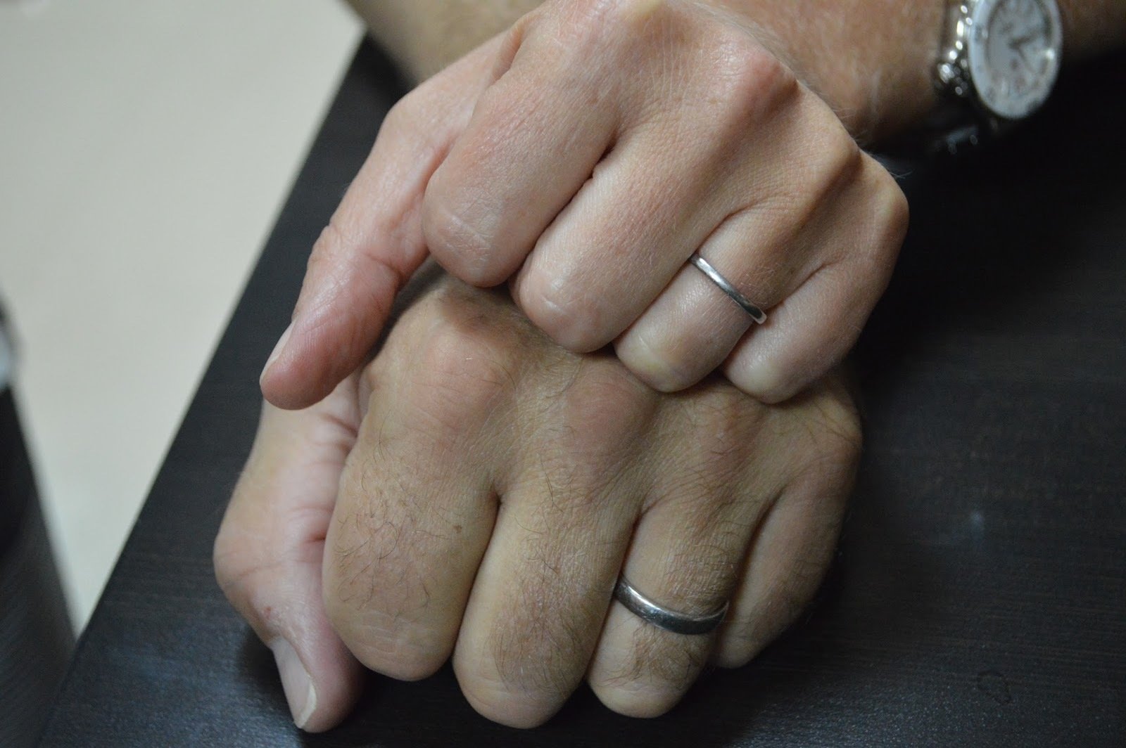

To emphasise the symbolic nature of the hands, I used a selective colouring tool available in Photoshop that allowed me to look at the wedding rings in more detail. Throughout the editing process, I altered the rings so that they had a subtle glow, that when contrasted on a monochromatic background, stood out extremely well and reiterated my intention of reflecting on a relationship.
REpeated motif
The repetition of the motif ensures that there is complete synergy between all of my products whilst ensuring that my audience understands that all three products are meant to be interacted with as a collective group. As well as this, my audience is going to be able to associate the repeated images with my products, making it easily identifiable.
MUSIC VIDEO


MAGAZINE ADVERT
INITIAL DIGIPAK IMAGE
MUSIC VIDEO
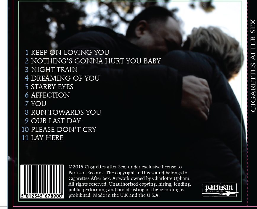
By sustaining frames and still images that exhibit contrasting low-key and high-key lighting across all of my products ensured a continuity in synergy and highlighted my intention of my products evoking emotional responses from my intended audience demographic. Throughout my music video, environments of high-key and low-key lighting are used to reflect the emotions of the characters, and by continuing this idea within the designs of my ancillary products, maintains a close relationship between my three products. The images on my final DigiPak design exhibit a still from my video and my own personal photography of the hands of the actors. A low-angled camera shot captures the actors in an embrace; featured on the back cover of the DigiPak with the hands of the male protagonist fairly obvious. To continue the symbolic design, the front cover is an image from my personal photography.


INSPIRATION
The designs of my ancillary products are relatively simplistic but effective - in keeping with the artists’ original style. Looking at the artwork produced by the artist, my ancillary products are similar, if not exact, to the style that they have used. The layout and overall design of my products will attract audiences simply because there is an element of intrigue and subtle ambiguity to the design, piquing audience interest and leading them to interact with the product.


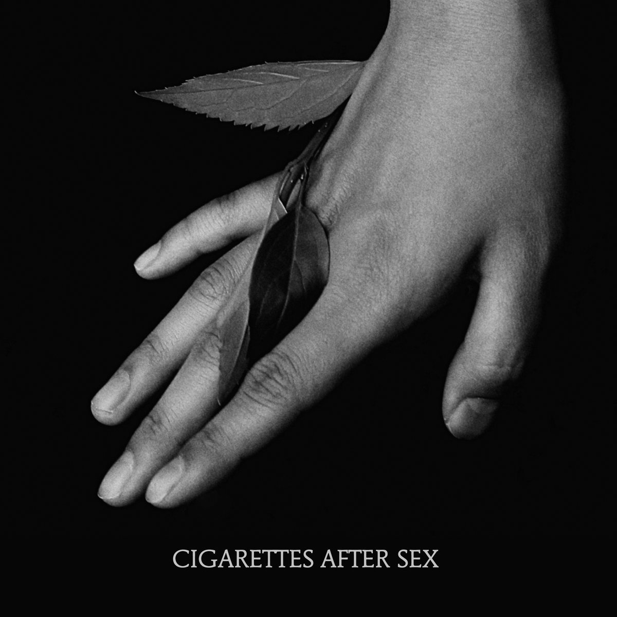
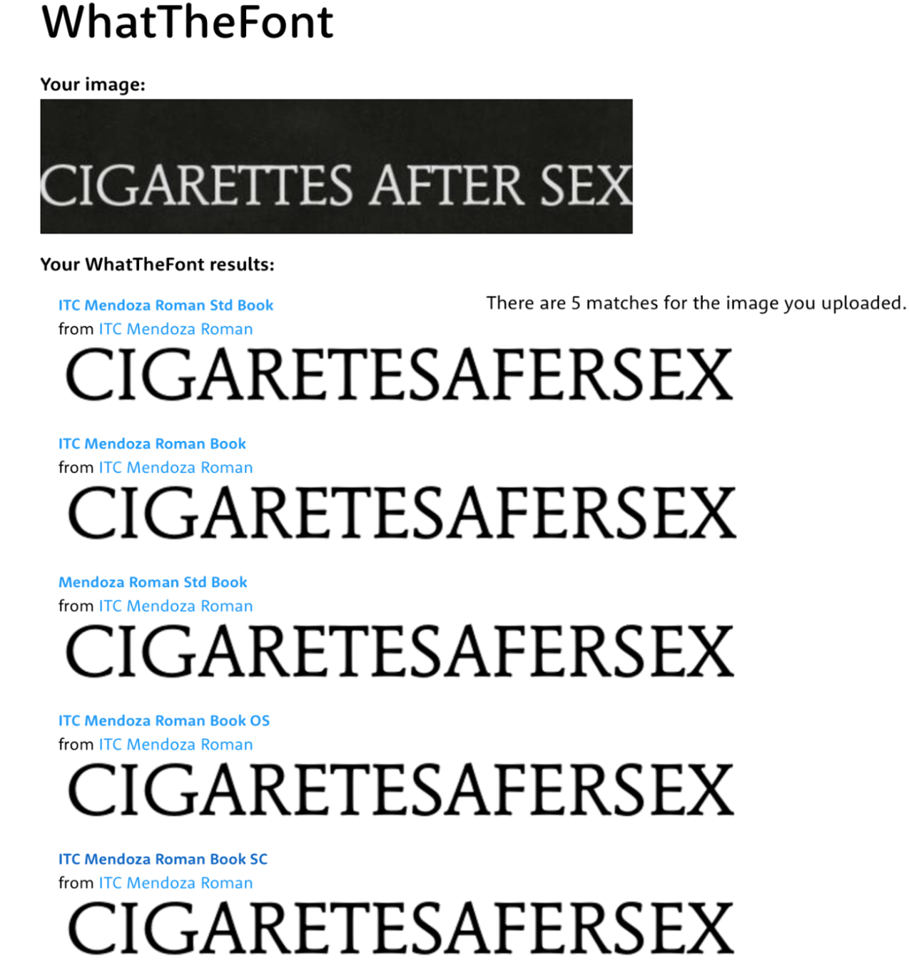
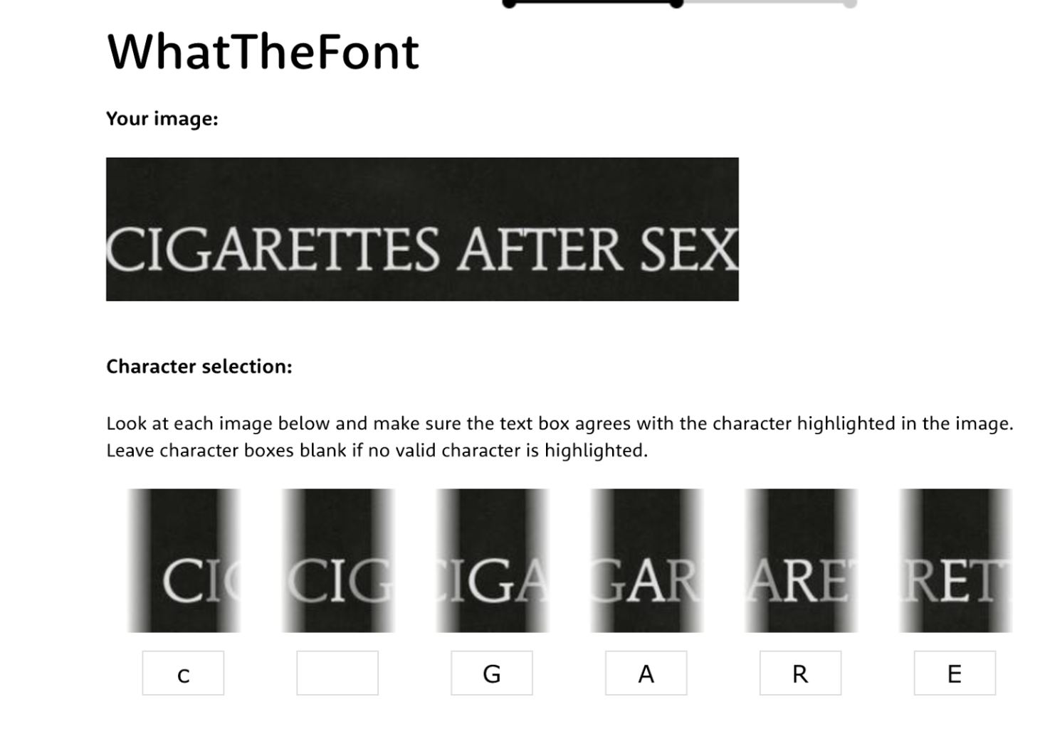
For example, the consistency of fonts should not go unnoticed. My ancillary products demonstrate the highest level of synergy through my consistency in my choice of font. Drawing inspiration from the original band posters, I took the font ‘ITC Mendoza Roman Book SC’ and utilised it throughout the track list on the DigiPak, the music reviews on the magazine advert and the name of the band (on both products). I made this creative choice because I knew that their already established fanbase would recognise the font and therefore associate my product package with their image.
FONT

COLOURING
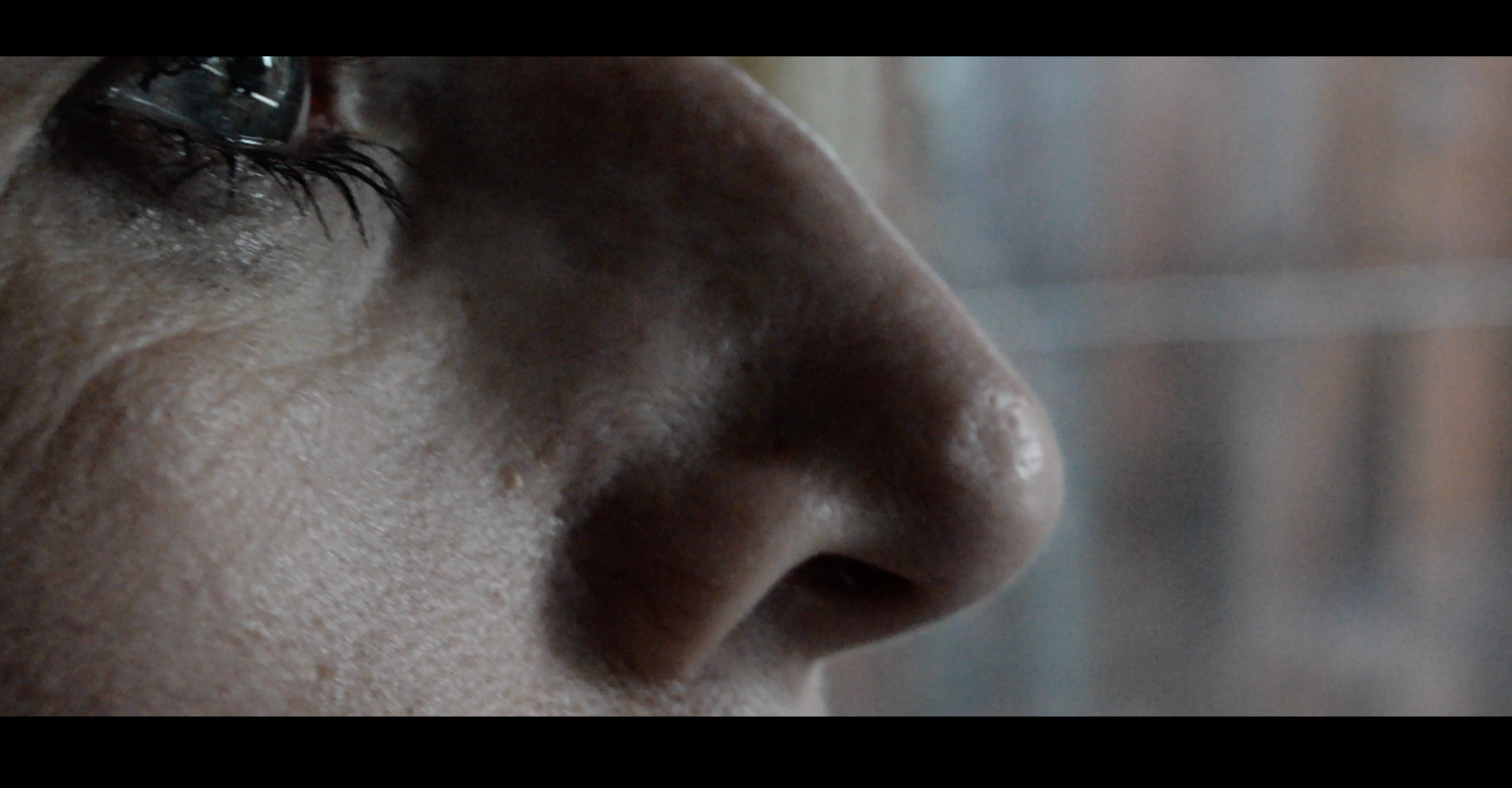
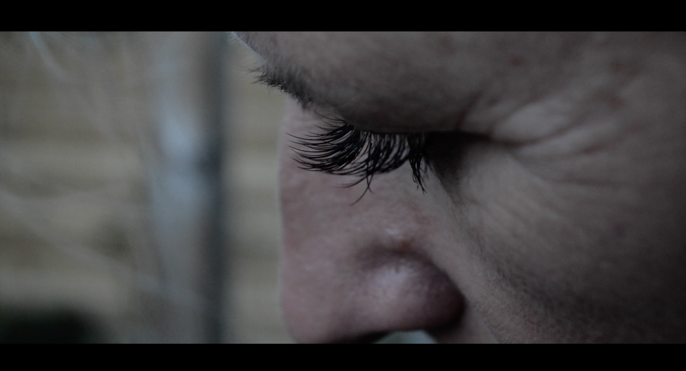
Demonstrated throughout all of my products is the consistency in colour and texture. Colour within my products is integral in conveying my message to audiences, as well as reflecting the mood of my creations. Firstly, in my music video, I utilise bright colours, accompanied with high-key lighting, to accentuate the happiness that both of the actors feel. More specifically, throughout establishing cuts and transition footage, I create a visual semantic field of peace and joy by editing the greens and yellows of the plants so that the emotional message becomes more obvious. In contrast, there are moments within the music video where I utilise darker colouring.



I have retained the idea that Colour Psychology is integral when coercing audience members to feeling certain emotions, thus, I edited certain frames so that they are extremely contrasted with the colourful footage in order to provoke certain emotional responses from audiences. Using Final Cut Pro X, I utilised the filter ‘Luma Keyer’ to exaggerate moments of sadness within the footage, as this filter enhanced the grittiness of the footage whilst sustaining heightened emotional impact.
COLOUR PSYCHOLOGY: MUSIC VIDEO
DIGIPAK COLOURING

The way in which I mirrored this utilisation of colour in my DigiPak was by taking still images from the actual music video and featuring them as an inside cover design. To replicate the emotive response that I wanted audiences to infer from the DigiPak design, I took a still from the video that exhibited a plant, complemented with extreme high-key lighting and I edited the image so that the highlights were accentuated – this was done in Photoshop using Curves.
As well as utilising a bold coloured inside cover image, I also adapted the monochromatic images into the design. Thus, linking back to my aforementioned point about the repeated motif of the hands that tie the products together in complete synergy. The hand image was utilised on the front cover of the DigiPak design, as the ambiguous yet stunning image provides an enigma for audiences to engage with, thus coercing them to interact with my product.
MAGAZINE ADVERT DESIGN

The magazine advert, however, features a noticeable lack of colour. I did this as I took inspiration from the original band magazine adverts and tour posters, and found that even with the lack of colour, the advert was extremely successful. Again, to reinforce the idea of a symbiotic relationship between my products, the hands yet again make an appearance on the design. This is to ensure that the repeated images are going to be associated with Cigarettes After Sex and my products – thus creating new iconography for audiences to identify with. As with my other designs, I wanted to keep the magazine advert relatively simple but captivating with enigmatic, mysterious iconography. Noted here, the wedding rings yet again are included on the design, thus reinforcing my overall message of my products: reflecting an intimate relationship. I decided to keep the design minimalistic because I didn’t want to bombard the audience with colourful or brash images and fonts, as this doesn’t fulfill my intention. The enigma code of the hand on the design pique audience interest and urges them to interact with my products.
RELEVANCE TO 21st CENTURY MEDIA
QR CODE LINK

SOUNDCLOUD LINK
iTUNES LINK
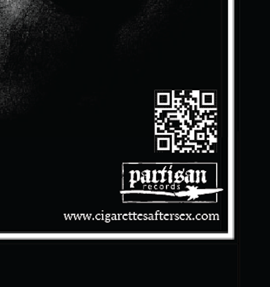
As well as keeping the design relatively simple, I also included features that make the product easily accessible for audiences to interact with. Features such as a QR Code that links audiences to the bands’ official website means that the advert is keeping up with 21st Century social media developments, ensuring the advert maintains it’s relevance to todays society. Furthermore, icons make the audience aware of the alternative platforms that the song is available on. With audiences made aware of the different platforms of which to access the song on, ensures that I am maintaining maximum engagement with a 21st Century audience and ensuring that my product can be advertised all over the internet to reach other audience demographics.
final THOUGHTS
Overall, all of my products met the high standards that I intended to achieve throughout the creative design process and I couldn’t be more impressed with the outcome. They conform to genre conventions, but they also challenge them – thus evidencing my knowledge on how to manipulate conventions but still being able to keep them appropriate to the context and intention.

