Building Components without Borders
by Ryan edge
Ryan Edge
I build multiplatform applications for Web, Desktop, and Mobile
I ❤️ Flutter and React

We're not here to talk about CSS border properties
We're here to talk about frameworks
What’s wrong with frameworks?

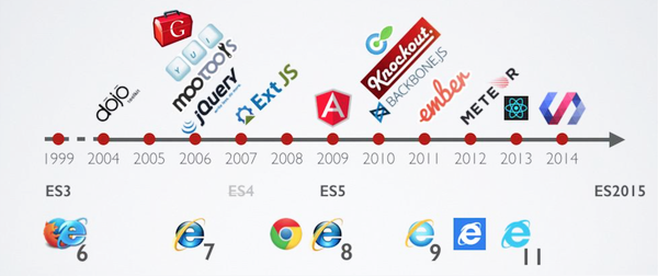
What's wrong with frameworks? The browser
- Rapid change over decades
- An influx of ideas from various backgrounds
- inputs fuel experimentation, excitement, and adaptation
Every

Frameworks...
- Cannot keep up with browser changes
- Require complete buy-in
- Migrating = rewrite
Make us productive so we love them.
No matter how much businesses want the ability to reuse components, JavaScript frameworks as we know them are never going to deliver interop. It’s called “framework churn” and not “component mixing” because to adopt the new thing the old one must be plowed under. - Alex Russell
But first, what are Web Components?
Web Components are...
-
Performant Browser APIs that rely on the web's component model
- Shadow DOM
- HTML Templates
- Custom Elements
- Encapsulated ways to create custom, reusable HTML tags
- Framework agnostic
Web Components power...
Apple Music*
USA Today
Coca-Cola
Diligent
EA
OlaCabs
Microsoft
Amazon
Bloomberg
Netflix
GitHub
Salesforce**
Adidas
Porsche
Samsung
To build Web Components, we'll use a popular library called Stencil
- Developed by Ionic
- Compiles to framework-agnostic components
Isn't Stencil a Framework?
- Stencil is a framework for building component libraries
- Abstracts the complexity of web components
- Framework-like component syntax
Who uses Stencil?

Would you like to know more?
Architecture of a Stencil Component
The Component decorator
@Component({
  tag: "fancy-tag",
  scoped: true,
  styles: `
    :host {
      display: inline-block;
    }
  `,
})
The Component decorator creates the custom element (like Angular).
The component definition
export class FancyTag {
  /**
   * Button variant - grey, success, error, alert, secondary
   */
  @Prop() variant: "grey" | "success" | "error" | "alert" = "grey"

  render() {
    const classes = cc([containerCls, this.variant])

    return (
      <Host>
        <div class={classes}>
          <div>
            <slot />
          </div>
        </div>
      </Host>
    )
  }
}
The style definition
const containerCls = css`
  border-radius: 13px;
  text-align: center;
  > div {
    padding: 5px 11px;
  }

  &.alert {
    background-color: ${colors.alert};
    > div {
      background-color: rgba(255, 255, 255, 0.35);
    }
  }

  &.success {
    background-color: ${colors.success};
    > div {
      background-color: rgba(255, 255, 255, 0.75);
    }
  }
`
Putting it all together
- Use adapters for React
- Straightforward elsewhere

Show me the code!
Wrapping up
- Frameworks & Web Components 👍
- Browser APIs & framework churn 💩
- Stencil solves developing pains 😊
Wrapping up
