Python 資料分析
講師:乘一、溫室蔡
NumPy & Matplotlib
何謂資料分析
從資料中「看出什麼」的過程
可分為三個步驟:
一、資料獲取
二、資料處理
三、資料視覺化
EX:爬蟲
EX:多項式擬合
EX:折線圖
萬能的 Python
這些東西在 Python 都有專門的套件處理
而 NumPy 與 Matplotlib
就分別對應到處理與視覺化的部分


- Python 標配
- 陣列、矩陣運算
- 方便的數學函式
- 以C語言撰寫,高效能
談談線性代數
談談線性代數
向量:
自原點向外延伸的箭頭
以其在各軸上的分量表示
談談線性代數
純量乘法:
箭頭沿線縮放
分量逐項相乘
談談線性代數
向量加法:
箭頭頭尾相接
分量逐項相加
談談線性代數
向量減法:
箭頭頭頂相連
分量逐項相減
談談線性代數
向量內積/點積:
逐項相乘後各項總和
談談線性代數
矩陣:
有 列(rows) 行(columns)的矩陣
圖為 矩陣
談談線性代數
矩陣的幾何意義:
與向量相乘,以對該向量進行特定的空間變換
如旋轉矩陣:
談談線性代數
矩陣乘法:
兩矩陣 的維度分別為 與
則相乘後得到矩陣 維度為
且第 列第 項
談談線性代數
談談線性代數
談談線性代數
談談線性代數
談談線性代數
談談線性代數
NumPy 實際應用
NumPy 非內建套件
可以在終端機使用 pip 安裝:
$ pip install numpy在 Python 中如下引入:
import numpy as npNumPy 的核心:多維陣列
陣列就是裝了多個元素的東西
a = np.array([1, 2, 3])
print(a) # [1 2 3]
b = np.array([[1, 2], [3, 4], [5, 6]])
print(b)
# [[1 2]
#  [3 4]
#  [5 6]]
如果陣列裡面裝陣列,那就是二維陣列
陣列裡面的陣列裝陣列,那就是三維陣列
NumPy 的核心:多維陣列
ndarray (n-dimensional array)
a = np.array([[1, 2], [3, 4], [5, 6]])
# 幾乘幾的陣列
print(a.shape) # (3, 2)
# 幾維的陣列
print(a.ndim)  # 2
# 裝什麼型別
print(a.dtype) # dtype('int64')
可由 np.array() 轉換 Python 陣列而來
其有一些重要的屬性:
多維陣列索引
a = np.array([[1, 2, 3], [4, 5, 6], [7, 8, 9]])多維陣列索引
print(a[0]) # [1 2 3]多維陣列索引
print(a[0, 2]) # 3多維陣列索引
print(a[1:]) # [[4 5 6]
# [7 8 9]]多維陣列索引
print(a[:, 1]) # [2 5 8]多維陣列索引
print(a[[0, 2], [0, 2]]) # [1 9]多維陣列方法
a = np.array([1, 2, 3, 4, 5, 6])

# 轉換成 3x2 矩陣
print(a.reshape(3, 2))
# [[1 2]
#  [3 4]
#  [5 6]]

# 轉換型別
print(a.astype(float))
# [[1. 2.]
#  [3. 4.]
#  [5. 6.]]

# 矩陣轉置
print(a.T)
# [[1 3 5]
#  [2 4 6]]
ndarray 有一些常用的方法:
要注意的是這些方法
都不會修改原來的陣列
而是回傳修改後的陣列
NumPy 四則運算
a = np.array([6, 8, 2])
b = np.array([1, 9, 4])

# 加法
print(a + b) # [7 17 6]

# 減法
print(a - b) # [5 -1 -2]

# 純量加減法
print(a + 5) # [11 13 7]

# 純量乘法
print(2 * a) # [12 16 4]

# 逐項乘法(非向量內稽!)
print(a * b) # [6 72 8]

# 內積
print(np.dot(a, b)) # 86
花式建陣列
# 從 Python 陣列建立
print(np.array([4, 3, 9])) # [4 3 9]

# 建立全為 0 的陣列
print(np.zeros(5)) # [0. 0. 0. 0. 0.]
# 3x2 零陣列
print(np.zeros((3, 2)))
# [[0 0]
#  [0 0]
#  [0 0]]

# 建立全為 1 的陣列
print(np.ones(4)) # [1. 1. 1. 1.]

# 用類似 range() 的方法建矩陣
print(np.arange(1, 10, 2)) # [1 3 5 7 9]

# 在範圍內產生平均分布的 n 個點
print(np.linspace(2.0, 3.0, 20))
# [2.         2.05263158 2.10526316 2.15789474 2.21052632 2.26315789
#  2.31578947 2.36842105 2.42105263 2.47368421 2.52631579 2.57894737
#  2.63157895 2.68421053 2.73684211 2.78947368 2.84210526 2.89473684
#  2.94736842 3.        ]

# 生成隨機陣列
np.random.rand(2, 5) # 2x5, [0, 1) 平均分布
np.random.randn(4, 3) # 4x3, 標準常態分布
np.random.randint(1, 10, size=(5, 3)) # 5x3, [1, 10) 整數平均分布
NumPy 的龐大函式庫
a = np.arange(5)
print(a) # [0 1 2 3 4]
# 三角函數
print(np.sin(a)) # [ 0.          0.84147098  0.90929743  0.14112001 -0.7568025 ]
print(np.cos(a)) # [ 1.          0.54030231 -0.41614684 -0.9899925  -0.65364362]
print(np.tan(a)) # [ 0.          1.55740772 -2.18503986 -0.14254654  1.15782128]
# 次方
print(np.power(a, 2)) # [ 0  1  4  9 16]
# 平方根
print(np.sqrt(a)) # [0.         1.         1.41421356 1.73205081 2.        ]
# 自然對數
print(np.log(a)) # [      -inf 0.         0.69314718 1.09861229 1.38629436]
# 最大最小值
print(np.max(a)) # 4
print(np.min(a)) # 0

# ...
NumPy 內建了大量的數學函式
大部分都是「逐項套用」
Vectorizing functions
def relu(x):
    return x if x > 0 else 0

vrelu = np.vectorize(relu)

a = np.random.randn(5)
print(a)
# [ 0.86929017 -0.42837333  2.03339915  0.27163138 -0.41706056]
print(vrelu(a))
# [ 0.86929017  0.          2.03339915  0.27163138  0.        ]
NumPy 也可以讓你把自己的函式
變成可以「逐項套用」的版本
使用 np.vectorize()
NumPy 是一個非常強大的數學函式庫
但目前為止,我們都只能看到一堆數字
解讀資料時,顯然需要更視覺化的方式
Matplotlib
- 繪製各式圖表
- 與numpy連用
- 建構在MATLAB的基礎上
- 可以製作會動的圖表
Matplotlib 架構
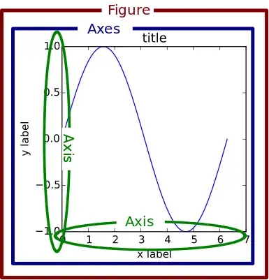
Figure: 空白畫布
axis: 坐標軸
axes: 一套座標軸
subplot: 子圖
Matplotlib 架構

Matplotlib 實際應用
Matplotlib 非內建套件
一樣在終端機使用 pip 安裝:
$ pip install matplotlib在 Python 中如下引入:
import matplotlib.pyplot as plt輸出折線圖
import matplotlib.pyplot as plt
year = [1960, 1970, 1980, 1990, 2000, 2010, 2020]
population = [3.032, 3.682, 4.433, 5.28, 6.114, 6.922, 7.764]
fig = plt.figure() #建立畫布
ax = fig.add_subplot(111) #增加一個子圖
ax.plot(year,population) #畫上x,y軸及資料
plt.show() #輸出折線圖
plt.show()
輸出折線圖
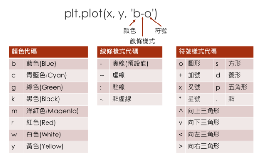
plt.plot(x,y,'style-code')
import matplotlib.pyplot as plt
year = [1960, 1970, 1980, 1990, 2000, 2010, 2020]
population = [3.032, 3.682, 4.433, 5.28, 6.114, 6.922, 7.764]
plt.plot(year, population, "b-o") #畫出折線圖
plt.show() #輸出折線圖
plt.show()
輸出折線圖
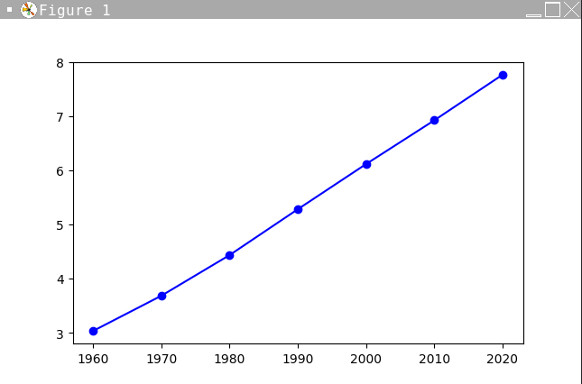
輸出折線圖
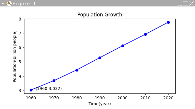
加入文字?
plt.title("string"): 寫入標題
plt.xlabel('string'): x軸標題
plt.ylabel('string'): y軸標題
plt.text(xp, yp, 'string'): 在圖上xp, yp的位置寫字
p的位置寫字
import matplotlib.pyplot as plt
......
......
plt.title("Population Growth")
plt.xlabel("Time(year)")
plt.ylabel("Population(billion people)")
plt.text(1962,3.032,"(1960,3.032)")
plt.show()
加入文字?
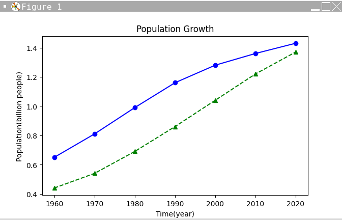
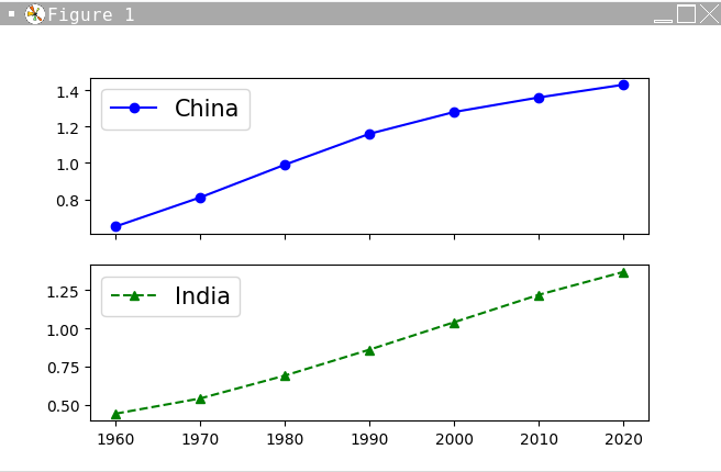
多筆數據?
import matplotlib.pyplot as plt
year = [1960, 1970, 1980, 1990, 2000, 2010, 2020]
y1 = [0.65, 0.81, 0.99, 1.16, 1.28, 1.36, 1.43] #中國人口
y2 = [0.44, 0.54, 0.69, 0.86, 1.04, 1.22, 1.37] #印度人口
plt.plot(year, y1, "b-o", year, y2, "g--^") #畫出折線圖
plt.title("Population Growth")
plt.xlabel("Time(year)")
plt.ylabel("Population(billion people)")
plt.show()
多筆數據?
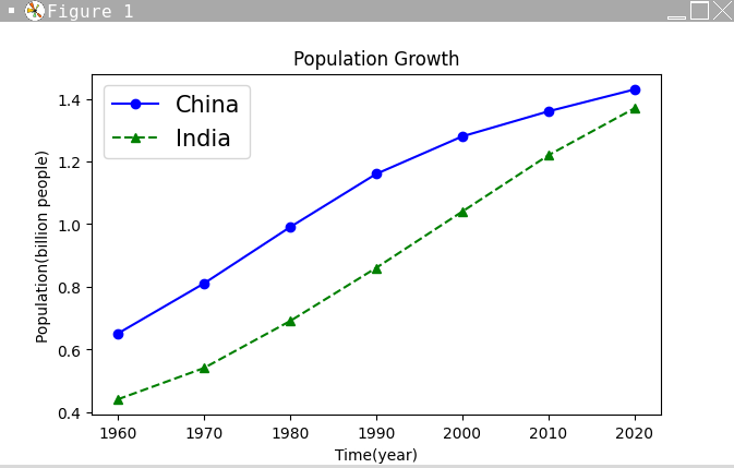
圖示說明?
import matplotlib.pyplot as plt
......
......
plt.legend(["China", "India"], loc="best", fontsize=15) #設定圖例
plt.show()
plt.legend([list of legend text],loc='location')
location: 'best'、'upper right'......
更多設定看這裡
圖示說明?
自訂坐標軸
plt.xticks([tick marks],[mark labels]) :x軸刻度、標記
plt.yticks([tick marks],[mark labels]) :y軸刻度、標記
plt.xlim([min,max]) : x坐標軸下、上界
plt.ylim([min,max]) : y坐標軸下、上界
自訂坐標軸
import matplotlib.pyplot as plt
#......
#......
plt.xticks([1960,1965,1970,1975,1980,1985,1990,1995,2000,2005,2010,2015,2020])
plt.ylim([0,2])
plt.show()
多張圖表
plt.subplots(m,n,sharex='...',sharey='...')
m,n: 垂直、水平方向上有幾張圖
sharex,sharey: 共用x,y軸座標,可填入:
'col': 垂直方向小圖共用
'row': 水平方向小圖共用
'all': 全部小圖共用
'false'(default): 不共用(預設)
在同一個視窗畫出m*n張圖表
多張圖表
在同一個視窗畫出m*n張圖表
import matplotlib.pyplot as plt
year = [1960, 1970, 1980, 1990, 2000, 2010, 2020]
y1 = [0.65, 0.81, 0.99, 1.16, 1.28, 1.36, 1.43]
y2 = [0.44, 0.54, 0.69, 0.86, 1.04, 1.22, 1.37]

fig,ax = plt.subplots(2,1,sharex = "col")
#建立畫布(fig)及劃分2*1個子圖,垂直方向共用x座標軸
ax[0].plot(year, y1, "b-o")  #在左上數到右下第0個(但他只有一維)
ax[1].plot(year, y2, "g--^") #畫出折線圖
ax[0].legend(["China"], loc="best", fontsize=15)
ax[1].legend(["India"], loc="best", fontsize=15)
plt.show()
多張圖表
換個方法?
import matplotlib.pyplot as plt
year = [1960, 1970, 1980, 1990, 2000, 2010, 2020]
y1 = [0.65, 0.81, 0.99, 1.16, 1.28, 1.36, 1.43]
y2 = [0.44, 0.54, 0.69, 0.86, 1.04, 1.22, 1.37]

ax1 = plt.subplot(211)
ax2 = plt.subplot(212)
ax1.plot(year, y1, "b-o")
ax2.plot(year, y2, "g--^") #畫出折線圖
ax1.legend(["China"], loc="best", fontsize=15)
ax2.legend(["India"], loc="best", fontsize=15)
plt.show()
plt.subplot(m,n,i) m*n圖表中的第i個
多張圖表
在同一個視窗畫出m*n張圖表
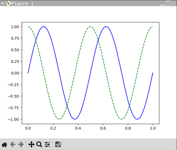
與numpy連用
創建sin圖形與cos圖形
import matplotlib.pyplot as plt
import numpy as np

x = np.linspace(0,1.0,1000)
#創建一個從0到1,共1000個平均分布元素的陣列
y1 = np.sin(4*np.pi*x)
y2 = np.cos(4*np.pi*x)
plt.plot(x,y1,"b-",x,y2,"g--")
plt.show()
與numpy連用
創建sin圖形與cos圖形
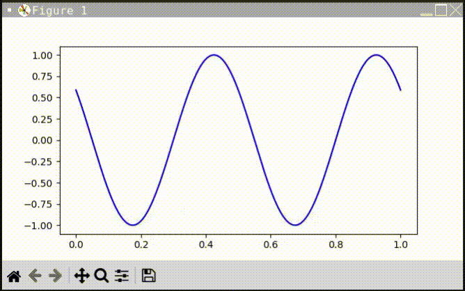
我想讓圖表動起來...
plt.ion() : 打開互動模式,圖表才會更新
set_data(x, y) : 更新x, y資料
fig.canvas.draw() : 重新繪圖
fig.canvas.flush_events() : 輸出新圖表
我想讓圖表動起來...
import matplotlib.pyplot as plt
import numpy as np
plt.ion()
x = np.linspace(0,1.0,1000)
#創建一個從0到1,共1000個平均分布元素的陣列
y = np.sin(4*np.pi*x)
fig,ax = plt.subplots() #建立畫布
pic, = ax.plot(x,y,'b-')
i=0
while True:
    i+=0.01
    ux = np.linspace(0,1.0,1000)+i
    uy = np.sin(4*np.pi*ux)
    pic.set_data(x,uy) #重新設定x,y資料
    fig.canvas.draw() #重新繪圖
    fig.canvas.flush_events()
我想讓圖表動起來...
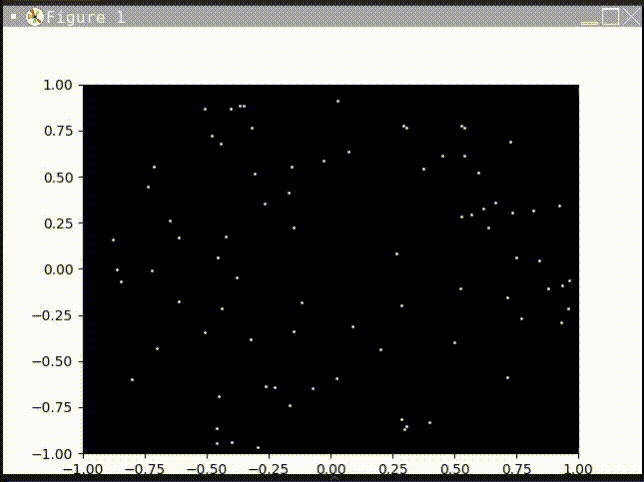
實際演練!
讓矩陣旋轉起來吧!
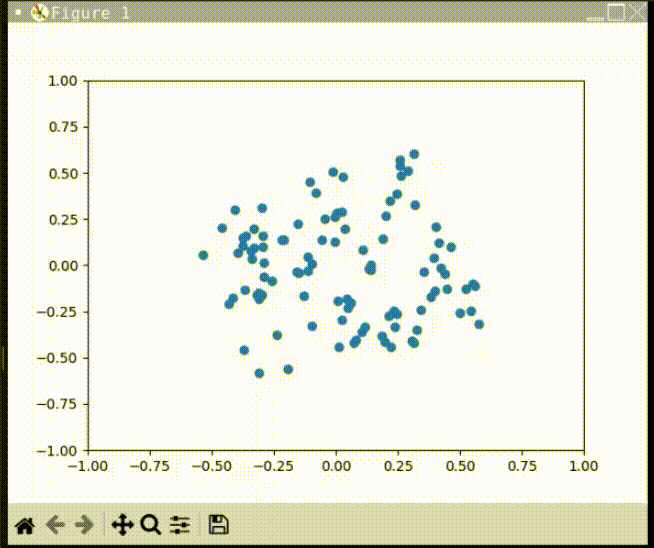
實際演練!
讓矩陣旋轉起來吧!
import numpy as np
import matplotlib.pyplot as plt

def rotate(vectors, theta):
    rotmat = np.array([
        [np.cos(theta), -np.sin(theta)],
        [np.sin(theta),  np.cos(theta)]
    ])
    return np.dot(rotmat, vectors)

if __name__ == '__main__':
    npoints = 100
    points = np.random.rand(2, npoints)-0.5
    plt.ion()
    fig, ax = plt.subplots()
    ax.set_xlim(-1, 1)
    ax.set_ylim(-1, 1)
    markers, = ax.plot(points[0], points[1], 'o')
    while True:
        points = rotate(points, 0.1)
        markers.set_data(points[0], points[1])
        fig.canvas.draw()
        fig.canvas.flush_events()
The end!