Survey Data Basics
Ryan Clement
Middlebury College
Data Services Librarian
May 4, 2021
What are we covering?
- Types of data
- Survey data basics -- what to look at
- Some useful techniques and visualizations for looking at your data
- Questions about using Qualtrics to look at data
- Suggestions for other tools
What are we NOT covering?
- Rigorous statistical analysis
- How to use R/other tools
Survey Data
what kind of data do we have?
Different types of data
- Categorical/nominal data
- Ordinal data
- Ratio data
- Real number data
- Natural language
Categorical/nominal data
- Constrained to "categories" -- can be characters or numbers
- Race, gender, religion, yes/no, success/fail
- Yes/no, True/false are a subset known as binary data
- Cannot compare along a relative scale
- Cannot use mean/median, must use mode
- Very useful in creating crosstabs
Ordinal data
- Ordered along a scale, but the distances between categories are not known
- For instance, Likert scale questions -- 5 is higher than 4, but is my 5 the same amount higher than your 5?
- Other examples: Income brackets, highest level of education
- Can use to create a ranking, but cannot use other statistics -- What does "3.5 out of 5" mean?
- Look at relative numbers of responses, like nominal data
Interval data
- Order as well as the differences between responses (e.g. the "intervals") are known
- Fahrenheit/Celsius temps, time/date, income vs. spending
- No "true zero" -- negative values can exist, zero has meaning (it's not just "does not exist")
- Can say one value is "higher" than the other, but not necessarily "twice" as high
Ratio data
- Just like interval data, but now absolute zero has meaning and means "does not exist"
- Kelvin temp, height/weight, number of children, years of education, income
- Zero means "does not exist" -- so you can more easily say "X is 2x higher than Y"
Natural Language
- Written by the respondent themselves in a free-text field
- Usually needs to be coded in some way before it can be analyzed
- Can possibly use text analysis tools on this type of data too
- Age
- Grades
- Political party
- Number of poor mental health days in the past week
Mean, median, mode, and standard deviation
Describing the tendencies of data
Mode
- The value that occurs most often
- Almost completely unaffected by outliers
- Can be unimodal: [1, 1, 2, 2, 4, 4, 4, 5, 6, 6] or more
- [1, 1, 1, 2, 2, 3, 4, 4, 4] (bimodal)
- Often used for categorical data
Mean
- We're talking about the arithmetic mean (there are others)
- Often referred to as "the average"
- Calculated by adding up the values and dividing by the number of values: (1+1+2+4+5+5)/6 = 3
- Can be very sensitive to outliers:
- (1+1+2+4+5+20)/6 = 5.5
Median
- The "middle" value in data -- the number that separates the top half from the bottom half
- Calculated by lining up the values and finding the middle value: [1, 1, 2, 4, 4, 5, 5]
- If you have an even number, take the mean of the middle two values:
- [1, 1, 2, 4, 5, 5] -> (2+4)/2 = 3
- Less sensitive to outliers than the mean:
- [1, 1, 2, 4, 5, 5]
- [1, 1, 2, 4, 5, 20]
Standard Deviation
- Measure of how "spread out" the data is
- Need to use the mean to calculate (we won't get into that)
- Lower SD means numbers are mostly clustered around the mean, higher SD means they are more spread out (e.g. there is more variance)
A few useful visualizations + techniques
Look at summaries of your data
- What are type of data are all of your variables?
- How many "complete" cases do you have? (i.e. how much missing data do you have?) Is there meaning/pattern behind this?
- Look at the central trends in your data (mode, mean) - do they make sense?
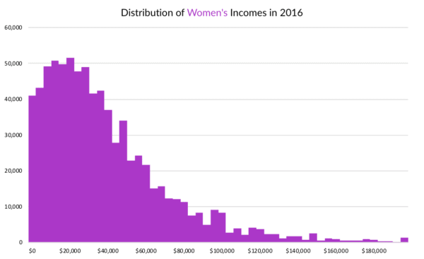
Distributions - histograms
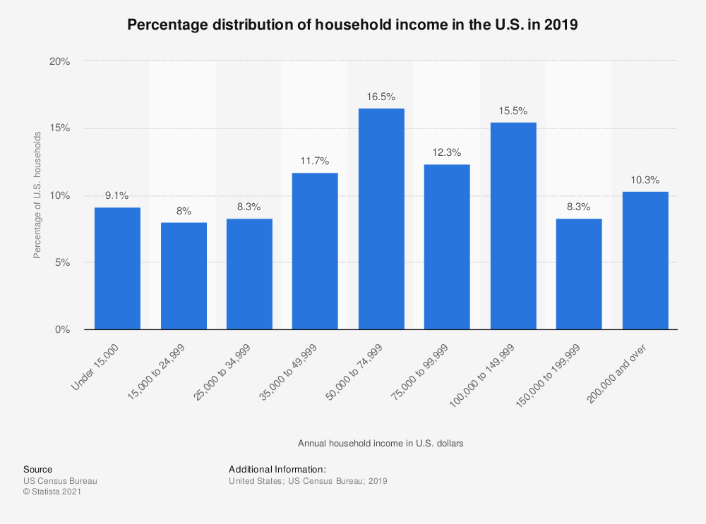
Distributions - bar charts
Distributions - pie charts

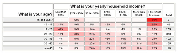
2 categorical variables - crosstabs
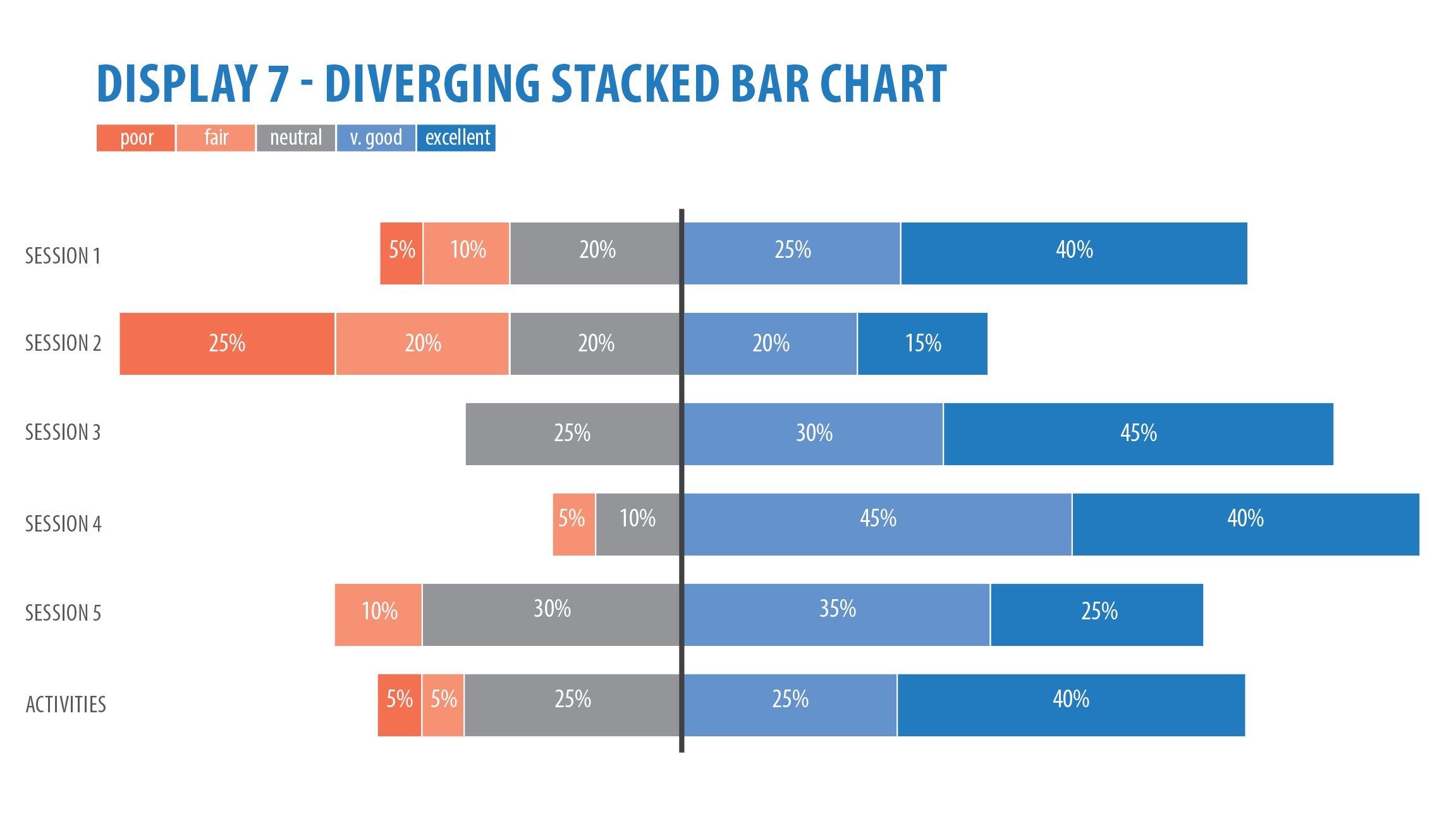
Likert scale data -- stacked bar charts
Tool Options
- Qualtrics -- just use the built-in visualizations and cross-tab tools!
- Excel -- export your data from Qualtrics and use Excel to manipulate and visualize your data
- Datawrapper, Infogram, Tableau (also has free student license) -- must use Excel (or something else) to clean and manipulate data first, but great for nicer/more complex visuals
- Voyant -- useful for simple text visuals (if you have a lot of "natural language" data)
- R + RMarkdown -- steeper learning curve, but great for cleaning/manipulating data, visualizing, and "writing" all in one