Understanding Editors
I've been building data visualizations to understand editor behavior.
I'll be sharing a few of the interesting observations that have come out of them.
This is a work in progress :-)
What are the observations we'll be looking at today?
- Editor retention has decreased in en, but the levels are higher in de, fr, zh etc.
- The decline in the monthly active editors in en could be a combined effect of the lower editor retention rate and a decrease in the number of new comers.
- Only the articles created in the early days (till about 2008) continue to see active edit activity.
Definitions
Active Editor
- An 'active editor' is a registered (and signed in) editor (not known as a bot) who makes 5 or more edits in a month in article space on countable pages. [1]
- SQL query
Editor Group
- Editors are grouped by the month of their edit.
- Eg: Editors who made their first edit in Jan 07 belong to the Jan 07 group.
- SQL query
Editor Retention
Calculating retention is a bit tricky.
We are going to use a very simple definition.
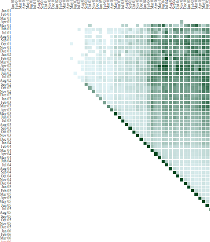
All the active editors joining in a month will be considered the total in the group.
We will then look at what % of them are active in every subsequent month.

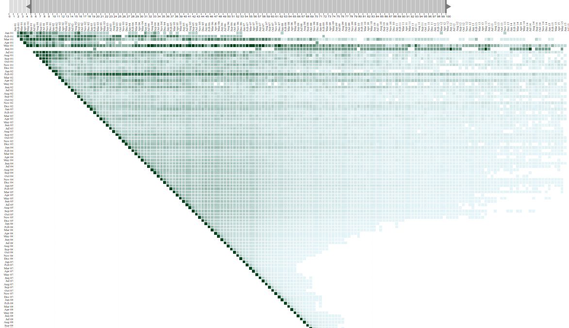
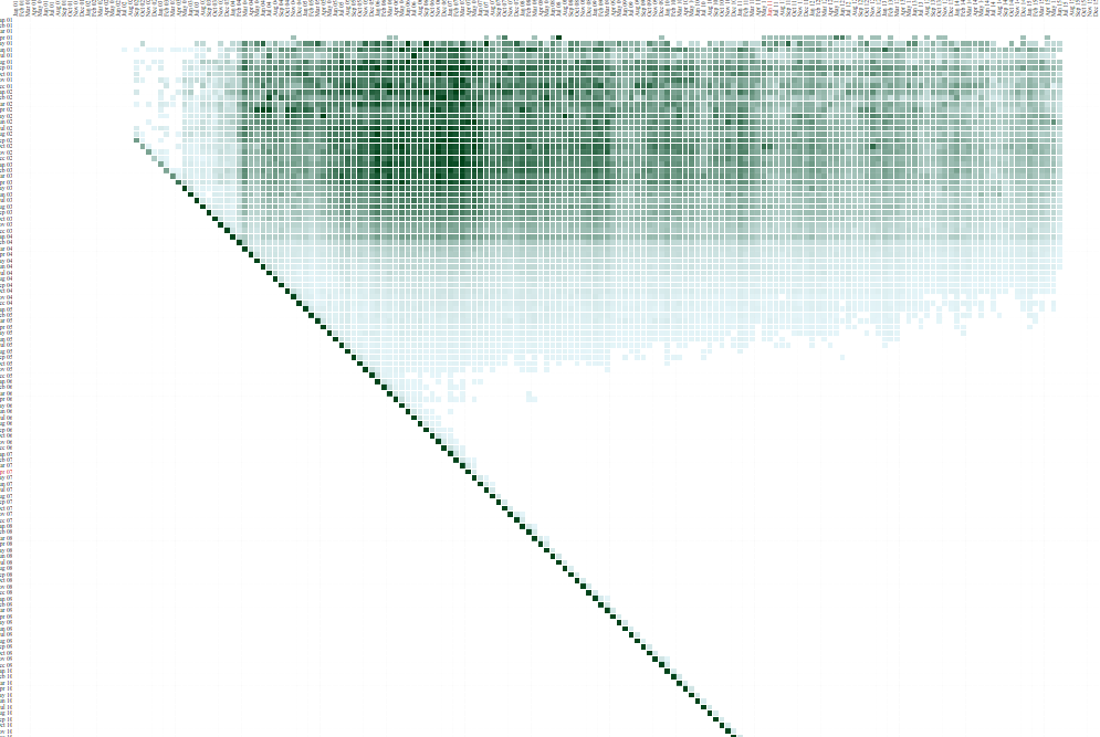
The groups are on the Y axis. Every row represents represents the activity of a group over its lifetime.

The X-axis shows the time in months

Filter by %
Filter by the % value of retention
Setting the retention levels at 5% - 100%, we see a slide starting in Dec 05 for en
Editor Longevity
- The editor retention levels starts falling in Dec 05, much before the peak active editor levels in March 07.
- The retention steadily fell and has reached a steady state these days.
- On avg these days only 5% active editors continue after 6-8 months of joining.
What about other languages?
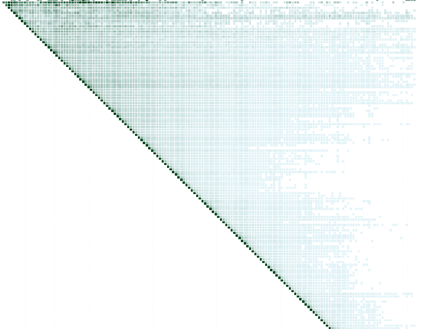
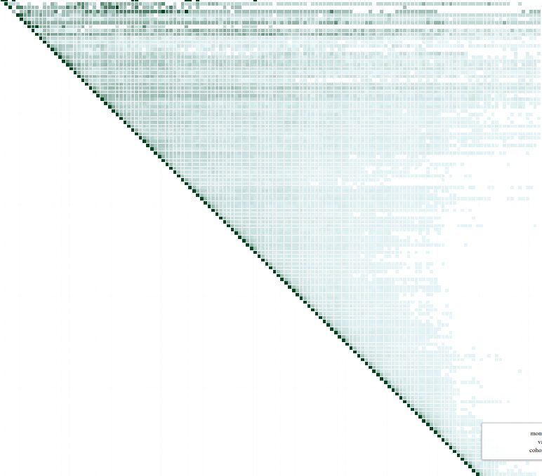
- de has a fall in retention too, but less than the case in en.
- zh has an increased retention of late.
de
ru
zh
Filtered at 5% - 100%
Monthly Editor Activity Graphs
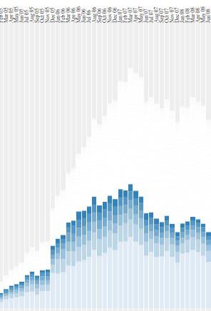
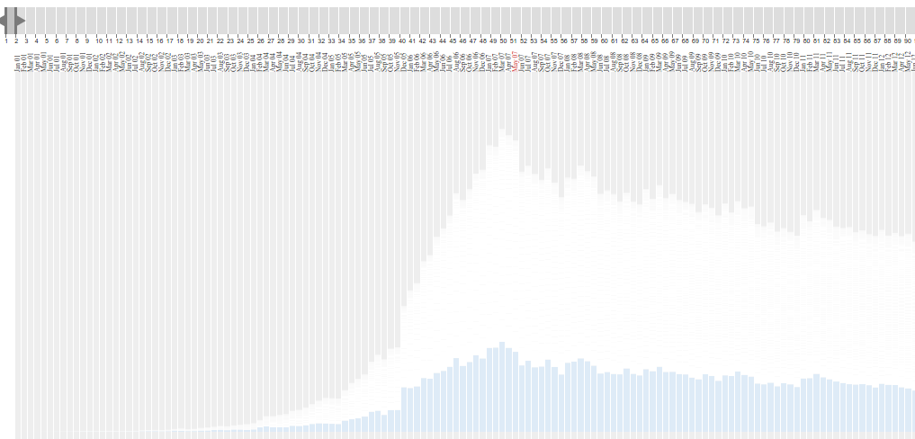
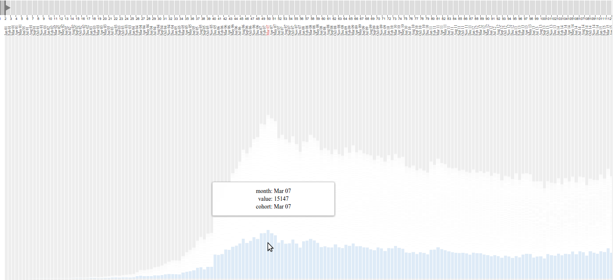
The activity of groups are stacked along the Y axis.
Time runs on the X axis
Filter
- Filter the monthly edit activity by contribution from different editor groups.

Filter by the age of a group in a month.
Lets filter to see only the contribution of active editors who newly join in a month.
Now we have selected the contribution of only the new comers in a month.
Eg : The contribution of only the new comers in a month
What have we seen?
- There has been a decline in the retention of editors.
- There has been a decline in the number of newly joining active editors.
- The decline in monthly active editors could be attributed to the combined effect of the fall in the retention of older editors and the decrease in the number of new editors.
Monthly activity graphs - de,fr,zh


de
fr
zh
Editor Retention Rate Change
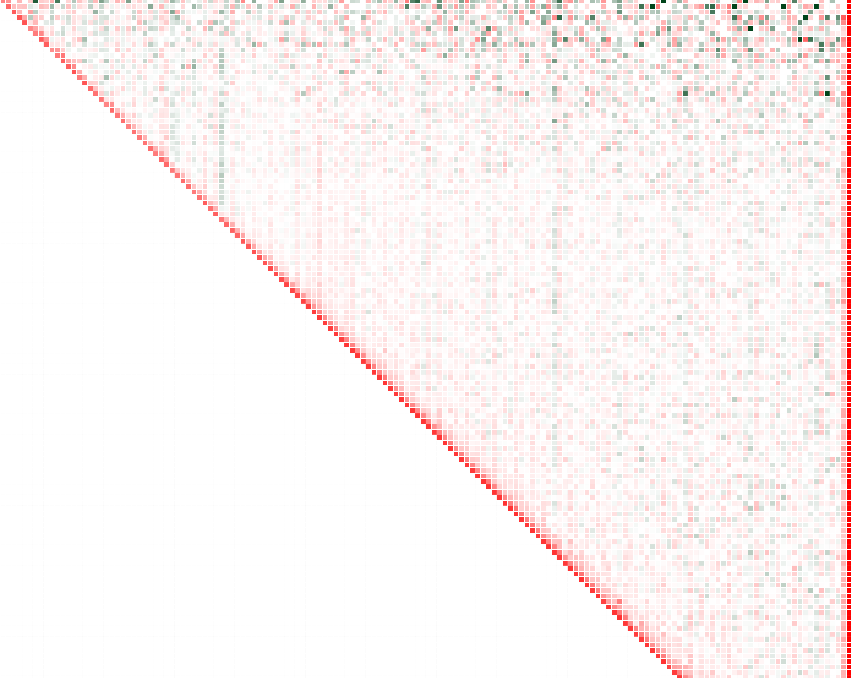
Editor retention rates - en. We can pick declines & spikes in monthly activity by looking at the vertical streaks of green & red. The spike are caused when a lot of older cohorts suddenly get active & the declines are similarly when their activity falls.
Seasonal Patterns
- If you look closely you'll notice that there is an increase in edit activity in winter.
- There is an increase in edit activity in the month of Jan. (en)
- You can find this in en, de etc.
Retention rate graph
- Retention in the first month these days is only 20%. (Only 20% survive to the 2nd month.)
- Even in the second month there is only a 50% retention rate.
- By the third month we only have about 10% of the active editors who joined in that cohort.
- We lose editors even in the second month of the cohort.
Article Edit Activity
Active Article
- An active article is defined as an articles which receives 5 >= edits/month.
- SQL Query
Article Group
- Articles are grouped by their month of creation.
- Eg: Articles created in Jan 07 belong to the Jan 07 group.
- SQL query
The groups are on the Y-axis.
Article group retention - de
Time is on the X-axis
Article Activity Retention
Article group retention for de filtered at 5%-100% levels. We see a fall for articles created after 2007.
What have we seen?
- Only the articles created till 2007 see continued editing.
- The articles in the subsequent groups see very little edit activity.
- Do we have a problem in surfacing editable articles?
- This is the case in all the major wikis.
Conclusions
Lets do more of data viz :-)
- The decline in monthly active editors could be attributed to the combined effect of the fall in the retention of older editors and the decrease in the number of new editors.
- Only the articles in the (beginning - 2007) groups continue to see active edit activity.
- Editor Retention rates are much higher in languages like de.
- We have seasonal edit activity in languages like en, de etc.
Ideas I'm working on
Relevant Links
Contact
jephpaul@gmail.com
Jeph_paul
Questions
- Are we losing editors because they can't find content they can edit? Content they can contribute to?
Thank You
The graphs look very different when we define "edits >=100 as an active editor".
