Visualizing Editor Trends
What are the results we'll be looking at today?
- The monthly decline in active editors in en may be attributed to the old timers. We see this across other languages too.
- Only the articles in the (beginning - 2007) cohorts continue to see active edit activity.
- Retention rates are much higher in languages like de.
- zh (continues to show uptrend on many fronts. Active Editors, retention etc).
Monthly Editor Activity Graphs
Definitions
Active Editor
- An 'active editor' is a registered (and signed in) person (not known as a bot) who makes 5 or more edits in a month in mainspace on countable pages. [1]
- SQL query
Editor Cohort
- Editors are grouped by the month of their edit.
- Eg: Editors who made their first edit in Jan 07 belong to the Jan 07 cohort.
- SQL query
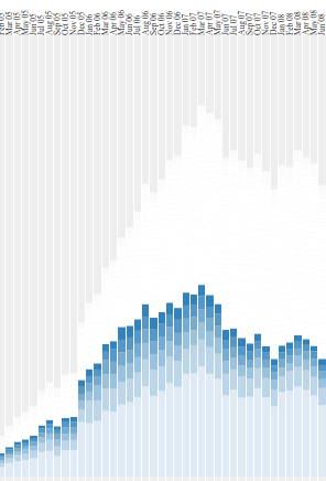
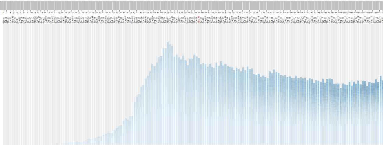
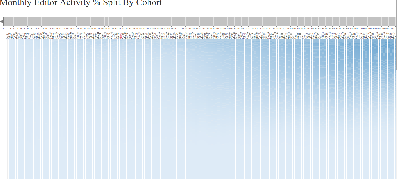
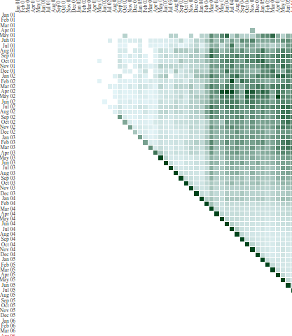
The cohorts are stacked along the Y axis.
Time runs on the X axis
Filter
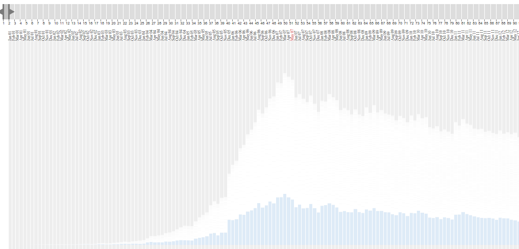
- Filter the cohorts by the age of the cohorts in every month.

Filter by the age of a cohort in a month.
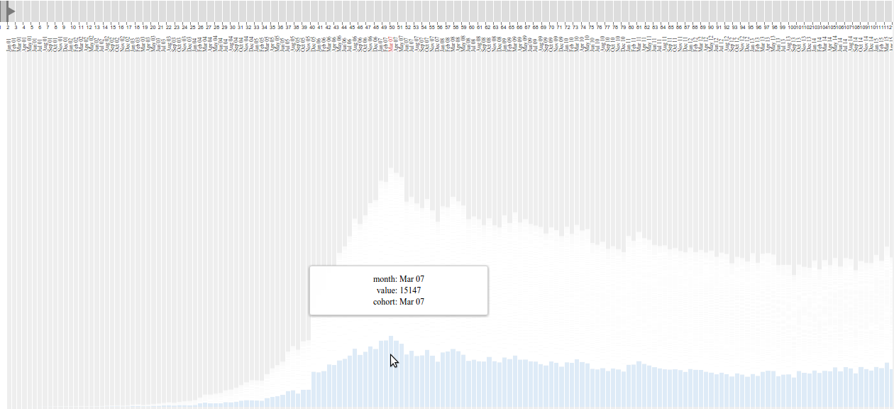
Now we have selected the cohort of age 1 month in every month. Eg: Cohort Jan 07 is 1 month old in month Jan 07, 2 months old in Feb 07 etc
Eg : The contribution of only cohorts of age 1 month in every month.
No of active editors per month - stacked cohorts
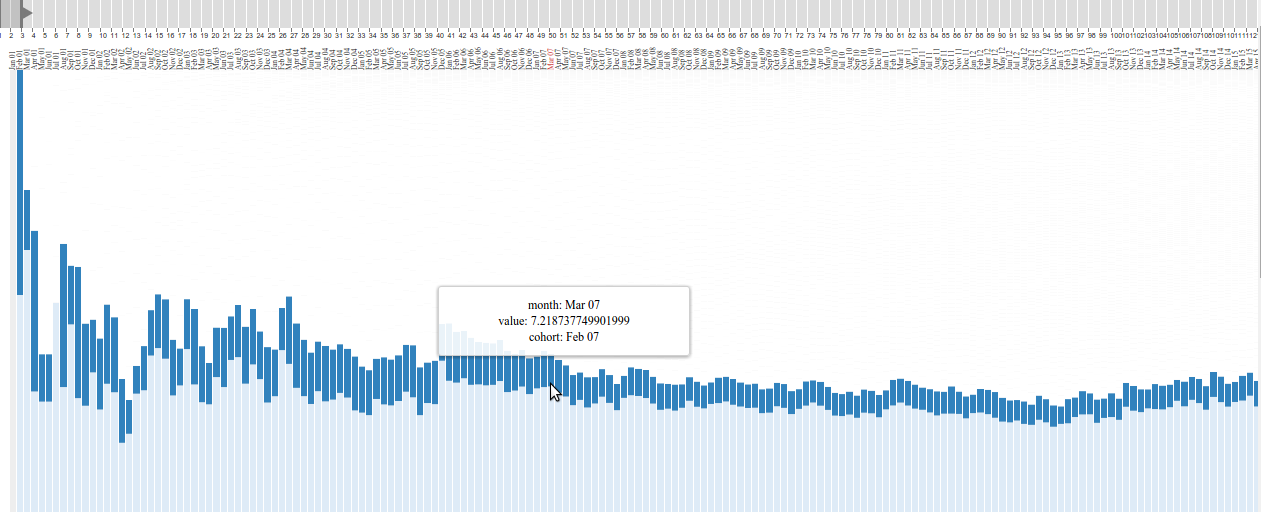
Lets filter to see the active editors from every month who belong to 1 month old cohorts
Percentage of active editors per month - staked cohorts
Lets filter like before.
What have we seen?
- Newly joining active editors + active editors in their second month ~ 40% of active editors in a month. ~60% active editors are older experienced editors.
- The general decline can be attributed to the fall in the number of older editors.
- Even monthly declines can be attributed to them.
- The older cohorts can trigger an increase or decrease in the total number of active editors in a month.
- This is the case with other languages too. (de, fr, it. etc)
Monthly activity graphs - de,fr,zh


de
fr
zh
Editor Longevity

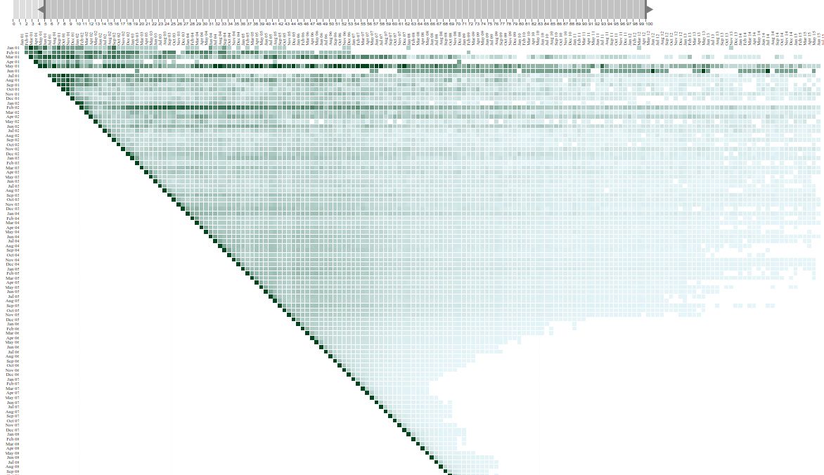
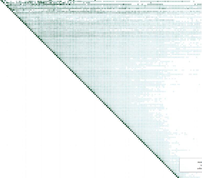
The cohorts are on the Y axis. Every row represents represents the activity of a cohort over time.

Filter by %
Filter by the % value
Setting the retention levels at >5%, we see a dramatic slide starting in Dec 05
Editor Longevity
- Atleast 5% editor retention levels starts falling in Dec 05, much before the peak in March 07.
- The retention steadily fell and has reached a steady state these days.
- On avg these days only 5% active editors continue after 6-8 months of joining.
What about other languages?
- de has a fall in retention too, but nothing as dramatic the case in en.
- zh has an increased retention of late.
de
ru
zh
Filtered at >=5% levels
Editor Retention Rate Change
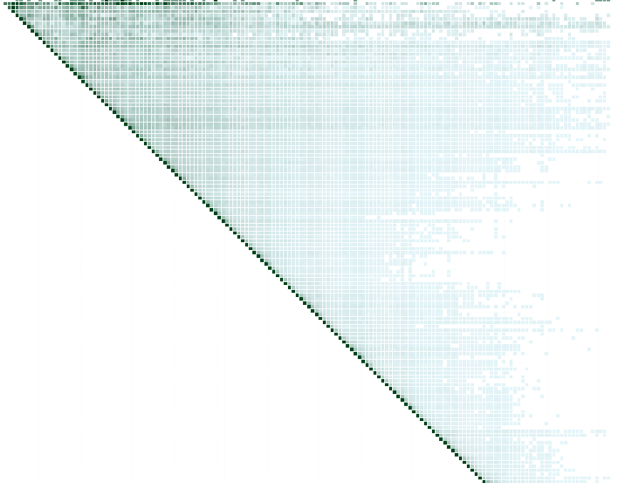
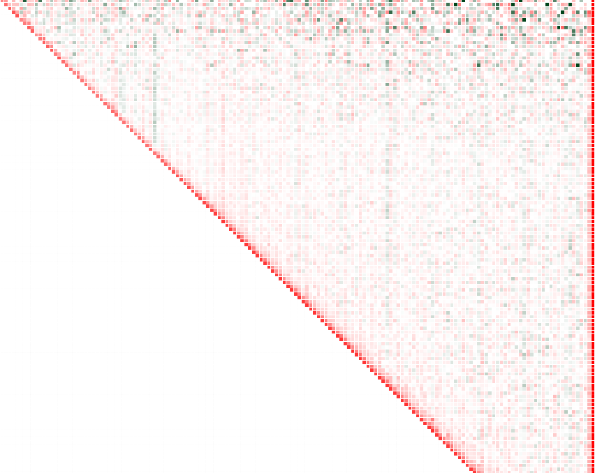
Editor retention rates - en. We can pick declines & spikes in monthly activity by looking at the vertical streaks of green & red. The spike are caused when a lot of older cohorts suddenly get active & the declines are similarly when their activity falls.
Retention rate graph
- Retention in the first month these days is only 20%. (Only 20% survive to the 2nd month.)
- Even in the second month there is only a 50% retention rate.
- By the third month we only have about 10% of the active editors who joined in that cohort.
- We lose editors even in the second month of the cohort.
Article Edit Activity
Active Article
- An active article is defined as an articles which receives 5 >= edits/month.
- SQL Query
Article Cohort
- Articles are grouped by their month of creation.
- Eg: Articles created in Jan 07 belong to the Jan 07 cohort.
- SQL query
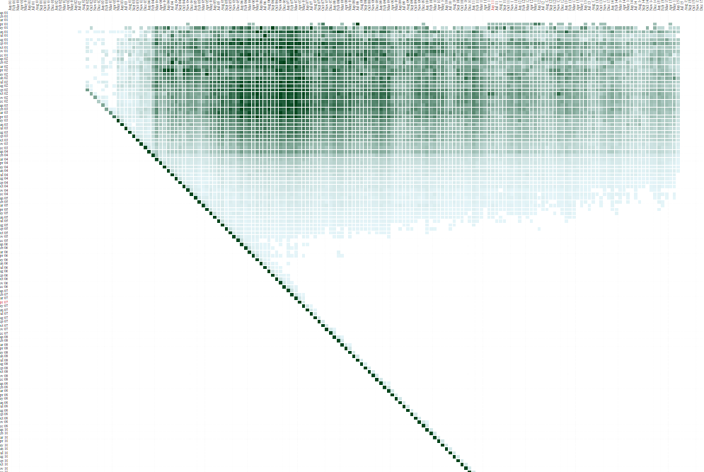
The cohorts are on the Y-axis. A row shows the cohorts activity over time.
Article cohort longevity - de
Article Longevity
I don't have the graph for en, the query kept failing :-(
Article cohort longevity for de filtered at >=5% levels. We see a dramatic fall for articles created after 2007.
What have we seen?
- Only the articles created till 2007 see continued editing.
- The articles in the subsequent cohorts see very little edit activity.
- Do we have a problem in surfacing editable articles?
- Newly created articles rapidly lose all editing activity.
- We have two buckets of editing activity, the cohorts till 2007 & the articles in the newly created cohorts.
- This is the case in all the major wiki I have looked at. (Looked at all except en - the query kept failing.)
Conclusions
Lets do more of data viz :-)
- A monthly decline in active editors is a drop in new comers & old timers, more old timers (~60%). We see this across languages too.
- So a decline in active editors can be strongly attributed to the decline in activity in the older editors.
- Only the articles in the (beginning - 2007) cohorts continue to see active edit activity.
- Exceptions to the peak are zh (continues to show uptrend) & ru (peaks in 2009).
- Retention rates are much higher in languages like de.
Ideas I'm working on
Relevant Links
Questions
- Are we losing editors because they can't find content they can edit? Content they can contribute to?
- How do we categorize editors better? The categories on the pages they edit? (I'm experimenting here)
Thank You
I have other interesting results too. When can we do this next :-)
The graphs look very different when we define "edits >=100 as an active editor".
