smart tv
"Television - that's where movies gowhen they die" - Bob Hope, 1953
By @cramrov
Last update: May, 2014
marc rovira vall

36 years old, from Vic (Catalonia, Spain)
Multimedia Engineer + Computer Science + MGT + PMA
PM | Agile Lead | Mobile App Dev @
Medialab Barcelona
Professor @
La Salle University Barcelona Campus
agenda
OVERVIEW
TV CHRONOLOGY
MARKET
FEATURED APPS
HANDS-ON
FUTURE
STUDENT PRACTICE
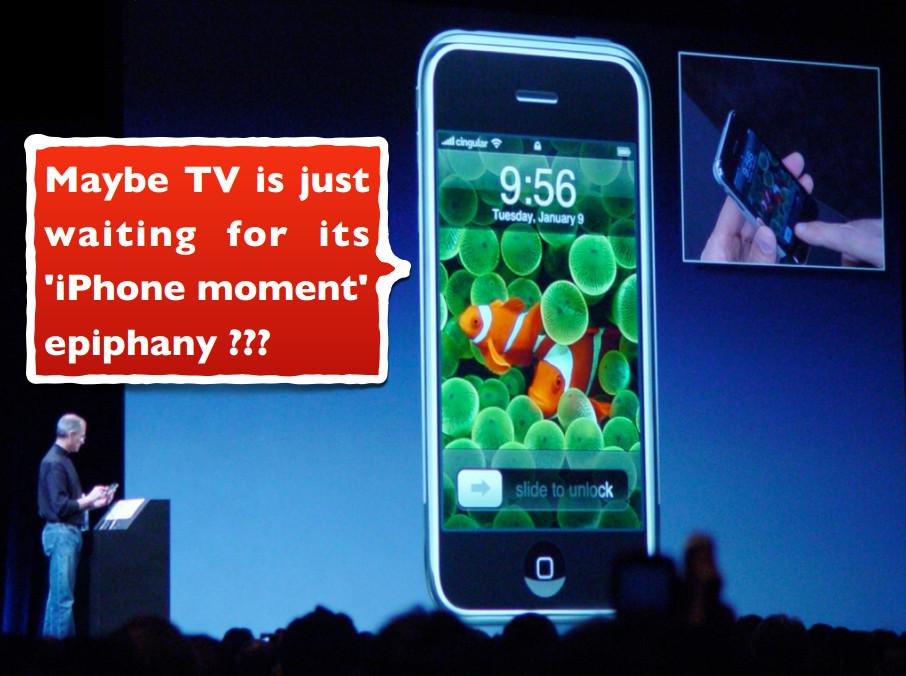
Remember the first time you used an iPad?


...and THE FIRST TIME YOU USED A
smart tv?


The iPad has captured our imagination, but Smart TVs have not (yet).
overview
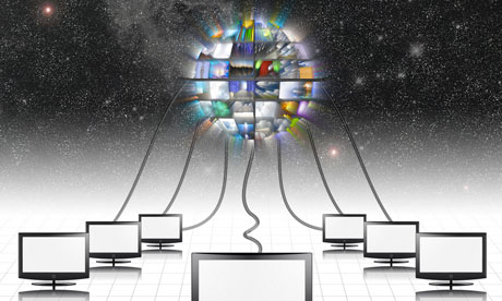
SMART TV = CONNECTED TV (CTV) = HYBRID TV
“A TV CONNECTED TO THE
INTERNET VIA A SET TOP BOX,
A GAMES CONSOLE, OR THE
TV ITSELF”
“Connected viewers will be
more important than
Connected TVs”
What was TV?
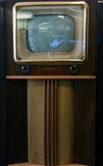
- Broadcast
-
Family Device
- Timeline
What is TV now?

-
Multiple screens
-
Content escaped from channels
-
Replay and time shift have reshaped the TV experience
- Creation / publishing tools everywhere
tv chronology

tv chronology
_______________________________________________________ ...
|
1927
First public TV broadcasts made by the BBC in UK

tv chronology
_______________________________________________________ ...
|
1927
|
1930
CBS and NBC TV broadcasts in the US joined in


TV broadcasts with the current format started a few years later (broadcast programs on a fixed schedule)
tv chronology
_______________________________________________________ ...
|
1927
|
1930
|
2009
After 80 years the TV format has remained largely unchanged
Improvements come from technical performance and increased TV program offer:
- Emergence of new channels
- Remote control
- From B&W to Colour TV
-
Digitization process (DVB)
- CRT>Flat>Plasma>LCD>LED>OLED>?
- 3D, HD, 4K...
tv chronology
_______________________________________________________ ...
|
1927
...
|
2014
|
1930
|
2009
A big change has been produced following digitization based on 2 factors which burst into TV:

internet

multi/second
screen
Multiple screens and audience fragmentation
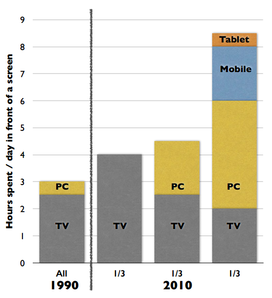
30% US users watch video
on their smartphone
iPhone daily: 15min calls
vs. 1 hour screen
1.2 Bn people spend 6.5
hrs/week on Facebook
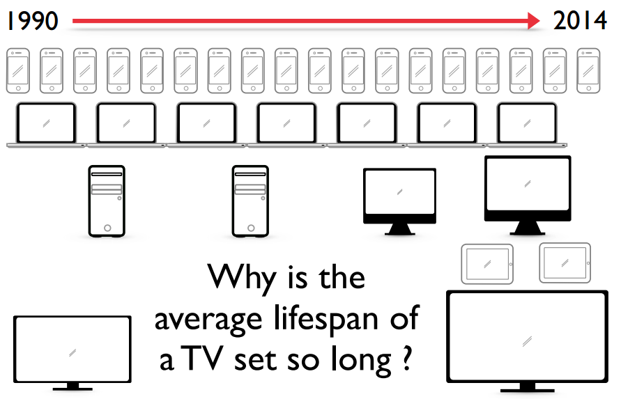
Product life cycles
market
proprietary solutions
TV |
stb |
gaming |
|
|
|










statistics
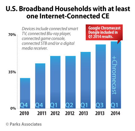
“Nearly 50% of U.S. broadband households connect a game console to the Internet to access online content and applications, while 24% have a connected Smart TV.”
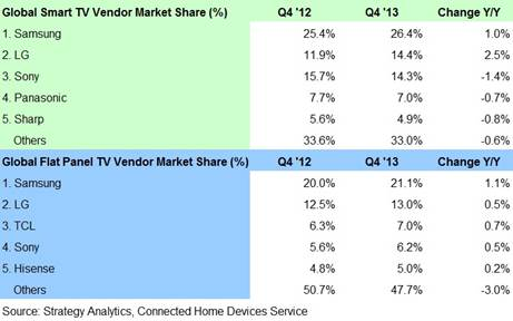
standard solutions

STANDARD SOLUTIONS

First ANNUAL IAB Spain research:
ctv & Online VIDEO (oct 2013)
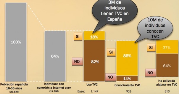
More details:
featured apps

Apps for everything
Music |
Social |
Video |
sports |
games |
|
|
|







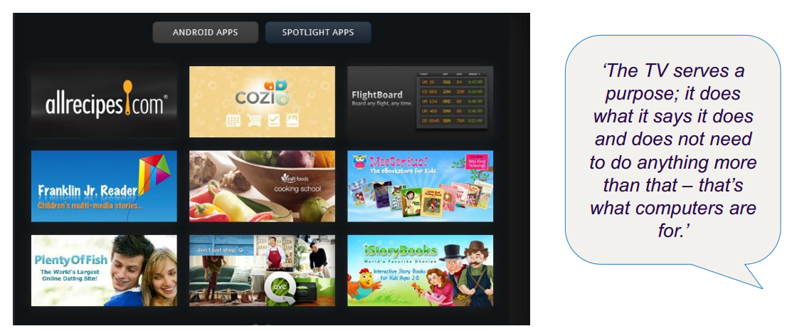
Limited appetite for "long tail" of apps on the connected TV
the killer app
¿?
Sports could be a Smart TV killer app.

THE KILLER APP
Hyper-personalized Apps in a way that wouldn't be possible with a traditional TV.
"Imagine a workout channel that connects you directly to your personal trainer, who is able to give you feedback thanks to a built-in webcam."
It won’t look anything like TV!
hands-on

setup
-
http://www.samsungdforum.com
- Sign In / Register
- Download & Install Java SE
-
Download Samsung Smart TV:
-
SDK 5.1 for your platform (run as admin)
- ATT (let's leave it for later)
- SDK Emulator Image
- VirtualBox 4.2.16
-
SDK 5.1 for your platform (run as admin)
-
Smart TV SDK IDE Help Guide
- Installation Guide
Video instructions:
testing
emulator
tv
stack

specs
Application development process

Development Guide:
App Display Types
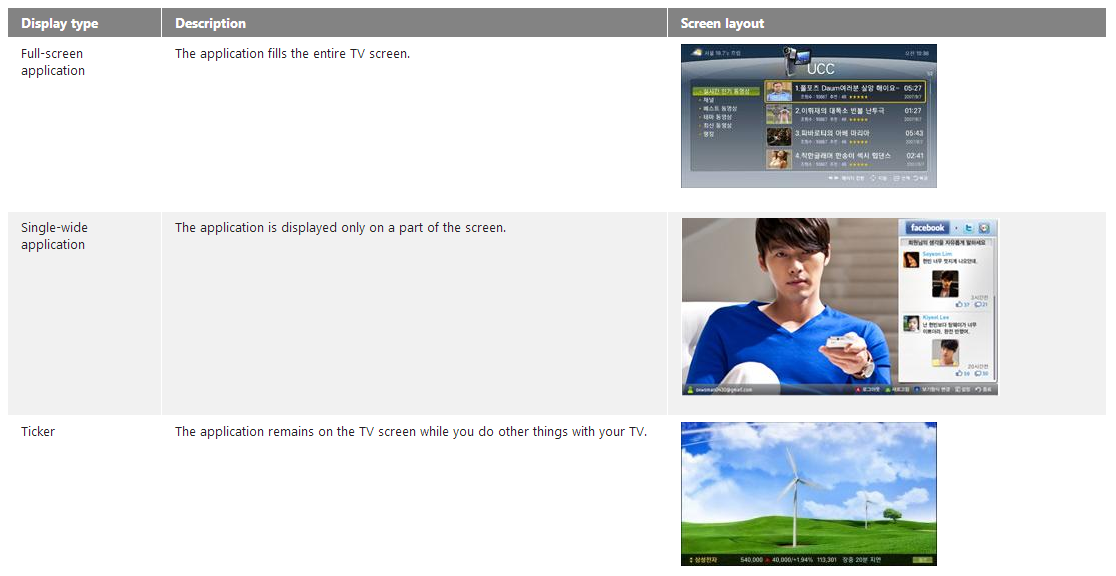
Note: Apps launched in Europe must be full-screen apps.
Coding Applications

or
or


General Apps
App Framework Apps
CAPH Framework Apps
C/C++ modules

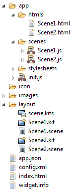
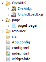
App Framework architecture

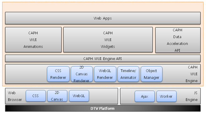
caph FRAMEWORK ARCHITECTURE
Recommended keys
-
Number keys (0~9)
- 4 direction keys and Enter
- Tool key and Info key
- Return and Exit keys
- 4 colour keys
- Player keys (FF, REW, Pause, Stop and Play)
- Audio keys (Volume Up, Down and Mute)
Common Modules API
| Objects | Description |
|---|---|
| TVKeyValue Object | Defines TV key code |
| Widget Object | Provides functions needed for running an application efficiently |
| Plugin Objects | Allows you to use some plugin functions |
| CImageViewer Module | Enables JPEG files to be played in SAMSUNG DTV |
| IME Module | Enables text input in applications |
| SSO Module | Enables SSO (Single-Sign On) in applications |
| Common popup IME | IME Common |
| IMECN Module | IME Chinese |
DESIGN PRINCIPLES

Source:
design principles
-
User Environment
-
UX Principles
- How to Facilitate Easier Use for a Better UX
DESIGN PRINCIPLES
User Environment
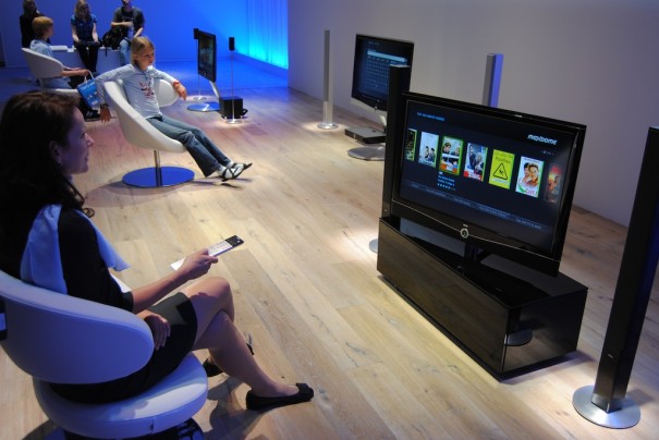
10-foot user interface (3 meters)
People lean back and relax
while watching TV.
Not
used to
complex screen layouts
and controls.
TV screens are
larger
and
viewed from a greater distance.
Legibility
must be considered for this distance.
Size of text
and other elements must be
adjusted
accordingly.

DESIGN PRINCIPLES
USER ENVIRONMENT
The standard Remote is the fundamental TV control
App navigation using only:
selection, return, and exit buttons.
Control feedback must be instant and distinct.
When applying a pointing navigation system:
-
The
pointer
must be
large
enough
-
Avoid complex
and detailed
navigations
-
Pointed at areas must be
large
and clearly
identifiable
DESIGN PRINCIPLES
USER ENVIRONMENT
TV is used by more than one person
What happens when more than one person is using the device?
Precaution measures when:
-
Showing sensible info (credit cards, passwords...)
-
Sign-in service is available (who the signed-in user is?)
DESIGN PRINCIPLES
UX Principles
Simplicity
Complex App Better App
The layout should be:
-
user-friendly (easy to access features)
- simple (with few depth levels)
Apps should not require a separate guide or a manual.
DESIGN PRINCIPLES
UX PRINCIPLES
Clarify
Clear and accurate navigation functions (move, return, enter...) for user operations.
Ambiguous navigation cause users:
-
Feel confused and insecure
-
Close the App, and may never use it again
Users should always know exactly
where they are within an App.
DESIGN PRINCIPLES
UX PRINCIPLES
User Control
The control method must account for the control device, and an intuitive layout must be provided accordingly.
The button names and icons on the remote control must match the actions that occur on the screen.
The movements that occur on the screen must be in the direction expected by the user.
DESIGN PRINCIPLES
UX PRINCIPLES
Consistency
Closely related to improvements in usability and learnability.
When using a new App, experience with a similar App will ensure fast learning.
Not always possible to (re)use the same UI for every App.
DESIGN PRINCIPLES
UX PRINCIPLES
Consistency
How to enable users to become familiar with common controls, and use Apps more easily?
- Consistency of Controls
-
Consistency of Screen Layout
-
Consistency of Navigation
DESIGN PRINCIPLES
UX PRINCIPLES
Feedback
Clear display of items that can be selected using the focus.
Show loading animations if time exceeds.
DESIGN PRINCIPLES
UX PRINCIPLES
Aesthetic Considerations
Aesthetically pleasing design:
- Makes Apps look simple to use
- Increases the chances of them being used again
- Helps users have a positive experience
Attention to TV-specific design factors:
- Colour
- Resolution
- Screen composition
design principles
How to Facilitate Easier Use for a Better UX
Focus
The Focus is the element that highlights a selectable component and signifies the user’s current on-screen location.

Good(left) and bad(right) examples of focus.
DESIGN PRINCIPLES
HOW TO FACILITATE EASIER USE FOR A BETTER UX
Navigation
Navigational movements must be predictable.
Using a grid is the best way to minimize confusion.

Confusion caused by diagonal placement.
DESIGN PRINCIPLES
HOW TO FACILITATE EASIER USE FOR A BETTER UX
Minimize Screen Transition
Frequent screen transitions will make the users feel lost and make the App difficult to navigate.

A good example is flat navigation with 2 levels.
future of smart tv
Sources:
key points
making tv smart
Second screen
video content
Making TV smart
MAKING TV SMART
Mid ’90s...
-
Idea of bringing Internet content to the living room
- Pioneers like WebTV Networks set out to revolutionize TV

But 20 years later, the revolution still hasn't materialized.
MAKING TV SMART
Smart TV sell, but don’t work well
Sales of Smart TVs are decent.
All TV makers have an app marketplace on its TV sets.
Many content available on these platforms.
...but the experience for users is often painful.
Why?
-
Hard to navigate around a smart TV screen using a RC
-
People prefer to connect their PC to the TV
MAKING TV SMART
Your phone is more powerful than your TV

Your phone is cheaper than your TV and has a much smaller screen — but it’s got a lot more processing power.
MAKING TV SMART
Smart TV features are merely bolted on
“They are really still old-style linear TVs with some network feature bolted on.”

Your computer has a standby mode, but your TV doesn't, and that's a problem.
MAKING TV SMART
Netflix pushes TV makers to up their game
Netflix has begun to talk to manufacturers to push them towards rethinking their Smart TV products:
-
Adding on-screen navigation
-
Adding a real sleep mode
- Simplifying RCs

MAKING TV SMART
It may take four, five, six Netflixes
People just don’t know what to do with their Smart TV.
There’s Netflix, and some people also watch YouTube or Hulu Plus, or stream Pandora on their TVs...
But other than that, not many apps have gained significant traction.
In other words: Smart TVs need more killer apps!
MAKING TV SMART
Standards AREN'T there yet
Where to start?
Samsung, LG, Google, Yahoo, Roku, Panasonic, Opera...
Roku uses BrightScript (similar to Visual Basic).
Google TV is based on Android (Java).
Yahoo Connected TV widgets are a custom flavour of XML and Javascript that doesn't really work anywhere else.
TV manufacturers are starting to adopt HTML5.
The goal is to deliver the same look and feel across all devices.
MAKING TV SMART
Buyers of dedicated boxes are more engaged
Roku users are expecting to be on the internet, and they are expecting to install applications and to have an app store.
That’s not necessarily true for someone who picks up a smart TV at a mall just because it was on sale.
Makers of TV sets had hoped that app stores would give them a whole new revenue stream, comparable to the income Google and Apple see with their mobile platforms. So far, that revenue hasn't materialized.
MAKING TV SMART
10 feet away, screens work differently
TV has been described as a leanback platform, for a reason: “You are 10 feet away, possibly horizontal”.
Developers need to completely rethink how they present and structure information (Ex. scrolling).
Smart TV remote controls largely rely on the D-Pad.
Everything has to be one or two clicks away to be within reach.
MAKING TV SMART
Netflix A/B-tests every feature
Netflix famously A/B-tests every significant feature before rolling it out to its general user base.

Ex: Personalized profiles were rolled out on 2013 after more than six months of testing.
MAKING TV SMART
TVs are a shared device
One of YouTube’s takeaways: The TV is a shared device, with many people looking at it at the same time.
That has huge implications for app design, especially when it comes to sharing potentially sensitive data like the viewing history, including those embarrassing YouTube videos you watched when no one else was around.
MAKING TV SMART
Time to flake out
In the end, even a Smart TV is first and foremost a TV, not a computing device.
That means that users in most cases aren't looking for interaction, but for entertainment. For something they can watch, without having to press many buttons or navigate many menus. For the opposite of interactivity.
“TV is not a tool. TV is a purpose. You use it to flake out and let it saturate you, have that experience and let it do the work.”
MAKING TV SMART
Changing the channel without knowing the number
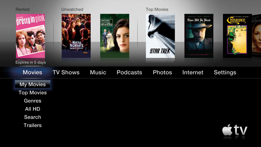
Search, or even entering account credentials on streaming box like Apple TV or Roku is a royal pain (using on-screen keyboards with D-Pad RCs).
After failing with the full keyboard, Google took a different route for its second generation of devices:
"Remote controls with microphones"
MAKING TV SMART
Your TV is not your friend
Many manufacturers have been experimenting with other ways to move beyond the D-Pad:
- Voice control on Google, MS's Xbox, and Samsung
-
Wii-like screen pointer on LG TVs, MS's Kinect gesture control, and Haier eye tracking (near future)
Another challenge is ensuring that the technology doesn't make users feel uncomfortable. Speaking to a computer, or even a TV, puts users on the spot.
MAKING TV SMART
Almost like AirPlay, but open


MAKING TV SMART
DIAL and Google Cast could make TVs not just smart, but social and fun

Ready to cast:
Will DIAL and Google Cast enable the future of social TV?
second screen
CTV PENETRATION & USAGE WILL LAG BEHIND second
SCREENS
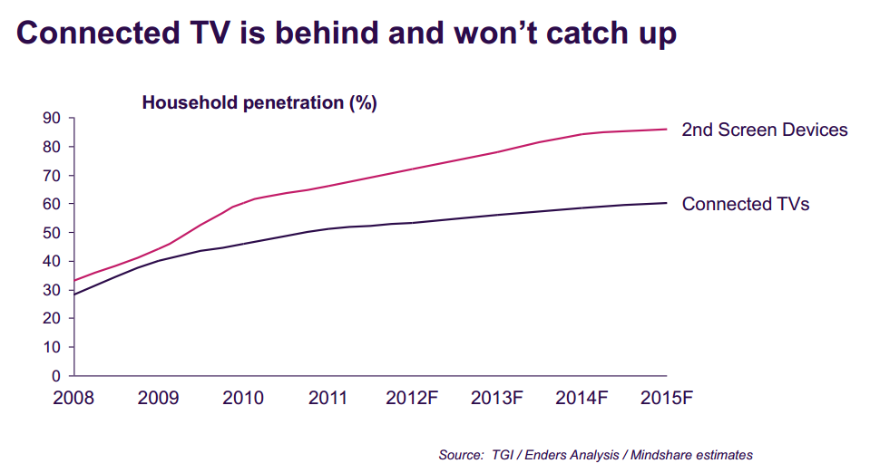
SECOND SCREEN
A CTV opens the door to many opportunities
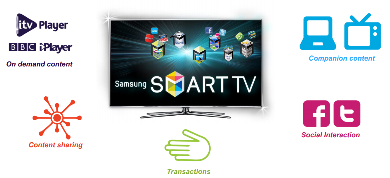
SECOND SCREEN
But the fundamental role of TV remains the same
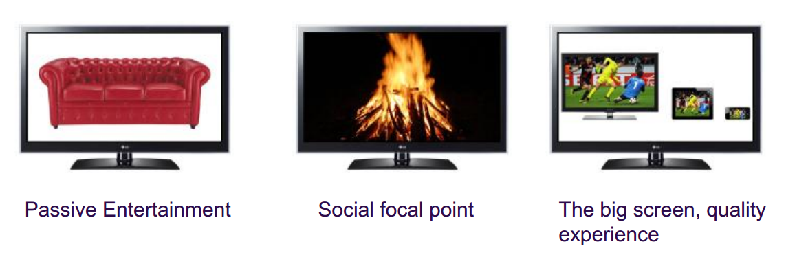
SECOND SCREEN
Personal nature of social makes it better suited to
second screen
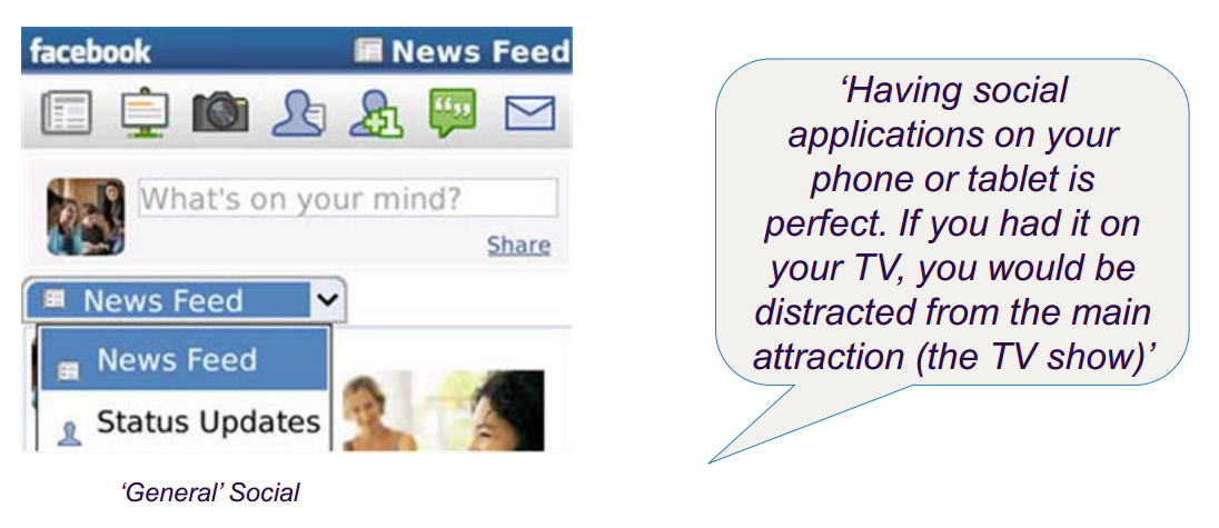
SECOND SCREEN
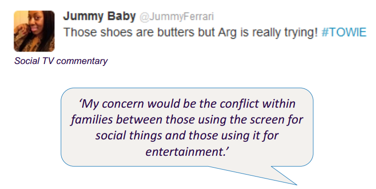
Social TV commentary is more complementary and
less intrusive on the second screen
SECOND SCREEN
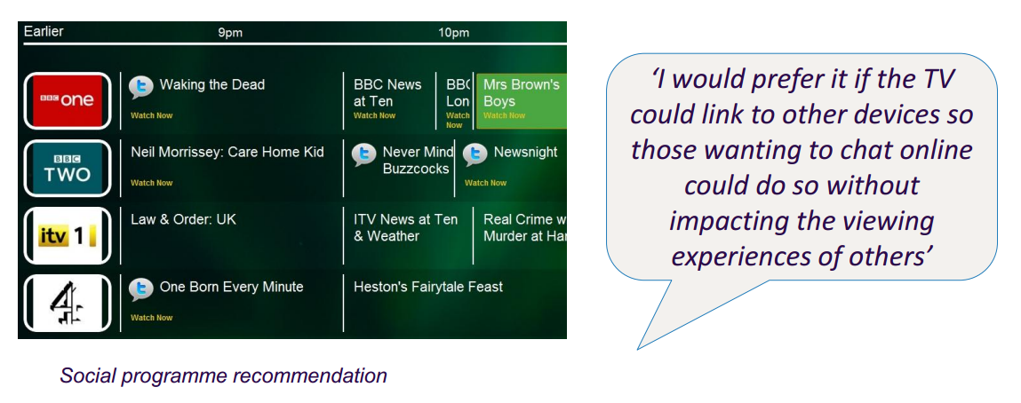
Social TV recommendations on the second screen
can be more personalised
SECOND SCREEN
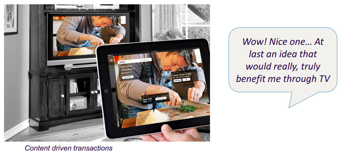
Viewers are keen on transactions prompted from
the TV
SECOND SCREEN
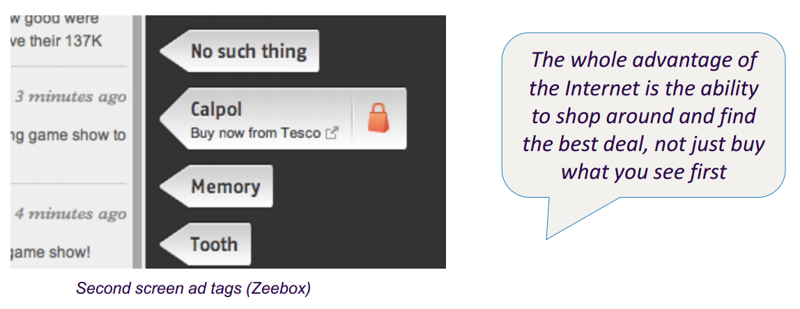
The opportunity for browsing makes the second
screen the natural place for transactions
SECOND SCREEN
The Second Screen allows TV to be both
personalised & communal
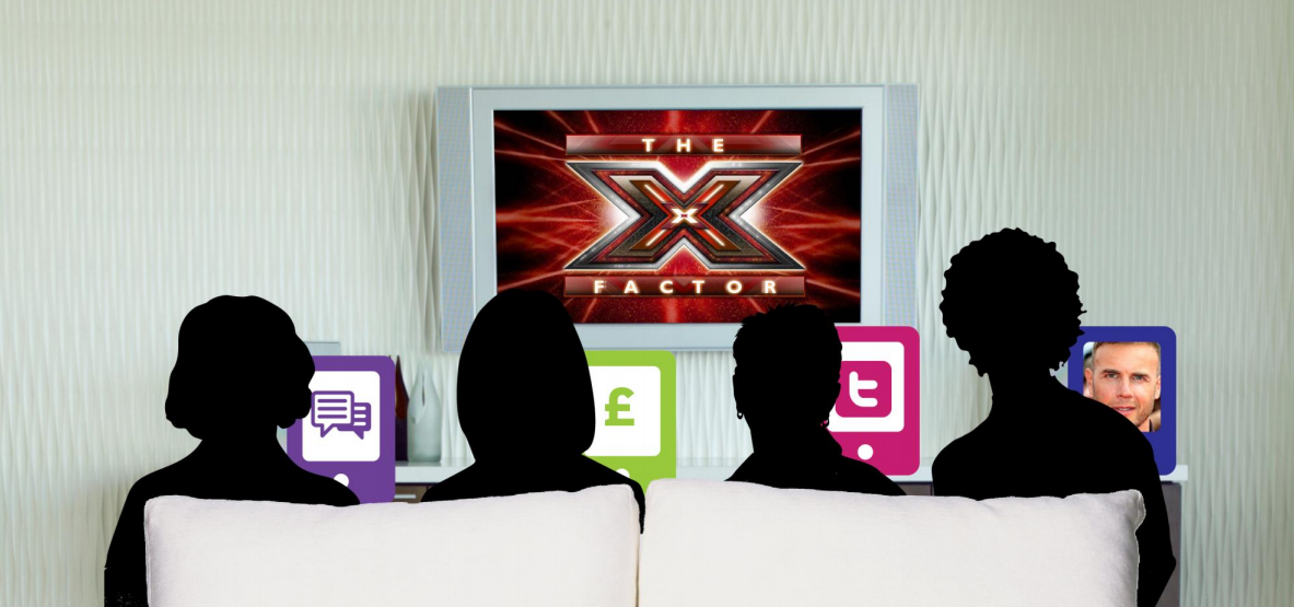
SECOND SCREEN
Question is who will control the second screen
experience?


video content
Consumers still primarily want TV from their TVs
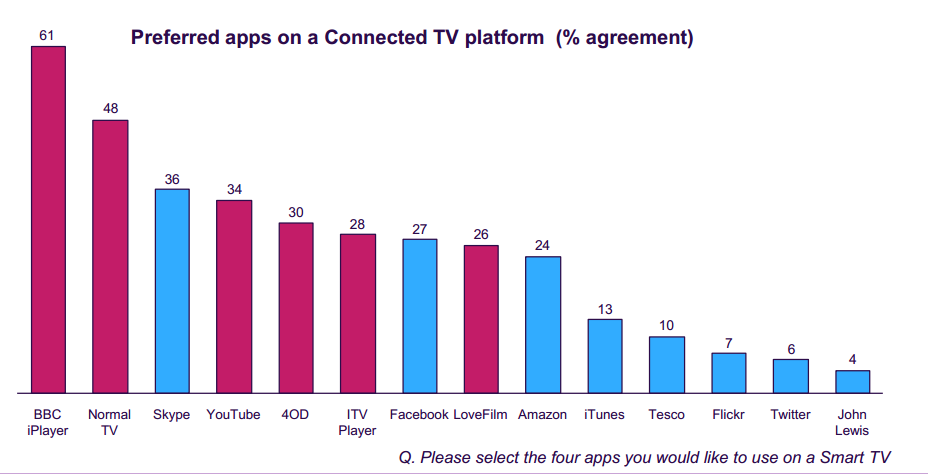
VIDEO CONTENT
TV usage will continue to grow, driven by video
viewing
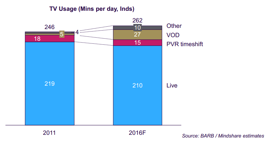
VIDEO CONTENT
Services that depend on inter-device connectivity
will gain traction
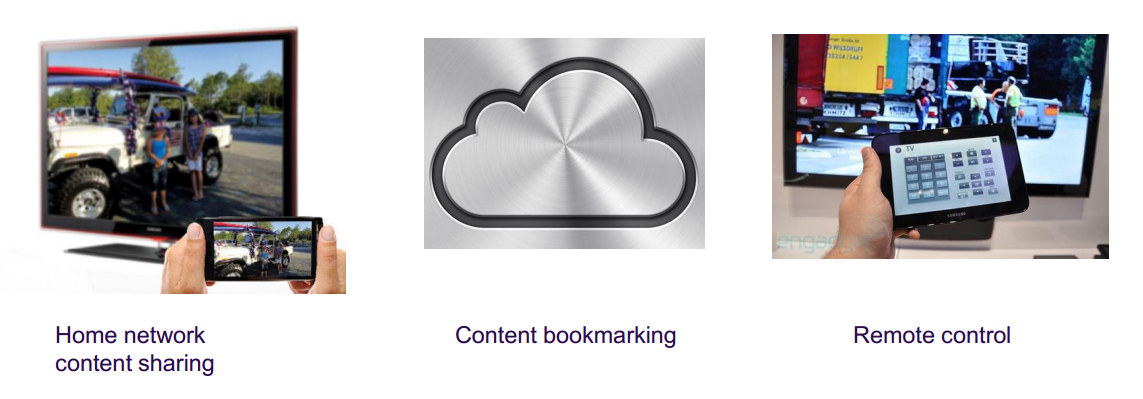
VIDEO CONTENT
The applications of connectivity will migrate to
different screens

student practice

student practice
Free themed Samsung Smart TV App, be creative! ;)
Small team, 2 people at most.
minimum requirements
- Containing at least 4 screens (scenes)
- config.xml properly set (App Basic Info, Icons, Author Info)
- Conform to Samsung Smart TV Design Principles
- Well documented source code
nice to have
- Video/Audio playback
- Consume 3rd party Web Service content (e.g. RSS feed)
STUDENT PRACTICE
important dates
-
30/05 - 03/06 > E-mail me with your App details:
- Team members
- App name and short App description
- 16/06 > Practice delivery deadline (eStudy)
- 17/06 - 20/06 > Group interviews (if required)

the end
Thank you!
questions?
Contact:
marcr@salleurl.edu

