Cristian Arebalo

portfolio
table of contents
about
motion effects
UI development
brand identity
brand material
3
4
7
9
11
about
hi! my name is Cristian.
I am a visual designer and photographer and a recent graduate from Eastern Washinton University with a Bachelor of Design in Visual Communication Design. I've been passionate and strived to learn more since my first multimedia classes in high school. I love to work with open-minded people, feed off of good energy to find and create meaninful solutions to design problems around us all around us whether it is a client, assignment, or a self-initiated project.
Brand Idenity
logo & menu design
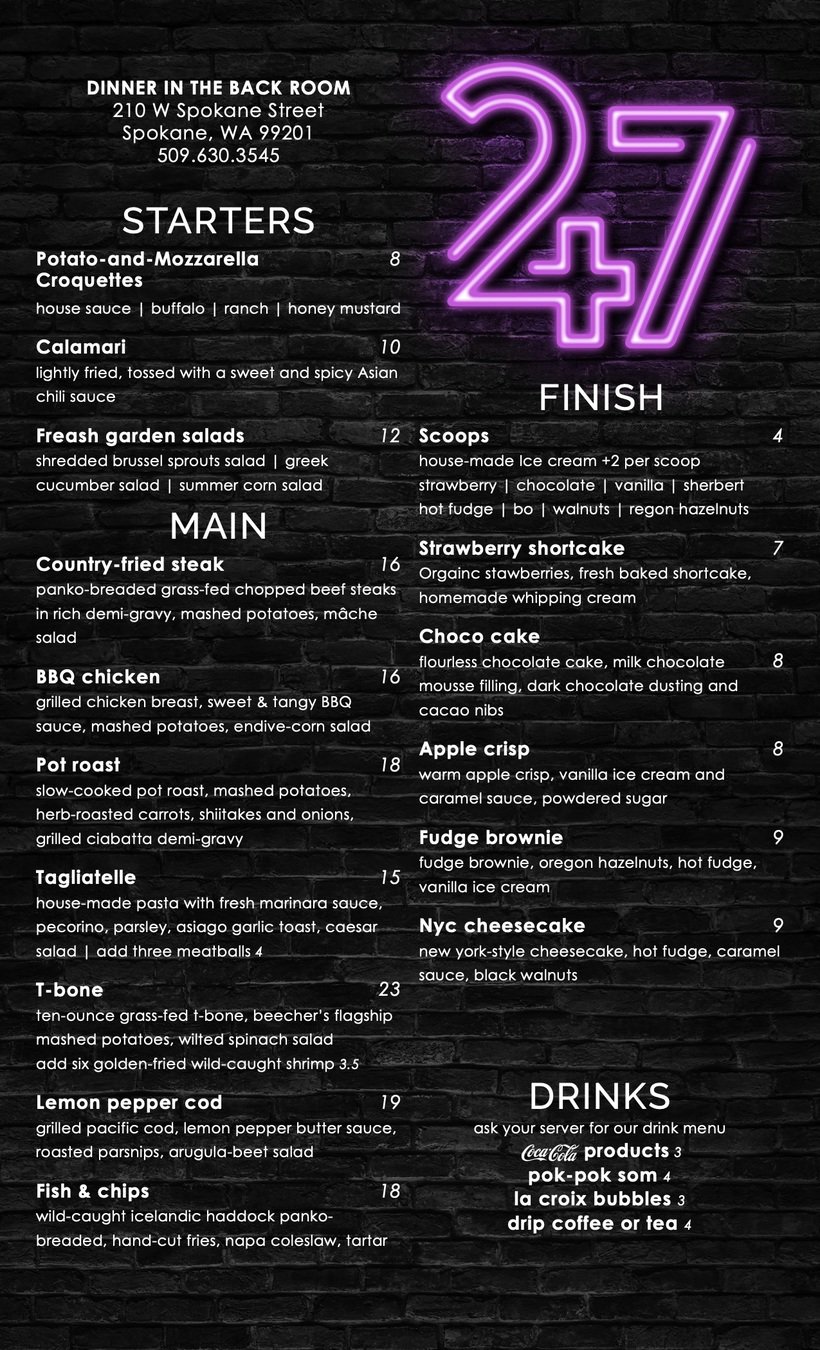
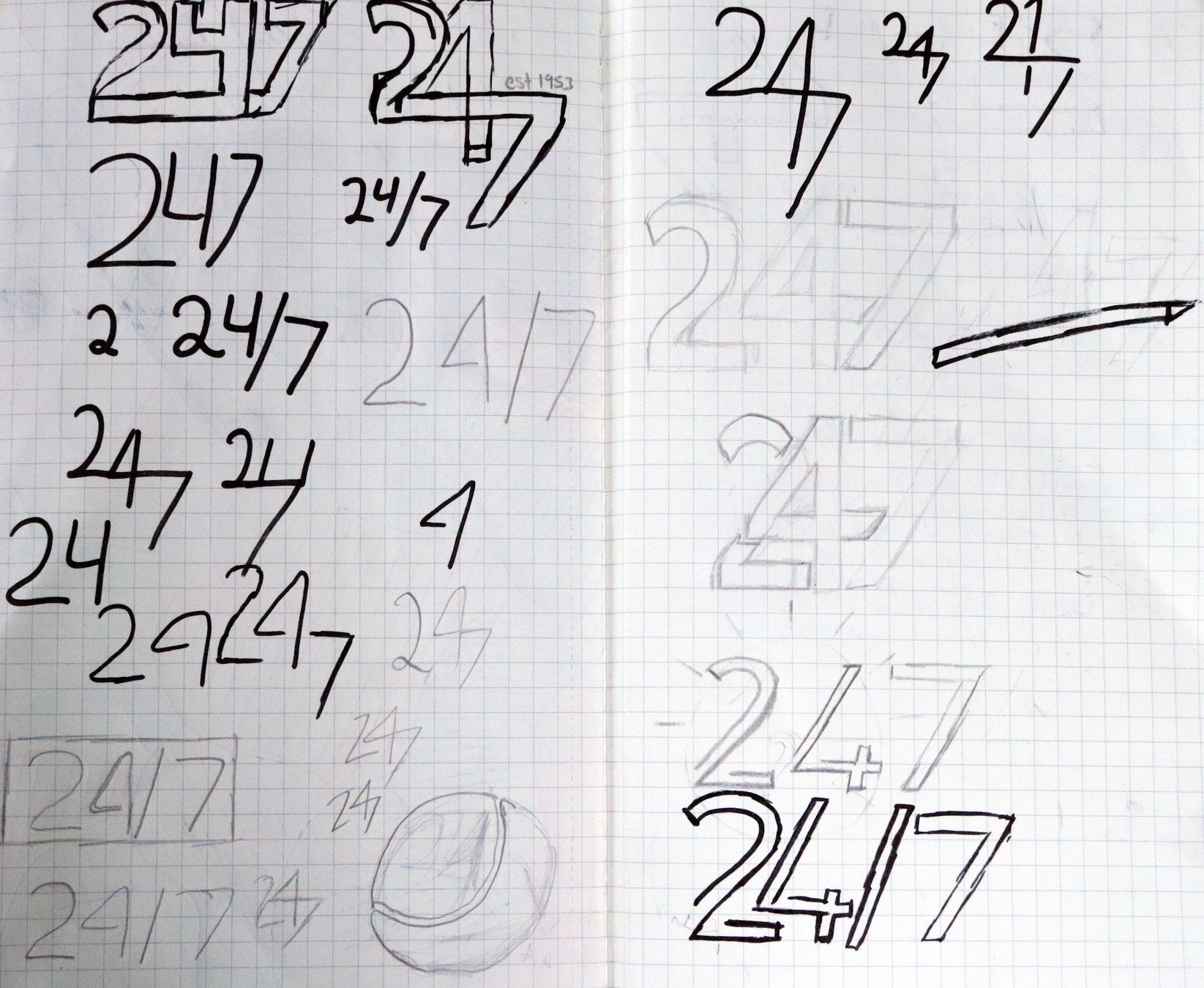
Twenty-Four Seven Diner
Denny’s is looking for a facelift. They are launching a new chain/sub-brand in select high-income urban markets. THINK: Seattle, New York, San Francisco, Los Angeles. While still offering American Style comfort food, they are doing so with a modern, minimalist twist, including high-end dinner service. Using your choice of 4 brand names and the supplied information and copy, research and design a wordmark and a family of typographic menus for the new brand.
assignment prompt
wordmark
dinner Menu
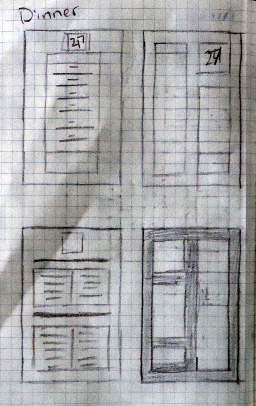
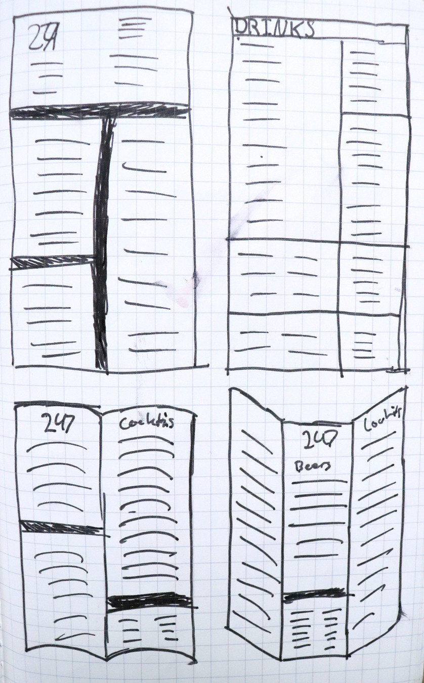
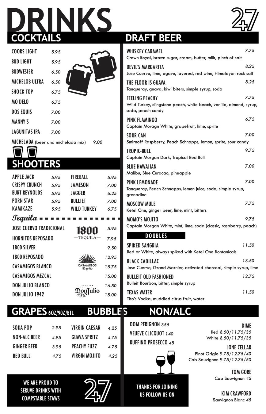
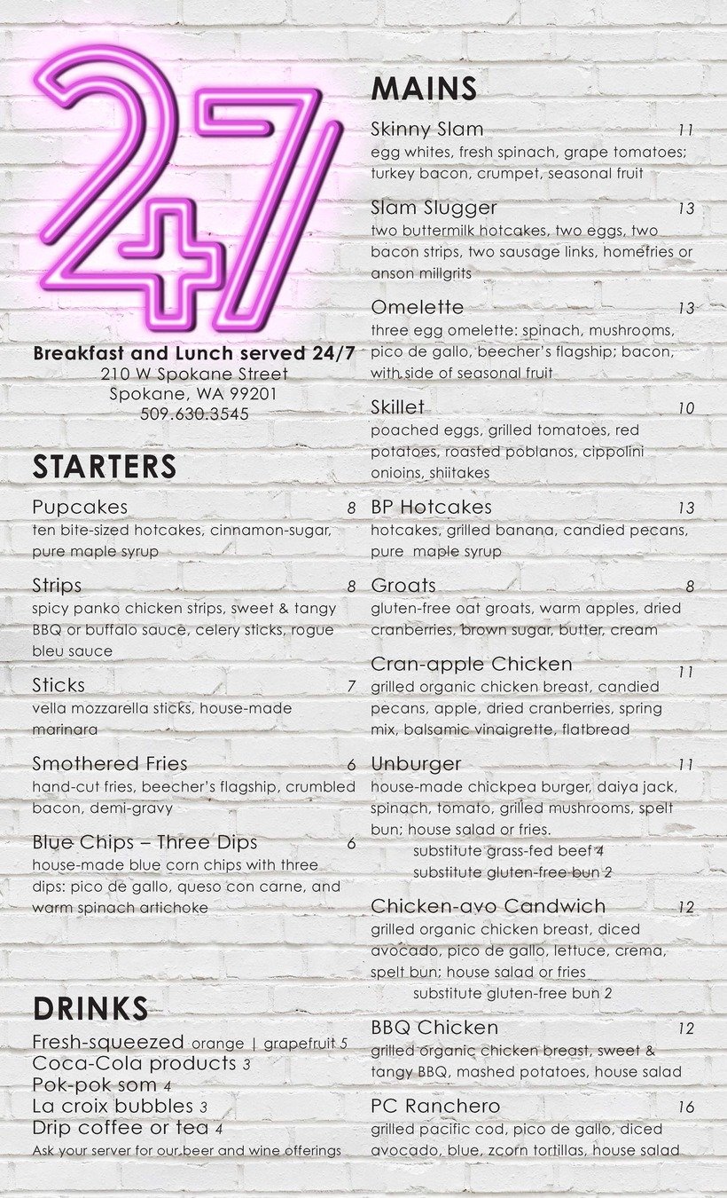
drink Menu
breakfast Menu
Motion Effects
kinetic type
Using After Effects, animate a sound clip of your choosing with typography which is at least forty-five seconds in length. Incorporates visual typography into motion, as well as proper audio techniques. Grading will be based on Animation, Typography, Movement, and Timing.
assignment prompt
concept & choices
Kinetic Type - hot shower
I choose to do a lively rap song created by Chance the Rapper call Hot Shower. I decided to do the first 45 seconds as you get the hook and some of the best lines. It has a fast tempo and dense with a lot of words for a 45-second clip.
Brand Material
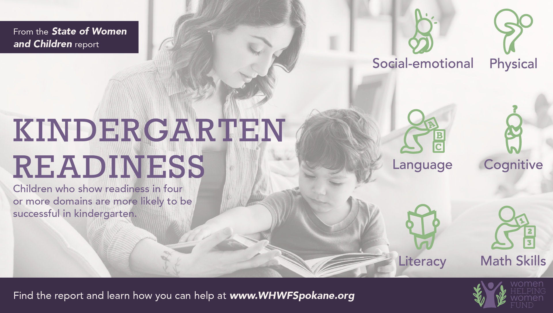
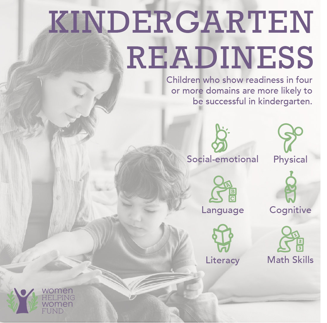
psa & social media post
1920x1080 pixel PSA style posters for the Women Helping Women Fund and an accompanying Instagram graphic (1080x1080). The Women Helping Women Fund (WHWF) is "a non-profit organization dedicated to empowering women and children to create healthy families and vibrant communities."
WHWF put out a large-scale report on the state of women in Spokane. Our posters will be in response to that report. The report has four sections. Our class will be broken into four groups, each group will read their section of the report.
assignment prompt
concept & choices
Women Helping Women Fund
I was in the group where we had to focus on early childhood and chose to focus on kindergarten readiness. I wanted it to have useful information that can be quick to grasp, in combination to being a PSA poster. Keeping it simple made it a lot easier to turn into a social media post.
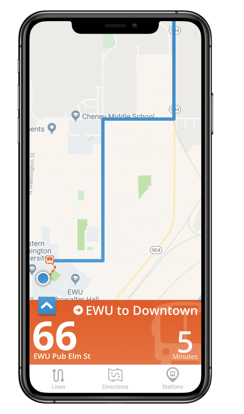
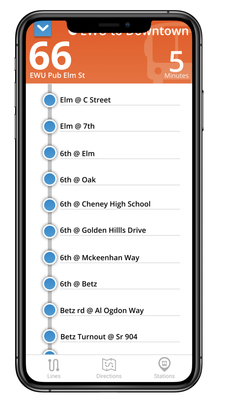
UI Development
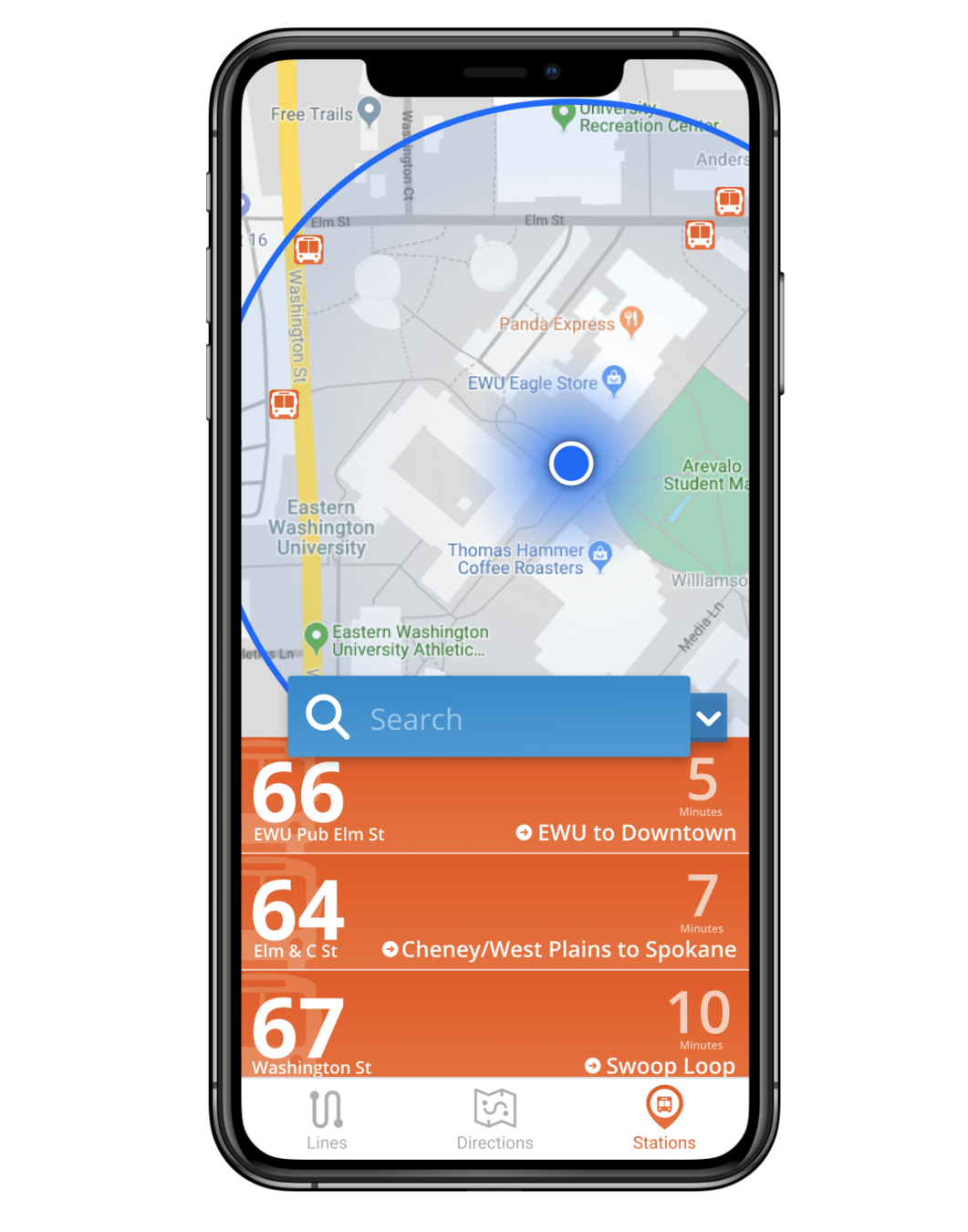
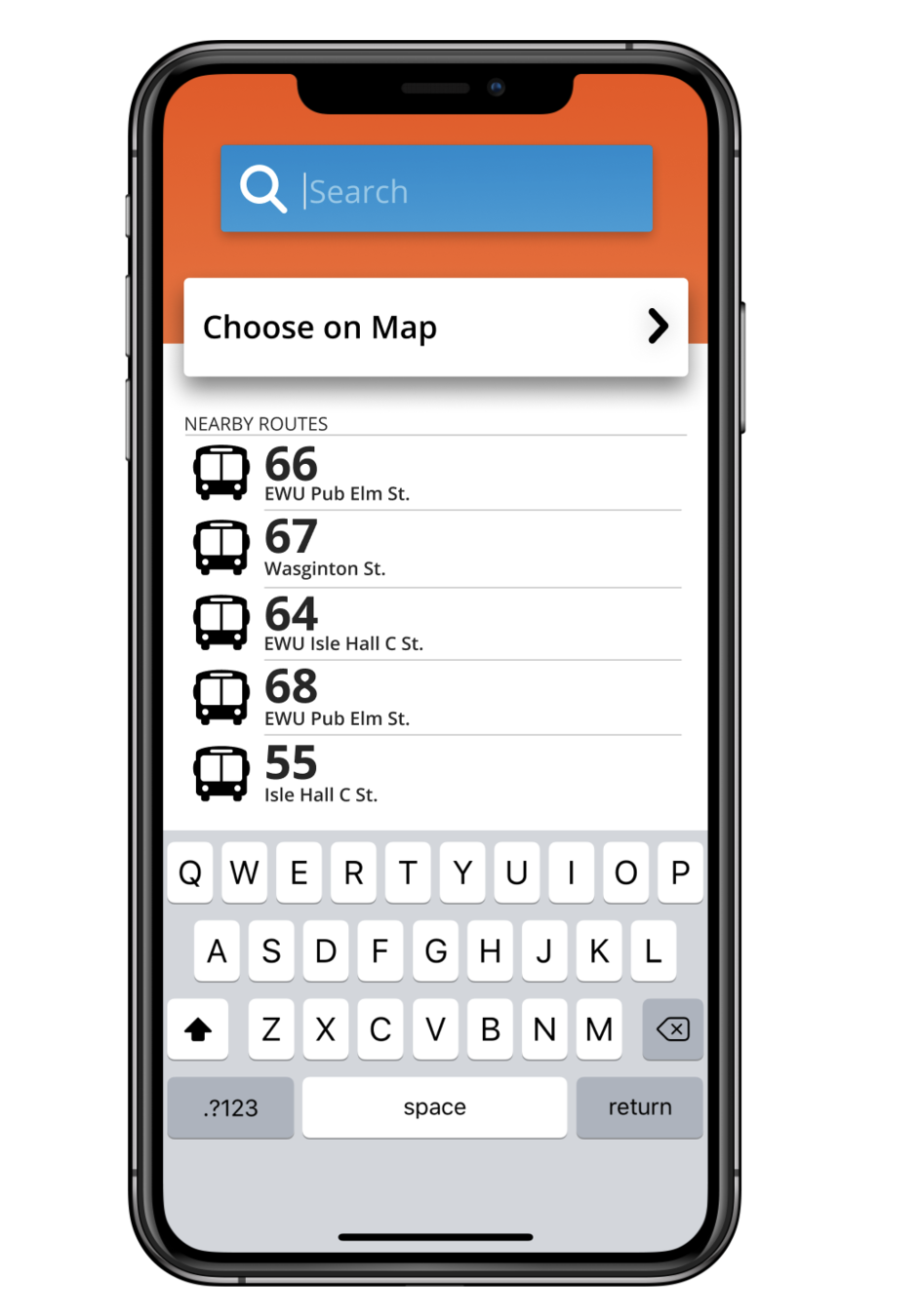
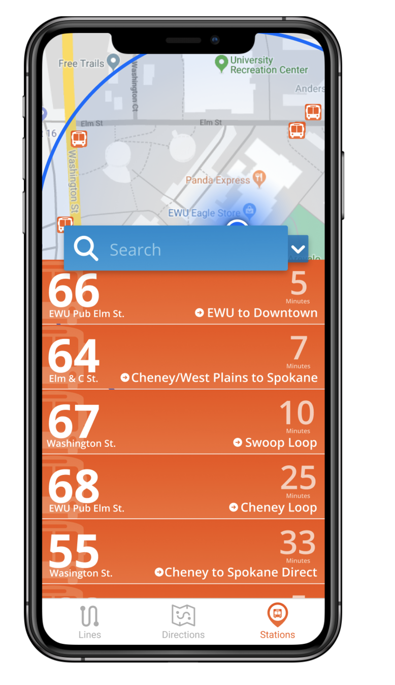
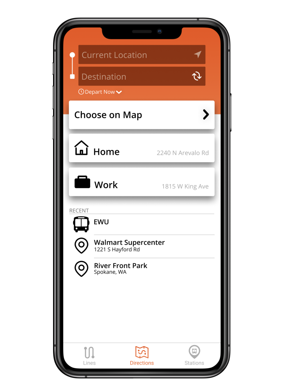
bus tracker app
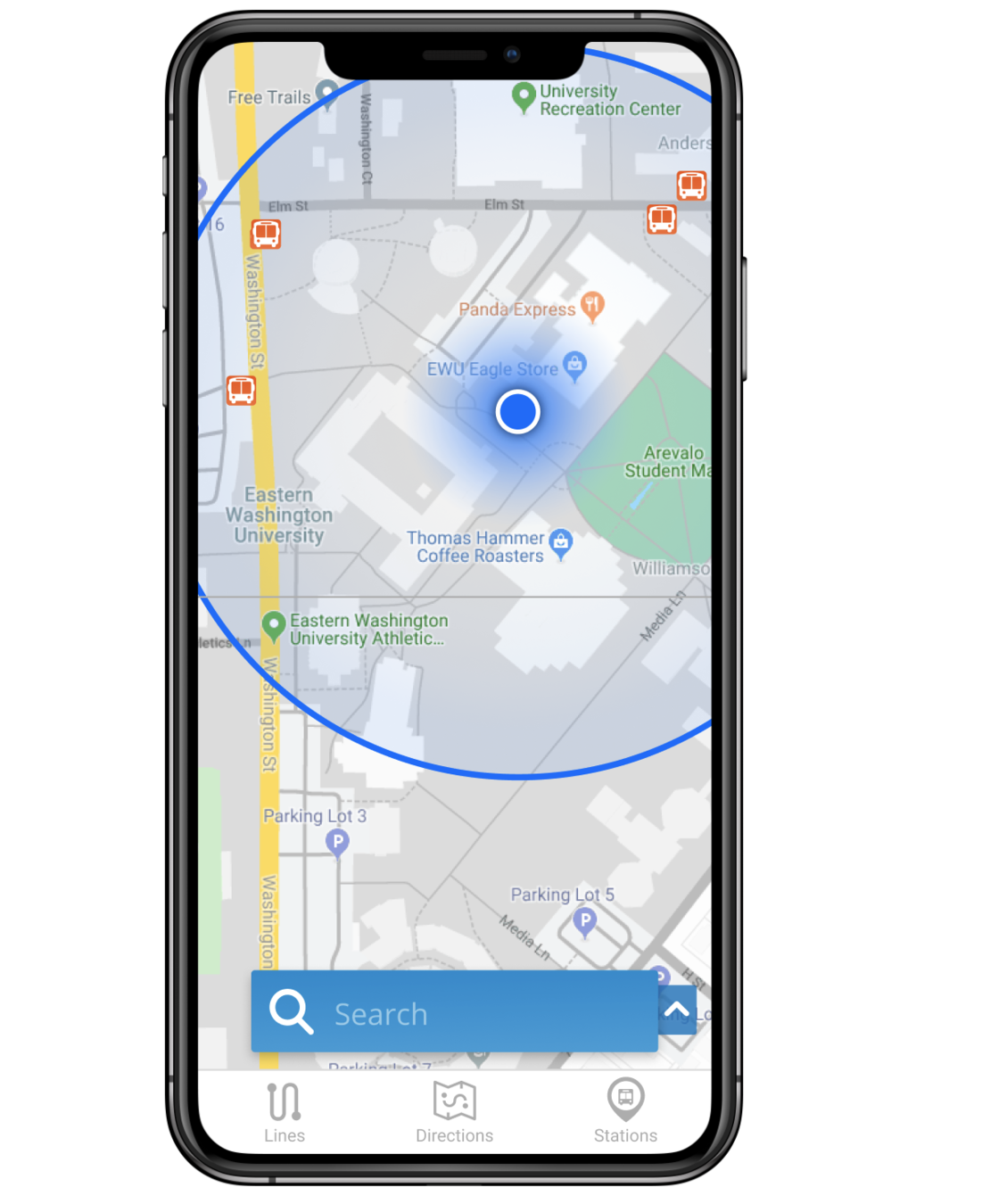
Choose your own interface to redesign. It can be any kind of interface you want; maybe it’s an app or a website. Maybe it’s the pump at the gas station or your thermostat. Choose something you think can be improved upon and created using Figma.
What you’d like to redesign?
Why do you think it should be redesigned?
Why do you think it’s worth your time redesigning?
Assignment Prompt
Brand Logo
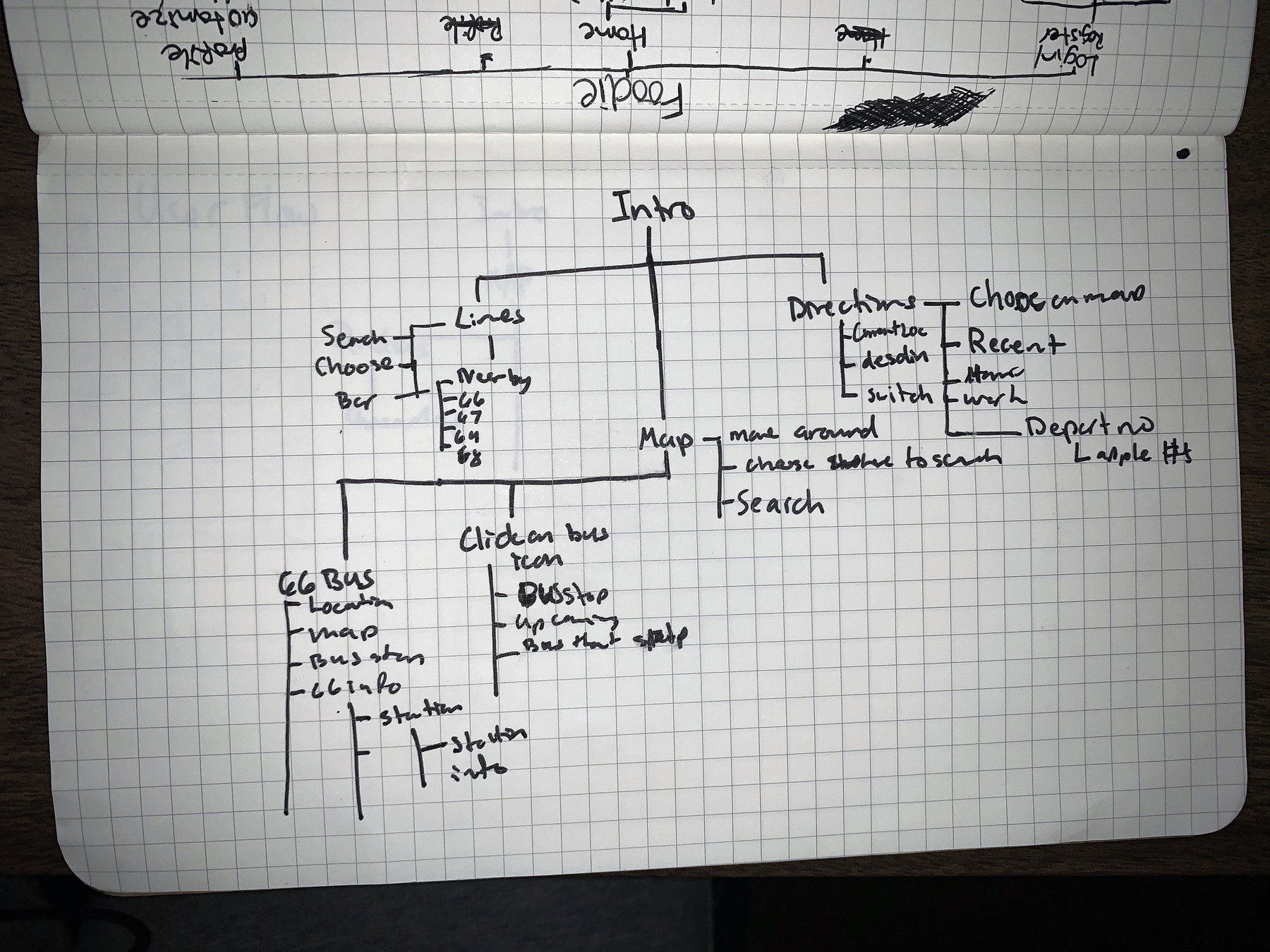
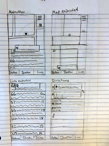
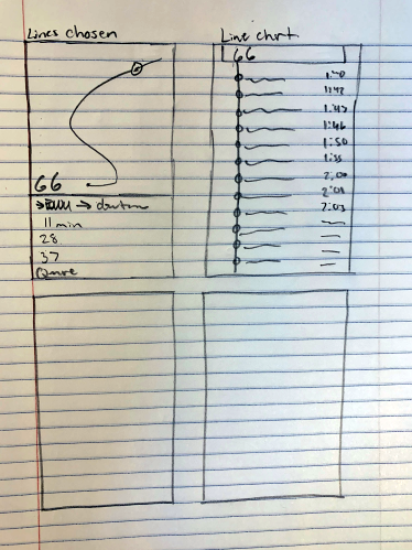
The Bus App - Transit Tracker

Hex: 0083CC
Hex: F0500B
Hex: 932D02
Hex: 93CDED