CONTENTS PAGE DRAFTS

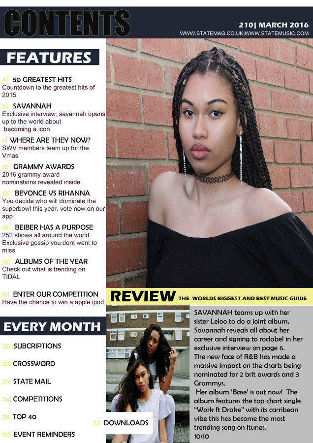
Here is the first draft of my magazine contents page. In contrast to exsiting content pages it conforms to the typical conventions. A problem with this draft was that the numbering on the features column was hard to see. In order to improve this draft i will change the font colour and font style, this includes making the subtitle of each story bigger. I found the main image looked rather stretched and wasn't contrasting with the rest of the page. In order to improve this i will use a different image.

CONTENTS PAGE DRAFTS
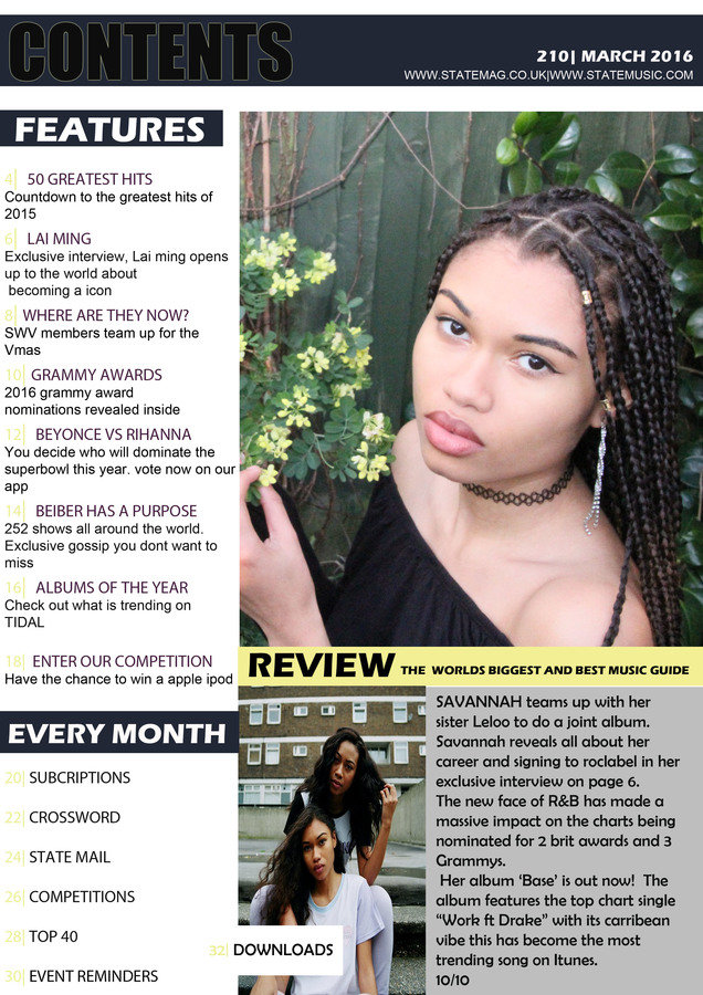
Minimal things were changed in this draft despite the feedback from the first draft. Overall the image contrasts with the yellow theme yet i am still not fully satisfied with it.
For my final draft i am going to change the font and colour of the whole features column. The burgundy does not relate to my theme and the yellow makes it hard to see the page numbers. The title 'CONTENTS' will be changed to white in order to be visible ; i will also add the logo of the magazine in the top right corner as this is a convention of magazines.The review section will be changed to columns instead of one whole paragraph. I will change the image and also lighten the grey background.

CONTENTS PAGE DRAFTS
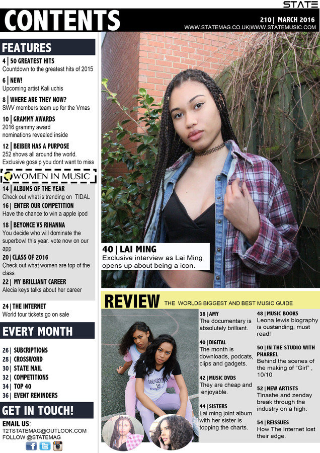
Here is the final draft of my contents page i changed the layout of the features column by changing fonts and the size of each title. I added a extra title of 'Women in music' this made the features column stand out more adding something extra. The title 'CONTENTS' was fairly visible before so i made the text on the above column white to stand out. I decided to use a different image which used a different outfit. I found the camera shot of this image made it work much more. I added a extra column to fill the empty space at the bottom of my magazine, i also added two sub images.
