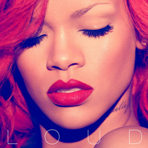
The Loud digipak uses a 6 panel design and the left and right panel fold in to make it look like it is 1 panel. The design is very appealing as it is very interactive, the audience are essentially forced to fold out each panel to discover content .The digipak uses very eye-catching sensual, feminine and calm red colours which makes the audience see rihanna in a loving feminine light. The colours are associated with love because Rihanna's songs are mostly about love and heartbreak. The fact that the digipak uses very feminine colours may suggest the intended target audience (females), I will think about the use of colours very carefully when creating my digipak. It can be argued that this album cover is not stereotypical of the pop genre as it appears very minimalistic similar to a classical music album. However i think the heavy makeup helps the audience identify it is pop.


The main imagery used on the front album artwork is shown to be taken within a studio, using high-key lighting to capture the artists facial features in the best way, this makes Rihanna look more aesthetically appealing. The advantages of using high-key lighting is that it creates strong shadows around the artists face emphasising the focus on the artists face and makeup features.The cover image suggests a sense of love and passion through the bright red hair and lips. There is a strong use of the colour red within the digipack, the colour red connotes love and possible danger. This could be related to the emotional songs featured on the CD. The vivid colours relate well to the title of the album 'Loud' as the boldness of the red is striking and eye-catching to the audience. Each letter is spaced out across the album, this connotes how music is loud and can travel across. The unpretentious form is noticeable but doesn't lose the main image of the album.
Goodwin's notion of looking as well as Mulveys male gaze theory can be recognised here as some people argue red lips are a sexual part of a women, and this is where the eyes are attracted to. Goodwin idea of demands of the record company can be identified as the main focal point of the image on the front cover is Rihannas lips and red hair. Red hair became Rihannas trademark for a while , the record company would want this to be featured as it is a selling point of her image.

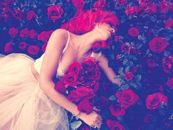
Roses are iconically used within this digipack, the symbolism of the rose connotes innocence and love, this related to the love theme of the CD tracks such as 'only girl in the world'. The danger connotations of the colour red can relate to the risky love themed songs such as 'S&M'. A Informal font is used which helps keep the main image the focus of the cover.

The theme of love is continued onto the threesided section where Rihanna is found lying into a bed of roses.This page entices the audience to know the story of the artist on the front cover who now seems distressed layed down. A narrative enigma is created to what happened to the artist. The large image inside the digipack presents allot of emotion through the use of the busy background of a bed of roses. The boldness and vibrance of the red roses alongside the body language of Rihanna create a sense of weakness and heartbreak. Sex appeall is present through the revealing crop top the artist is wearing , this is also seen on the album front cover, the red lipstick is very seductive conforming to the male gaze theory drawing attention from male audiences to her mouth.

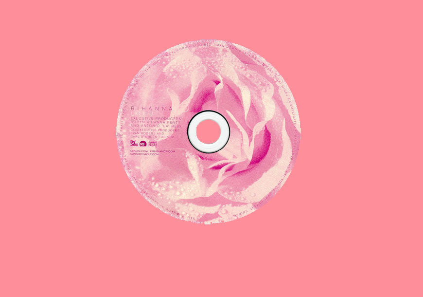
The CD uses the image of a rose to cover the entire CD. The rose follows the digipacks overall concept of love as roses are often associated with love and valentines day.
On the left hand side of the CD the words 'Rihanna' and 'Loud' are present in capital letters followed by copyright information with logos from the companies/labels involved in the making of the album. When creating my own digipack i will include these features.