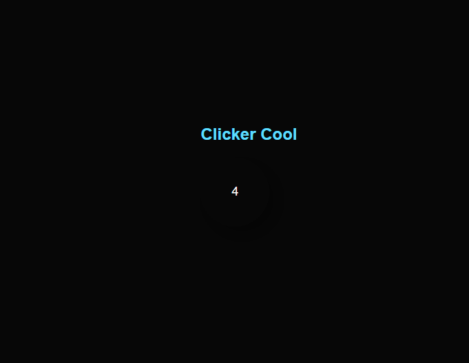
Clicker Cool
the game
What will we learn today?
- Interactive button
- Display Click indicator
- Adding juice
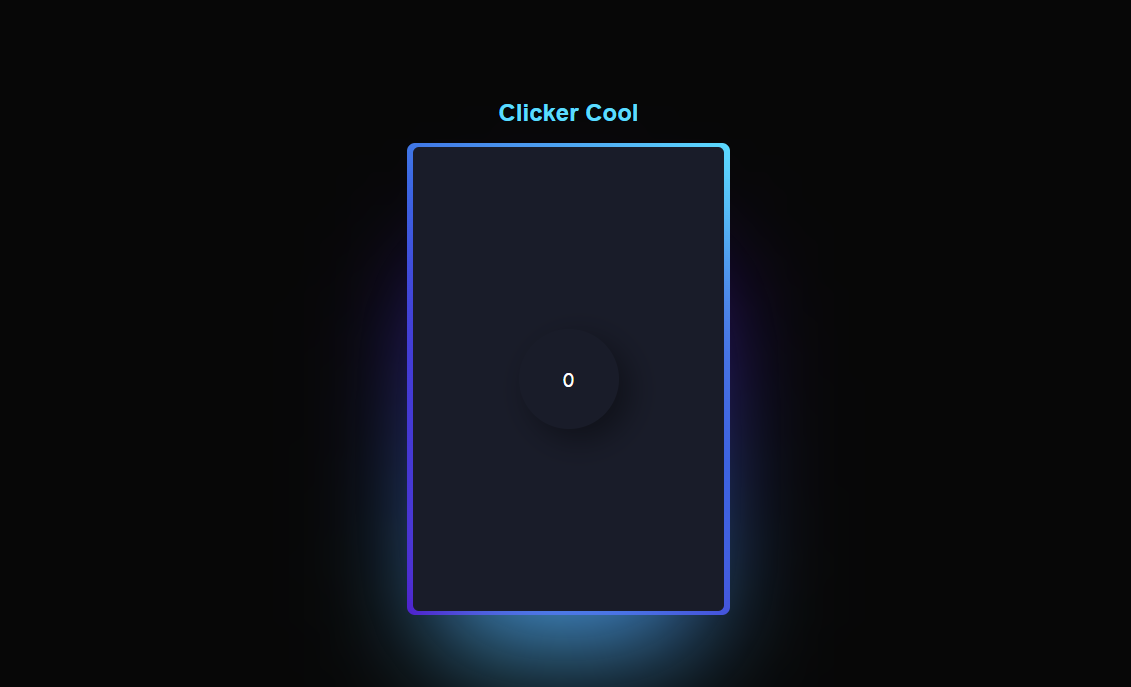
No juice
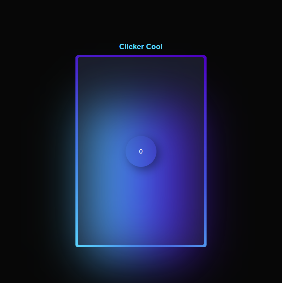
with juice
HTML, CSS?
wth?
.html
Hypertext Markup Language
Born: 1993
Purpose: Language for organizing and structuring web content.
Nickname:
Backbone of the Web
.css
Cascading Style Sheets.
Born: 1996
Purpose: Complement HTML by controlling presentation and layout.
Nickname:
Stylish Artisan
.js
Javascript
Born: 1995
Purpose: Enabling dynamic and responsive web behavior.
Nickname:
Dynamic Maverick
Content vs Behavior
HTML // JS
Static
A fixed and unchanging web presence, displaying the same content to all visitors, built using only HTML and CSS.
Dynamic
An interactive and personalized web experience, generating content on-the-fly based on user interactions and data, utilizing server-side processing and client-side scripting.
Real Life Sample
Here's an example of a real life website that has style and looks nice.
vhsgame.com
vhsgame.com
Making a website
3 steps
vscode
index.html
style.css
app.js
index.html
Structure of the website
<!DOCTYPE html>
<html>
<head>
  <title>Cool Clicker</title>
  <link rel="stylesheet" href="styles.css">
</head>
<body>
  <div class="container">
    <h1 class="title">Clicker Cool</h1>
    <div class="cookie-container">
      <div class="card">
        <div class="cookie cookie-count">0</div>
      </div>
    </div>
  </div>
  <script src="app.js"></script>
</body>
</html>
styles.css
Style of the content
body {
  display: flex;
  justify-content: center;
  align-items: center;
  height: 100vh;
  margin: 0;
  background-color: #070707;
  font-family: Arial, sans-serif;
}

.container {
  text-align: center;
}

.title {
  font-size: 24px;
  color: #5ddcff;
}

.cookie-container {
  position: relative;
  margin-top: 20px;
}
.cookie {
width: 100px;
height: 100px;
border-radius: 50%;
display: flex;
justify-content: center;
align-items: center;
font-size: 18px;
color: white;
cursor: pointer;
user-select: none;
z-index: 12;
transition: all 0.2s;
box-shadow: 0.66rem 0.66rem 2rem #00000067;
&:hover {
transform: scale(1.25);
}
&:active {
transform: scale(1.5);
}
}app.js
Dynamic elements
let cookieCount = 0;

const cookie =
	document.querySelector('.cookie');
const cookieCountElement =
	document.querySelector('.cookie-count');

cookie.addEventListener('click', () => {
  cookieCount++;
  updateCookieCount();
});

const updateCookieCount = () => {
  cookieCountElement.textContent = cookieCount;
}
Layout Set
Extra Styles
.card {
  background: #191c29;
  width: var(--card-width);
  height: var(--card-height);
  padding: 3px;
  position: relative;
  border-radius: 6px;
  justify-content: center;
  align-items: center;
  text-align: center;
  display: flex;
  font-size: 1.5em;
  color: rgb(88 199 250 / 0%);
  font-family: cursive;
}

.card::before {
  content: "";
  width: 104%;
  height: 102%;
  border-radius: 8px;
  background-image: linear-gradient(
    var(--rotate)
    , #5ddcff, #3c67e3 43%, #4e00c2);
    position: absolute;
    z-index: -1;
    top: -1%;
    left: -2%;
    animation: spin 2.5s linear infinite;
}
@property --rotate {
  syntax: "<angle>";
  initial-value: 132deg;
  inherits: false;
}
:root {
--card-height: 65vh;
--card-width: calc(var(--card-height) / 1.5);
}
.card::after {
position: absolute;
content: "";
top: calc(var(--card-height) / 6);
left: 0;
right: 0;
z-index: 1;
height: 100%;
width: 100%;
margin: 0 auto;
transform: scale(0.8);
filter: blur(calc(var(--card-height) / 6));
background-image: linear-gradient(
var(--rotate)
, #5ddcff, #3c67e3 43%, #4e00c2);
opacity: 1;
transition: opacity .5s;
animation: spin 60s linear infinite;
}
@keyframes spin {
0% {
--rotate: 0deg;
}
100% {
--rotate: 360deg;
}
}styles.css
Style of the content