Data Science & Machine Learning
with R
DISCLAIMER: The images, code snippets...etc presented in this presentation were collected, copied and borrowed from various internet sources, thanks & credit to the creators/owners
 Save
SaveDeep Dive
-
What is Data Science?
-
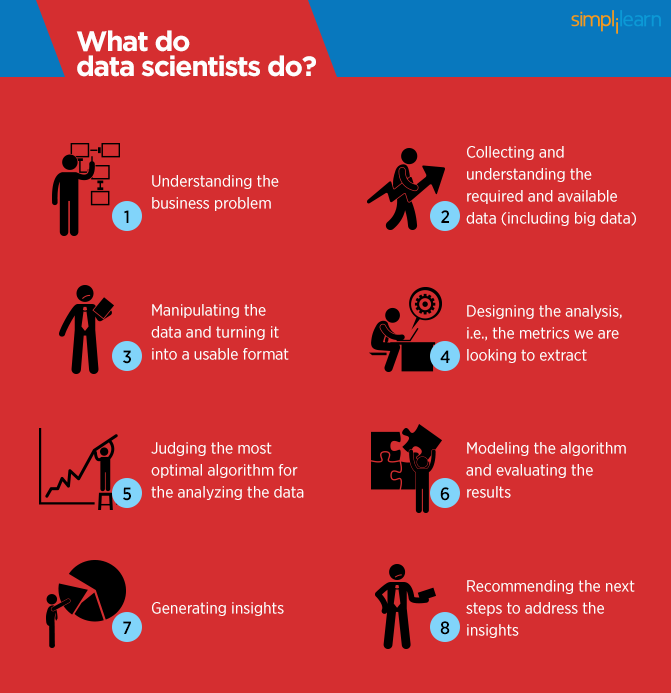
What Data Science Can Do?
-
Prerequisites & Skillset
-
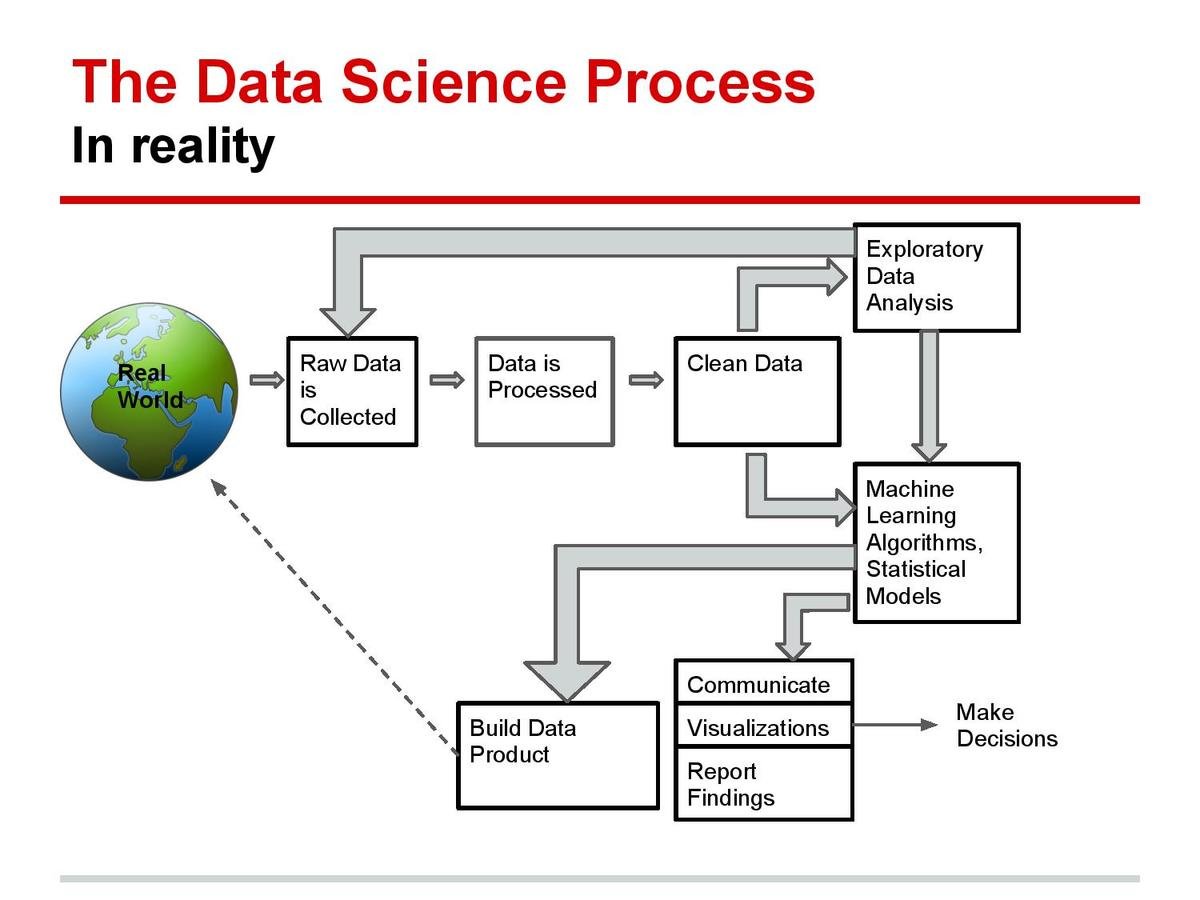
Data Science Workflow
-
R Programming
-
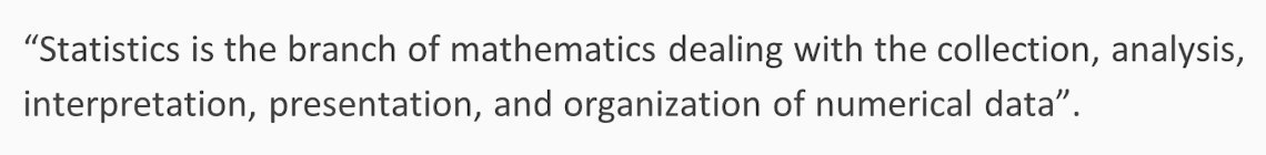
Statistics
-
Data Analysis & Visualization
-
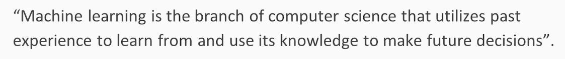
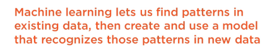
Machine Learning
-
Course Curriculum
-
Q & A
What is Data Science?
To gain insights into data through computation, statistics and visualization
The ability to take data—to be able to understand it, to process it, to extract value from it, to visualize it, to communicate it—that’s going to be a hugely important skill in the next decades - Hal Varian
What Data Science Can Do?
- Predict whether a patient hospitalized due to a heart attach, will have a second heart attach. The prediction is to be based on demographic, diet & clinical measurement for that patient..
- Predict the price of a stock in 6 months from now, on the basis of company performance measures & economic data.
- Identify the risk factors for prostate cancer, based on clinical & demographic variables.
- It can also figure out whether a customer is pregnant or not by capturing their shopping habits from retail stores
- It also knows your age and gender, what brands you like even if you never told., including your list of interests(which you can edit) to decide what kind of ads to show you.
- It can also predict whether or not your relationship is going to last, based on activities and status updates on social networking sites. Police departments in some major cities also know you're going to commit a crime.
- It also tells you what videos you've been watching, what you like to read, & when you're going to quit your job.
- It also guess how intelligent you are how satisfied you are with your life, and whether you are emotionally stable or not -simply based on analysis of the 'likes' you have clicked
this is actually just the tip of the iceberg
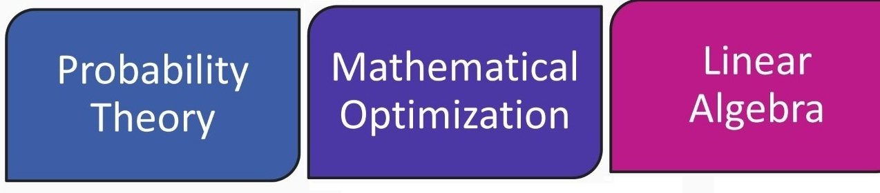
Prerequisites & Skillset

Data Science Workflow
R Programming


Statistics
Elementary statistics
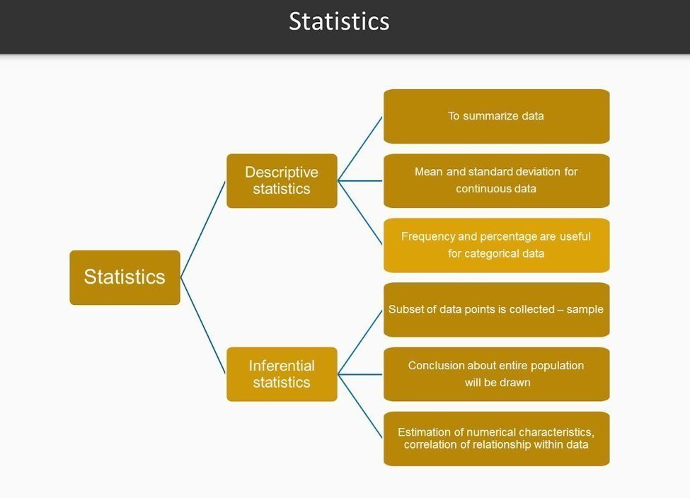
Statistics
Mean, Median, Mode, Standard Deviation, Range, Quartiles, skewness, kurtosis,.. more
#Applying basic statistics
data(iris)
class(iris)
mean(iris$Sepal.Length)
sd(iris$Sepal.Length)
var(iris$Sepal.Length)
min(iris$Sepal.Length)
max(iris$Sepal.Length)
median(iris$Sepal.Length)
range(iris$Sepal.Length)
quantile(iris$Sepal.Length)

sapply(iris[1:4], mean, na.rm=TRUE)
summary(iris)
cor(iris[,1:4])
cov(iris[,1:4])

t.test(iris$Petal.Width[iris$Species=="setosa"],
       iris$Petal.Width[iris$Species=="versicolor"])
cor.test(iris$Sepal.Length, iris$Sepal.Width)

aggregate(x=iris[,1:4],by=list(iris$Species),FUN=mean)

library(reshape)
iris.melt <- melt(iris,id='Species')
cast(Species~variable,data=iris.melt,mean,
     subset=Species %in% c('setosa','versicolor'),
     margins='grand_row')

?reshape
?aggregate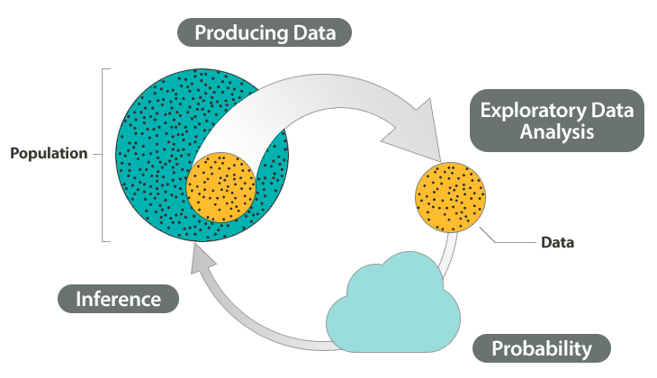
Data Analysis & Visualization
Data Analysis & Visualizations
Summarize, Scatter plot, Histogram, Box plot, Pie chart, Bar plot, ...... more
data(iris)
table.iris = table(iris$Species)
table.iris
pie(table.iris)
hist(iris$Sepal.Length)
boxplot(Petal.Width ~ Species, data = iris)
plot(x=iris$Petal.Length, y=iris$Petal.Width, col=iris$Species)
pairs(iris[1:4], main = "Edgar Anderson's Iris Data", pch = 21,
      bg = c("red", "green3", "blue")[unclass(iris$Species)])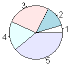
head(sales)
  cust_id sales_total num_of_orders gender
1  100001      800.64             3      F
2  100002      217.53             3      F
3  100003       74.58             2      M
4  100004      498.60             3      M
5  100005      723.11             4      F
6  100006       69.43             2      F

summary(sales)
    cust_id        sales_total      num_of_orders    gender
 Min.   :100001   Min.   :  30.02   Min.   : 1.000   F:5035
 1st Qu.:102501   1st Qu.:  80.29   1st Qu.: 2.000   M:4965
 Median :105001   Median : 151.65   Median : 2.000
 Mean   :105001   Mean   : 249.46   Mean   : 2.428
 3rd Qu.:107500   3rd Qu.: 295.50   3rd Qu.: 3.000
 Max.   :110000   Max.   :7606.09   Max.   :22.000
#console and script
> x = 7
> x + 9
[1] 16

#comments
# COMMENTS ARE SUPER IMPORTANT so we learned about them

#graphics
x = rnorm(1000, mean = 100, sd = 3)
hist(x)

#getting help
# if you know the function name, but not how to use it:
?chisq.test
# if you know what you want to do, but don't know the function name:
??chisquare

#data types
# character vector
> y = c("apple", "apple", "banana", "kiwi", "bear", "strawberry", "strawberry")
> length(y)
[1] 7
# numeric vector
> numbers = rep(3, 99)
> numbers
 [1] 3 3 3 3 3 3 3 3 3 3 3 3 3 3 3 3 3 3 3 3 3 3 3 3 3 3 3 3 3 3 3 3 3 3 3 3 3 3
[39] 3 3 3 3 3 3 3 3 3 3 3 3 3 3 3 3 3 3 3 3 3 3 3 3 3 3 3 3 3 3 3 3 3 3 3 3 3 3
[77] 3 3 3 3 3 3 3 3 3 3 3 3 3 3 3 3 3 3 3 3 3 3 3

#matrices
> mymatrix = matrix(c(10, 15, 3, 29), nrow = 2, byrow = TRUE)
> mymatrix
     [,1] [,2]
[1,]   10   15
[2,]    3   29
> t(mymatrix)
     [,1] [,2]
[1,]   10    3
[2,]   15   29
> solve(mymatrix)
           [,1]        [,2]
[1,]  0.1183673 -0.06122449
[2,] -0.0122449  0.04081633
> mymatrix %*% solve(mymatrix)
     [,1] [,2]
[1,]    1    0
[2,]    0    1
> chisq.test(mymatrix)
Pearson's Chi-squared test with Yates' continuity correction
data:  mymatrix
X-squared = 5.8385, df = 1, p-value = 0.01568

#data frames (the mother of all R data types)
# set working directory
setwd("~/Documents/R_intro")
# read in a dataset
wages = read.table("wages.csv", sep = ",", header = TRUE)

#exploratory data analysis
> names(wages)
[1] "edlevel" "south"   "sex"     "workyr"  "union"   "wage"    "age"
[8] "race"    "marital"
> class(wages$marital)
[1] "integer"
> table(wages$union)
not union member     union member
             438               96
> summary(wages$workyr)
   Min. 1st Qu.  Median    Mean 3rd Qu.    Max.
   0.00    8.00   15.00   17.82   26.00   55.00
> nrow(wages)
[1] 534
> length(which(is.na(wages$sex)))
[1] 0
> linmod = lm(workyr ~ age, data = wages)
> summary(linmod)

hist(wages$wage, xlab = "hourly wage", main = "wages in our dataset", col = "purple")
plot(wages$age, wages$workyr, xlab = "age", ylab="years worked", main = "age vs. years worked")
abline(lm(wages$workyr ~ wages$age), col="red", lwd = 2)
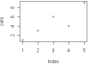
                                     mtcars[mtcars$mpg>=20,c('gear','mpg')]
                  aggregate(. ~ gear,mtcars[mtcars$mpg>=20,c('gear','mpg')],mean)
           subset(aggregate(. ~ gear,mtcars[mtcars$mpg>=20,c('gear','mpg')],mean),mpg>25)

                                       #output

                                          gear   mpg
                                        2    4 25.74
3 5 28.20Machine Learning
myData <- data.frame(age=c(10,20,30), weight=c(100,200,300))
myPersonsAge <- data.frame(age=c(20,25,30))
myTrainModel <- lm(weight~age,data = myData)
predict(myTrainModel,myPersonsAge)Machine Learning Intro
Algorithms:
Machine Learning Algorithms
Linear regression
Decision trees
K-means
# Load required packages
library(ggplot2)
library(datasets)
# Load data
data(iris)
# Set seed to make results reproducible
set.seed(20)
# Implement k-means with 3 clusters
iris_cl <- kmeans(iris[, 3:4], 3, nstart = 20)
iris_cl$cluster <- as.factor(iris_cl$cluster)
# Plot points colored by predicted cluster
ggplot(iris, aes(Petal.Length, Petal.Width, color = iris_cl$cluster)) + geom_point()# Include required packages
library(party)
library(partykit)
# Have a look at the first ten observations of the dataset
print(head(readingSkills))
input.dat <- readingSkills[c(1:105),]
# Grow the decision tree
output.tree <- ctree(
nativeSpeaker ~ age + shoeSize + score,
data = input.dat)
# Plot the results
plot(as.simpleparty(output.tree))# Load required packages
library(ggplot2)
# Load iris dataset
data(iris)
# Have a look at the first 10 observations of the dataset
head(iris)
# Fit the regression line
fitted_model <- lm(Sepal.Length ~ Petal.Width + Petal.Length, data = iris)
# Get details about the parameters of the selected model
summary(fitted_model)
# Plot the data points along with the regression line
ggplot(iris, aes(x = Petal.Width, y = Petal.Length, color = Species)) +
geom_point(alpha = 6/10) +
stat_smooth(method = "lm", fill="blue", colour="grey50", size=0.5, alpha = 0.1)Support vector machine
#svm
library(e1071)
# quick look at the data
plot(iris)

# feature importance
plot(iris$Sepal.Length, iris$Sepal.Width, col=iris$Species)
plot(iris$Petal.Length, iris$Petal.Width, col=iris$Species)
#split data
s <- sample(150, 100)
col <- c('Petal.Length','Petal.Width','Species')
iris_train <- iris[s,col]
iris_test <- iris[-s,col]
#create model
svmfit <- svm(Species ~ ., data = iris_train, kernel="linear", cost=.1, scale = FALSE)
print(svmfit)
plot(svmfit, iris_train[, col])

tuned <- tune(svm, Species~., data = iris_train, kernel='linear', ranges = list(cost=c(0.001, 0.01,.1, 1.10, 100)))
summary(tuned)

p <- predict(svmfit, iris_test[,col], type='class')
plot(p)
table(p, iris_test[,3])
mean(p==iris_test[,3])
Simple Linear Regression
# Creating Statistical Models
# Load the data
data(iris)
# Peak at data
head(iris)

# Create a scatterplot
plot(
    x = iris$Petal.Length,
    y = iris$Petal.Width,
    main = "Iris Petal Length vs. Width",
    xlab = "Petal Length (cm)",
    ylab = "Petal Width (cm)")

# Create a linear regression model
model <- lm(
    formula = Petal.Width ~ Petal.Length,
    data = iris)

# Summarize the model
summary(model)
# Draw a regression line on plot
lines(
    x = iris$Petal.Length,
    y = model$fitted,
    col = "red",
    lwd = 3)

# Get correlation coefficient
cor(
    x = iris$Petal.Length,
    y = iris$Petal.Width)
# Predict new values from the model
predict(
    object = model,
    newdata = data.frame(
        Petal.Length = c(2, 5, 7)))
some important algorithms: https://goo.gl/zAyFea
Least squares regression line
# generate normally distributed data for linear regression, make the scatter plot, and draw
# the least squares regression line.

# generate 1000 normally distributed random numbers and plot a histogram.
     x <- rnorm(100)
     hist(x)
     y <- x + rnorm(100)
     plot(x, y)
     foo <- lm(y ~ x)
abline(coefficients(foo))Course Curriculum