Robust and charming dataviz with RainCloud Plots
D. Poggiali, postDoc
Dublin, PyConIE 19

M. Allen, D. Poggiali, K. Whitaker, T. R. Marshall, R. A. Kievit

Summary:
- What is a RainCloud plot?
- The python package "ptitprince"
- Project history
you can find these slides at
https://slides.com/davidepoggiali
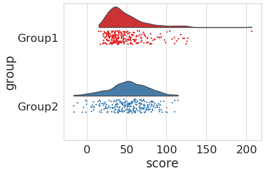
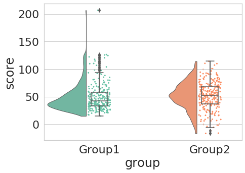
What is a RainCloud plot?
A Raincloud plot is a categorical plot, which aims to be informative and visually pleasant
Your data:
Your data:
Other categorical plotting tools:
1. Barplot
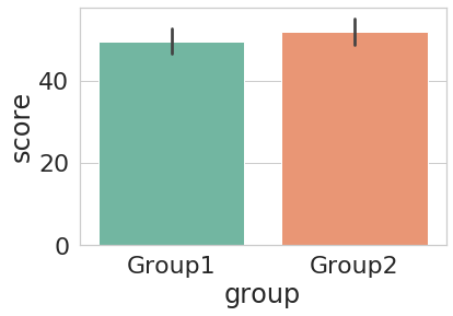
Your data:
Other categorical plotting tools:
2. Stripplot
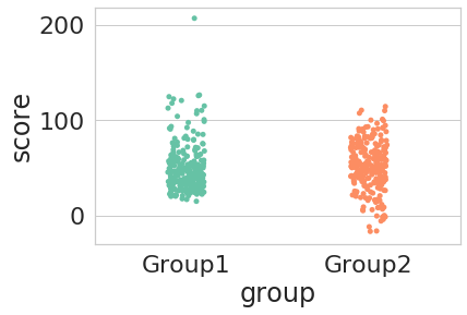
Your data:
Other categorical plotting tools:
3. Boxplot
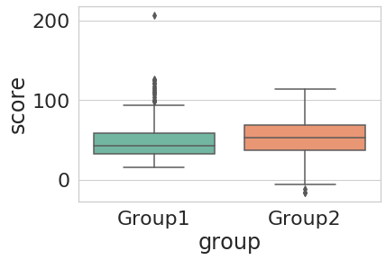
Your data:
Other categorical plotting tools:
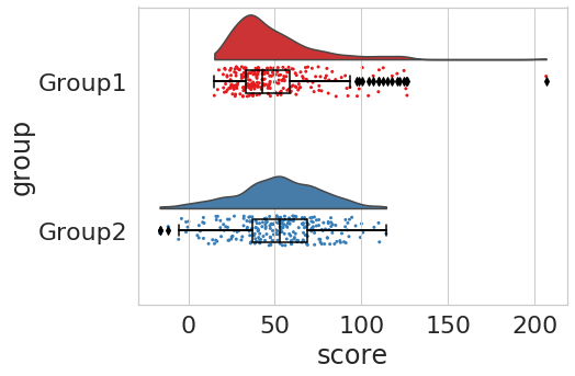
4. Violin plot
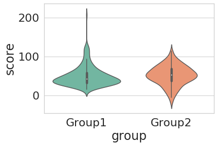
Comparison...
The Python package: ptitprince
RainCloud is currently written in:
- R
- Python
- MATLAB
The Python package is called ptitprince.
# you can install it via pip

pip install ptitprince

# or via conda

conda install -c conda-forge ptitprince

# or cloning the repo

git clone https://github.com/pog87/PtitPrince.git
cd PtitPrince/

python setup.py install
If you just want to try it out..
https://github.com/RainCloudPlots/RainCloudPlots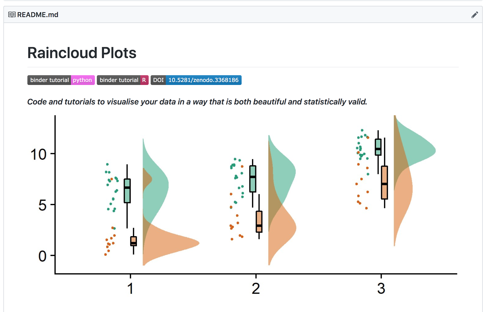
Basic usage
import pandas as pd
import matplotlib.pyplot as plt
import seaborn as sns
import ptitprince as pt
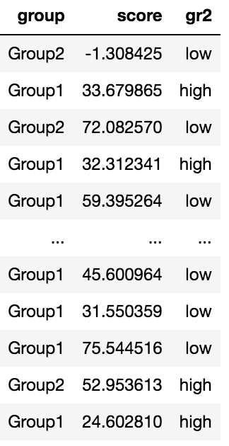
df = pd.read_csv(your_fancy_table)
f, ax = plt.subplots(figsize=(7, 5))
ax = pt.RainCloud(x = "group", y = "score", data = df)import pandas as pd
import matplotlib.pyplot as plt
import seaborn as sns
import ptitprince as pt
df = pd.read_csv(your_fancy_table)
f, ax = plt.subplots(figsize=(7, 5))
ax = pt.RainCloud(x = df["group"], y = df["score"])>>help(pt.RainCloud)
Help on function RainCloud in module ptitprince:
RainCloud(x=None, y=None, hue=None, data=None, .... )
[.....]
Main inputs:
x categorical data. Iterable, np.array,
or dataframe column name if 'data' is specified
y measure data. Iterable, np.array,
or dataframe column name if 'data' is specified
hue a second categorical data. Use it to obtain
different clouds and rainpoints
data input pandas dataframe
order list, order of the categorical data
hue_order list, order of the hue
orient string, vertical if "v" (default), horizontal if "h"
width_viol float, width of the cloud
width_box float, width of the boxplot
move float, adjusts rain position to the x-axis (default value 0.)
offset float, adjusts cloud position to the x-axis
A quick look at the help
Orientation
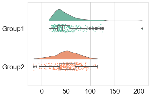
ax = pt.RainCloud(x = "group", y = "score",
                  data = df, ort = "h")
Rain shift
ax = pt.RainCloud(x = "group", y = "score",
                  data = df, ort = "h",
                  move = .2)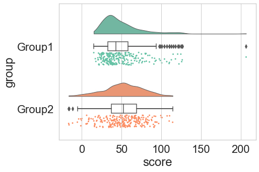
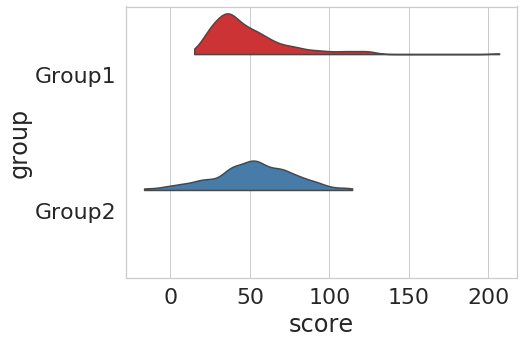
KDE bandwidth
ax = pt.RainCloud(x = "group", y = "score",
data = df, ort = "h",
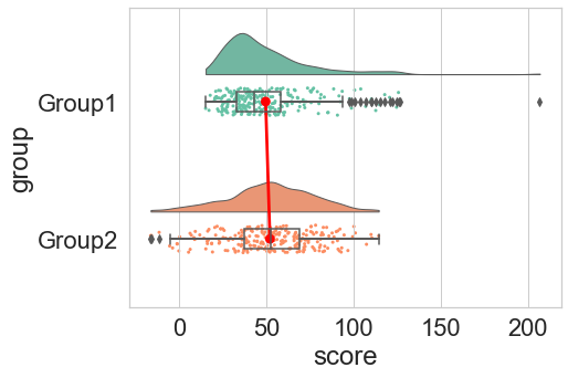
bw = .05)Adding a pointplot
ax = pt.RainCloud(x = "group", y = "score",
                  data = df, ort = "h",
                  pointplot = True)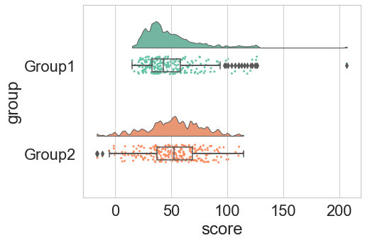
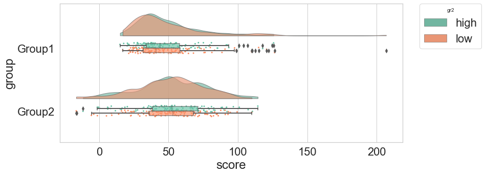
In case of a second category you can set hue...
ax=pt.RainCloud(x = "group", y = "score",
			data = df, orient = "h",
			hue = "gr2",
	 		alpha = .65,
            		dodge = True)
g = sns.FacetGrid(df, col = "gr2", height = 6)
g = g.map_dataframe(pt.RainCloud, x = "group", y = "score",
data = df, orient = "h")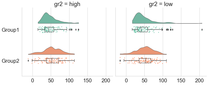
...or use FacetGrid!
Project History
The Raincloud project is a teamwork


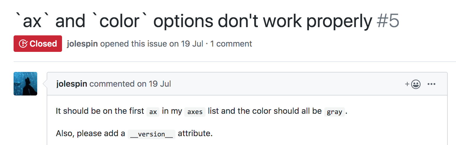
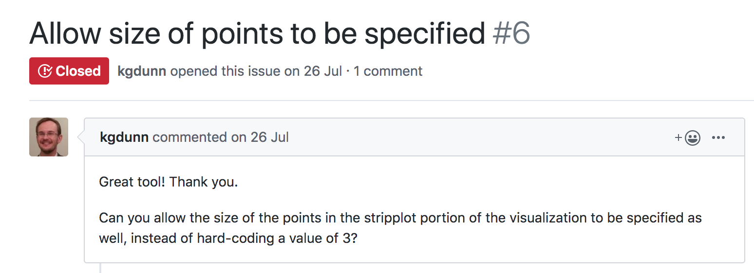
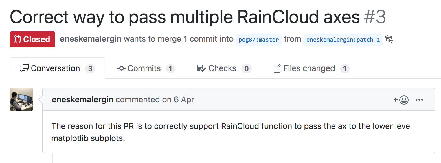
A lot of help was given via GitHub!
To cite Raincloud plots in your paper:
Allen M, Poggiali D, Whitaker K et al. Raincloud plots: a multi-platform tool for robust data visualization [version 1; peer review: 2 approved]. Wellcome Open Res 2019, 4:63. DOI: 10.12688/wellcomeopenres.15191.1