1. In what ways does your media product use, develop or challenge forms and conventions of real media products?
Using a tiger head instead of the original image challenged most music magazines as it is uncommon. I chose to do this because of the odd horse head trend and 'hipster art' which used geometric patterns and animal heads. I decided on a tiger because as the name is Wilderness, this would reflect that while challenging most magazines that focus on airbrushed images of people. Also, as seen on the Rolling Stones cover, featuring Deadmau5, I thought this would be an unusual and controversial feature for creating the 'Thane' persona.


Cover Image
I chose not to use a lot of text or too many photos on my magazine cover as most indie magazines have a basic layout, but I challenged most designs by using a combination of fonts together for different text features.
This was inspired by the fonts used for Indie brands and cafe signs, and was sligtly unusual for an indie magazine which does not combine multiple fonts.
Minimalistic Design


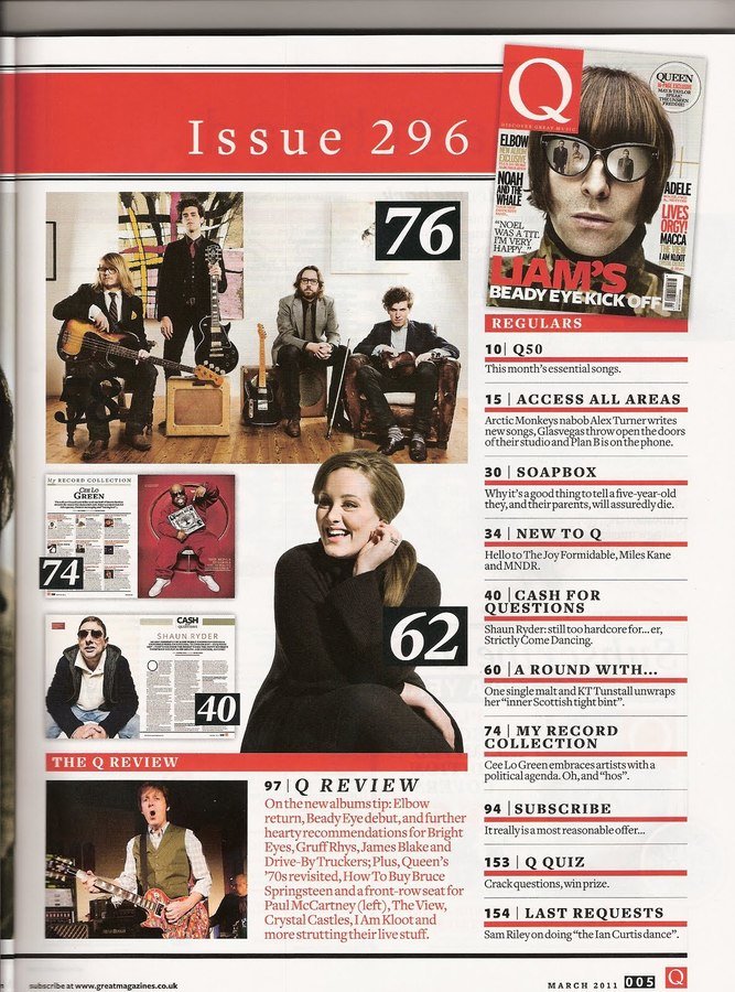
Using red lines to split text stuck to the traditional style of indie rock music magazines (such as Q Magazine) which made it conventional but the images were positioned in a row to make it look more organised on the page and minimalistic.


One of the design elements I tried to incorporate was a wide screen effect. If my magazine was more artistic I would have used thicker borders to create this effect, but because of the conventions of a music magazine it was not suitable.
Wide Screen Effect


3D Effect
I used the 3D effect to introduce more colour into my magazine cover image. I stuck with blue and red to give it more of a rock theme and manipulated the image more which made the indie theme stronger. A similar effect is used on Ben Howard's album art but layers of the photo which gives an exposure effect.

