Sample Website
Code Along
HTML Semantic Elements
Elements that describe meaning to browser and developer
<div>

<span>
Not Semantic
<form>

<table>
Semantic
HTML Semantic Elements
It is common for sites to use code such as this to define structure:
<body>
    <div id="nav">
        <!--Navigation Content Here-->
    </div>

    <div id="header">
        <!--Header Content Here-->
    </div>

    <div id="footer">
        <!--Footer Content Here-->
    </div>

</body>
Alternative is to use semantic elements
<body>
    <nav>
        <!--Navigation Content Here-->
    </nav>

    <header>
        <!--Header Content Here-->
    </header>

    <footer>
        <!--Footer Content Here-->
    </footer>

</body>
HTML Semantic Elements
Alternative is to use semantic elements
<article>
<aside>
<details>
<figcaption>
<figure>
<footer>
<header>
<main>
<mark>
<nav>
<section>
<summary>
<time>
<!DOCTYPE html>
<html>
<head>
<title>COM414 Internet Tech - Home Page</title>
<meta name="viewport" content="width=device-width, initial-scale=1.0">
<link rel="stylesheet" type="text/css" href="sample.css">
</head>
<body>
</body>
</html>- Create new folder called "SampleProject"
- Create an index.html file
- Create a sample.css file
- Copy/Paste the below into your html file to get started
<!DOCTYPE html>
<html>
<head>
	<title>COM414 Internet Tech - Home Page</title>
	<meta name="viewport" content="width=device-width, initial-scale=1.0">
	<link rel="stylesheet" type="text/css" href="sample.css">
</head>
<body>
    <header>
        <div class="container">
            <div id="branding">
                <h1>COM414 Sample</h1>
            </div>
            <nav>
                <ul>
                    <li><a href="index.html">Home</a></li>
		    <li><a href="about.html">About</a></li>
		    <li><a href="products.html">Products</a></li>
                </ul>
            </nav>
        </div>
    </header>
</body>
</html>- Use <header> tag
- Create a <div> and create a "container" class
- Create another <div> with id = "branding"
- Create Page header inside branding
- Creat Nav element
- Create list of links for navigating (Home, About, Products)
- Create another <div> with id = "branding"
<!DOCTYPE html>
<html>
<head>
<title>COM414 Internet Tech - Home Page</title>
<meta name="viewport" content="width=device-width, initial-scale=1.0">
<link rel="stylesheet" type="text/css" href="sample.css">
</head>
<body>
<header>
<div class="container">
<div id="branding">
<h1>COM414 Sample</h1>
</div>
<nav>
<ul>
<li><a href="index.html">Home</a></li>
<li><a href="about.html">About</a></li>
<li><a href="products.html">Products</a></li>
</ul>
</nav>
</div>
</header>
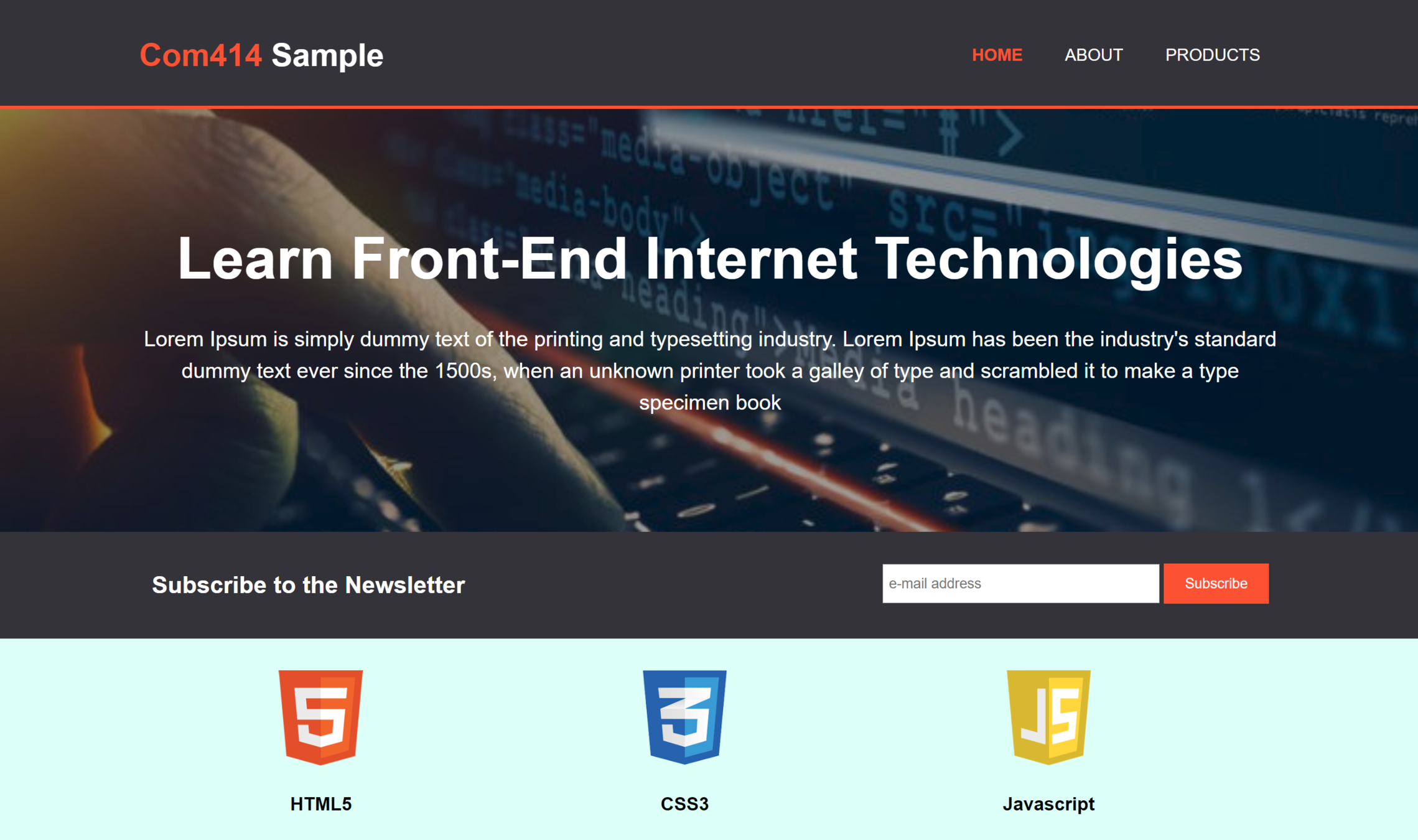
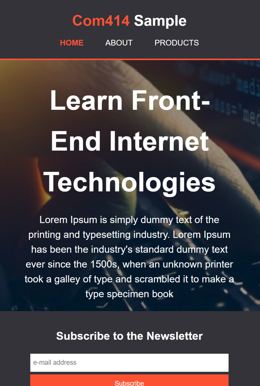
<section id="showcase">
<div class="container">
<h1>Learn Front-End Internet Technologies</h1>
<p>Lorem Ipsum is simply dummy text of the printing and typesetting industry. Lorem Ipsum
has been the industry's standard dummy text ever since the 1500s, when an unknown printer
took a galley of type and scrambled it to make a type specimen book
</p>
</div>
</section>
</body>
</html>- Add new section for hero image
- Add div with class set as "container"
- Add h1 text and p text
<!DOCTYPE html>
<html>
<head>
	<title>COM414 Internet Tech - Home Page</title>
	<meta name="viewport" content="width=device-width, initial-scale=1.0">
	<link rel="stylesheet" type="text/css" href="sample.css">
</head>
<body>
    <header>
        <div class="container">
            <div id="branding">
                <h1>COM414 Sample</h1>
            </div>
            <nav>
                <ul>
                    <li><a href="index.html">Home</a></li>
		    <li><a href="about.html">About</a></li>
		    <li><a href="products.html">Products</a></li>
                </ul>
            </nav>
        </div>
    </header>

    <section id="showcase">
        <div class="container">
            <h1>Learn Front-End Internet Technologies</h1>
            <p>Lorem Ipsum is simply dummy text of the printing and typesetting industry. Lorem Ipsum
            has been the industry's standard dummy text ever since the 1500s, when an unknown printer
            took a galley of type and scrambled it to make a type specimen book
            </p>
	</div>
    </section>

    <section id="news">
        <div class="container">
            <h1>Subscribe to the Newsletter</h1>
            <form>
                <input type="email" placeholder="e-mail address">
		<button type="submit" class="button1">Subscribe</button>
	    </form>
        </div>
    </section>
</body>
</html>- Add newsletter subscribe section
- Add a div with container class
- Add a form with email input and button to subscribe
<!DOCTYPE html>
<html>
<head>
	<title>COM414 Internet Tech - Home Page</title>
	<meta name="viewport" content="width=device-width, initial-scale=1.0">
	<link rel="stylesheet" type="text/css" href="sample.css">
</head>
<body>
    <header>
        <div class="container">
            <div id="branding">
                <h1>COM414 Sample</h1>
            </div>
            <nav>
                <ul>
                    <li><a href="index.html">Home</a></li>
		    <li><a href="about.html">About</a></li>
		    <li><a href="products.html">Products</a></li>
                </ul>
            </nav>
        </div>
    </header>

    <section id="showcase">
        <div class="container">
            <h1>Learn Front-End Internet Technologies</h1>
            <p>Lorem Ipsum is simply dummy text of the printing and typesetting industry. Lorem Ipsum
            has been the industry's standard dummy text ever since the 1500s, when an unknown printer
            took a galley of type and scrambled it to make a type specimen book
            </p>
	</div>
    </section>

    <section id="news">
        <div class="container">
            <h1>Subscribe to the Newsletter</h1>
            <form>
                <input type="email" placeholder="e-mail address">
		<button type="submit" class="button1">Subscribe</button>
	    </form>
        </div>
    </section>

    <section id="topicList">
        <div class="container">
            <div class="topic">
	        <img src="logo_html.png">
		<h3>HTML5</h3>
		<p>Lorem ipsum dolor sit amet, consectetur adipiscing elit, sed do eiusmod tempor incididunt
                ut labore et dolore magna aliqua.</p>
	    </div>
	    <div class="topic">
	        <img src="logo_css.png">
		<h3>CSS3</h3>
		<p>Lorem ipsum dolor sit amet, consectetur adipiscing elit, sed do eiusmod tempor incididunt
                ut labore et dolore magna aliqua.</p>
	    </div>
	    <div class="topic">
	        <img src="logo_javascript.png">
		<h3>Javascript</h3>
		<p>Lorem ipsum dolor sit amet, consectetur adipiscing elit, sed do eiusmod tempor incididunt
                ut labore et dolore magna aliqua.</p>
	    </div>
        </div>
    </section>
</body>
</html>- Add topics section to show general topics covered by module
- Add a div with container class
- Add 3 divs, each with class as "topic"
- Add content to each topic div
- Logo
- H1 text
- P text
<!DOCTYPE html>
<html>
<head>
<title>COM414 Internet Tech - Home Page</title>
<meta name="viewport" content="width=device-width, initial-scale=1.0">
<link rel="stylesheet" type="text/css" href="sample.css">
</head>
<body>
<header>
<div class="container">
<div id="branding">
<h1>COM414 Sample</h1>
</div>
<nav>
<ul>
<li><a href="index.html">Home</a></li>
<li><a href="about.html">About</a></li>
<li><a href="products.html">Products</a></li>
</ul>
</nav>
</div>
</header>
<section id="showcase">
<div class="container">
<h1>Learn Front-End Internet Technologies</h1>
<p>Lorem Ipsum is simply dummy text of the printing and typesetting industry. Lorem Ipsum
has been the industry's standard dummy text ever since the 1500s, when an unknown printer
took a galley of type and scrambled it to make a type specimen book
</p>
</div>
</section>
<section id="news">
<div class="container">
<h1>Subscribe to the Newsletter</h1>
<form>
<input type="email" placeholder="e-mail address">
<button type="submit" class="button1">Subscribe</button>
</form>
</div>
</section>
<section id="topicList">
<div class="container">
<div class="topic">
<img src="logo_html.png">
<h3>HTML5</h3>
<p>Lorem ipsum dolor sit amet, consectetur adipiscing elit, sed do eiusmod tempor incididunt
ut labore et dolore magna aliqua.</p>
</div>
<div class="topic">
<img src="logo_css.png">
<h3>CSS3</h3>
<p>Lorem ipsum dolor sit amet, consectetur adipiscing elit, sed do eiusmod tempor incididunt
ut labore et dolore magna aliqua.</p>
</div>
<div class="topic">
<img src="logo_javascript.png">
<h3>Javascript</h3>
<p>Lorem ipsum dolor sit amet, consectetur adipiscing elit, sed do eiusmod tempor incididunt
ut labore et dolore magna aliqua.</p>
</div>
</div>
</section>
<footer>
<p>Ulster University, Copyright © 2018</p>
</footer>
</body>
</html>- Add footer section
- Add p with copyright
body
{
	font-family: Arial, Helvetica, sans-serif;
	font-size: 15px;
	line-height: 1.5;

	padding: 0;
	margin: 0;

	background-color: #DDFFF7;
}- Start with the CSS
- Font
- No margins or padding for body
- Background color
.container
{
	width: 80%;
	margin: auto;

	/*hide content that spills over size of container*/
	/*i.e. dont create scroll bars inside containers*/
	overflow: hidden;
}- style the container class
- set width as a percentage (responsive)
- set margin to auto (this will center everything)
- style the header
- set colors
- set padding
- set min height (responsive)
- add bottom border
header
{
	background-color: #303036;
	color: #ffffff;

	padding-top: 30px;
	min-height: 70px;
	border-bottom: #F93943 3px solid;

}- style the links in the header
- set colors
- set padding
- set min height (responsive)
- add bottom border
header a
{
	color: #ffffff;
	text-decoration: none;
	text-transform: uppercase;
	font-size: 16px;
}
header ul
{
margin: 0;
padding: 0;
}
header li
{
float: left;
display: inline;
padding: 0 20px 0 20px;
}- make menu appear horizonatally
- remove space around links
- Make items display beside each other
- add padding left and right
header #branding
{
	float: left;
}

header #branding h1
{
	margin: 0;
}

header nav
{
	float: right;
	margin-top: 10px;
}- make menu appear on right hand side
- Put "branding" div on left
- Put nav menu on right
header .highlight
{
	color: #F93943;
	font-weight: bold;
}

header .current a
{
	color: #F93943;
	font-weight: bold;
}- Highlight parts of the header
- Add Class to h1 and first li
- Change color of COM414
- Change color of menu item currently selected
...
<div id="branding">
    <h1><span class="highlight">COM414</span> Sample</h1>
</div>
<nav>
    <ul>
	<li class="current"><a href="index.html">Home</a></li>
	<li><a href="about.html">About</a></li>
	<li><a href="products.html">Products</a></li>
    </ul>
</nav>
...
header .highlight, header .current a
{
color: #F93943;
font-weight: bold;
}
- Highlight parts of the header
- Add Class to h1 and first li
- Change color of COM414
- Change color of menu item currently selected
...
<div id="branding">
    <h1><span class="highlight">COM414</span> Sample</h1>
</div>
<nav>
    <ul>
	<li class="current"><a href="index.html">Home</a></li>
	<li><a href="about.html">About</a></li>
	<li><a href="products.html">Products</a></li>
    </ul>
</nav>
...
This is the same as previous slide
header a:hover
{
	color: #cccccc;
	font-weight: bold;
}- Add hover effect to nav menu
#showcase
{
	background:url('heroImage2_1.jpg') no-repeat;
	background-size: cover;
	text-align: center;
	color: #ffffff;
}
- Add hero image
#showcase
{
	background:url('heroImage2_1.jpg') no-repeat;
	background-size: cover;
	text-align: center;
	color: #ffffff;

    	min-height: 400px;
}
- Add hero image
#showcase
{

	background:url('heroImage2_1.jpg') no-repeat;
	background-size: cover;
	text-align: center;
	color: #ffffff;

  	min-height: 400px;
    	background-attachment: fixed;
}
- Add hero image
#showcase h1
{
	margin-top: 100px;
	font-size: 55px;
	margin-bottom: 10px;
}

#showcase p
{
	font-size: 20px;
}- Tidy up text around image
#showcase
{
	min-height: 400px;
	background:url('heroImage2_1.jpg') no-repeat;
	background-size: cover;
	text-align: center;
	color: #ffffff;
}

#showcase h1
{
	margin-top: 100px;
	font-size: 55px;
	margin-bottom: 10px;
}

#showcase p
{
	font-size: 20px;
}- Add background image to the showcase areas
- Improve the font of the h1 and p inside the showcase area
#news
{
	padding: 15px;
	color: #ffffff;
	background-color: #303036;
}

#news h1
{
	float: left;
}

#news form
{
	float: right;
	 margin-top: 15px;
}- Style the newsletter area
- Same color as header background
- White font
- float heading to left and form to right
.button1
{
	height: 38px;
	background-color: #FC5130;
	border: 0;
	padding-left: 20px;
	padding-right: 20px;
	color: #ffffff;
}
- Style the form within the newsletter area
- Larger button
#news input[type="email"]
{
	padding: 4px;
	height: 25px;
	width: 250px;
}- Style the form within the newsletter area
- Larger email entry box
#topicList
{
	margin-top: 20px;
}

#topicList .topic
{
	float: left;
	width: 30%;
}- Style the topics area
- Add margin in top
- Make width of each topic take up 30% of the width of the container it is in
- Float topics left so they appear side by side
#topicList .topic
{
	float: left;
	width: 30%;
	padding: 10px;
	text-align: center;
}- Style the topics area
- Add some padding to each topic box
- Center align everything in each box
#topicList .topic img
{
	width: 90px;
}- Style the topics area
- Set width of img to preset size
footer
{
	padding: 20px;
	margin-top: 20px;
	color: #ffffff;
	background-color: #FC5130;
	text-align: center;
}- Style the footer
- Padding & margins
- Text color and align
- Background color
- Create the About page
- Create about.html
- Copy the html code from the index.html into the about.html page
- Make modifications to the about.html page then
<!DOCTYPE html>
<html>
<head>
	<title>COM414 Internet Tech - About</title>
	<meta name="viewport" content="width=device-width, initial-scale=1.0">
	<link rel="stylesheet" type="text/css" href="sample.css">
</head>
<body>
    <header>
        <div class="container">
	    <div id="branding">
	        <h1><span class="highlight">Com414</span> Sample</h1>
	    </div>
	    <nav>
	        <ul>
		    <li><a href="index.html">Home</a></li>
		    <li class="current"><a href="about.html">About</a></li>
		    <li><a href="products.html">Products</a></li>
	        </ul>
	    </nav>
        </div>
    </header>


    <section id="news">
        <div class="container">
	    <h1>Subscribe to the Newsletter</h1>
	        <form>
		    <input type="email" placeholder="e-mail address">
		    <button type="submit" class="button1">Subscribe</button>
	        </form>
	</div>
    </section>

    <section id="main">
	   <div class="container">
	    </div>
    </section>

    <footer>
	<p>Ulster University, Copyright © 2018</p>
    </footer>
</body>
</html>- Make modifications to the about.html page:
- Change title
- Change current class in nav to about
- Remove the hero image showcase section
- Remove the topicList section
- Add a new section with id="main"
- Add a div with class="container"
...
<section id="main">
    <div class="container">
        <article id="main-article">
	    <h1 class="main-title">About Us</h1>

	    <p>Lorem ipsum dolor sit amet, consectetur adipiscing elit. Integer et ex est. Vivamus ex sapien, lacinia et condimentum vel, vestibulum id dui. Cras blandit consequat ligula sit amet venenatis. Suspendisse ullamcorper felis tellus. Nullam bibendum placerat dui. Etiam at venenatis turpis. Suspendisse eleifend vehicula urna vulputate auctor. Nam hendrerit elementum mauris hendrerit egestas. Nam dignissim, lorem eu efficitur gravida, nibh arcu commodo felis, at pretium nibh tortor nec augue. Maecenas eget euismod nulla. Quisque scelerisque metus ac arcu elementum varius. Vestibulum ut mi fermentum, sodales nunc pulvinar, tristique dui. Nullam fermentum malesuada nulla, vel fringilla eros lacinia ac. Integer ullamcorper dapibus dolor, sit amet lobortis nunc facilisis eget.</p>

	    <p>Aliquam pulvinar elit elit, vel porttitor ex sollicitudin a. Sed sagittis iaculis faucibus. Sed vel orci tempor, porttitor turpis eget, fringilla dui. Proin eu felis dolor. Pellentesque nec pretium tortor. Nunc a semper sapien. Vivamus vestibulum, nisi sit amet convallis vulputate, turpis dui ornare urna, eu placerat neque turpis ac nibh. Suspendisse egestas mollis dignissim.</p>
        </article>
    </div>
</section>
...- Make modifications to the about.html page:
- Add an "article" element to the new main section inside container
- Assign id="main-article"
- Add h1 inside article
- Assign class="main-title"
- Add two paragraphs
- Add an "article" element to the new main section inside container
...
<section id="main">
    <div class="container">
        <article id="main-article">
	    <h1 class="main-title">About Us</h1>

	    <p>Lorem ipsum dolor sit amet, consectetur adipiscing elit. Integer et ex est. Vivamus ex sapien, lacinia et condimentum vel, vestibulum id dui. Cras blandit consequat ligula sit amet venenatis. Suspendisse ullamcorper felis tellus. Nullam bibendum placerat dui. Etiam at venenatis turpis. Suspendisse eleifend vehicula urna vulputate auctor. Nam hendrerit elementum mauris hendrerit egestas. Nam dignissim, lorem eu efficitur gravida, nibh arcu commodo felis, at pretium nibh tortor nec augue. Maecenas eget euismod nulla. Quisque scelerisque metus ac arcu elementum varius. Vestibulum ut mi fermentum, sodales nunc pulvinar, tristique dui. Nullam fermentum malesuada nulla, vel fringilla eros lacinia ac. Integer ullamcorper dapibus dolor, sit amet lobortis nunc facilisis eget.</p>

	    <p>Aliquam pulvinar elit elit, vel porttitor ex sollicitudin a. Sed sagittis iaculis faucibus. Sed vel orci tempor, porttitor turpis eget, fringilla dui. Proin eu felis dolor. Pellentesque nec pretium tortor. Nunc a semper sapien. Vivamus vestibulum, nisi sit amet convallis vulputate, turpis dui ornare urna, eu placerat neque turpis ac nibh. Suspendisse egestas mollis dignissim.</p>
        </article>

        <aside id="sidebar">
	    <h3>Teaching Aims</h3>

            <p>Pellentesque nec pretium tortor. Nunc a semper sapien. Vivamus vestibulum, nisi sit amet convallis vulputate, turpis dui ornare urna, eu placerat neque turpis ac nibh. Suspendisse egestas mollis dignissim.</p>
	</aside>
    </div>
</section>
...- Make modifications to the about.html page:
- Add an "aside" element to the new main section inside container
- Assign id="sidebar"
- Add h3 inside aside
- Add a paragraph
- Add an "aside" element to the new main section inside container
aside#sidebar
{
	float: right;
	width: 30%;
	margin-top: 10px;
}- Style the aside
- Float to the right
- Set width as %
- Set margin top
article#main-article
{
	float:left;
	width: 65%;

}- Style the article
- Float to the left
- Set width as %
- Set margin top
.container
{
	...
}

.coloredbox
{
	padding: 15px;
	background-color: #30BCED;
	color: #FC5130;
	margin-top: 10px;
	margin-bottom: 10px;
}- Style the sidebar
- Create generic coloredbox style
- Position high up in css file (just below .container will work)
- Create generic coloredbox style
...
<aside id="sidebar">
    <div class="coloredbox">
        <h3>Teaching Aims</h3>

	<p>Pellentesque nec pretium tortor. Nunc a semper sapien. Vivamus vestibulum, nisi sit amet convallis vulputate, turpis dui ornare urna, eu placerat neque turpis ac nibh. Suspendisse egestas mollis dignissim.</p>
    </div>
</aside>
...- Style the sidebar
- Apply the coloredbox style by creating a div inside sidebar and setting class=coloredbox
.container
{
	...
}

.coloredbox
{
	padding: 15px;
	background-color: #30BCED;
	color: #FC5130;
	margin-top: 10px;
	margin-bottom: 10px;

        margin-right: 5px;
	border: 1px solid #303036;

	box-shadow: 2px 4px 8px black;
	border-radius: 3px;
}- Style the sidebar
- Style the border
- Create the Products page
- Create products.html
- Copy the html code from the about.html into the products.html page
- Make modifications to the products.html page then
- Make modifications to the products.html page:
- Change title
- Change current class in nav to products
- Change the "About Us" text to "Products" in the article element
- Remove the <p> tags and content from the article element
<!DOCTYPE html>
<html>
<head>
	<title>COM414 Internet Tech - Products</title>
	<meta name="viewport" content="width=device-width, initial-scale=1.0">
	<link rel="stylesheet" type="text/css" href="sample.css">
</head>
<body>
    <header>
	<div class="container">
	    <div id="branding">
	        <h1><span class="highlight">Com414</span> Sample</h1>
	    </div>
	    <nav>
	        <ul>
	            <li><a href="index.html">Home</a></li>
		    <li><a href="about.html">About</a></li>
		    <li class="current"><a href="products.html">Products</a></li>
	        </ul>
	    </nav>
	</div>
    </header>


    <section id="news">
        <div class="container">
	    <h1>Subscribe to the Newsletter</h1>
	    <form>
                <input type="email" placeholder="e-mail address">
		<button type="submit" class="button1">Subscribe</button>
	    </form>
	</div>
    </section>

    <section id="main">
        <div class="container">
	    <article id="main-article">
	        <h1 class="main-title">Products</h1>

	    </article>

	    <aside id="sidebar">
	        <div class="coloredbox">
		    <h3>Teaching Aims</h3>

		    <p>Pellentesque nec pretium tortor. Nunc a semper sapien. Vivamus vestibulum, nisi sit amet convallis vulputate, turpis dui ornare urna, eu placerat neque turpis ac nibh. Suspendisse egestas mollis dignissim.</p>
		</div>
            </aside>
	</div>
    </section>

    <footer>
        <p>Ulster University, Copyright © 2018</p>
    </footer>
</body>
</html>- Make modifications to the products.html page:
- Add an unordered list to the article below h1
- set id="products"
- Add 3 list items to the list
- For each <li>
- Add a h3
- Add a p with description
- Add a p with schedule info
- Add an unordered list to the article below h1
...
<article id="main-article">
    <h1 class="main-title">Products</h1>

    <ul id="products">
	<li>
	    <h3>HTML Basics</h3>
	    <p>Lorem ipsum dolor sit amet, consectetur adipiscing elit. Etiam imperdiet suscipit nisl non varius.</p>
	    <p>Schedule: Weeks 1-3</p>
	</li>
	<li>
	    <h3>CSS Basics</h3>
	    <p>Lorem ipsum dolor sit amet, consectetur adipiscing elit. Etiam imperdiet suscipit nisl non varius.</p>
	    <p>Schedule: Weeks 4-6</p>
	</li>
	<li>
	    <h3>Javascript Basics</h3>
	    <p>Lorem ipsum dolor sit amet, consectetur adipiscing elit. Etiam imperdiet suscipit nisl non varius.</p>
	    <p>Schedule: Weeks 6-10</p>
        </li>
    </ul>
</article>
...- Modify the side bar:
- Change h3 heading to "Ask a question"
- Remove the <p> element and content
- Add a form with a class of "question"
- Add text entry
- Add email entry
- Add message entry
- Add button input
- Give button class of "button1" which we have already styled
...
<aside id="sidebar">
    <div class="coloredbox">
        <h3>Ask a Question</h3>

	<form class="question">
	    <div>
		<label>Name</label><br>
		<input type="text" placeholder="Name">
	    </div>
	    <div>
		<label>Email</label><br>
		<input type="email" placeholder="Email Address">
	    </div>
	    <div>
		<label>Message</label><br>
		<textarea placeholder="Message"></textarea>
	    </div>
	    <button class="button1" type="submit">Send</button>
	</form>
    </div>
</aside>
...- Style the products list
- Set padding on ul to 0
- Remove bullet points
- Add adding and margin
- Set border
- Set background color
ul#products
{
	padding: 0;
}

ul#products li
{
	list-style: none;
	padding: 20px;
	border: #303036 solid 1px;
	margin-bottom: 5px;


	background-color: #AFBFC0;
}- Style the sidebar (only style the input and textareas)
- Set width
- Add padding
aside#sidebar .question input, aside#sidebar .question textarea
{
	width: 90%;
	padding: 5px;
}
rules in CSS
@mediaThe @media rule is used in media queries to apply different styles for different media types/devices.
In other words, apply these extra styles for small screens to make them fit better on the screen
Main aim of making site like ours mobile friendly is removing the float left and right styles
We want elements stacked on top of each other
@media(max-width: 700px)
{
	/*everything in here will only be affected
	 when screen is less that 700px wide*/

	 header #branding,
	 header nav,
	 header nav li
	 {
	 	float: none;
	 	text-align: center;
	 	width: 100%;
	 }
}- Remove floats, align center and set width to 100%
- Do this for all the elements in the header
@media(max-width: 700px)
{
	/*everything in here will only be affected
	 when screen is less that 700px wide*/

	 header #branding,
	 header nav,
	 header nav li
	 {
	 	float: none;
	 	text-align: center;
	 	width: 100%;
	 }

         header
	 {
	 	padding-bottom: 20px;
	 }
}- Add some space below the header
@media(max-width: 700px)
{
	/*everything in here will only be affected
	 when screen is less that 700px wide*/

	 header #branding,
	 header nav,
	 header nav li
	 {
	 	float: none;
	 	text-align: center;
	 	width: 100%;
	 }

         header
	 {
	 	padding-bottom: 20px;
	 }

     #showcase h1
	 {
	 	margin-top: 40px;
	 }
}- Tidy up showcase
@media(max-width: 700px)
{
	/*everything in here will only be affected
	 when screen is less that 700px wide*/

	 header #branding,
	 header nav,
	 header nav li,
	 #news h1,
	 #news form
	 {
	 	float: none;
	 	text-align: center;
	 	width: 100%;
	 }

         header
	 {
	 	padding-bottom: 20px;
	 }

         #showcase h1
	 {
	 	margin-top: 40px;
	 }

      #news button
	 {
	 	display: block;
	 	width: 100%;
	 }

	 #news form input[type="email"]
	 {
	 	width: 100%;
	 	margin-bottom: 5px;
	 }
}- Tidy up newsletter
- Remove floats
- Center
- Width 100%
- Put button below text
- Set width of text and button to be wider
@media(max-width: 700px)
{
	/*everything in here will only be affected
	 when screen is less that 700px wide*/

	 header #branding,
	 header nav,
	 header nav li,
	 #news h1,
	 #news form,
     #topicList .topic
	 {
	 	float: none;
	 	text-align: center;
	 	width: 100%;
	 }

         header
	 {
	 	padding-bottom: 20px;
	 }

         #showcase h1
	 {
	 	margin-top: 40px;
	 }

         #news button
	 {
	 	display: block;
	 	width: 100%;
	 }

	 #news form input[type="email"]
	 {
	 	width: 100%;
	 	margin-bottom: 5px;
	 }
}- Tidy up topics
- remove float
- center
- width to 100%
@media(max-width: 700px)
{
	/*everything in here will only be affected
	 when screen is less that 700px wide*/

	 header #branding,
	 header nav,
	 header nav li,
	 #news h1,
	 #news form,
	 #topicList .topic,
	 article#main-article,
	 aside#sidebar
	 {
	 	float: none;
	 	text-align: center;
	 	width: 100%;
	 }
	 {
	 	float: none;
	 	text-align: center;
	 	width: 100%;
	 }

         header
	 {
	 	padding-bottom: 20px;
	 }

         #showcase h1
	 {
	 	margin-top: 40px;
	 }

         #news button
	 {
	 	display: block;
	 	width: 100%;
	 }

	 #news form input[type="email"]
	 {
	 	width: 100%;
	 	margin-bottom: 5px;
	 }
}- Tidy up article and side bar
- remove float
- center
- width to 100%
#news button, .question button
{
    display: block;
    width: 100%;
}- Tidy sidebar button a little
Job
Done
@media(max-width: 700px)
{
	/*everything in here will only be affected
	 when screen is less that 700px wide*/

	 header #branding,
	 header nav,
	 header nav li,
	 #news h1,
	 #news form
	 {
	 	float: none;
	 	text-align: center;
	 	width: 100%;
	 }

         header
	 {
	 	padding-bottom: 20px;
	 }

         #showcase h1
	 {
	 	margin-top: 40px;
	 }
}- Tidy up newsletter
- Remove floats
- Center
- Width 100%