Flex, Positioning, Borders, and Shadows

CSS Three
Flexbox
Flexbox allows more flexibility for how a parent element arranges its contents.
Games that teach flexbox:
Flexbox Properties
We have access to many properties with flexbox
flex-example {
    /*initialize flexbox*/
    display: flex;

    /*available properties*/
    flex-direction: row;
    justify-content: center;
    align-items: center;
    flex-wrap: wrap;
}
Flex Direction
flex-direction determines the direction content should flow
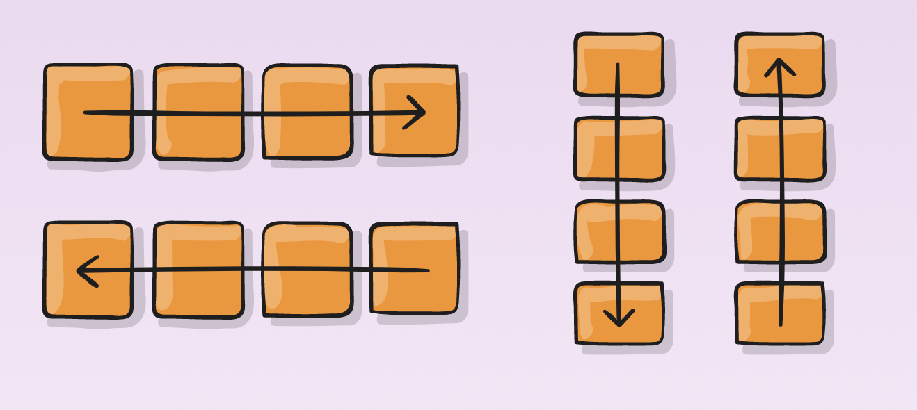
flex-direction: row; (default value)
flex-direction: row-reverse;
Flex Wrap
flex-wrap determines whether or not the content can wrap in the parent element.
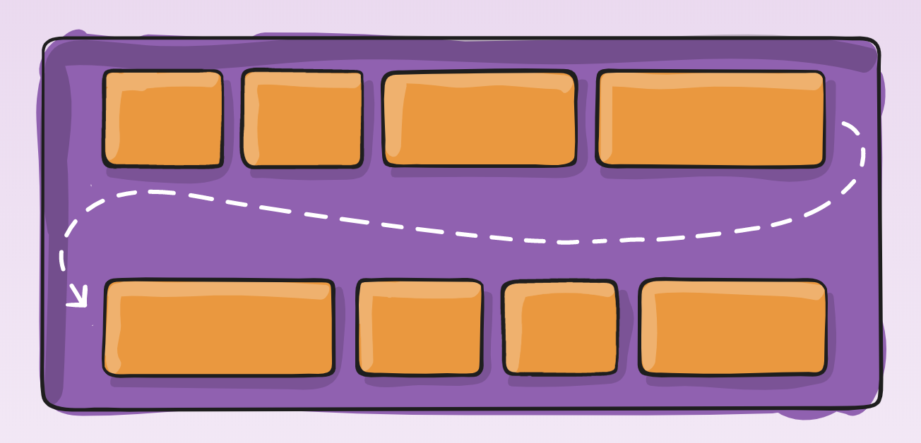
Flex-wraps default value is no-wrap;
Justify Content
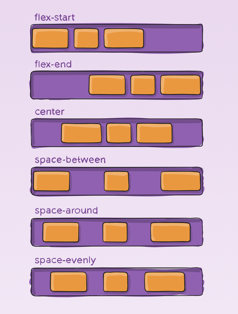
justify-content determines where to place content in the container, and how much space is between that content.
Default value is flex-start.
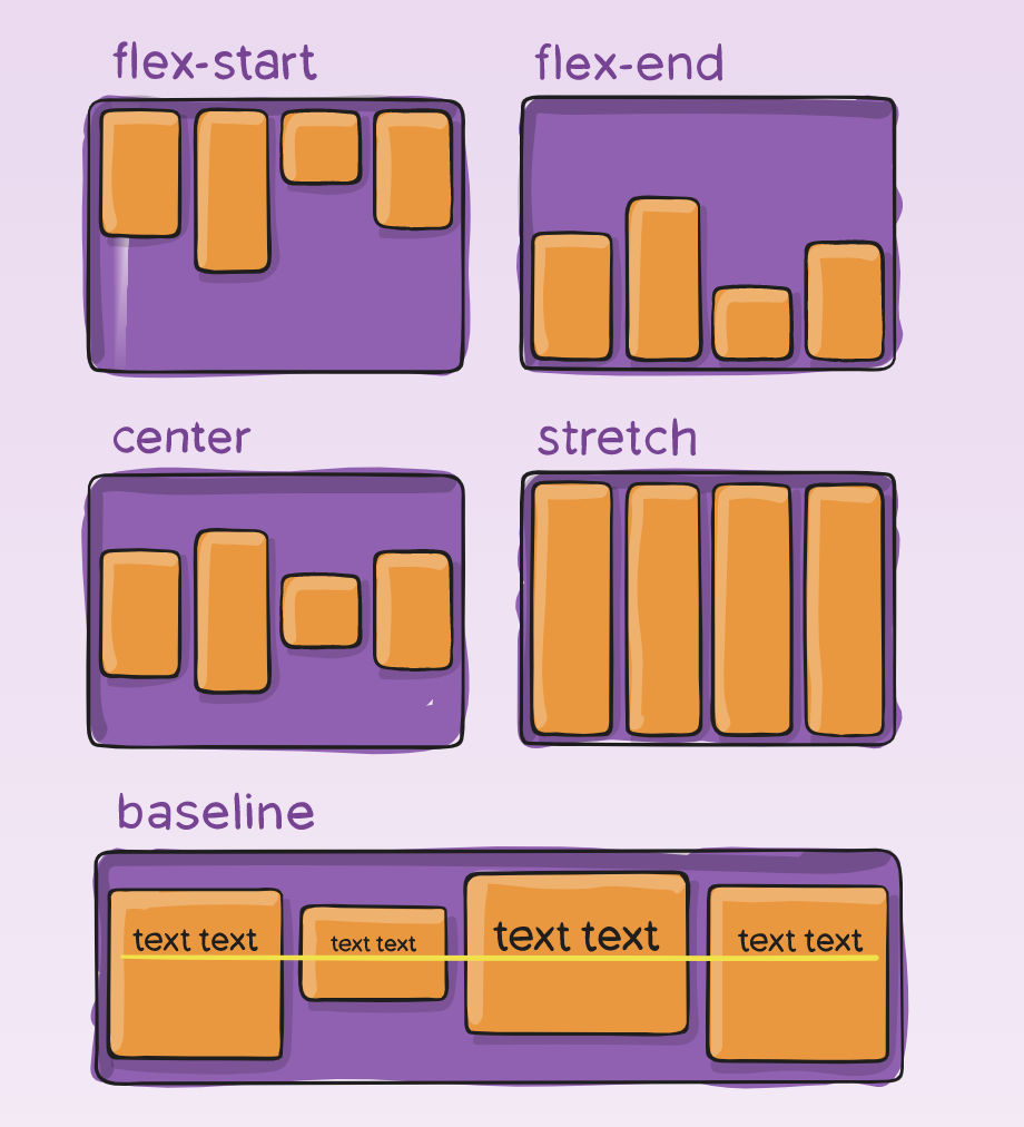
Align Items
align-items determines how content is laid out along the cross axis of the container
(vertically if flex-direction is row, horizontally if flex-direction is column)
Default value is flex-start.
Position Properties
Position properties in CSS allow us to specify the position of a selected element. There are five position property values we'll cover:
Static (positions default value)
Relative
Fixed
Absolute
Sticky
Position Properties: Relative
Relatively positioned elements are positioned relative to where they would normally be placed in the document flow.
.relative-example {
    position: relative;
    top: 5px;
    left: 5px;
}
Elements original position
Elements new position
Viewport
Position Properties: Fixed
Fixed positioned elements are positioned relative to the viewport. The fixed element remains in that portion of the viewport, regardless of scroll.
.fixed-example {
    position: fixed;
    top: 0px;
    right: 0px;
}
Fixed
Viewport
Position Properties: Absolute
Absolute positioned elements are positioned relative to their nearest positioned ancestor.
If there are no positioned ancestors, the element positions relative to the viewport.
.ancestor-example {
    position: relative;
}

.absolute-example {
    position: absolute;
    top: 0px;
    right: 0px;
}
Absolute
Ancestor
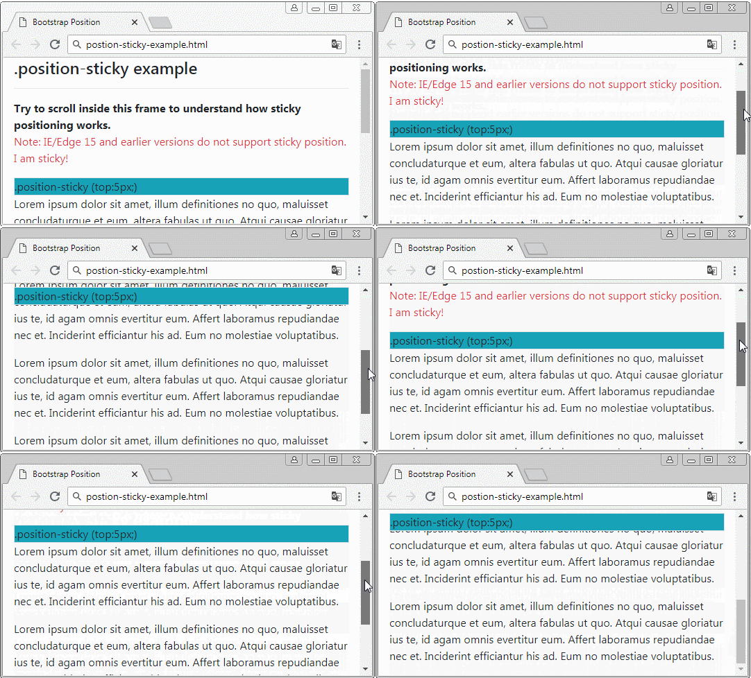
Position Properties: Sticky
Sticky toggles between fixed and relative, based on scroll position. The sticky element remains relatively positioned until the scroll hits a specified position, then toggles to fixed.
While working with positioned elements, you may have noticed a positioned element layered beneath another element and thought:
When working with position, we can use the z-index property to determine how we want to layer our positioned elements. The higher the z-index value, the more priority it has to the front of the view.
Z-index
.bottom-layer {
    position: relative;
    z-index: 1;
}

.top-layer {
    position: relative;
    top: 5px;
    left: 5px;
    z-index: 2;
}
bottom-layer
top-layer
We can target individual borders on an element to create emphasis using these properties.
- border-top
- border-right
- border-bottom
- border-left
Targeting Borders
.box {
  height: 100px;
  width: 100px;
  background-color: red;
  border-bottom: 15px solid black;
}
box
The property border-radius lets us make rounded corners. The element does not need a defined border for this to work.
border-radius
.circle {
  height: 100px;
  width: 100px;
  background-color: red;
  border-radius: 50%;
}
circle
box-shadow
The box-shadow property can add a 'shadow' to an existing element. This can create a 3D looking effect for elements.
More about box-shadow here:
.shadow-example {
    box-shadow: 3px 3px 0px 0px black;
}
Horizontal Offset
Vertical Offset
Blur Radius
Spread Radius
color
shadow example
Google Fonts
We can use more than the built-in CSS fonts using a website like Google Fonts.
We'll use it to select fonts and it will generate some code for us. Then we just take the code and put it in our CodePens.
We store <link> tags from Google Fonts in the head of our document, which provides information about the document but doesn't show up on the page.