HTML5 & CSS3
Dustin Tauer
Easel Solutions
e: dustin@easelsolutions.com
t: @dtauer
http://slid.es/dtauer/
Schedule
- The Interweb: Past, Present, Future
- HTML5 Features
- CSS3 Features
- Responsive Web Design
Along the way
- Practical Uses / Fallback Solutions
- Testing Tools, Generators, Frameworks
- Resources. Resources. Resources.
Credits
-
Ben Callahan
- @bencallahan
-
http://speakerdeck.com/bencallahan
Past | Present | Future
- 1991: HTML
- 1994: HTML 2
- 1996: CSS 1, JavaScript
- 1997: HTML 4
- 1998: CSS 2
- ...[Flash]...
- 2009: HTML 5 / CSS 3
Note: Aside from adding AJAX in 2005,
JavaScript hasn't changed
Past | Present | Future
- Built sites with simple HTML & CSS
- Used JavaScript sparingly
-
browsername=navigator.appName; if (browsername.indexOf("Netscape")!=-1) {browsername="NS"} else if (browsername.indexOf("Microsoft")!=-1) {browsername="MSIE"} browserversion="0"; if (navigator.appVersion.indexOf("2.")!=-1){browserversion="2"}; if (navigator.appVersion.indexOf("3.")!=-1){browserversion="3"}; - Relied heavily on server-side code for dynamic functionality
- Used a lot of Flash. A lot.
Past | Present | Future
- Sites are being updated to be more "mobile friendly"
- Sites are replacing Flash content with JavaScript
- jQuery to the rescue
- 9800+ lines of code so you can do this:
//Load current temperature from an external webservice
//by passing a zipcode...all without reloading the page$.ajax({url: "/api/getWeather", data: {zipcode: 90210},
  success: function( data ) {
    $( "#temp" ).html(data + " degrees" );
  }
});
Past | Present | Future
The Framework Era
- CSS
- Twitter Bootstrap, PureCSS
- CSS Pre-processors
- Sass, LESS, Compass
- JavaScript UI
- jQueryUI, YUI
- JavaScript Architecture
- Backbone.js, Knockout
- Templating
- Mustache, Underscore
Past | Present | Future
- Responsive Web Design
- Mobile-first approach
- Single page websites
- AJAX
- Responsive/Adaptive images
- For Retina and other high-resolution displays
- Lighter page load
- Few "standards"
Past | Present | Future
"Build it in HTML 5"
Past | Present | Future
HTML 5 is not mobile
HTML 5 is not the replacement for Flash
HTML 5 ~= HTML + CSS + JavaScript
Past | Present | Future
-
HTML 5.0: Q4, 2014
- Yep, it's not done yet
-
HTML 5.1: 2016
-
HTML 5.2: 2018
-
No more "mobile" websites
- Browser consistency
Past | Present | Future
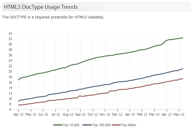
trends.builtwith.com
Past | Present | Future
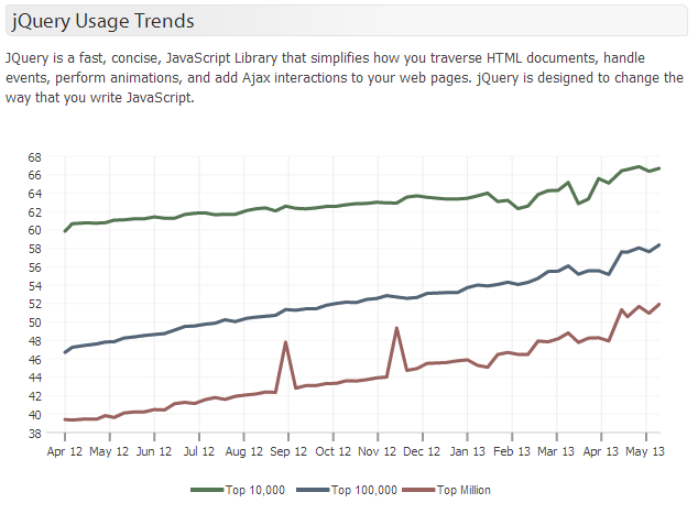
trends.builtwith.com
Past | Present | Future

trends.builtwith.com
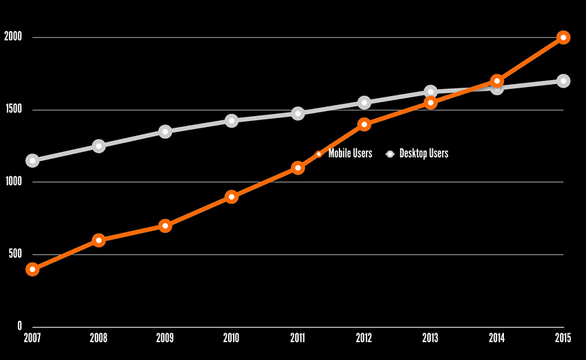
The web is not fixed width
- 52% of Laptop owners also own a smartphone
- 31% of smartphone owners also own a laptop
- 13% own a laptop, smartphone, & tablet
Laptop and Desktop ownership is the
same today as it was in 2007
http://bit.ly/13frzFo
The web is not fixed width
bit.ly/L5cqiO
The purpose of html 5
- New features should be based on HTML, CSS, DOM, and JavaScript
- Reduce the need for external plugins (like Flash)
- Better error handling
- More markup to replace scripting
- HTML5 should be device independent
- The development process should be visible to the public
Before we start
- Course Files
- Dreamweaver
- Source Code Pro font
- caniuse.com & html5please.com
- Web developer toolbar
- Chrome: F12
- IE: F12
- Firefox: Install Firebug
- Safari: Enable in preferences
HTML 5 | Semantics
-
New Structural Tags
- Polyfills/Shivs
-
Datalist
-
Details/Summary
-
Meter/Progress
HTML 5 | Forms
- New Types
- email, tel, number
- date
- range
- search
- color
- Attributes:
- placeholder, required, min/max
-
Validation
-
jQuery Form Widget
HTML 5 | Audio & Video
- Video codecs
- MP4, WebM, OGV/OGG
- http://www.mirovideoconverter.com/
- Audio
- MP3, OGG
HTML 5 | Graphics
-
SVG
-
Canvas/WebGL Demos
HTML 5 | Other
- Offline Applications
-
Local Storage
-
Indexed Database
-
Local File Access
-
Custom Data Attribute
Questions on html 5?
css 3 | vENDOR PREFIXES
-
http://css3please.com/
- -moz (Firefox)
- - webkit (Chrome/Safari)
- -ms (Microsoft)
- -o (Opera)
CSS 3 | sELECTORS
 li:nth-child(even) {
   color: white;
   background-color: black;
}
CSS 3 | prESENTATION
- Columns
- 2d Transforms
- Flex Box Model
- Transitions
- Web Fonts
- Text Wrapping
- Animations
CSS 3 | mEDIA qUERIES
<!-- In your HTML --> <link media=”(min-width: 480px)” ... <link media=”screen and (max-width: 1024px)” .../* In your CSS */ @media (min-width: 480px) { ... } @media screen and (max-width: 1024px) { ... }
qUESTIONS ON css 3?
Let's get real
Dont' forget about jQuery
-
http://jquery.com/
- Version 1: IE6+
- Version 2: IE9+
Off Topic
- CSS Preprocessors
- Sass/LESS
rwd | rESPONSIVE wEB dESIGN
State of the Union
RWD | RESPONSIVE WEB DESIGN
- Fluid foundation (container)
- Responsive content
- Media Queries
RWD | RESPONSIVE WEB DESIGN
Before we can do anything
<!-- html --> <meta name="viewport" content="width=device-width; initial-scale=1.0;">/* CSS */ @-webkit-viewport { width:device-width; } @-moz-viewport { width:device-width; } @-ms-viewport { width:device-width; } @-o-viewport { width:device-width; } @viewport { width:device-width; }
RWD | RESPONSIVE WEB DESIGN
A responsive formula:
target / context = %
/* Fixed */ .container{ width: 600px; } .sidebar{ width: 200px; }/* Responsive */ .container{ width: 100%; } .sidebar{ width: 33.33333%} /* 200 / 600 = 33.33333*/
RWD | Four CSS Approaches
1) Single File
- Simple to implement
- Single request
- Doesn’t require a preprocessor
- Requires JS to serve large layout to old IE if starting with small layouts
- Large sites can be difficult to maintain because of the size of the single file
Single File Approach
/* styles.css */ aside { color: #333; width: 100%; }/* if the viewport width is 40em or greater */ @media (min-width: 40em) { aside { width: 50%; } }/* if the viewport width is 60em or greater */ @media (min-width: 60em) { aside { width: 30%; } }
RWD | FOUR CSS APPROACHES
2) Multiple Files
-
Doesn’t require a preprocessor
- At least two requests
- Requires you to separate layout from other styles
- Allows you to start with small layouts and serve a single large layout to old
- IE without JS
- Requests go up if you use multiple MQs
Multiple File approach
<link href=”global.css” rel=”stylesheet”><link href=”layout.css” media=”(min-width: 40em)” rel=”stylesheet”><!--[if (lt IE 9) & (!IEMobile)]> <link href=”layout.css” rel=”stylesheet”> <![endif]-->
RWD | FOUR CSS APPROACHES
3) Breakpoint-based Partials
-
Allows you to start with small layouts and serve large layout to old IE without JS
- Only 1 or 2 requests
- Requires preprocessor
- Maintenance can be complex
breakpoint-based partials
<link href=”base.css” rel=”stylesheet”><!--[if (lt IE 9) & (!IEMobile)]> <link href=”no-mq.css” rel=”stylesheet”> <![endif]-->base.scss /* Sass */ @import “smallest”; @media (min-width: 40em) { @import “40em”; } @media (min-width: 60em) { @import “60em”; }no-mq.scss @import “40em”; @import “60em”;
RWD | FOUR CSS APPROACHES
4) Module-based Approach
-
Single Request
- Easy Maintenance
- Allows you to start with small layouts and serve large layout to old IE without JS
- Single request for all
- Requires Preprocessor
RWD | Resources
Tools
- Adobe Edge Reflow
- Responsive Inspector (Chrome Extension)
Frameworks
Book
RWD | RESOURCES
Twitter
- @bencallahan
- @scottjehl
- @ResponsibleRWD
- @chriscoyier
- @rwd
- @mesh
More Resources
Check for browser compatibility
Normalize/Reset CSS
CSS Preprocessors (Advanced)
HTML5 Boilerplate
Course files and slides
You can download the finished files from here (Select File > Download to download everything):
Since the slides are in an HTML format, they aren't downloadable. You are able to embed them via the share button.