It's Time To Ditch The Grid System
Emily Hayman @eehayman 2016 CSS Conf
A bit of history


flexbox
but what about the real world?

What's the big deal?
- Efficient way to align and distribute space for dynamic items in a container along an axis
it's all about the container
display: flex;
flex-direction: row || column;
flex-wrap: nowrap || wrap;
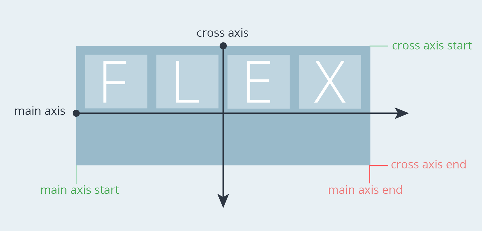
align and distribute
justify-content (main-axis): flex-start, flex-end, space-between, space-around, center
align-items (cross-axis): center, flex-start, flex-end, baseline, stretch

display: flex;
justify-content: space-between;
align-items: center;
clear: both;
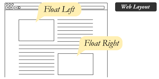
> .logo float: left;
> .navigation float: right; margin-top: magic hard-coded number;vs.
children properties
flex-grow: element size relative to its siblings
flex-basis: specify initial main size

display: flex;
justify-content: space-between;
align-items: center;
Main container
Search field container
display: flex;
//align-items: stretch; default!
Search input
flex-grow: 1;
Equal-Width Columns
.container {
    display: flex;
}

.container > div {
    flex-grow: 1;
    flex-basis: 0;
}Let's add some breathing room
.container {
    display: flex;
}

.container > div {
    flex-grow: 1;
    flex-basis: 0;
    margin-left: 15px;
    margin-right: 15px;
}

.container > div:first-child {
    margin-left: 0;
}

.container > div:last-child {
    margin-right: 0;
}let's de-squish for mobile
.container {
    display: flex;
}

.container > div {
    flex-grow: 1;
    flex-basis: 0;
    margin-left: 15px;
    margin-right: 15px;
}

.container > div:first-child {
    margin-left: 0;
}

.container > div:last-child {
    margin-right: 0;
}

@media (max-width: 600px) {
    .container {
        flex-direction: column;
    }
    .container > div {
        flex-basis: auto;
        margin-left: 0;
        margin-right: 0;
    }
    .container > div + div {
        margin-top: 30px;
    }
}let's sass-ify
@mixin flexbox-equal-col($padding: 20px, $whitespace: margin, $element: "div", $column-breakpoint: 0) {
    display: flex;

    > #{$element} {
        flex-basis: 0;
        flex-grow: 1;
        #{$whitespace}-left: (1/2) * $padding;
        #{$whitespace}-right: (1/2) * $padding;

        &:first-child {
            #{$whitespace}-left: 0;
        }

        &:last-child {
            #{$whitespace}-right: 0;
        }
    }

    @if ($column-breakpoint != 0) {
        @media (max-width:$column-breakpoint) {
            flex-direction: column;

            > #{$element} {
                flex-basis: auto;
                #{$whitespace}-left: 0;
                #{$whitespace}-right: 0;

                + #{$element} {
                    #{$whitespace}-top: $column-padding;
                }
            }
        }
    }
}
Other possible parameters
- Reverse as a boolean flag
- Column breakpoint padding
- Etc, etc.
identify component patterns
- Refactor re-occurring structural logic into a mixin
- Creating responsive equal width / height columns is now as easy as:
.container {
    @include flexbox-equal-col($padding: 30px, $column-breakpoint: 600px);
}
find the middle ground
- Each mixin should be comprehensive enough to handle re-occurring differing use cases within a component type
- However, in all things moderation
two columns
1 fixed width - the other takes up remaining space
@mixin flexbox-two-col-fixed($fixed-col: left, $fixed-col-width: 250px);@mixin flexbox-two-col-fixed($fixed-col, $fixed-col-width, $element: "div") {
display: flex;
> #{$element} {
&:first-child {
@if $fixed-col == left {
flex-basis: $fixed-col-width;
}
@if $fixed-col == right {
flex-grow: 1;
flex-basis: 0;
}
}
&:last-child {
@if $fixed-col == left {
flex-grow: 1;
flex-basis: 0;
}
@if $fixed-col == right {
flex-basis: $fixed-col-width;
}
}
}
}two columns
1 content-based width; other takes up remaining space

@include flexbox-two-col-flexible($fixed-col: left, $padding: 30px);@mixin flexbox-two-col-flexible($fixed-col, $padding: $column-gutter, $element: "div") {
display: flex;
> #{$element} {
&:first-child {
@if $fixed-col == left {
margin-right: $padding;
}
@if $fixed-col == right {
flex-grow: 1;
flex-basis: 0;
}
}
&:last-child {
@if $fixed-col == left {
flex-grow: 1;
flex-basis: 0;
}
@if $fixed-col == right {
margin-left: $padding;
}
}
}
}two columns
Both percentage-based widths
@include flexbox-two-col-fluid($first-col-width: 55%, $padding: 60px);
@mixin flexbox-two-col-fluid($first-col-width, $padding: $column-gutter, $element: "div") {
    display: flex;

    > #{$element} {

        &:first-child {
            flex-basis: $first-col-width;
            margin-left: 0;
            margin-right: $padding / 2;
        }

        &:last-child {
            flex-basis: (100% - $first-col-width);
            margin-right: 0;
            margin-left: $padding / 2;
        }
    }
}
wrapping grid
@include flexbox-grid($col-num: 3);@mixin flexbox-grid($col-num, $element: "div", $reverse: false) {
display: flex;
@if ($reverse==false) {
flex-wrap: wrap;
}
@if ($reverse==true) {
flex-wrap: wrap-reverse;
}
> #{$element} {
flex-basis: 100% / $col-num;
}
}when things get more complicated

.outer-container {
    @include flexbox-two-col-fluid($first-col-width: 75%, $padding: 30px);
}


.left-column {
    @include flexbox-equal-col();
}

.right-column {
    display: flex;
    flex-direction: column;
    > div {
        flex-grow: 1;
    }
}
.item {
    display: flex;
    flex-direction: column;
    justify-content: space-between;
}
tl;dr
- Rethinking old practices can provide more flexibility
- View elements as dynamic and align / distribute them on the container level
- For re-occurring structural logic (generally when child properties are necessary), create a Sass mixin
- Utilize parameters to handle varying use cases