How effective is the combination of your main product and ancillary texts?
I believe that the combination of my main product and my digipak and poster is very effective. I’ve used synergy to forge connections between each of my products.

Since the start I was set on having a running theme throughout my product and ancillary texts and after reading up John Stuart’s theory on Intertextuality I decided I wanted the theme to be something which the audience may be familiar with to generate both potential nostalgic and new meanings. Therefore I decided I wanted to have an Alice In Wonderland concept in my music video and then following it by using it on the digipak and poster.
Design and layout
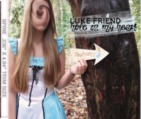

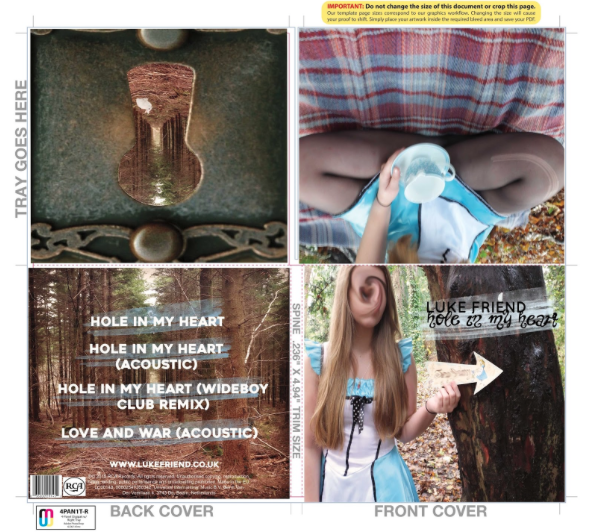
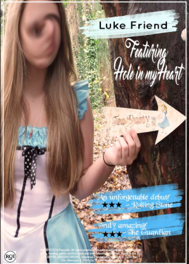
For my digipak I decided I wanted to create a 4-panel digipak. The reason for this is that typically most cd albums have this layout and my aim was to make my digipak as realistic but creative as possible. For the front cover, I have used a picture that I took myself of the main character in her Alice In Wonderland costume. In the picture she’s stood beside a tree in some woods and she is holding a sign. This links to the music video as in it you see a shot of the same sign and the main shots of the video are shot in the woods. Also, I’ve used the same image from the front of the digipak as the main image for my poster.
Design and layout
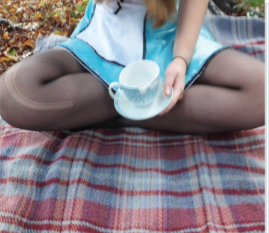
The top right of my digipak is an image of the main character sitting down with a teacup. Again, this links with my music video, as there are some shots of the two characters drinking at a ‘tea party’.
Design and layout
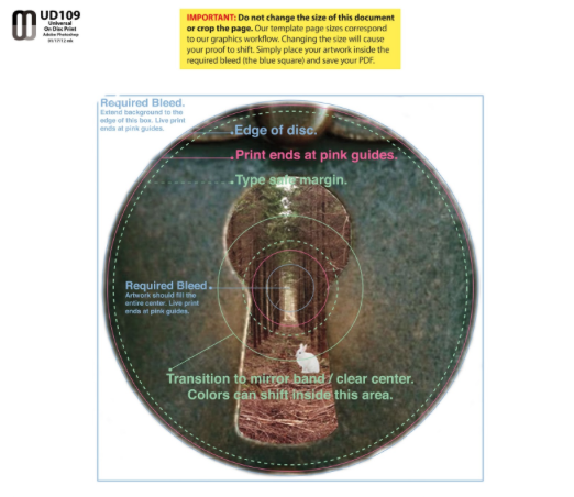
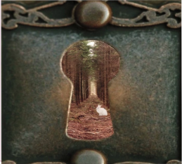
The top right of the digipak is where the CD tray goes. I initially found an image off the internet which I liked that I felt fit the theme/look I was going for but edited it to make it something of my own. I used the same image for the design of the actual CD to make it look unique.


Original version
My version
Design and layout
Instead of settling with an image I found on the internet, I decided I wanted to create my own but using the same idea as the original version to the side. I used the same key hole but put my own image of some forest beneath the key hole layer. I then found an image of a white rabbit and traced around it, placing it on top of the woods layer but beneath the key hole layer.

Original version
Design and layout
The back cover of the digipak is the same image found in the keyhole from the CD tray.
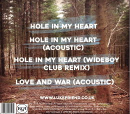
Overall, I believe that I have found ways to bind my digipak, poster and video through the design and layout to make it distinct and creative.
Constructions of representations
The main idea for my music video was to put a twist on what was know as the original Alice In Wonderland storyline. I decided I wanted the main character to be Alice and the minor character to be the Mad Hatter.
Constructions of representations
By reference to Stuart Hall’s theory of encoding and decoding, the meaning or preferred reading that I wanted the audience to take from the story is that Alice was too invested in something that she knew wouldn’t work out and it lead to her eventual madness. This was all shown in a dream-like sequence but from looking at the audience feedback, which I received, a lot of the audience took an aberrant reading as they’ve misread or misunderstood the message I was trying to portray.
Constructions of representations
The main character that is seen on the front of my digipak and poster is presented with a distorted face. The reason I’ve done this is because I want the audience to be confused on why she’s like this but it’s also meant to represent the twisted feel to the storyline, it represents the madness which she later feels.
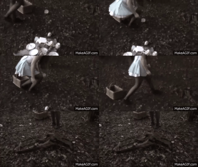
Constructions of representations
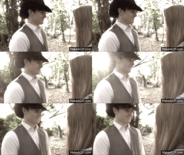
The minor character is the Mad Hatter and I set out to portray him as mysterious since he disappears towards the end and the audience never finds out why or where he goes. This also explains why I haven’t put him on my digipak or poster.

Mise-en-scene
Settings
There are two noticeable settings in my music video, a bridge walkway and some woods. I first decided to use the bridge, as it’s quite a common place for strangers to meet and this is exactly what takes place at the start of my music video; two strangers bump into eachother.
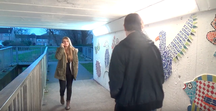
Mise-en-scene
Settings
I then chose the wood setting for the main part of my music video as it fit with the original storyline of Alice In Wonderland and gave the story an authentic feel. Since my aim was to make my product and ancillary texts connect, I made sure that both my digipak and poster are based around a wood setting.
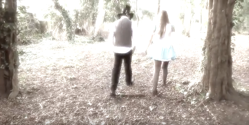
Mise-en-scene
Lighting
Most of the shots in the music video are in high-key lighting from the filters used or are shot in natural daylight. However, with the Alice In Wonderland scenes you can see that the lighting progressively gets darker. This was intentional to show the process of time taking place; I wanted everything in the video to develop really fast. On my digipak and poster, similarly the lighting is natural as it’s all constructed outside.
Mise-en-scene
Costume
Arguably the most easily noticeable aspect of mise-en-scene is costume. In my music video there are two different costumes, one being casual everyday clothing, which is seen at the start and end of the music video and the second is Alice In Wonderland themed costumes. The thing that makes them themed is they resemble the costumes you would see in the original film. Alice wore a blue and white dress and so my character wore the same thing. The Mad Hatter would of wore a top hat and some sort of suit/waistcoat. Therefore, the Mad Hatter in my music video wore a top hat and waistcoat. Since the majority of the music video is focused on the Alice In Wonderland scenes I decided I wanted my digipak and poster to focus on the themed aspect aswell.
Colour scheme
For my digipak and poster, I decided I wanted to go for natural colours such as blue, white, brown and green. The thinking behind this is the brown and green colours fits with the setting and the blue and white fit with the characters costume. One feature that I’ve tried to use throughout my ancilliary texts is the use of the paint stroke. This feature is mainly in blue and you can find it on the digipak and poster. I believe having this common feature throughout both texts makes it easily recognizable to the audience. In my music video, there is no distinct use of colour as a lot of it has a coloured filter.
My products are easily identifiable as they all share a noticeable linked theme. Also, both my poster and digipak use the same image therefore the audience will be able to see clearly that they go together as a package.