IN WHAT WAYS DO YOUR PRODUCTS USE, DEVELOP OR CHALLENGE FORMS AND CONVENTIONS OF REAL MEDIA PROCUCTS?
MAGAZINE ADVERTISEMENT

ALBUM AND ARTIST NAME



MY PRODUCT
EXISTING PRODUCTS
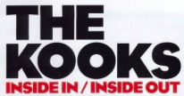
From the comparison between existing products and the magazine advert that I have created, it is clear that I have used a conventional form of album and artist name. My artist name is displayed in large, clear and simple font, that is typical of the Indie Rock genre. It is the largest font on the page, as it is the most important. If the audience recognise my artist, they will be more likely to actually read it. Underneath the artist name is the name of the album, which is smaller than the artist name, as it is the second most important piece of text on the page, after the artist name. It informs the audience of the name of the album, so they can research it or look for it in stores. I decided to use a different font, which is less conventional to a Indie Rock advertisement, as it sort of dirupts the minimalism, but I wanted to differentiate the album name from the artist name.
IMAGE
MY PRODUCT
EXISTING PRODUCTS
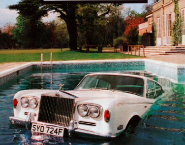
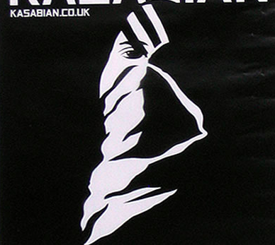
As you can see from above, my product actually challenges the conventional Indie Rock image. On an Indie Rock magazine advertisement, the image typically features a location or artwork, rather than themselves. This is because their ideology is their music, it is the only thing that matters and the fame and creating an image for themselves has no significance or value in career. Other genres, such as pop, punk, etc. typically feature the artist on their main image, as it attracts the audience because they can recognise them. I chose to challenge the conventions of an Indie Rock magazine advertisement because the use of the artists creates a sense of familiarity and connection with the audience . I feel like the my audience are more likely to read my magazine advertisement if they recognise that it is my artists’, which they could not do if it if was an image of a location or artwork.



INDIE ROCK
OTHER
release date
MY PRODUCT
EXISTING PRODUCTS
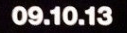
I used a release date on my magazine advertisement, which is obviously a convention that the majority of advertisements use. I decided to use this as I thought it was important that my audience knew when my digipak came out, so that they could order it/download it or go out and buy it. If they didn’t know this date, they may miss out on buying it. There are many forms that release dates take, like the three examples from existing advertisements above. They are all conventional, but I chose to use the bottom one, which is from Arctic Monkeys AM album, as an influence for my own. I chose this as I felt that it was more conventional to the genre, as it is very short and to the point. I used simple font, which is conventional to the genre also as it is very minimalist.



METHODS OF CONSUMPTION
MY PRODUCT
EXISTING PRODUCTS
I also decided to use the convention of where the digipak would be available to buy. This a less common convention, as not all artists have the methods of consumption featured on their advertisement, but it is still conventional regardless. However, I decided that I wanted to use it because it provides the audience with more information as to where to buy it. I find that a promotion doesn’t really function unless it provides the audience with as much information as they need. The use of logos is an even less common convention. I decided to use these as it specifies which sites that they can be downloaded, so the audience know where to buy it from. Rather than making my spotify logo white to continue the monochromatic look, I decided to make it the regular green, as my audience would recognise it.







record label logo & artist website
MY PRODUCT
EXISTING PRODUCTS
The record label logo and artist website are both conventions that I have used in my magazine advertisement. I included these at the bottom of the page in small, as they aren’t crucial in promoting the album, but they are still important. The website address allows the audience to go onto the website to catch up with what the artists have been doing, or look up information about the album. The record label logo is mainly for the benefit of the record label themselves. As the audience enjoy the artist, it is fair to assume that the record label will have other artists like them, signed to their label, who the audience will also like.





conventions that i have challenged, by not including them.
REVIEWS
SINGLES

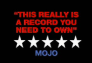


A convention that is sometimes used in magazine adverts is reviews. These reviews are used to persuade the audience to buy the digipak, as they only portray it in a positive light, so the audience assume and get the impression that they need it, as they are missing out if they don’t get it.
Another convention that is used is information about the singles that are included. If the audience have heard the single on the radio, or watched the video and they liked it, they are more likely to buy it, as they are aware that they like the music on the album.
I chose not to include either of these conventions in my magazine, as I didn’t feel that they were crucial. I also believe that it would have made my advertisement look very cramped, which would repel my audience, rather than attracting them.