Question 7: Looking back at your preliminary task, what do you feel you have learnt in the progression from it to the full product?
Research and planning
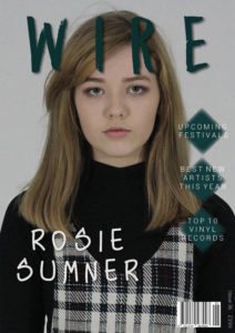
Looking back at my preliminary task, I can see that iv'e progressed a lot. My research and planning has aloud me to improve my skills as for my final product I researched a lot into existing magazines that share the same or similar genre. For example I looked a lot at Clash's front covers to see what is featured on a real magazine. During this I learnt about the common layouts of indie and alternative magazines. On the front cover there's usually a big central image of the cover artist (which draws in the fans of the artist) , masthead at the top (to make it clear what magazine it was), bar code somewhere at the bottom and other things such a plugs around the image (to again draw in the reader). I wanted to achieve a magazine that would draw in my target audience, so I used most of these conventions.
Contents pages in indie magazines were often very different from one another with each one being unique in things like their layout and colour choices, so each company of magazine was original. So this gave me the opportunity to create my own style for my contents page with different shapes and fonts that I knew would fit the indie genre because of my research.
I also found out the different types of colours that indie magazine used. In magazines like Clash, who I was inspired by, they often blues, greens, whites and greys, so this is what I've used in my final magazine pages to slightly fit in with other existing magazines and attract my audience, that I know would like magazines like Clash.
My time management has also majorly improved since my preliminary task. Before I would spend to much of my time on things like cutting out images with photo shop tools, and not realizing how unprofessional it would turn out. Since doing my research I found that it would actually look more professional not cutting around the models and leaving the shape of the original photo. Many other magazines did the same with their photos.
Instead I made sure I was working on things like the layout instead which I now know is one of the most important things on a magazine. I think I've planned more before making my music magazine as I did surveys on my designs to try and make the pages the best they could be and so they definitely would appeal. My design as well were a lot more detailed as I explained what type of poses and shots i would be using. In my preliminary task I just drew a figure, and later on decided on the pose.
Overall this research has helped me achieve a more professional look to my magazine and by researching into real magazine it also helped me make sure that I was aiming my magazine at the right audience.
Construction
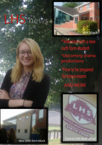
On my preliminary task front cover the over all appearance and layout is too busy. The multiple images I have around the page are too big for the cover and are taking a lot of the focus off on the central image, of the person. I have definitely learnt how to get the correct proportions for the layout and how to work with different backgrounds to not overcrowd the cover and images. Also the sharp edges of the photos don't look professinal and isn't something you would see on a real music or school magazine.
The difference in my photography is pretty big. Even though I only have one image, the quality of it compared to the five I have on my school magazine cover is great. I have made sure the lighting of my photos is good and the camera is in focus before I take the photo, whereas in the preliminary task my photos look messy and bad quality to what they could be.
The fonts used I have used in my music magazine are good as they're related to the genre and look nice with everything else on the page, but the fonts in my school magazine are very basic, unprofessional and hard to read against my images and colour choices.
The costumes I have chosen fit well in my music magazine. I needed dark moody clothing for the indie genre and in my school magazine I should have had the model wearing a school uniform but didn't, meaning it doesn't look like it could be a school magazine. The costumes aren't really appropriate for the purpose in my preliminary task.
My preliminary task contents page over all is very plain and boring. There is also a lack of images and the one image doesn't help to give an interesting insight to what to expect to see in the magazine, so it wouldn't attract to the audience very much. I have learnt now how to create a professional unique looking contents page layout, as even the way the title is and the way the text is laid out in my first task looks messy and tacky. The writing on the page also isn't inline and the colours of the numbers aren't clear making it overall looked rushed.
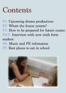
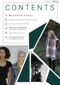
Looking at the photos, the ones I have taken for my music magazine have a really good quality and indie vibe to them. They all fit well with my genre and what will be in the magazine. On the other hand, the image on my preliminary contents page is quite fussy and dull. It doesn't have a huge purpose to the page so look is quite pointless.
The choice of fonts in my school magazine were poor. There isn't anything special about them as they are just basic fonts without a reasoning for using them. In my music magazine I used fonts that I thought matched well with my genre. I chose the spaced out lettering , as it's something I've seen on other indie magazines, and the slim font which both compliment each other and the style of the overall magazine.
Again, the costumes in my preliminary task didn't get chosen for a purpose or reason, so they don't really work well with the purpose of the magazine. Where as the the outfits and poses in my music magazine suit the genre and look overall really nice and professional.