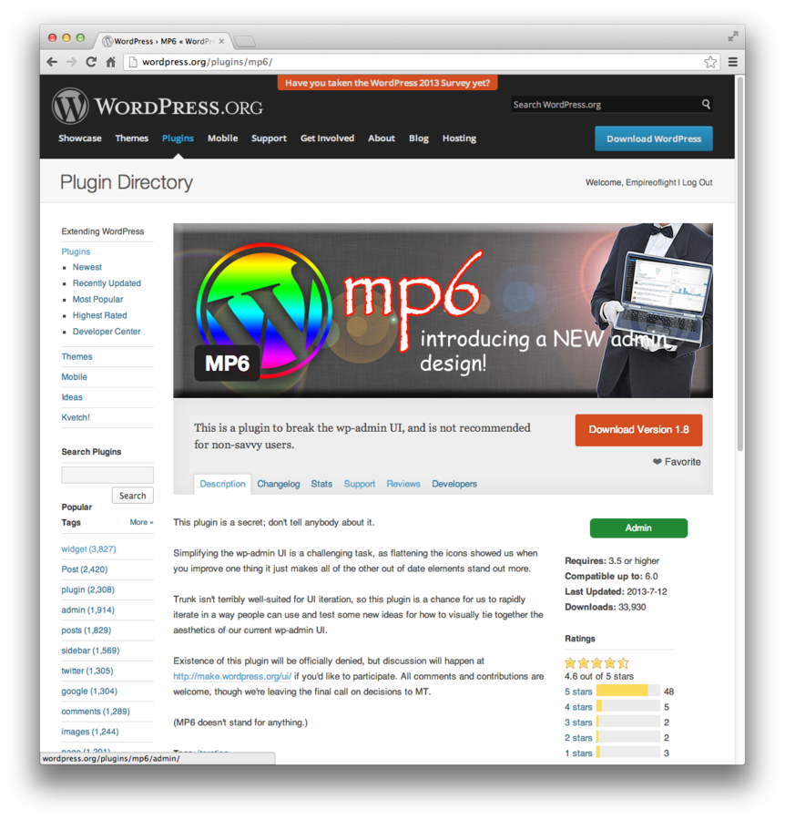
flattening wordpress
Ben Dunkle @empireoflight
Toronto WordPress Group, Toronto, ON
Saturday, July 13, 2013
About the talk
This presentation will cover:
-
the history of my role as icon designer for the WordPress project
- the emerging "flat" paradigm for interface design, and how it relates to the development of WordPress
- A brief demonstration on making icon fonts using Adobe Illustrator, Glyphs App, and Font Squirrel
About me
-
WordPress guy
-
core designer for wordpress.org
-
admin of Buffalo WordPress users group
-
professor at Canisius College, Buffalo NY
A little history
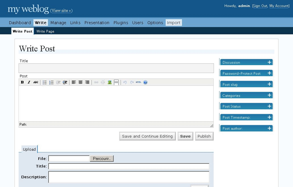
2004/5 or something
2.0 "Duke"
2.5 - a modern interface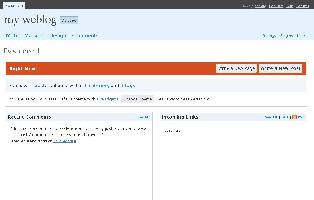
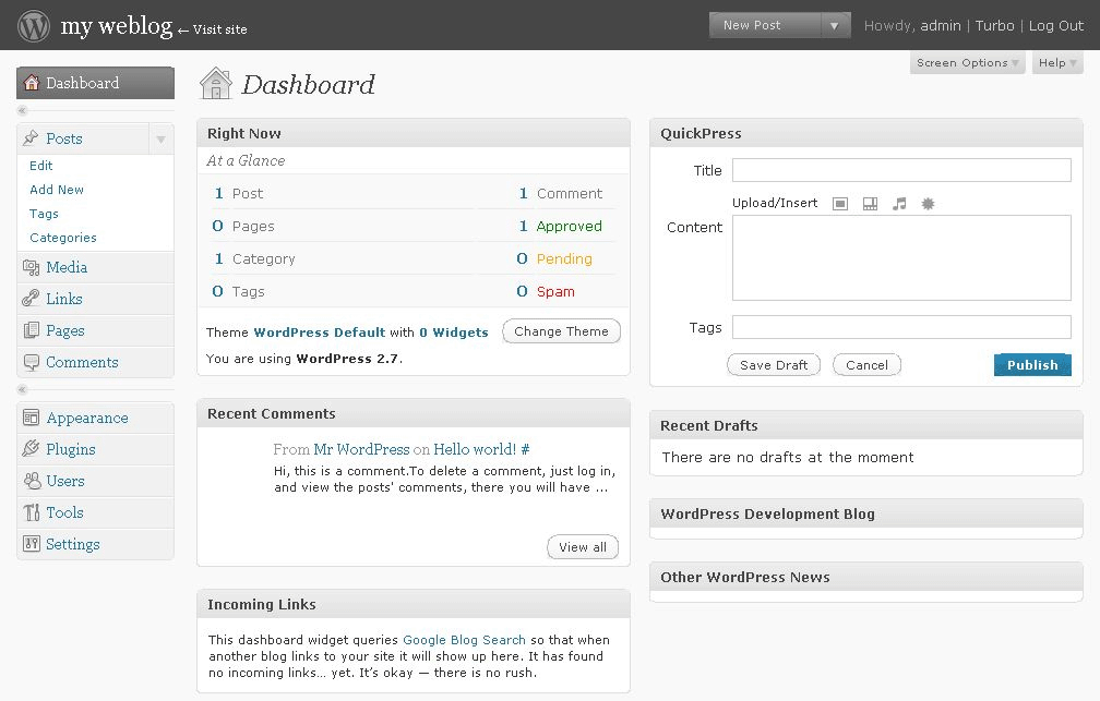
2.7: Coltrane
3.x: retina
"Retina all the things" (http://core.trac.wordpress.org/ticket/21019)
2013: MP6
2013: wordpress.com admin overhaul
3.?: new dashboard
what is "flat" design?
- simpler, fewer details
-
tighter or sharp edges
-
consistent or no shading
- high contrast
- flexible
- embrace the medium
- easier
windows 8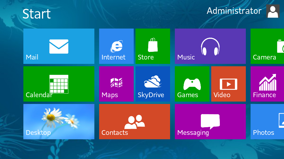
mobile apps
coffley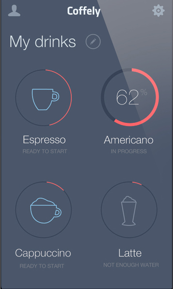

letterpress
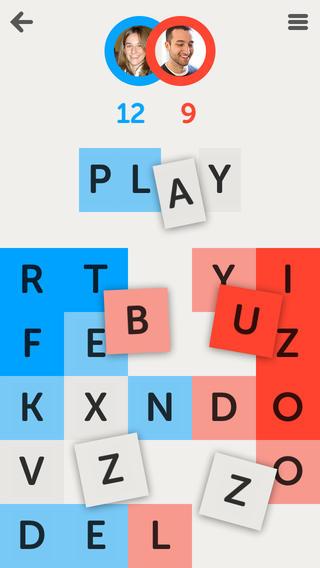

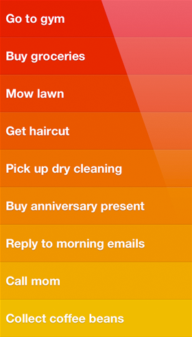
clear
icons
flat ICON Technology
-
before: sprites
- difficult to update
- not scalable for devices
- not semantic
- after: fonts
- easy (somewhat) to update
- expandable
- scalable
- more semantic
challenges
-
using your own icon in dashboard
-
browser/os inconsistencies
-
resistance to change
