CSS Flexbox
2019/10/31
Flexbox Layout 目的在於提供一種更有效的方式來佈置、調整項目之間在一個容器之中更便利地分配空間使用。
Flex佈局背後主要思想是讓容器在各種行動裝置與螢幕尺寸下,能夠更便利改變項目的寬度與高度、橫向與縱向之順序。
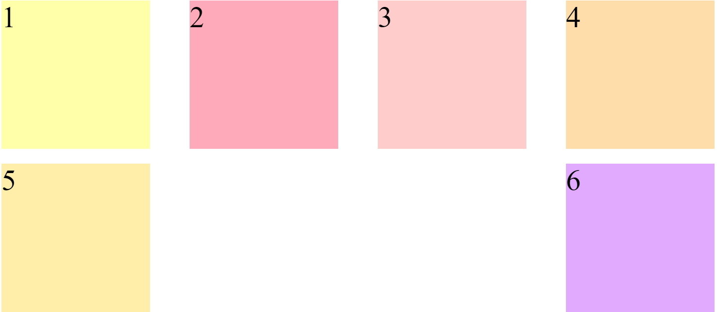
<div class="wrap">
	<div class="item item1">1</div>
	<div class="item item2">2</div>
	<div class="item item3">3</div>
	<div class="item item4">4</div>
	<div class="item item5">5</div>
	<div class="item item6">6</div>
</div>
.wrap{
display: flex;
flex-wrap:wrap;
}
.item{
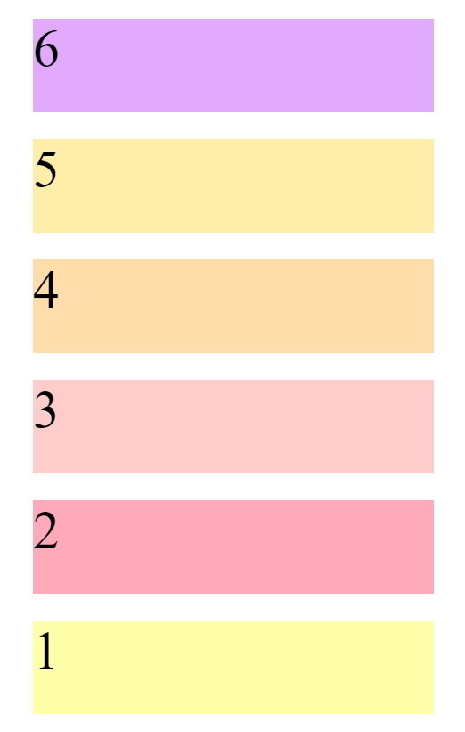
align-selfs:flex-star;
}Felxbox HTML結構與CSS語法基本結構
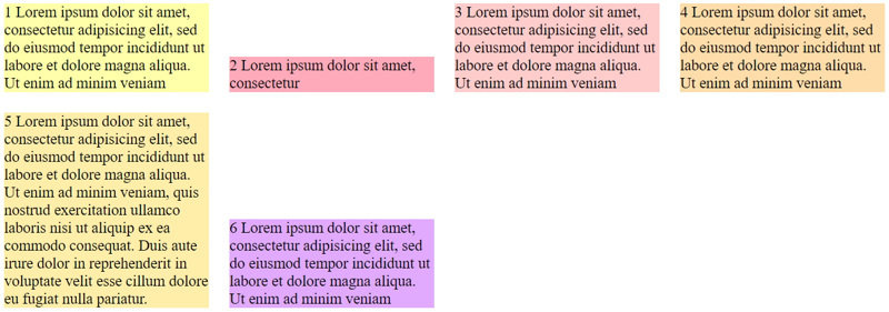
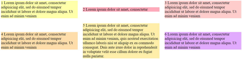
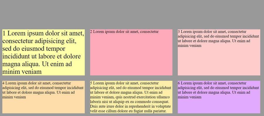
Flex的起手式
display:flex;flex-wrap
決定容器內項目是否換行
容器是否轉換方向
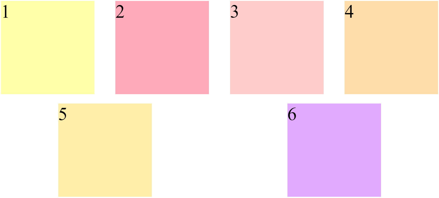
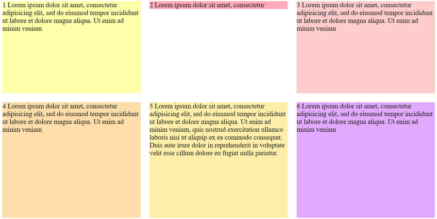
 flex-wrap:nowrap;不換行(預設)
 flex-wrap:wrap; 換行
 flex-wrap:wrap-reverse;反轉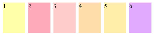
.wrap{
	display: flex;
	flex-wrap:nowrap;
}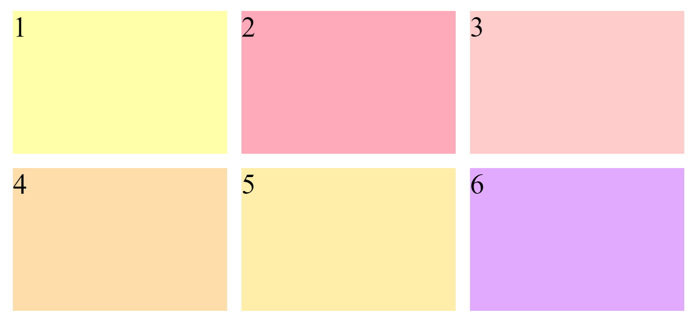
.wrap{
	display: flex;
	flex-wrap:wrap;
}
.wrap{
display: flex;
flex-wrap:wrap-reverse;
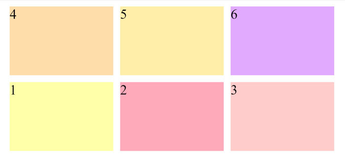
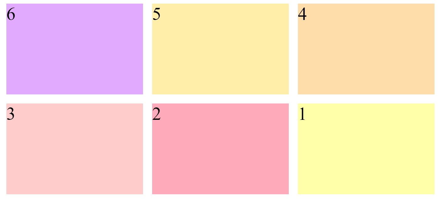
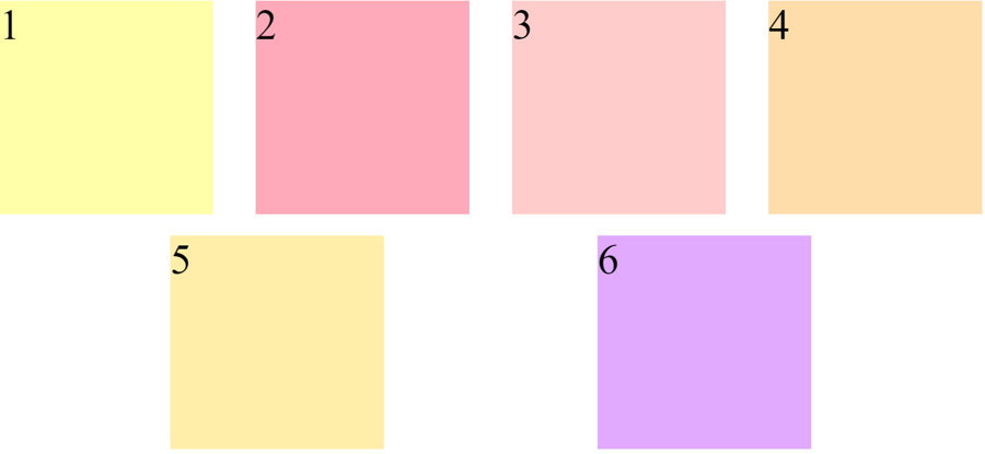
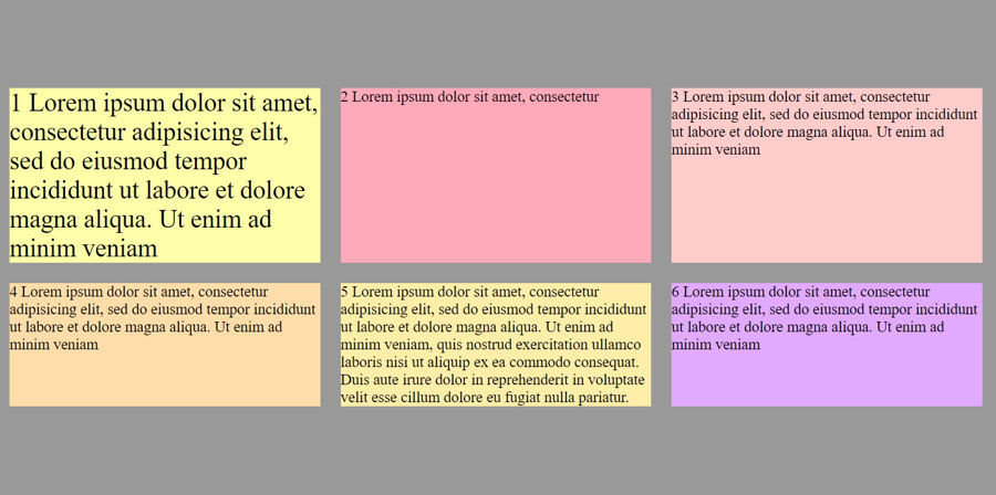
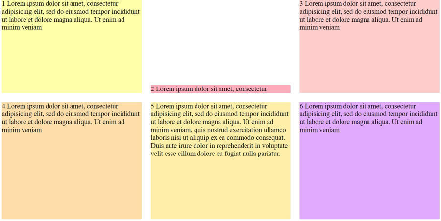
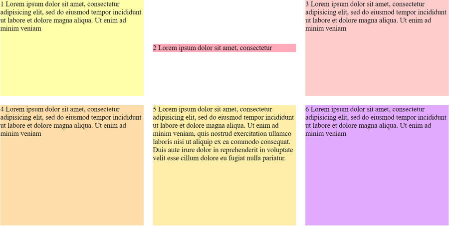
}flex-direction
為決定容器內所有項目排列方向
flex-direction:row 從左至右 (預設)
flex-direction:row-reverse 由右至左
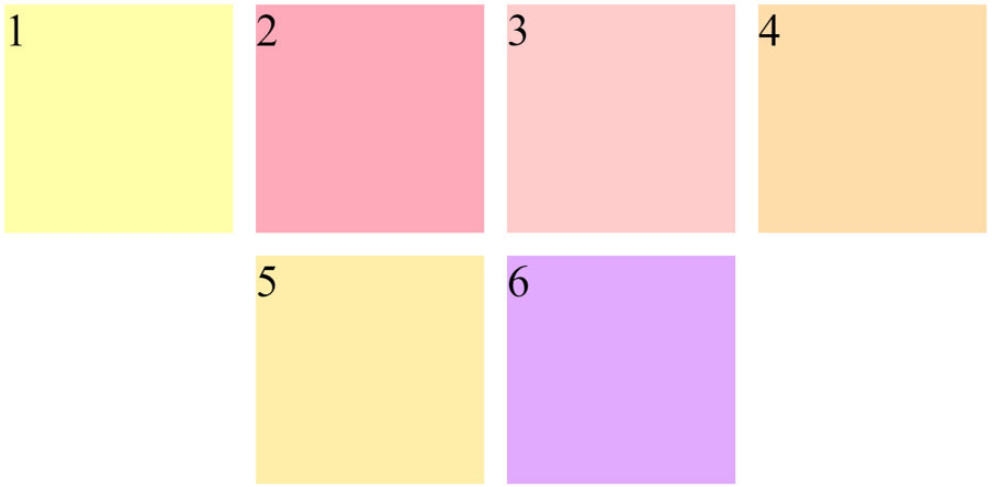
flex-direction:column 由上至下
flex-direction:column-reverse 由下至上
.wrap{
	display: flex;
	flex-wrap:wrap;
	flex-direction:column;
}
.wrap{
	display: flex;
	flex-wrap:wrap;
	flex-direction:column-reverse;
}
.wrap{
display: flex;
flex-wrap:wrap-reverse;
flex-direction:row-reverse;
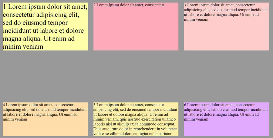
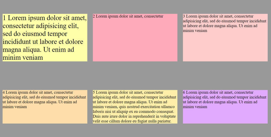
}justify-content
整個內容橫向對齊的方式
justify-content:flex-start; 整個內容向左靠齊 (預設)
justify-content:flex-end; 整個內容向右靠齊
justify-content:center; 整個內容橫向置中靠齊
justify-content:space-between; 整個內容平均向左右靠齊,中間留下空間
justify-content:space-around; 整個內容左右兩邊都留空間
justify-content:space-evenly; 內容左右兩邊都留空間,且所留空間平均分配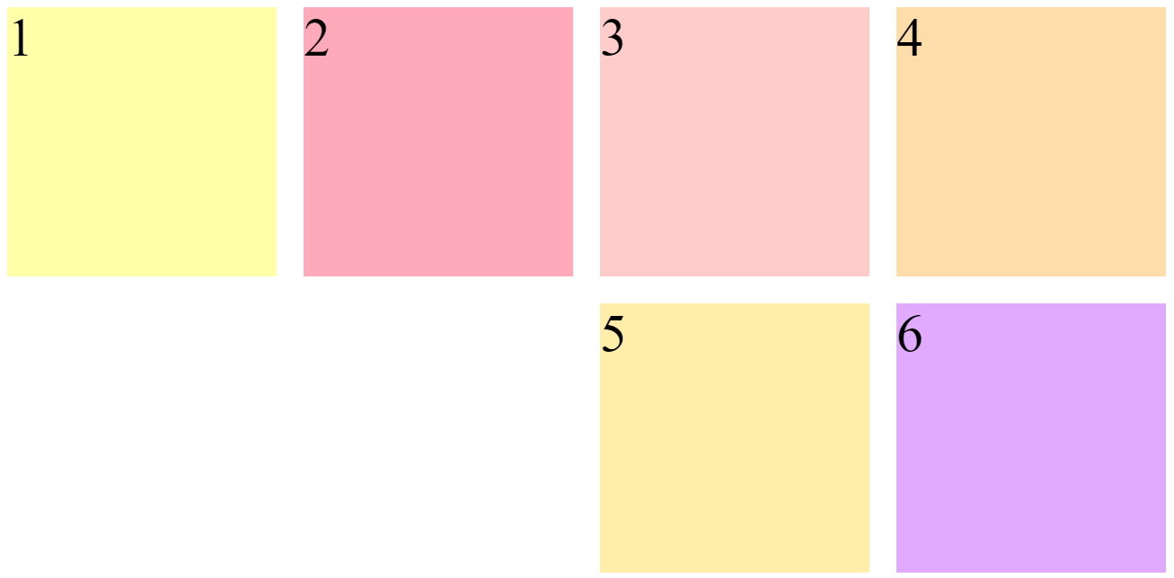
.wrap{
	display: flex;
	flex-wrap:wrap;
	justify-content:flex-end;
}

.item{
	width:200px;
	height:200px;
	margin:10px;
	font-size: 40px;
}
justify-content:flex-end;
.wrap{
	display: flex;
	flex-wrap:wrap;
	justify-content:center;
}

.item{
	width:200px;
	height:200px;
	margin:10px;
	font-size: 40px;
}
justify-content:center;
justify-content:space-between;
.wrap{
	width: 980px;
	margin:auto;
	display: flex;
	flex-wrap:wrap;
	justify-content:space-between;
}

.item{
	width:200px;
	height:200px;
	margin:10px;
	font-size: 40px;
}
justify-content:space-around;
.wrap{
	width: 980px;
	margin:auto;
	display: flex;
	flex-wrap:wrap;
	justify-content:space-around;
}

.item{
	width:200px;
	height:200px;
	margin:10px;
	font-size: 40px;
}
justify-content:space-evenly;
.wrap{
	width: 980px;
	height:500px;
	margin:auto;
	display: flex;
	flex-wrap:wrap;
	justify-content:space-evenly;
}

.item{
	width:200px;
	margin:10px;
	font-size: 40px;
}
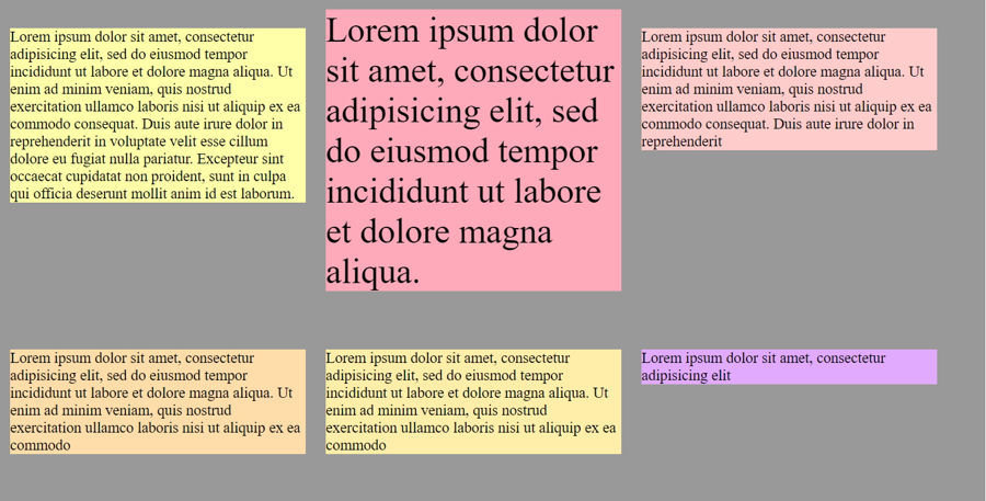
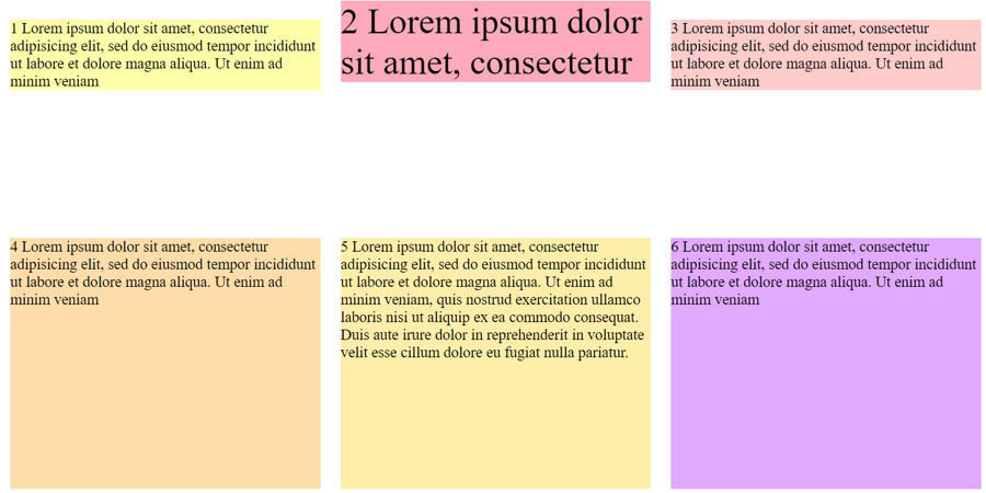
align-items
項目垂直對齊的方式
align-items:flex-start; 單一內容向上對齊
align-items:flex-end; 單一內容內容向下對齊
align-items:center; 單一內容內容直向置中對齊
align-items:baseline; 單一內容內容文字對齊
align-items:stretch;  單一內容內容填滿高度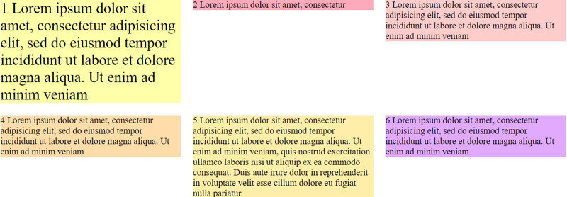
align-items:flex-start;
.wrap{
	width: 980px;
	margin:auto;
	display: flex;
	flex-wrap:wrap;
	align-items:flex-start;
}

.item{
	width:300px;
	margin:10px;
	font-size: 15px;
}
align-items:flex-end;
.wrap{
	width: 980px;
	margin:auto;
	display: flex;
	flex-wrap:wrap;
	align-items:flex-end;
}

.item{
	width:200px;
	margin:10px;
	font-size: 15px;
}
align-items:center;
.wrap{
	width: 980px;
	margin:auto;
	display: flex;
	flex-wrap:wrap;
	align-items:center;
}

.item{
	width:300px;
	margin:10px;
	font-size: 15px;
}
align-items:baseline;
.wrap{
	width: 980px;
	margin:auto;
	display: flex;
	flex-wrap:wrap;
	align-items:baseline;
}

.item{
	width:300px;
	margin:10px;
	font-size: 15px;
}
align-content
整個內容垂直對齊方式
align-content:flex-start; 整個內容向上對齊
align-content:flex-end; 整個內容向下對齊
align-content:flex-end;  整個內容置中對齊
align-content:space-between; 整個內容向上;向下對齊,中間留空間
align-content:space-around; 整個內容上下都留空間
align-content:stretch; 整個內容填滿高度 (預設)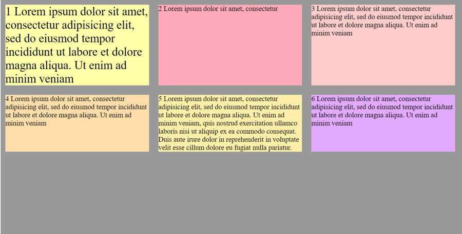
align-content:flex-start
.wrap{
	width: 980px;
	height:500px;
	background-color: #999;
	margin:auto;
	display: flex;
	flex-wrap:wrap;
	align-items:stretch;
	align-content:flex-start;
}

.item{
	width:305px;
	margin:10px;
	font-size: 15px;
}
align-content:flex-end;
.wrap{
	width: 980px;
	height:500px;
	background-color: #999;
	margin:auto;
	display: flex;
	flex-wrap:wrap;
	align-items:stretch;
	align-content:flex-end;
}

.item{
	width:305px;
	margin:10px;
	font-size: 15px;
}
align-content:center
.wrap{
	width: 980px;
	height:500px;
	background-color: #999;
	margin:auto;
	display: flex;
	flex-wrap:wrap;
	align-items:stretch;
	align-content:center;
}

.item{
	width:305px;
	margin:10px;
	font-size: 15px;
}
align-content:space-between;
.wrap{
	width: 980px;
	height:500px;
	background-color: #999;
	margin:auto;
	display: flex;
	flex-wrap:wrap;
	align-items:stretch;
	align-content:space-between;
}

.item{
	width:305px;
	margin:10px;
	font-size: 15px;
}
align-content:space-around;
.wrap{
	width: 980px;
	height:500px;
	background-color: #999;
	margin:auto;
	display: flex;
	flex-wrap:wrap;
	align-items:stretch;
	align-content:space-around;
}

.item{
	width:305px;
	margin:10px;
	font-size: 15px;
}
align-self:flex-start
.wrap{
	width: 980px;
	height:500px;
	margin:auto;
	display: flex;
	flex-wrap:wrap;
}

.item{
	width:305px;
	margin:10px;
	font-size: 15px;
}

.item2{
	background: #fab;
	align-self:flex-start;
}
.wrap{
	width: 980px;
	height:500px;
	margin:auto;
	display: flex;
	flex-wrap:wrap;
}

.item{
	width:305px;
	margin:10px;
	font-size: 15px;
}

.item2{
	background: #fab;
	align-self:flex-end;
}
align-self:flex-end;
align-self:center;
.wrap{
	width: 980px;
	height:500px;
	margin:auto;
	display: flex;
	flex-wrap:wrap;
}

.item{
	width:305px;
	margin:10px;
	font-size: 15px;
}

.item2{
	background: #fab;
	align-self:center;
}
align-self:baseline
.wrap{
	width: 980px;
	height:500px;
	margin:auto;
	display: flex;
	flex-wrap:wrap;
}

.item{
	width:305px;
	margin:10px;
	font-size: 15px;
}

.item1{
	background: #ffa;
	font-size: 25px;
	align-self:baseline;
}

.item2{
	background: #fab;
	align-self:baseline;
}
flex-grow
決定將剩餘的空間分配給每一個內容有多少
屬性值為數字,如0,1,2,3,4,5
若要平均分配填滿,屬性值都會使用1 來滿足
flex-grow:0; 不將剩餘的空間分配給內容(預設)
flex-grow:1; 將剩餘的空間分配給每個內容一份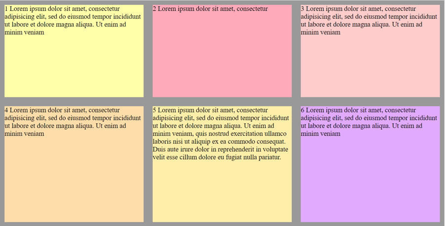
flex-grow:1
.wrap{
	width: 980px;
	height:500px;
	background-color: #999;
	margin:auto;
	display: flex;
	flex-wrap:wrap;
}

.item{
	flex-basis:250px;
	margin:10px;
	font-size: 15px;
	flex-grow:1;
}
order
為內容排列的順序預設為0,可以為正負數字
order:2; 在預設排序數來第二個位置
order:-1; 在預設排序之前的位置
flex-shrink
自動縮減文字寬度,通常會使用到此屬性,是在 container 使用 flex-wrap:nowrap 的情況下 屬性值為數字 0 或 1
flex-shrink:0; 不縮減文字寬度
flex-shrink:1;自動縮減文字寬度 (預設)
flex
為 flex-grow 、 flex-shrink及 flex-basis 集合縮寫
flex:1 0 200px; 即為flex-grow | flex-shrink | flex-basis的值
flex: 20%; 因為只有flex-basis 能使用% 所以其值為flex-basis的屬性值