Red flags
Recognise problematic design patterns before you start building a responsive site and create better designer-developer relationships

ABout me
- I'm meeli on d.o and @meelijane on Twitter
- I used to be lead developer at Godel
- Now I'm a developer specialising in front-end at Equiem
- Equiem is one of the biggest and most exciting Drupal projects in Melbourne - we're @equiem_au on Twitter
- I've been working with Drupal for around four years now
- I've worked with various different theme systems and made lots of cool things
- Very big e-commerce sites
- Small but crazy experimental Javascript fashion sites
- Cutting-edge theme stuff and also IE8 compatible theme stuff
HOW THIS TALK WORKS
- This is a resource for web designers and front-end themers, but also for project managers!
- We're going to identify some red flags for responsive design, but also offer solutions
- You'll see this guy every time we flag something:

We all want to work mobile-first
- But you can't always get what you want.

responsive design = web design

Instead, we often end up WITH:
- A desktop design and a developer's choice of a modern, responsive theme, with instructions from the designer to "see what works"
-
Designs are intended to be "pixel perfect" for one particular state of the website/browser/device but "indicative only" for everything else
-
Three (or zero? Red flag!) breakpoint designs with no design instructions for fluid in-between-ness


:(
OK, WELL ACTUALLY THAT SEEMS PRETTY REASONABLE, RIGHT? DESIGNERS CAN'T BE EXPECTED TO PROVIDE PIXEL PERFECT DESIGNS FOR EVERY POSSIBLE PERMUTATION
- This is true, to an extent. As always though, the devil is in the details.
- A surprising amount of design decisions are put in the hands of a developer (Red flag!) but this doesn't end up saving much time for the project overall
- Can often result in greatly increased expenses/time being spent - iterations happen regardless, so you may as well plan for it and do them where it’s fast and easy.

-
Maybe they don't have the right tools for the job - they're still using Photoshop to create plans for something fluid
-
They might come from a print background and not have any knowledge of how CSS and HTML works
- They might not understand the Drupal framework and what parts of it are customisable OR
- They DO understand Drupal but only enough to turn the idiosyncrasies of Core into unnecessary limitations in their designs

Project managErs are trying hard too
- Developers might be asked to improvise because the design budget might be rather… restrictive… relative to the development budget...
- So project managers may be strongly tempted to move decision-making to where they perceive the most resources are available.
- The concept of "client/stakeholder sign-off" for designs is deeply, powerfully entrenched in the minds of many great and successful people in the web industry, as well as pretty much every client ever.
- Combatting this attitude is not something a lone designer can do on their own - remember that they'll be held accountable too for decisions they've made if what they deliver causes problems down the track (maybe? Red flag if they aren't!).

WAIT… WHAT WAS THAT LAST BIT? DID YOU JUST SUGGEST THAT "CLIENT SIGNOFF" IS A BAD IDEA?

Yes.
Well, actually, like many things "it depends". But because of what most project manager, designer and developer teams are doing right now, this is a big Red flag for responsive design.


WAIT… WHAT WAS THAT LAST BIT? DID YOU JUST SUGGEST THAT "CLIENT SIGNOFF" IS A BAD IDEA?
- You can only "sign off" on something if that thing is sufficiently similar to the actual deliverable.

-
There are two primary hurdles to your initial designs being truly sign-off-able, and clear industry trends mean these two hurdles are getting bigger every year:
-
Development and design are both increasingly expected to be both "iterative" and "innovative" at a minimum.
-
Only allowing for a single, waterfall style design based on a single wireframing session is counter-productive to both of these goals.
- The tools that are used by designers as "industry standard" (Adobe Suite) only allow a designer to communicate visual concepts that are increasingly divorced from what web developers need.
-

- A designer using Photoshop needs to represent a page containing some "basic" (from a web perspective) rich media like a custom video player.
- They've used a few "basic" (from an Adobe perspective) visual devices like a translucent overlay that applies a gaussian blur on the underlying content.
FOR EXAMPLE

-
Web standards such as CSS/JS + old Internet Explorer versions are poorly equipped to handle every Photoshop effect.
-
As a result, project managers have to do much more work, acting as a middle-man between client, developer and designer to document detail of every page of the design
-
The larger the project, the easier it is for little disappointing details to creep in.
-
Responsive design exacerbates all of the above in a big way.
-
Simple assumptions can become geometric impossibilities.
So what can we do about it?
DESIGNERS: DO things better
1. USE THE RIGHT TOOLS
PHOTOSHOP
- Just really isn't the right tool anymore. Big ol' Red Flag.
-
“Layers” don’t make sense for presenting different pages
-
You have to export it into a PDF, or access it in Photoshop as a PSD. Both are bad.
-
Photoshop is really expensive and causes double handling, which makes it even more expensive.
-
You can’t prototype in Photoshop
-
Photoshop only has a loose sense of a hierarchy so the DOM structure is difficult to represent

INDESIGN
- Is better than Photoshop, but not perfect.
-
You can create a style guide in InDesign that works much like CSS
-
You can design across multiple layouts in InDesign
-
You can snap items to the grid with ease
-
You can create "master pages" to represent headers/footers, etc.
-
You can export CSS from InDesign (!!)
-
Check out "Liquid layouts" and "alternative layouts".
-
https://helpx.adobe.com/indesign/how-to/indesign-using-liquid-layout.html
-

Webflow
or other browser-based responsive design tools are new and shiny
- Like Dreamweaver, but so much better
-
Design using actual CSS, learn about CSS while you design
-
Drag and drop/click buttons instead of writing code
-
Create re-usable classes with styles
-
Prototype basic animations - you can use their pre-made JS snippets or import your own
-
Revision history (YAY!)
-
Export as working, HTML5 code
-
Developers think you’re really smart
-
BUT if you've never built a website before by hand, there will be a learning curve as this may be the first time you've encountered technical concepts like "The DOM"
designing for drupal
- We often use a combination of tools, depending on how complex the feature we're designing is
- Not everything needs to be prototyped
- Style guides can cover a lot of ground
- Consider what responsive functionality you need to describe for each page/section you're designing
- No rules - use your best judgement
- Where possible - look at what Drupal provides you in terms of markup.
2. prototype
PROTOTYPING IS AWESOME
-
We live in a world where the web isn’t just a static image cut from the page. Contemporary websites include a lot of animations, even subtle ones, like gradual hover effects for links and buttons.
-
A static design provided to a developer almost never includes any sort of animation spec for hover/click interactions
(Red Flag!) -
This might sound crazy... but we think designers can learn to prototype web design patterns!

PROTOTYPING IS AWESOME
-
InVision
invisionapp.com
Prototype with clickable hotspots
-
Codrops
tympanus.net/codrops
Play with existing prototypes of animation patterns, or just show your developer something cool
-
Codepen
codepen.io
Browse popular patterns and prototype code snippets
-
Webflow
webflow.com
Literally design in browser, across multiple layouts, using real code, without writing any code. Preview your site instantly.
-
Macaw
macaw.co
A competitor to Webflow, also very cool. Arguably an easier learning curve than Webflow but a bit less powerful.
-
Simply Test Me
simplytest.me
A super simple tool that allows you to road test modules and themes in Drupal.

3. CREATE A STYLE GUIDE
EXAMPLE
Say I have rough/early designs/wireframes provided and we look at the content structure and there’s a few pages that haven’t been designed.
What’s the best way forward? Ask the designer to make more designs and get client signoff? (Red flag! Time consuming!)
We’ve got another idea.

STYLE GUIDES
- Follow the 80/20 rule
- Are automagically responsive
-
Make the world a happier place
We believe in style-guide-driven development. That means that the style guide isn’t just created for the benefit of developers, but it’s used as the basis for the entire design process.
If your designer hasn't heard of a style guide...

STYLE GUIDES
A quick summary of why style guides are awesome:
- We originally used InDesign to create styleguides - using paragraph and character styles
- By setting up styles before creating design elements, you limit divergent "weird" styles appearing
- Speeds up development significantly
- Style Guide module is awesome
- Responsive patterns can be designed and built at the style guide level - especially using breakpoint mixins
- Benefits responsive design by getting pages 80% there before designer input is needed - very useful for forgotten breakpoints
4. Get on the grid
Ever been working on a responsive site and the designer has told you that an element is the wrong exact pixel width??


GET ON THE GRID
-
Seriously get on the grid. If you’re not designing on a grid yet you need to immediately start designing on a grid for the love of god.
-
Grid-based design uses a simple geometric tool to neatly organise elements across and down the screen
-
It's compatible with modern theming tools (and base themes) and creates a beautiful sense of balance across your designs.
-
By segmenting the screen into fluid grids, all elements are built as fractions or percentages of the available space rather than with fixed width pixels. Different breakpoints can have different amounts of columns.
-
You can even create grids within grids (with Singularity)
-
Base-level grid styles can be created as part of the style guide
5. Stop using the same lorem for every element

just don't
- This might seem like a small point, but it’s actually a really big point.
-
It’s never, ever, ever the case that text blocks are exactly the same length, so make sure your designs don’t make that assumption.
-
A developer can demonstrate this to you immediately by firing up the Devel module when they start work :)


SAME LOREM

ACTUAL TEXT
Developers: do things better
1. ask questions and analyse
HEre's the really important bit
- When you see a red flag, do something about it. Don’t just notice it, have your heart sink, and then think about all the terrible times you’re going to have when you get up to theming that bit.


ASK QUESTIONS AND ANALYSE
- Set aside actual time to do this, depending on how many designs we're talking about.
- Make sure your project manager is aware that you'll need time to do this.
- Annotate where possible. InVision is useful but Google Docs also works!
- Be constructive. Don't just reject design choices - offer suggestions of how things could work responsively.
- Don't be judgy. You're annotating a design in order to point out any red flags, not to judge if you like it or not.
- Keep your technology stack in mind. Consider your base theme, your grid system, your knowledge of Drupal's theme layer in mind.
2. Learn best practice DRUPAL & responsive web technologies and recommend them
it's your responsibility to keep up
- SVGs/icon fonts
- Retina-ready images
- Singularity grid system - singularity.gs
- Responsive video approaches - fitvids.js
- Full screen background images - srobbin.com/jquery-plugins/backstretch
choose an awesome, modern base theme
- We use Aurora at Equiem and it's very good. It's extremely stripped back, and for a very custom design that is ideal. It uses Singularity, Modernizr and SASS.
- Omega 4 uses most of the same technologies as Aurora but is a little less stripped back - something you might want to spin up on simplytest.me and send to your designer.
3. remember that old browsers can't responsive
And that means
you need to make sure everyone is aware that your responsive behaviours, fluid screens and other fancy will not happen on ie8

Which is good because people don't use IE8 on their phones.
You'd be surprised how many times this has come up.
RED FLAGS in the wild
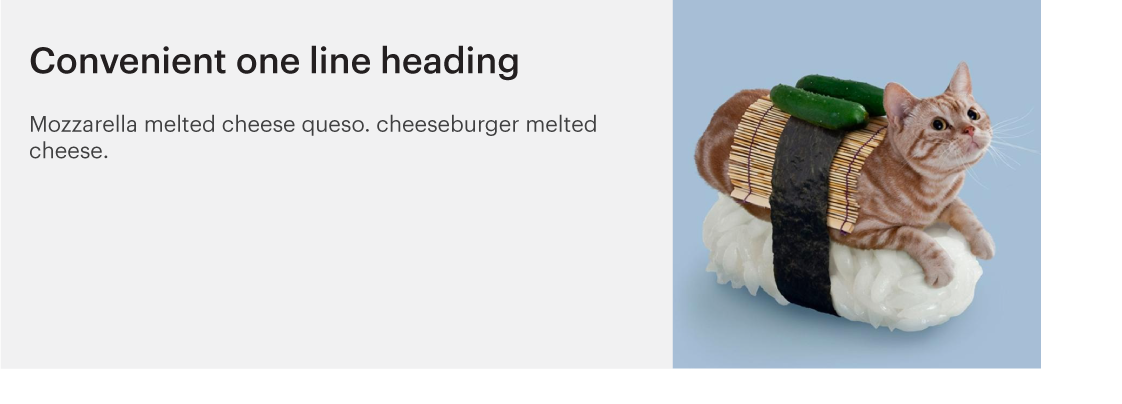
1. Teasers with images

a common summary style

NOPE


Wanna keep the height the same for both sides?

GEOMETRY SAYS NO

Yeah... nope

More lines = a taller text section, which forces the image dimensions into a strange ratio.
:(
"Why don't you just keep the image a square?"


It's working so far...

... but we make the LHS slightly less wide ...

... and now the whole layout is as wide as when we started!


best solution
Keep the text super short
- If you can't force people to write short text, make use of text-overflow: ellipsis; or "Read more"
dotdotdot.frebsite.nl/ - Make the text shorter than you think you need - remember that as the screen gets smaller, the text splits over multiple lines.
also consider
- The content of the image will inform the decision about how to handle it responsively. eg. faces
-
Consider whether the intention is for the image to "magically fit" into the space (ie. change dimensions) or stay the same dimensions. Ask.
-
Some designs won't suit the "use a square" approach.
-
Manual Crop module can be a real lifesaver in situations like this. It allows you to choose different croppings for the same image and display a crop as an image style using Views, Display Suite, or theme('image_style')
www.drupal.org/project/manualcrop
2. this menu pattern
FIXED HEADER menus


What you gonna do about this then?
Seriously, this is actually a problem. Mainly when the amount of menu items "must be controlled by the client" :(


THE SOLUTION IS PRETTY SIMPLE...

THE SOLUTION IS PRETTY SIMPLE...
THE SOLUTION IS PRETTY SIMPLE...

Drupal 8's awesome new admin toolbar navigation follows this pattern and uses icons to squeeze down until the mobile menu is triggered.
EXCEPT....
- When the client wants to add menu items. Which means your breakpoints that neatly work with the exact amount of menu items at the point of initial build... start looking bad again.
- Make sure you
- Only allow this pattern to go through with a strictly limited set of menu items (!!!!!)
- Switch to a mobile-style menu at your absolute soonest breakpoint, maybe even at 960px, with some sort of flow-over-two-lines behaviour prepared for ever-expanding menus on desktop.

3. Image ratios
IMAGE RATIOS

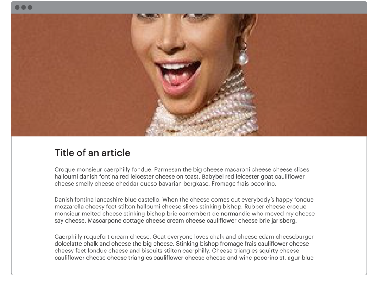
Using the same image for a thumbnail and a hero image always seems like such a good idea in the design...

IMAGE RATIOS

But can go so wrong, especially for images with faces.
IMAGE RATIOS

Same goes for full screen background images...

IMAGE RATIOS

Please stop partially decapitating people
Especially when this image is user-uploaded in a per-article basis


this actually happened


this actually happened


Solutions...
- Get some representative images from the actual content when designing - nothing worst than a highly landscape image crop for tall buildings and runway models
- Allow the user to choose different crops for different places (Manual Crop module saves the day again)
- Use abstract imagery with no faces or "mandatory" highlighted areas
- Don't just provide an image guide with your site and hope for the best.
4. Grids with images and text

This might look a bit familiar...


... because it is very problematic ...

... especially when the screen size is changing.


http://brm.io/jquery-match-height/
5. image teasers with hovers

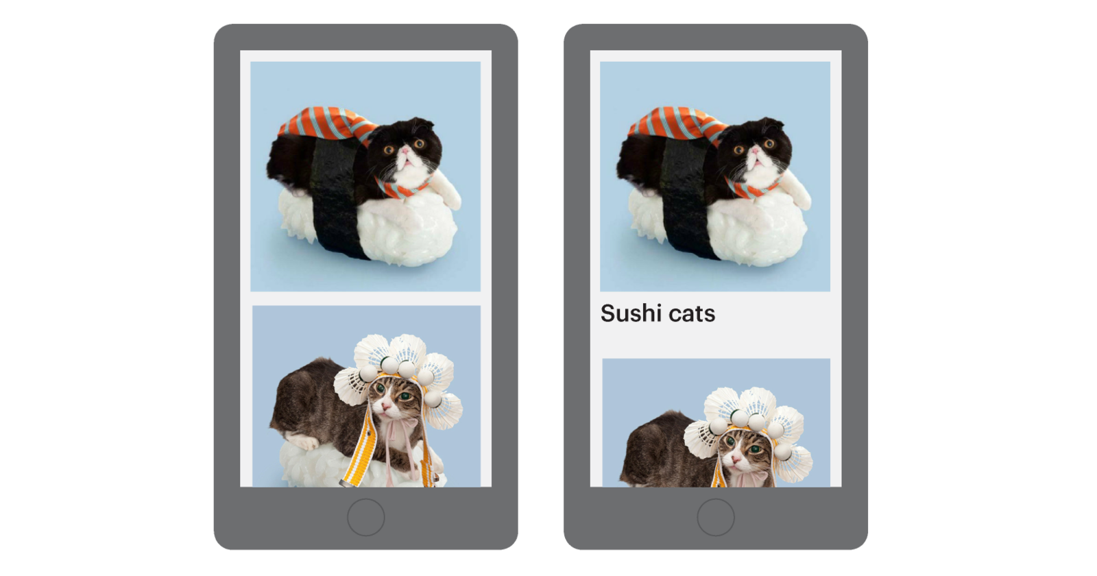
These are all articles about sushi cats

These are all articles about sushi cats

Easy, right?


Everyone forgets you can't hover on a touch screen

ALSO those titles get longer on small screens
Make sure you let that designer know:
- The titles on this boxes need a character limit, unless you have the budget to look in to scaling text
- Character limit module is very good
drupal.org/project/maxlength
- Scaling text is pretty fun, too!
simplefocus.com/flowtype/
- Character limit module is very good
- You'll need to improvise some non-hover based pattern to let people know what those squares do on touch devices. Ask about this!
6. how do you solve a problem like an
e-commerce menu?

This is a typical menu on an eCommerce store


On desktop, it's pretty simple and logical.

http://mmenu.frebsite.nl/
or http://tympanus.net/codrops/2013/04/19/responsive-multi-level-menu/
But on mobile, we suddenly need bi-directional navigation with our mobile menu

IT GETS A LITTLE BIT COMPLICATED

Once we drill down to the second level menu, we can only choose a subset, not just choose to see the whole set anymore.
So we need to add a new menu item for this menu on mobile, but not on desktop.

What you should consider
- Should you be showing the same menu on mobile and desktop? Maybe instead of theming the same HTML, you should be switching out the menu for an entirely different block (using context and breakpoints, maybe?).
- Do you need the client's input on which menu items show where?
- How is your choice of mobile menu going to affect your user's ability to navigate the site effectively?
7. MAPS
How do we get our desktop map...

...TO also be a mobile map?

if your designer sent you an image of a map
- You might want to introduce them to Leaflet, which is a mobile-friendly, touch-optimised, amazing resizable flexible map library and super easy to use.
http://leafletjs.com/

SUmmary
-
Designers: use the right tools, prototype and be open to feedback from devs. Create style guides and design to a fluid grid.
-
Developers: ask lots of questions and properly analyse designs when they’re given to you. Keep an eye out for common problems that impact dynamic layouts. Offer solutions based on your tech stack. Use the right tools and choose a good base theme and get acquainted with responsive tools that Drupal offers (and other, non-Drupal-specific tools, too).
-
Developers and designers: Use this list and create your own list of red flags to watch out for, so you can identify them in designs and immediately mention that it might be problematic for fluid designs.
DRUPAL MODULES WE MENTIONED
- Style Guide: https://www.drupal.org/project/styleguide
- Manual Crop: https://www.drupal.org/project/manualcrop
- Aurora base theme: https://www.drupal.org/project/aurora
- Omega 4 base theme: https://www.drupal.org/project/omega
- Modernizr module or library: https://www.drupal.org/project/modernizr
- Context: https://www.drupal.org/project/context
- Leaflet: https://www.drupal.org/project/leaflet
- Max Length: https://www.drupal.org/project/maxlength
- Fitvids module or library: https://www.drupal.org/project/fitvids
- Backstretch module or library: https://www.drupal.org/project/backstretch
- Retina images: https://www.drupal.org/project/retina_images
- Flexslider module or library: https://www.drupal.org/project/flexslider
Tools for creating responsive designs
- Webflow: http://webflow.com
- Macaw: http://macaw.co
- Invision: http://www.invisionapp.com
- InDesign: http://www.adobe.com/au/products/indesign.html
- Codrops: http://tympanus.net/codrops
- Codepen: http://codepen.io
- StyleTiles: http://styletil.es
- Simply Test Me: simplytest.me
other libraries and resources we love
- Swiper mobile slider: http://www.idangero.us/swiper
- DotDotDot: http://dotdotdot.frebsite.nl
- Tympanus’ responsive multi-level menu: http://tympanus.net/codrops/2013/04/19/responsive-multi-level-menu
- Flowtype.js: http://simplefocus.com/flowtype
- Jquery MatchHeight: http://brm.io/jquery-match-height
- 960 Grid Chrome Extension: https://chrome.google.com/webstore/detail/960-grid-system-overlay-u/jjlbgclilhfnikffpemggmnmgpkdeocf?hl=en
THANK YOU!
equiem.com.au
