CSS Session 3
Flexible Boxes
layout mode providing for the arrangement of elements on a page such that the elements behave predictably on different screen sizes
provides an improvement over the block model in that it does not use floats, nor do the flex container's margins collapse with the margins of its contents.
Child elements in a flexbox can be laid out in any direction and can have flexible dimensions to adapt to the display space
Positioning child elements is thus much easier, and complex layouts can be achieved more simply and with cleaner code, as the display order of the elements is independent of their order in the source code
Flexible Boxes Concept
The defining aspect of the flex layout is the ability to alter its items' width and/or height to best fit in the available space on any display device!
The flexbox layout algorithm is direction-agnostic as opposed to the block layout, which is vertically-biased, or the inline layout, which is horizontally-biased
Flexbox layout is most appropriate for the components of an application, and small-scale layouts, while the (emerging) Grid layout is intended for larger scale layouts
Flexible Boxes Vocabulary
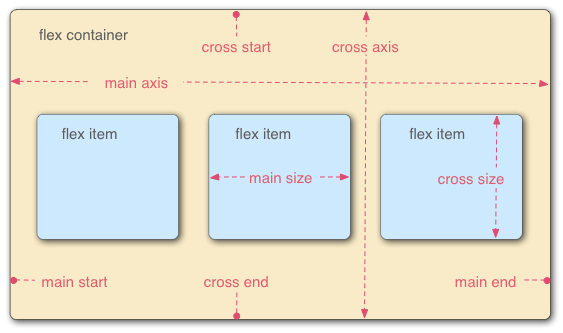
A flex container that has a flex-direction of row, meaning that the flex items follow each other horizontally across the main axis according to the established writing mode, the direction in which the element's text flows, in this case left-to-right
Flexible Boxes Vocabulary
flex container : Parent element in which flex items are contained. defined using the flex or inline-flex values of display property.
flex item : Each child of a flex container. Text directly contained in a flex container is wrapped in an anon. flex item
axes : Every flexbox layout follows two axes. The main axis is the axis along which the flex items follow each other. The cross axis is the axis perpendicular to the main axis.
flex-direction property establishes the main axis
justify-content defines how flex items are laid out along the main axis on the current line
align-items defines the default for how flex items are laid out along the cross axis on the current line
align-self defines how a single flex item is aligned on the cross axis, and overrides the default by align-items
Flexible Boxes Vocabulary
directions : The main start/end and cross start/end sides of the flex container describe the origin and terminus of the flow of flex items. (acc. to ltr or rtl)
order assigns elements to ordinal groups and determines which elements appear first
flex-flow shorthands the flex-direction and flex-wrap properties to lay out the flex items
Flexible Boxes Vocabulary
lines : Flex items can be laid out on either a single line or on several lines according to the flex-wrap property, which controls the direction of the cross axis and the direction in which new lines are stacked
dimensions : The flex items' agnostic equivalent of height and width are main size and cross size, which respectively follow the main axis and cross axis of the flex container :
the min-height and min-width properties initial value is 0
the flex property shorthands flex-grow, flex-shrink and flex-basis properties to establish the flexibility of the flex items
Flex Item Considerations
Text that is directly contained inside a flex container is automatically wrapped in an anonymous flex item. However, an anonymous flex item that contains only white space is not rendered, as if it were designated display: none.
Absolutely positioned children of a flex container are positioned so that their static position is determined in reference to the main start content-box corner of their flex container.
Flexbox's alignment properties do "true" centering, unlike other centering methods in CSS. This means that the flex items will stay centered, even if they overflow the flex container
Flexible Box Properties
column-* : props if the multiple column module have no effect
clear : has no effect
float : causes the display prop of the element to compute to block
vertical-align : no effect
Flexbugs project : https://github.com/philipwalton/flexbugs
Properties not affecting flexible boxes : Because flexible boxes use a different layout algorithm, some properties do not make sense on a flex container: