Making accessibility part of our workflow
Estella Gonzalez Madison
@chicagoing
NYC HTML5 / August 20, 2014
Who are we targeting?
Users that are
What I'm not going to talk about
WAI-ARIA
Web Accessibility Initiative
Accessible Rich Internet Applications
A set of roles, states, and properties to convey user interface behaviors and structural information
role="main"
indicates where the main content begins
role="tooltip"
Only requirement
aria-describedby
indicates the elements that describe the object
Example
role="dialog"
Requirements:
aria-labelledby and aria-describedby properties
At least one focusable element (close button, input field)
Focus on a default element when the dialog appears
Tab order should be contained by the dialog
— MDN, Using the dialog role
Example
role="navigation"
aria-controls (property)
associates a control with the elements that it controls
aria-owns (property)
defines a parent/child relationship between DOM elements where the DOM hierarchy does not reflect the relationship
aria-haspopup (property)
indicates the element has a popup context or sub-level menu
aria-expanded (state)
boolean, marks expandable and collapsible regions
Example
role="search"
No requirements
…but a useful property is:
aria-label (property)
an invisible label that is readable by screen readers only
Example
role="form"
Only requirement
aria-describedby (property)
a visible label for the form
Form Validation
What not to do
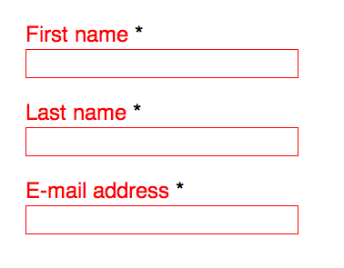
Form validation
aria-required (property)
let's the user know the form field is required
aria-invalid (state)
indicates the validation state
possible values: false | grammar | spelling | true
aria-hidden (property)
Can be used on any element that should be hidden to screen readers but present to everyone else
Form validation
When you run validation, you should
Set focus on the first invalid field
Set aria-invalid="true"
Add an element with a role="alert" to display the validation error messages
Example
Tools
Screen readers
Main references
That's it–Thanks!
@chicagoing