Material Button
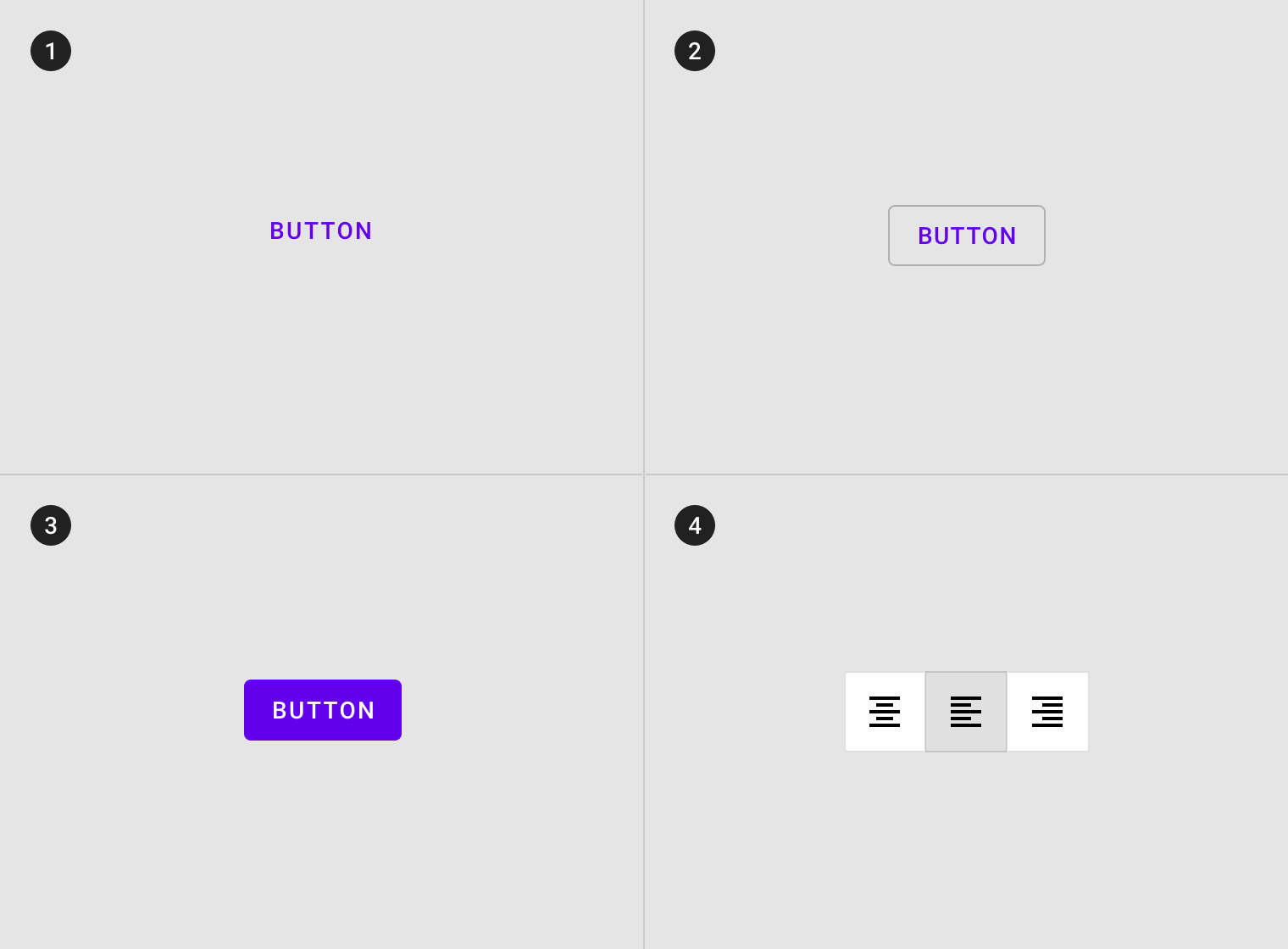
1. TextButton(明顯度最低)
3. Contained button(明顯度最高)
2. Outlined Button (明顯度中等)
4. Toggle button
圖片來源:https://material.io
1.Text button
A. Text label
C. Icon (optional)
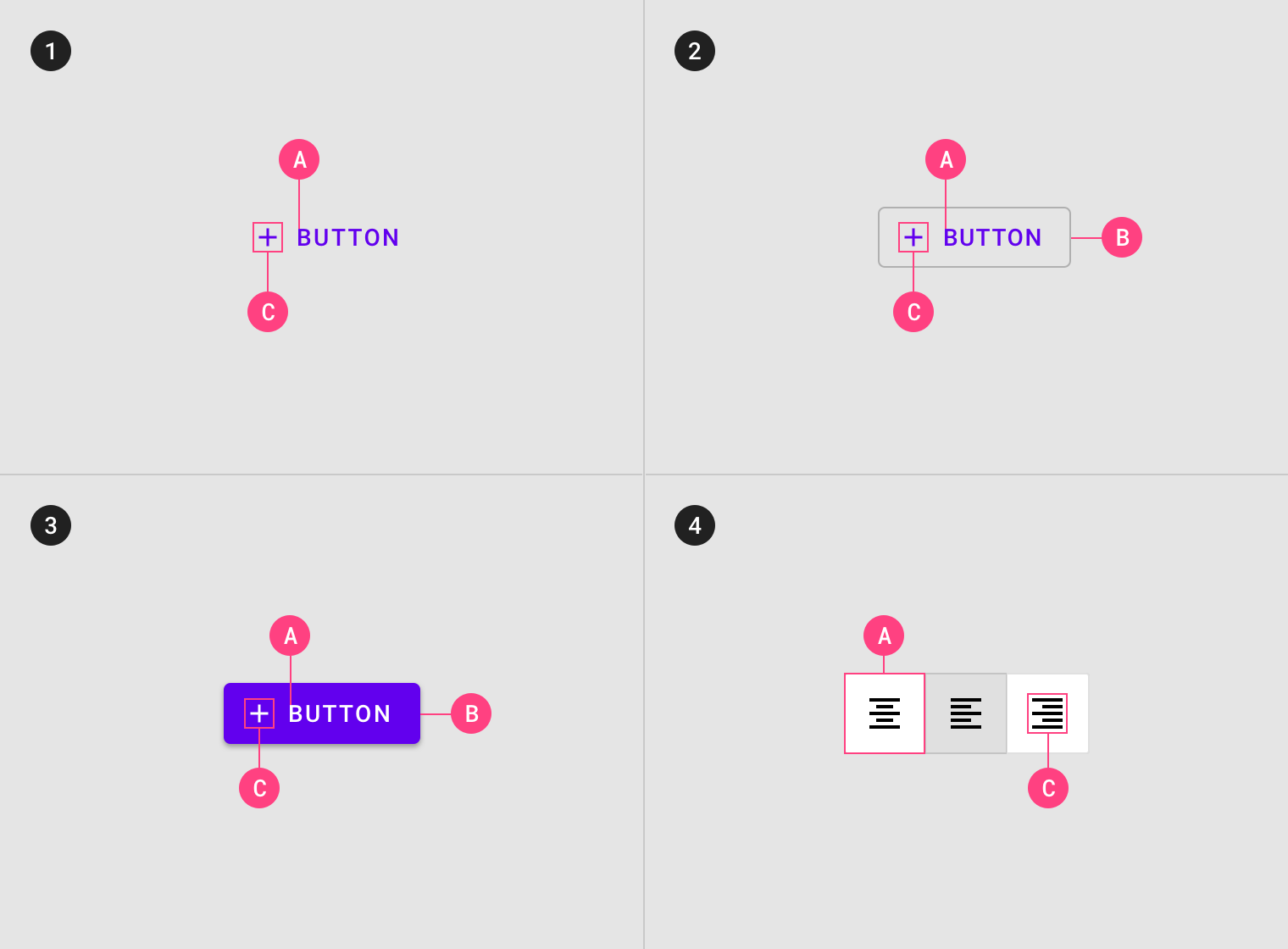
2.Outlined button
A. Text label
B. Container
C. Icon (optional)
3.Contained button
A. Text label
B. Container
C. Icon (optional)
4.Toggle button
A. Container
C. Icon
圖片來源:https://material.io
TextButton
- 常用在卡片裡
圖片來源:https://material.io
TextButton
- 常用在對話框
圖片來源:https://material.io
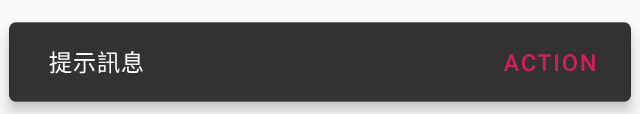
TextButton
- 在Snackbar裡
圖片來源:https://material.io
OutlineButton
圖片來源:https://material.io
Contained Button
圖片來源:https://material.io
Contained Button
圖片來源:https://material.io
Toggle Button
圖片來源:https://material.io
Color
<item name="materialButtonStyle">@style/AppButton</item><style name="AppButton" parent="Widget.MaterialComponents.Button">
<item name="backgroundTint">?attr/colorSecondary</item>
<item name="android:textColor">@color/button_text_color</item>
<item name="iconTint">@color/button_text_color</item>
<item name="rippleColor">@color/button_ripple_color</item>
</style>Shape
<!-- 客制形狀 -->
<item name="shapeAppearanceSmallComponent">@style/AppShapeAppearance.SmallComponent</item>
<item name="shapeAppearanceMediumComponent">@style/AppShapeAppearance.MediumComponent</item>
<item name="shapeAppearanceLargeComponent">@style/AppShapeAppearance.LargeComponent</item>
<style name="AppShapeAppearance.SmallComponent" parent="ShapeAppearance.MaterialComponents.SmallComponent">
<item name="cornerFamily">cut</item>
<item name="cornerSize">8dp</item>
</style>
<style name="AppShapeAppearance.MediumComponent" parent="ShapeAppearance.MaterialComponents.MediumComponent">
<item name="cornerFamily">rounded</item>
<item name="cornerSize">8dp</item>
</style>
<style name="AppShapeAppearance.LargeComponent" parent="ShapeAppearance.MaterialComponents.LargeComponent">
<item name="cornerFamily">rounded</item>
<item name="cornerSize">8dp</item>
</style>Material Motion
Material Motion
- Container transform
- Shared axis
- Fade Through
- Fade
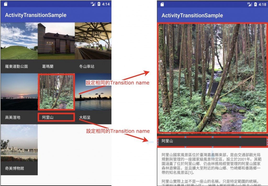
Container transform
Container transform
- Fragment
- Activity
- View
Shared axis
Fade Through
Fade
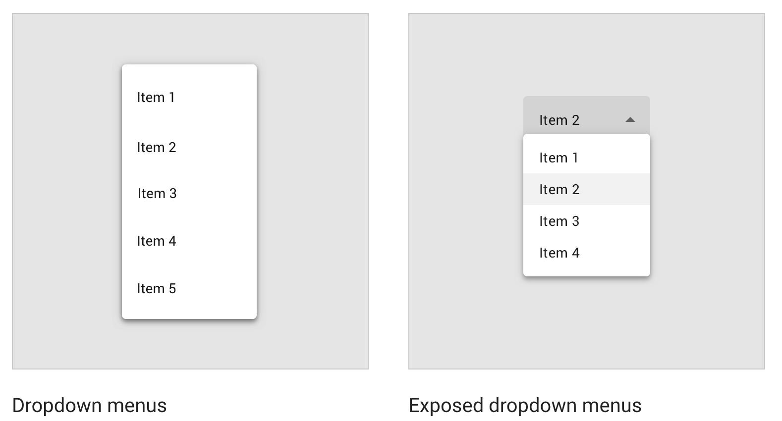
Selection controls
Selection controls
Menu
UI 常見錯誤
在我的手機測試都正常,App一上線就跑版
在我的手機測試都正常,App一上線就跑版
- 手機種類變多了
- 資料變多了
當資料只有局部出現或無資料時
當資料只有局部出現或無資料時
- 無資料
- 部分無資料
- 極限資料
發生錯誤,沒有告訴使用者該怎麼辦
使用者自行調整手機字型大小
UI佈局優化
客制可重用的UI元件
客制可重用的UI元件
- 重用UI元件:Include
- 使用Merge減少View的階層
- 延遲載入UI資源:Viewstub
- 自定義View:CustomView
- 用ViewGroup管理多個子View
Include
Merge
ViewStub
CustomView
Custom View Component
<evan.chen.tutorial.ui.customviewsample.CustomView
    android:layout_width="100dp"
    android:layout_height="100dp"
    android:background="@color/colorAccent" />
<evan.chen.tutorial.ui.customviewsample.CustomView
android:layout_width="100dp"
android:layout_height="100dp"
android:background="@color/colorAccent"
android:padding="20dp" />
CustomView
<FrameLayout
    android:layout_width="200dp"
    android:layout_height="200dp"
    app:layout_constraintBottom_toBottomOf="parent"
    app:layout_constraintEnd_toEndOf="parent"
    app:layout_constraintStart_toStartOf="parent">
    <evan.chen.tutorial.ui.customviewsample.CustomView
        android:layout_width="wrap_content"
        android:layout_height="wrap_content"
        android:background="@color/colorAccent"
        android:padding="20dp" />
</FrameLayout>
測量大小
override fun onMeasure(widthMeasureSpec: Int, heightMeasureSpec: Int) {
    val widthSpecMode = MeasureSpec.getMode(widthMeasureSpec)
    val widthSpecSize = MeasureSpec.getSize(widthMeasureSpec)

    if (widthSpecMode == MeasureSpec.AT_MOST) {
        //wrap_content
    }
    if (widthSpecMode == MeasureSpec.EXACTLY) {
        //指定大小
    }
    if (widthSpecMode == MeasureSpec.UNSPECIFIED) {
        //未定大小
    }
}
Draw
override fun draw(canvas: Canvas?) {
  canvas?.drawLine(startX, startY, stopX, stopY)
}
ViewGroup
ViewGroup
ViewGroup
override fun onMeasure(widthMeasureSpec: Int, heightMeasureSpec: Int) {

        val widthMode = MeasureSpec.getMode(widthMeasureSpec)
        val heightMode = MeasureSpec.getMode(heightMeasureSpec)
        val widthSize = MeasureSpec.getSize(widthMeasureSpec)
        val heightSize = MeasureSpec.getSize(heightMeasureSpec)

        //依子View計算GroupView的寬、高

    	setMeasuredDimension(finalWidth, finalHeight)
}

override fun onLayout(changed: Boolean, l: Int, t: Int, r: Int, b: Int) {

	//編排子View
}
Motion Layout
貝茲曲線
來源:維基百科
Loading Button
Loading Button
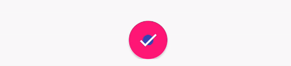
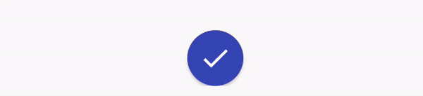
矩形 -> 圓形
載入中動畫
Reveal 完成
圓形 -> 矩形
Canvas.drawArc
canvas.drawArc(oval, 30f, 300f, true, p)
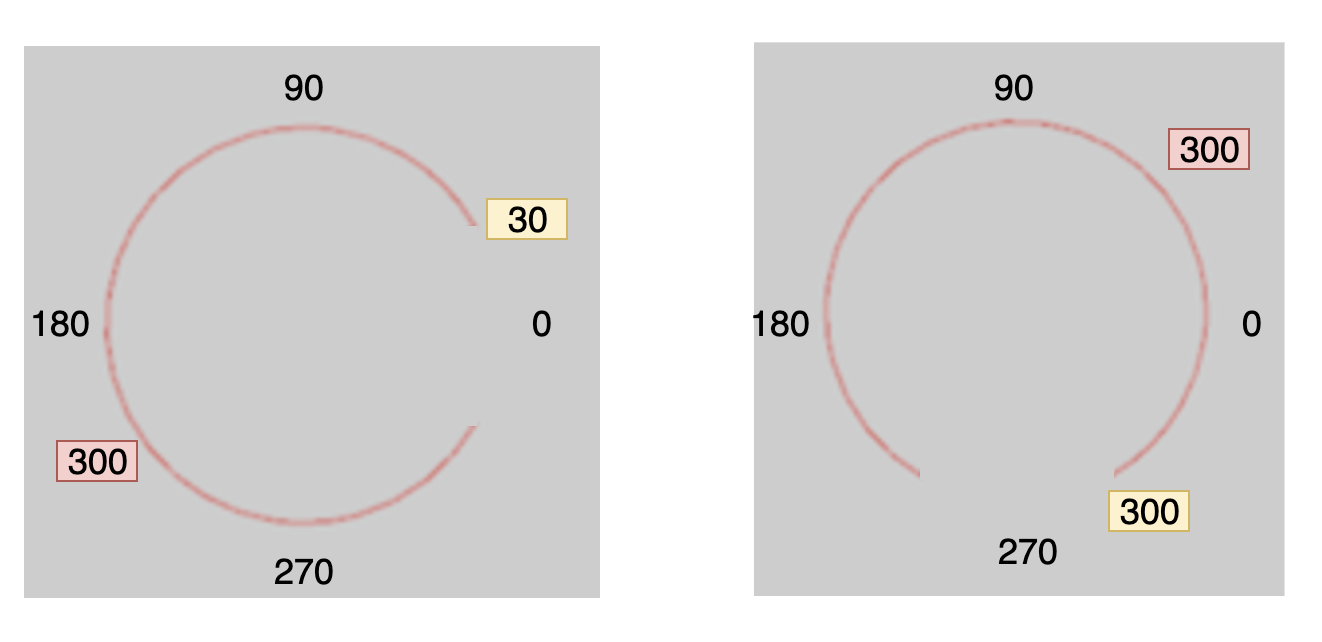
canvas.drawArc(oval, 300f, 300f, true, p)
BottomAppBar
Bar
-
ActionBar 最基本的Bar
-
ToolBar 客制Bar裡面的內容
-
AppBarLayout 隨著其他View響應變化
-
CollapsingToolbarLayout 可折疊式的Bar
- BottomAppBar 底部的Bar
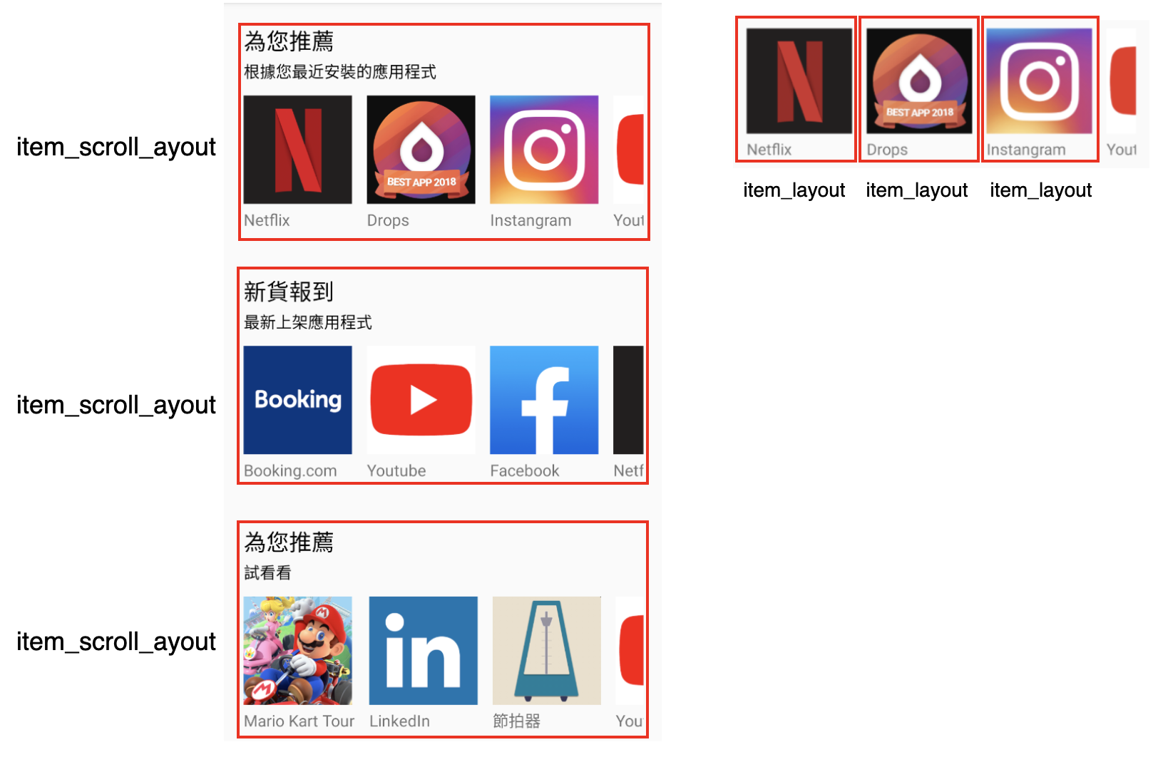
RecyclerView 結構
實作重點
- 建 Model
- 讓App 的Icon 第四個剛好出現一點點
- 在LinearLayout裡新增內容
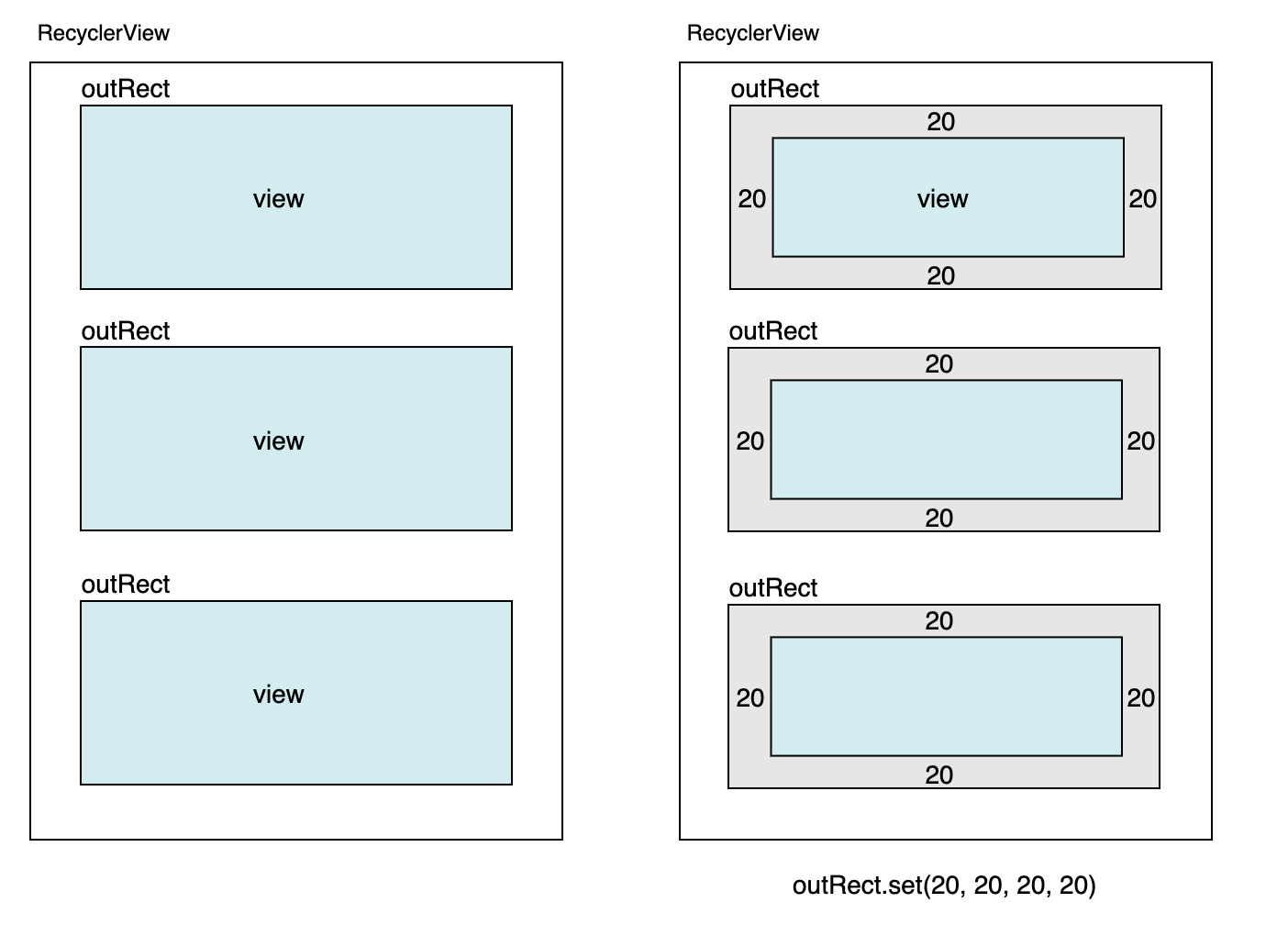
Item Decoration
Material Design Component
加入Material Design
dependencies {
	implementation 'com.google.android.material:material:1.1.0-beta01'
}
<style name="AppTheme" parent="Theme.MaterialComponents.Light.NoActionBar">加入Dependencies
修改Style
AndroidX
<androidx.drawerlayout.widget.DrawerLayout
    xmlns:android="http://schemas.android.com/apk/res/android"
    xmlns:app="http://schemas.android.com/apk/res-auto"
    android:id="@+id/drawerLayout"
    android:layout_width="match_parent"
    android:layout_height="match_parent"
    android:fitsSystemWindows="true">
https://developer.android.com/jetpack/androidx/migrate/class-mappings
<android.support.v4.widget.DrawerLayout
    xmlns:android="http://schemas.android.com/apk/res/android"
    xmlns:app="http://schemas.android.com/apk/res-auto"
    android:id="@+id/drawerLayout"
    android:layout_width="match_parent"
    android:layout_height="match_parent"
    android:fitsSystemWindows="true">
下載範例練習
CoordinatorLayout
用來協調子View之間動作的一個Layout
DatePicker
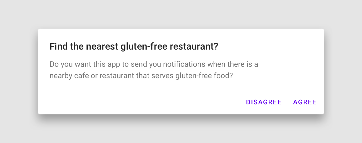
Material Dialog
對話框
Alert Dialog
Simple Dialog
Single Choice Dialog
Multi Choice Dialog
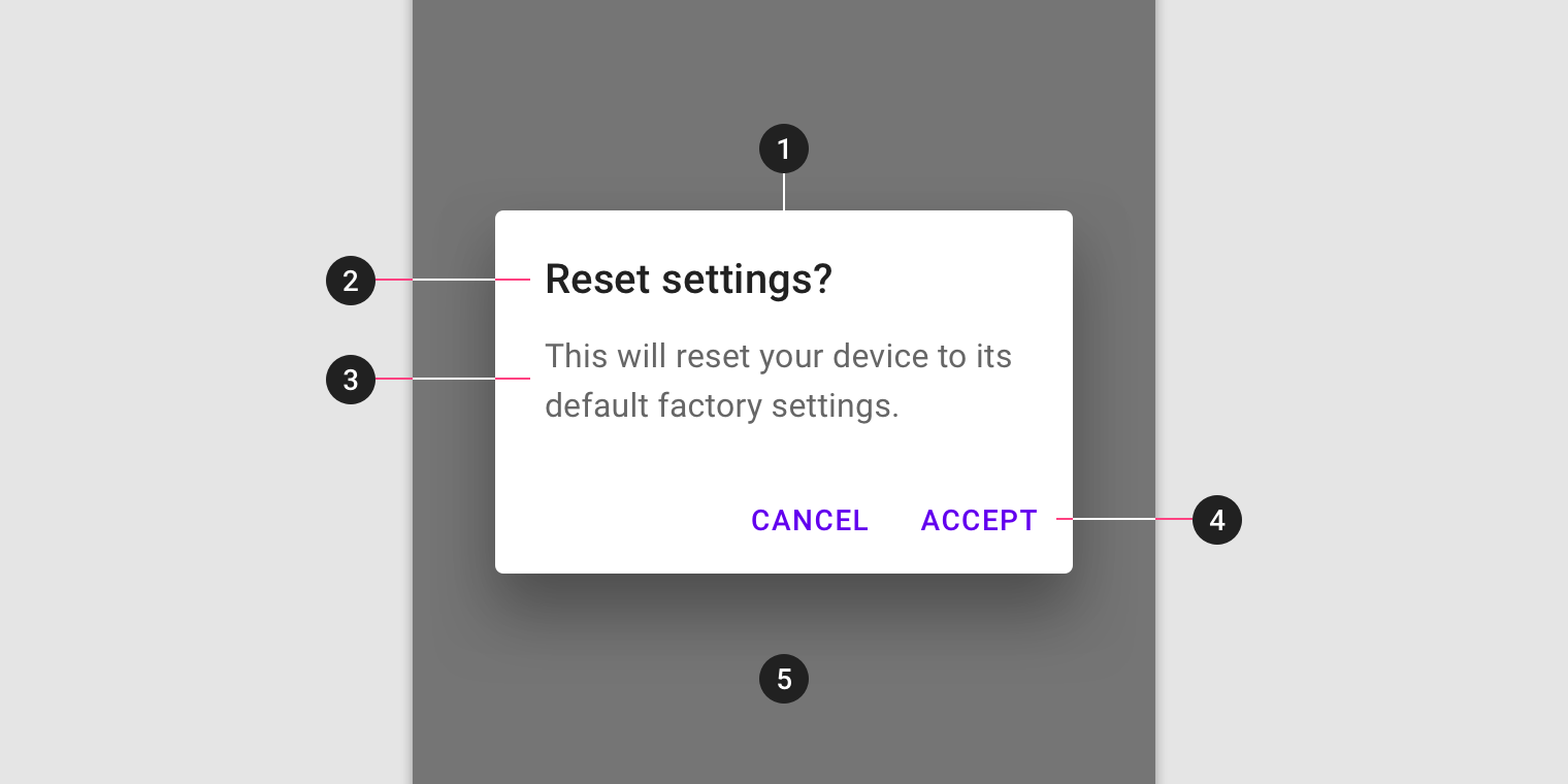
- Container
- Title (optional)
- Supporting text
- Buttons
- Scrim
圖片來源:https://material.io
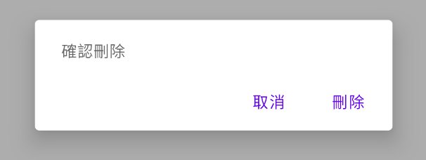
Alert Dialog
MaterialAlertDialogBuilder(this)
.setMessage("確認刪除")
.setPositiveButton("刪除") { _: DialogInterface?, _: Int ->
Toast.makeText(this, "刪除", Toast.LENGTH_SHORT).show()
}
.setNegativeButton("取消") { _, _ ->
Toast.makeText(this, "取消", Toast.LENGTH_SHORT).show()
}
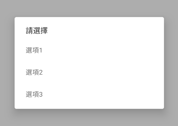
.show()Simple Dialog
val items = arrayOf("選項1", "選項2", "選項3")
MaterialAlertDialogBuilder(this)
.setTitle("請選擇")
.setItems(items){ _, i ->
Toast.makeText(this, "選項: ${items[i]}", Toast.LENGTH_SHORT).show()
}
.setCancelable(false)
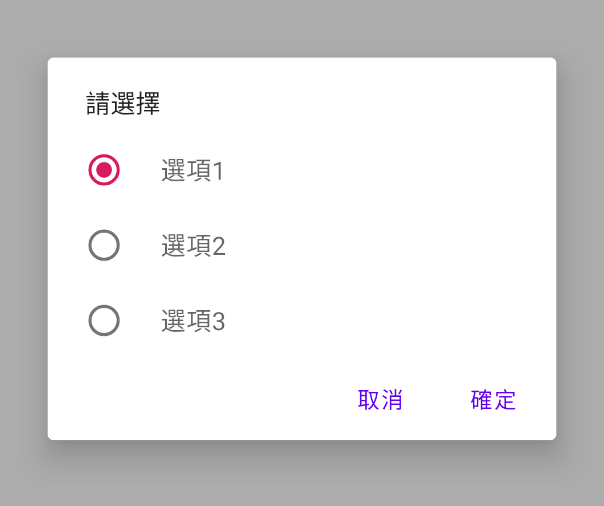
.show()Single Choice Dialog
val items = arrayOf("選項1", "選項2", "選項3")
val checkedItem = 0
MaterialAlertDialogBuilder(this)
.setTitle("請選擇")
.setSingleChoiceItems(items, checkedItem) { dialog, which ->
Toast.makeText(this, "選項 ${items[which]}", Toast.LENGTH_SHORT).show()
}
.setPositiveButton("確定") { dialog, which ->
Toast.makeText(this, "選項:${items[which]}", Toast.LENGTH_SHORT).show()
}
.setNegativeButton("取消") { dialog, which ->
Toast.makeText(this, "選項 cancel", Toast.LENGTH_SHORT).show()
}
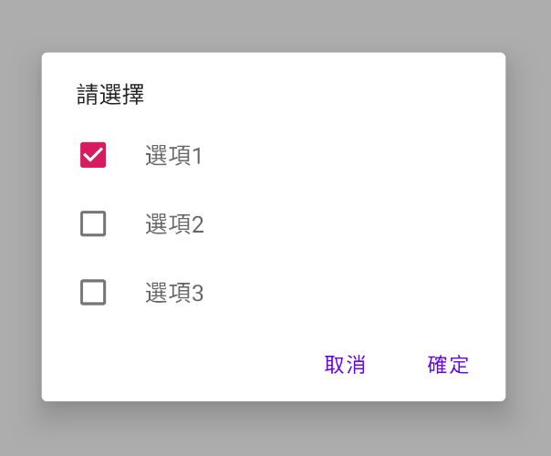
.show()Multi Choice Dialog
val items = arrayOf("選項1", "選項2", "選項3")
val checkedItems = booleanArrayOf(true, false, false, false)
MaterialAlertDialogBuilder(this)
    .setTitle("請選擇")
    .setMultiChoiceItems(items, checkedItems) { dialog, which, checked ->
        Toast.makeText(this, "Chose ${items[which]}", Toast.LENGTH_SHORT).show()
    }
    .setPositiveButton("確定") { dialog, which ->
        Toast.makeText(this, "確定 ${items[which]}", Toast.LENGTH_SHORT).show()
    }
    .setNegativeButton("取消") { dialog, which ->
        Toast.makeText(this, "取消", Toast.LENGTH_SHORT).show()
    }
    .show()
Bottom Sheet
由底部由下往上展開的,可以滑動來展開、收合的View
Bottom Sheet
SwipeRefreshLayout
下拉更新資料
Bottom Navigation
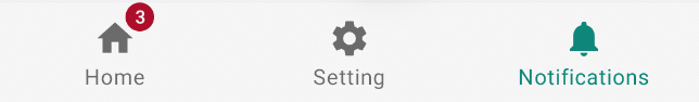
Code
<com.google.android.material.bottomnavigation.BottomNavigationView
        android:id="@+id/navigationView"
        android:layout_width="match_parent"
        android:layout_height="wrap_content"
        android:layout_gravity="bottom"
        app:layout_insetEdge="bottom"
        app:menu="@menu/bottom_nav_menu" />
<menu xmlns:android="http://schemas.android.com/apk/res/android">
<item
android:id="@+id/navigation_home"
android:icon="@drawable/ic_home_black_24dp"
android:title="@string/title_home" />
<item
android:id="@+id/navigation_settings"
android:icon="@drawable/ic_settings_black_24dp"
android:title="@string/title_setting" />
<item
android:id="@+id/navigation_notifications"
android:icon="@drawable/ic_notifications_black_24dp"
android:title="@string/title_notifications" />
</menu>
頁面滑至底部自動載入更多
多筆列表的滑動刪除
與拖拽排序
ItemTouchHelper
 ItemTouchHelper mIth = new ItemTouchHelper(
     new ItemTouchHelper.SimpleCallback(ItemTouchHelper.UP | ItemTouchHelper.DOWN,
         ItemTouchHelper.LEFT) {
         public abstract boolean onMove(RecyclerView recyclerView,
             ViewHolder viewHolder, ViewHolder target) {
             final int fromPos = viewHolder.getAdapterPosition();
             final int toPos = target.getAdapterPosition();

             return true;
         }
         public void onSwiped(ViewHolder viewHolder, int direction) {
             // remove from adapter
         }
 });
AndroidX Migrate
範例下載
Chip
Choice Chips 單選
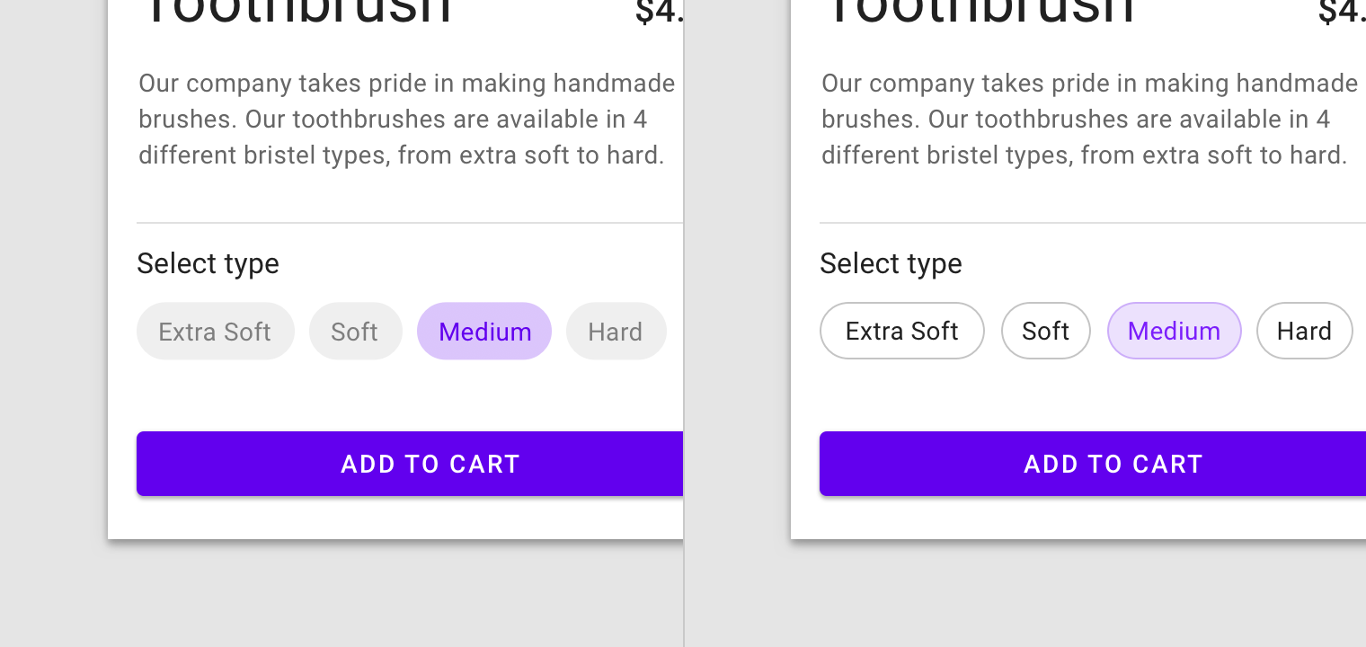
圖片來源:https://material.io
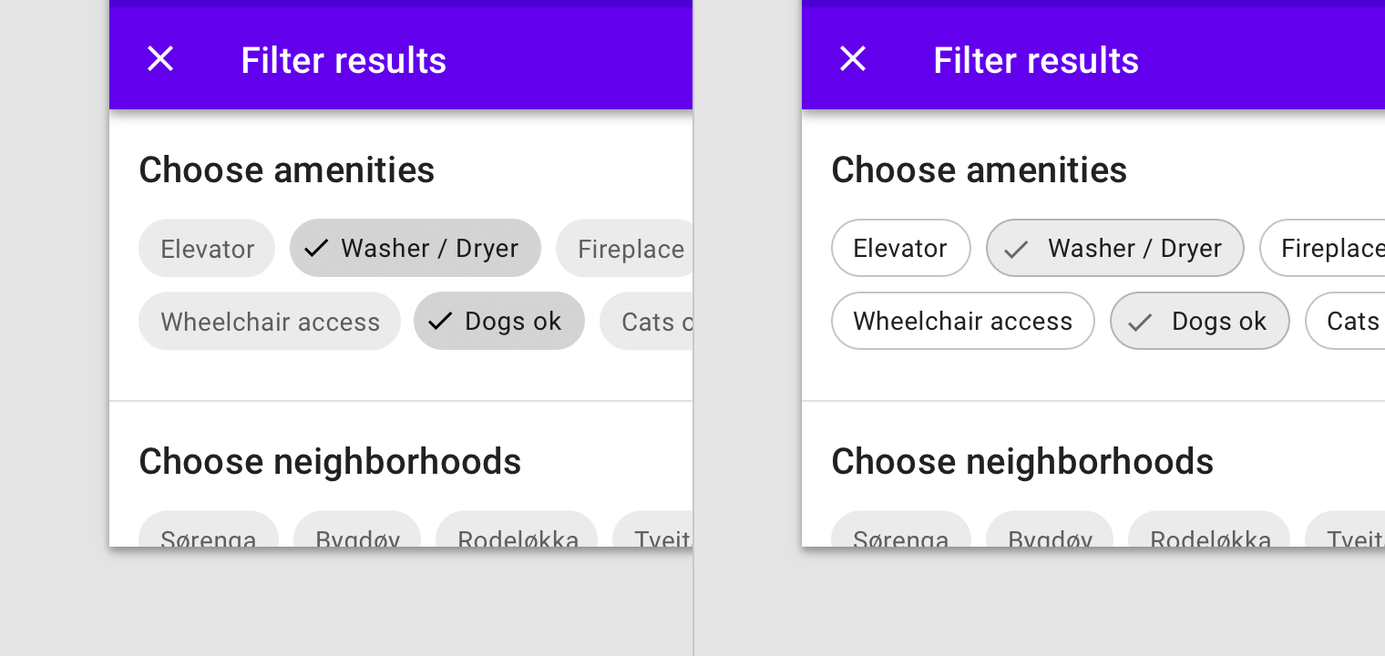
Filter Chips 複選、篩選
圖片來源:https://material.io
Action Chips
圖片來源:https://material.io
Input Chips
圖片來源:https://material.io
Sample
圖片來源:https://material.io
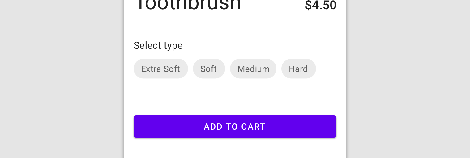
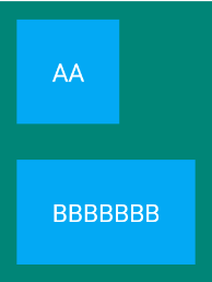
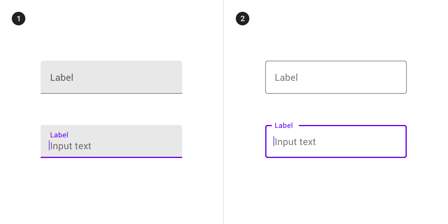
Text Field
種類
<com.google.android.material.textfield.TextInputLayout
    android:layout_width="match_parent"
    android:layout_height="wrap_content"
    android:hint="@string/hint_text">

  <com.google.android.material.textfield.TextInputEditText
      android:layout_width="match_parent"
      android:layout_height="wrap_content"/>

</com.google.android.material.textfield.TextInputLayout>
Text Field組成
1. Container
2. Leading icon (optional)
3. Label text
4. Input text
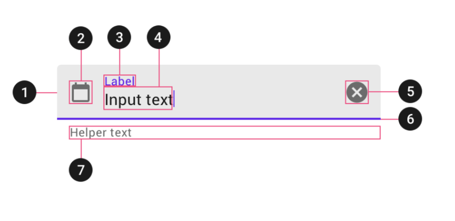
5. Trailing icon (optional)
6. Activation indicator
7. Helper text (optional)
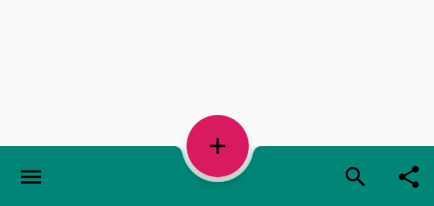
Floating action button (FAB)
來源:https://material.io
FAB
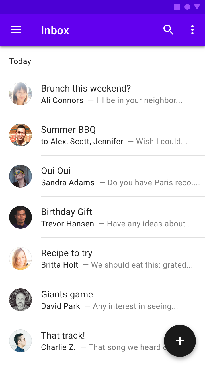
圖片來源:https://material.io
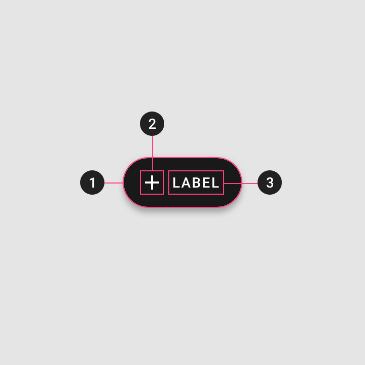
FAB組成
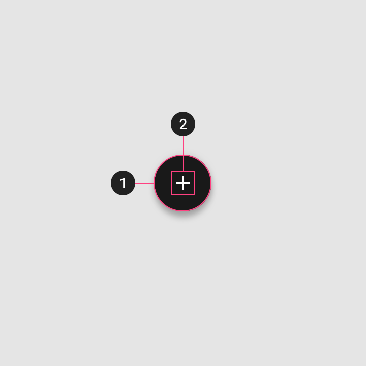
1.Container
2.Icon
Code
<androidx.coordinatorlayout.widget.CoordinatorLayout
    xmlns:android="http://schemas.android.com/apk/res/android"
    xmlns:app="http://schemas.android.com/apk/res-auto"
    android:layout_width="match_parent"
    android:layout_height="match_parent">

        <com.google.android.material.floatingactionbutton.FloatingActionButton
            android:id="@+id/fab"
            android:layout_width="wrap_content"
            android:layout_height="wrap_content"
            android:layout_gravity="bottom|end"
            android:layout_margin="16dp"
            android:src="@drawable/ic_add_black_24dp" />

</androidx.coordinatorlayout.widget.CoordinatorLayout>
不適合的情境
圖片來源:https://material.io
不適合的情境

圖片來源:https://material.io
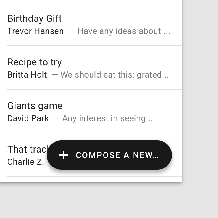
Extended FAB
圖片來源:https://material.io
組成
1.Container
2.Icon (optional)
3.Text label
Code
<androidx.coordinatorlayout.widget.CoordinatorLayout
    xmlns:android="http://schemas.android.com/apk/res/android"
    xmlns:app="http://schemas.android.com/apk/res-auto"
    android:layout_width="match_parent"
    android:layout_height="match_parent">

    <com.google.android.material.floatingactionbutton.ExtendedFloatingActionButton
        android:id="@+id/fab"
        android:layout_width="wrap_content"
        android:layout_height="wrap_content"
        android:layout_gravity="bottom|end"
        android:layout_margin="16dp"
        android:text="Add"
        app:icon="@drawable/ic_add_black_24dp" />

</androidx.coordinatorlayout.widget.CoordinatorLayout>
不適合的情境
圖片來源:https://material.io
不適合的情境
圖片來源:https://material.io
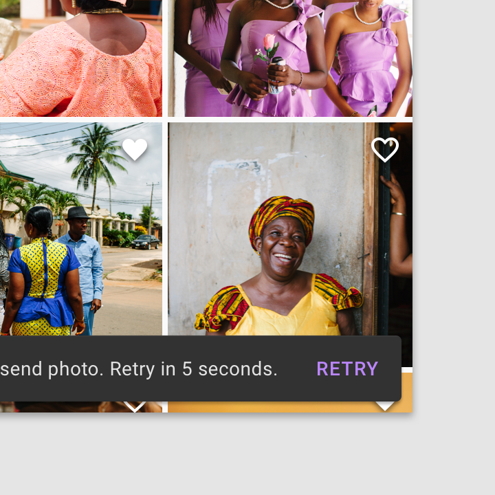
Snackbar
Snackbar
使用時機
| Component | 優先權 | 使用者互動 |
|---|---|---|
| Snackbar | 低 | Snackbars會自動消失,可能有互動 |
| Dialog | 高 | 可強制使用者選擇 |
Navigation drawer
側邊選單
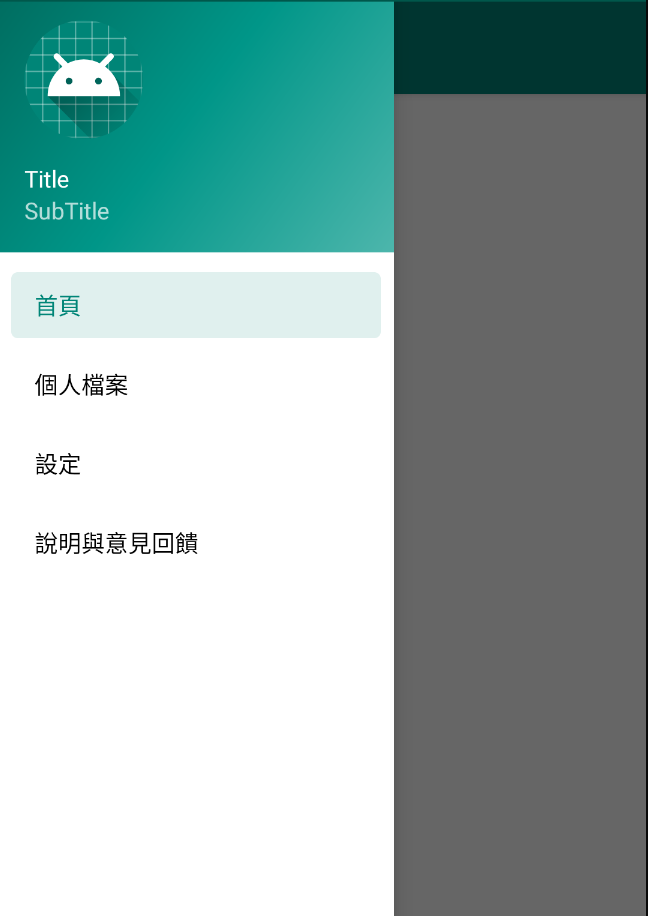
使用時機
- 有5個以上 top-level 目的頁面
- 有2個以上的導覽階層
- 需要在不相關的頁面快速的切換
Drawer
Bottom
Navigation
網站來源:https://material.io/
style
<style name="cardStyle" parent="Widget.MaterialComponents.CardView">
    <item name="cardCornerRadius">8dp</item>
    <item name="cardElevation">8dp</item>
    <item name="android:clickable">true</item>
    <item name="rippleColor">#666666</item>
    <item name="android:checkable">true</item>
</style>
屬性
<com.google.android.material.card.MaterialCardView
    app:cardBackgroundColor="#00BCD4"
    app:cardCornerRadius="8dp"
    app:cardElevation="8dp"
    app:rippleColor="#666666"
    android:clickable="true"/>
Material CardView
基於CardView做出來的更多功能的Component
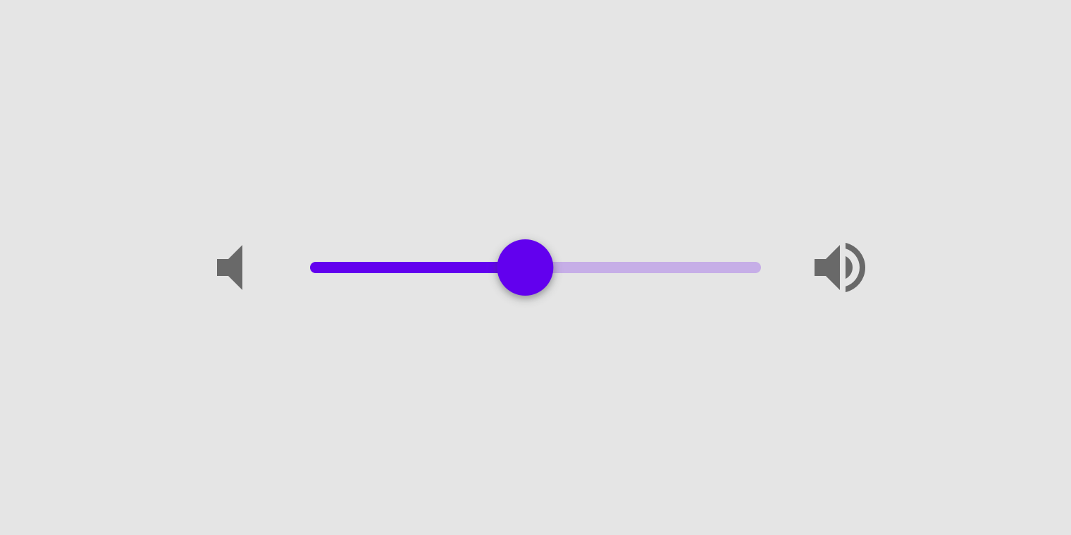
Sliders
圖片來源:https://material.io/