1. How does your product use or challenge conventions and how does it represent social groups or issues?
I used several magazine issues to draw inspiration and gather ideas about what sort of conventions I shall use in my magazine.
The name of magazine is Modage which means Modern age. As my genre is Fashion and the sub genre is casual wear it indirectly represents modern era in the fashion industry indirectly. There for the name of the magazine give an idea what the magazine will be about such as the latest trends.
The name of the magazine is something I came up with originally. Because in the fashion magazine it makes a lot of difference when it comes to the name to attract the audience.
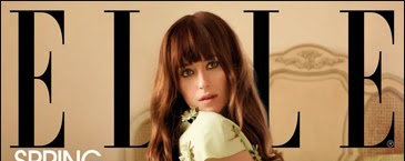


When it comes to the color of the masthead there are no restrictions and any color is used according to the style of the magazine. Therefore I used this color because it contrasted with the clothes of the magazine.
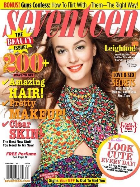
The masthead is stretched from edge to edge of the magazine which is one of the conventions of fashion magazines.
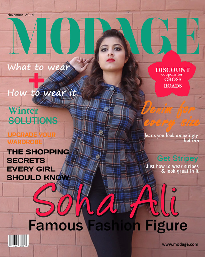
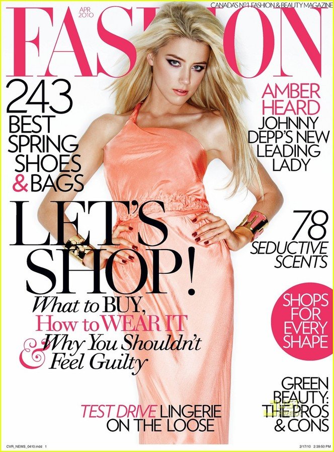
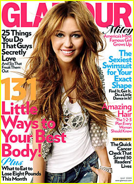
On my magazine the main image is in the center of the magazine which is conventional of most, if not all magazines. The model has a strong eye contact with the camera, addressing the audience. A cow boy shot like this is a feature that is also common for the front cover of a magazine.

The clothes worn by my model depicts the genre the magazine is based on which is casual wear for women. Therefore the clothes are not extravagant but simple.
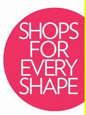
Pugs are usually placed at the top right or left corner of the magazine and usually display a promotion from the magazine's edition, they further attract the attention of the audience.
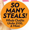
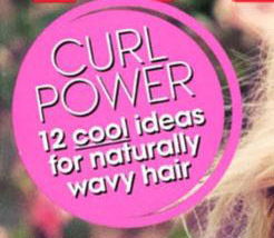

I used the shocking pink color so that the pug gets the attention of the audience and it follows the color scheme I was trying to coordinate in my magazine. The text on the pug is a discount from a clothing brand featured in the magazine of the cover story. The discount therefore makes it a good incentive for the audience to buy the magazine.

Cover lines are located at various points on the magazine telling the readers about the contents about the magazine so that the audience picks up and looks inside the magazine. Conventionally the font and color of the cover lines can be different or the same, however different fonts and color schemes are used.
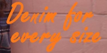
I used both San Serif and Serif because as if not in most magazines, but different fonts are used to make the magazine look interesting and not plain and a different range of colors following a color scheme to give a little bit of emphasize on the cover lines and the font size is small following the conventions of a fashion magazine. Also fashion magazines use a colors scheme for the text in coordination of what the model is wearing so that it balances the over all image of the magazine therefore I used the colors I used the colors green, black, orange and white which makes a good contrast with the coat of the model and balances the over all image of the magazine.
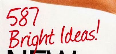

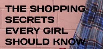




The main cover lines are the second largest font size on the cover page. On my magazine the name of the model and the title below it is from the cover story of the magazine so that the name of the famous figure attracts the audience. As it is used on fashion magazines, the model is a celebrity to further increase the sales of the magazine and I have followed this convention in my magazine and therefore the main cover line is about model featured in the magazine.


As all magazines contain a bar code I placed the bar code on the bottom left of the magazine to make my magazine look more authentic
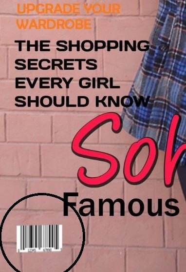
Barcode
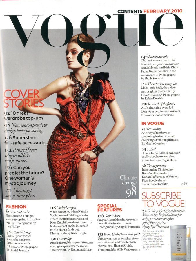
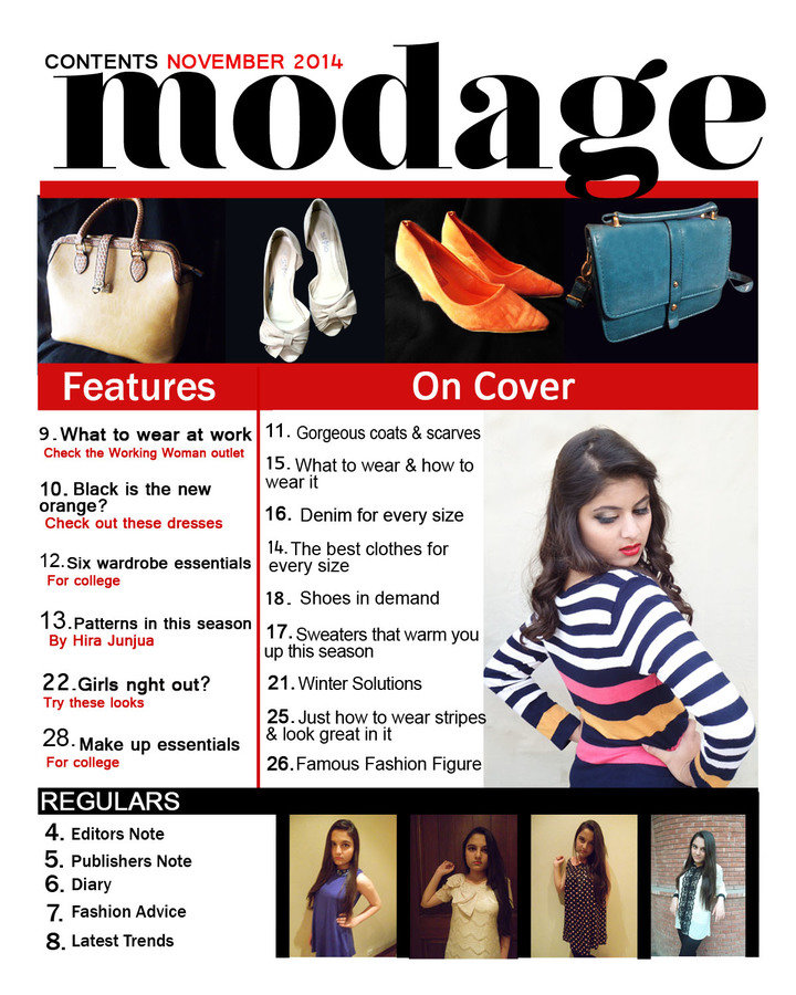
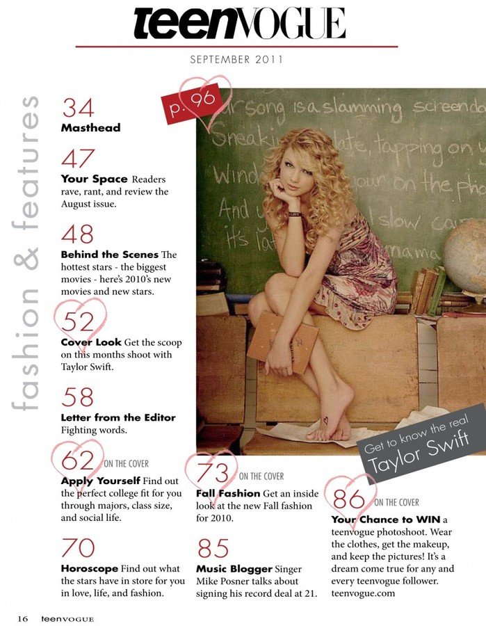
Just like in the contents page of vogue I have given the contents title along with its issue date and the with the same colors. Which helps to differentiatie between the title and the isse date.


I have also placed the name of the magazine in small letters just as the contents page of the vogue magazine which also is a convention of fashion magazine, where the name of the magazine is also on the contents page.
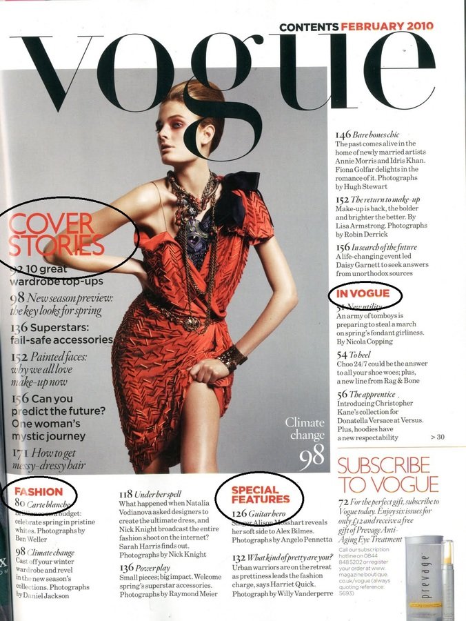
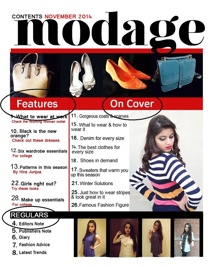
One of the conventions of the contents page of a magazine are that the articles in the magazine are divided into sections just like the vogue contents page. Therefore I have also divided the articles in sections, the features, regulars and the articles mentioned on the cover page of the magazine. Which will make it easier for the audience to navigate through the contents page based on their preference.

One of the images I have used is of the same model on the cover page and the other pictures are of different model. The picture of the model also on the cover page occupies more space as compared to the rest of the images, moreover the images of the shoes and bags are there because if not in many but most of the fashion magazines have images of accessories, shoes and bags on the contents page.
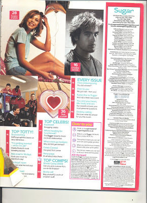
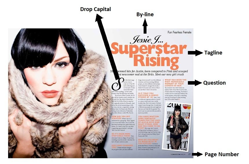
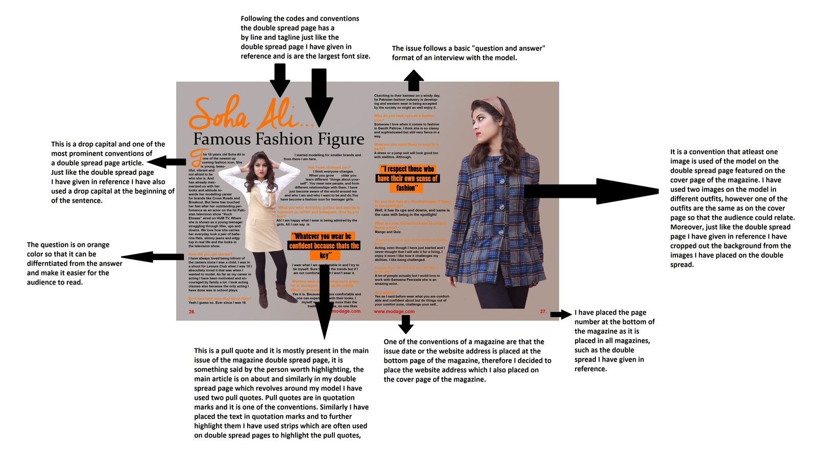
The double spread page also follows some codes and conventions and I have pointed out some of the conventions that are present in this double spread page that I have used in my own double spread page also.
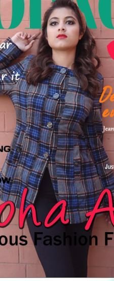



My magazine represents the social groups associated with the genre of fashion in a quite stereotypical way. Because as you can see the cover lines and main cover lines revolve around issues in the fashion world as in what to wear and solutions for every seasons. Also who to follow such as a "Famous Fashion Figure" all these represent the fashion world in a stereotypical way, that is fashion is all about your clothes and what you wear is really important as compared to other characteristics.
Another social group being represented is the female population who love fashion and their lives revolve around it and who are interested in western attire.
Which brings me to the issue that social group being represented is the upper and middle class and my main image strongly represents this because the magazine is completely based on western attire and not the traditional attire of Pakistan which is an issue because the lower classes do not have the resources to buy clothes from brands and let alone spend their money on fashion magazines.
My model also represents a young adult who is in her 20's and this shows that the magazine is for young adults.
The ethnic minority also represented are the ones who are interested in western attire as in Pakistan the eastern attire is more popular but the western attire is gaining recognition.