3. How did your production skills develop throughout this project?


Looking back at when I started which was from my preliminary task I believe I have improved a lot and learnt a great deal.
When I compare my preliminary tasks magazine with my Foundation Portfolio I feel that I improved a lot when it comes to Adobe Photoshop and understanding the codes and conventions because the final outcome of the foundation portfolio looks more professional.
As it comes to my first magazine I messed up the dimensions of my magazine whereas the dimensions of the second magazine are accurate.
I also did not leave margins for the first magazine, which I learned later that I have to.
Moreover, on my first magazine I haven't used any different fonts and have used one font only on the cover page that gives a monotonous effect. Whereas, on my second magazine you can see that I have used a variety of fonts and makes my magazine look interesting.
My editing skills have also improved, when we look at the face of the model as I noticed I have extremely edited her dark circles and spots which makes it look fake whereas in the second magazine I have edited the face of the model very naturally.
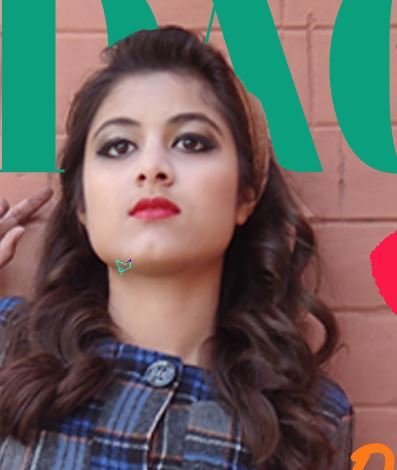



In my preliminary task I used a clone stamp too to hide the dark circles of the model.
However, my skills developed and I learned that the healing brush tool is the adequate tool to use to hide any spots and dark circles. from the face of the model. Therefore, in the foundation portfolio the editing looks more professional.


In my preliminary task I placed the masthead at the back of the model as it is one of the conventions of a fashion magazine. But, now that I look at it I did a very poor job and the shadow does not look good either. I used the polygonal lasso tool for it.
However, in the foundation portfolio I have done a better job and it looks professional and I have cropped the model using the polygonal lasso tool very skillfully.


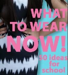


I learned how fonts and colors can carry messages and connotations that you wish to convey and how important they are when it comes to appealing to the audience. For example in my preliminary task I used the same font. However, I used different fonts for the magazine of my foundation portfolio to make it look interesting.
I also learned the conventions of a front cover that it is not only about the text and main image on the cover page but how everything is placed such as the cover lines and main cover lines play an important role in luring the audience. I kept all of this in mind when producing my foundation portfolio magazine. Whereas my preliminary task magazine looks bland as compared to it.


I believe I have improved when looking at the contents page as I have used few pictures and I did no crop the background prom the last picture which looks odd. Moreover I have just created two sections. The color scheme I choose then makes it look really boring. Also the way I have placed the pictures look very unprofessional and the cropping of the necklace is unprofessionally done.
However, in the foundation portfolio contents page I believe I have used many pictures and I believe the way I have placed them gives my contents page a professional look. Moreover, I have created three sections which appeals to the audience more. The vibrant colors I chose also gives an interesting look to the contents page.
One of the new things I learned was text wrapping when I was constructing my double spread page.
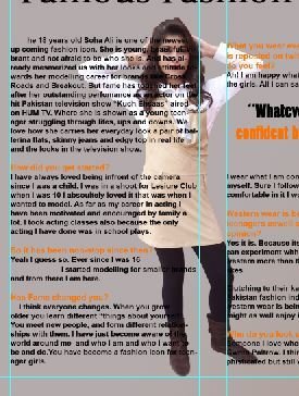
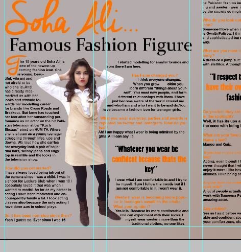


I also believe mye l photography has improved because in my preliminary task I wasn't as prepared compared to my final magazine because in my preliminary task I failed to keep in mind the requirements of the light and postures of the model.
In my contents page when it comes to the photography of the shoes and bags and accessories I also improved because the pictures taken for the final task look more professional and I have kept in mind the composition of the bags and shoes.
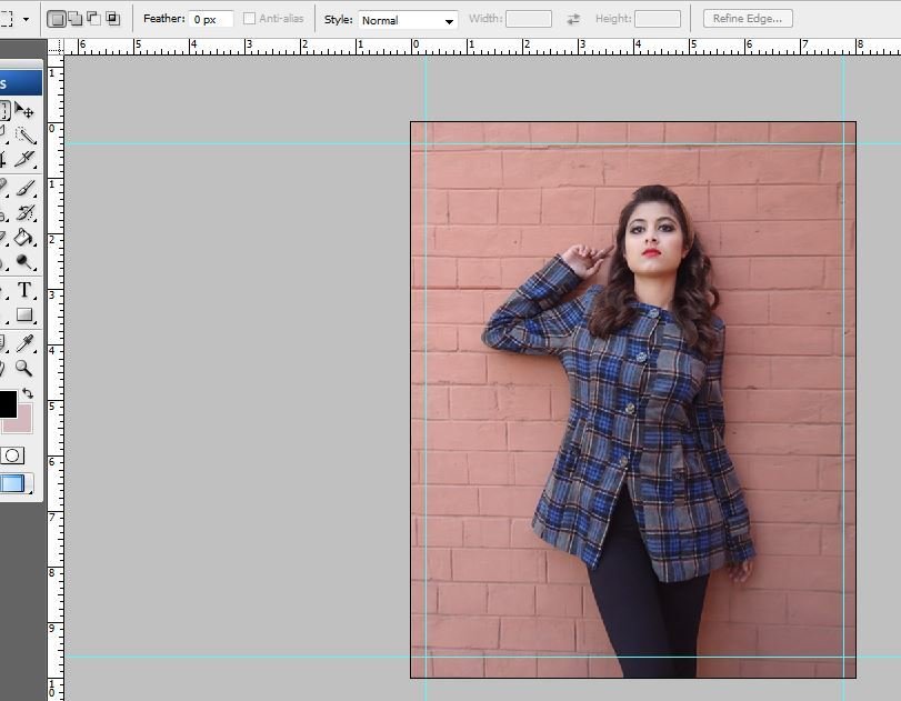
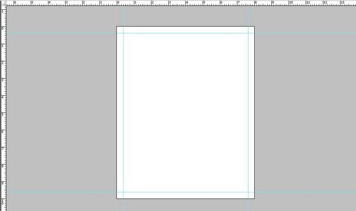
One of the other things I learned were that the use of margins is really important when constructing a magazine which I didn't in my preliminary task.